Leverage design tokens in your custom component
The UI Framework includes a built-in system of design tokens that helps you match your custom components to the platform’s visual style. These tokens standardize spacing, colors, font sizes, and more—so your component looks correct across themes and layout densities.
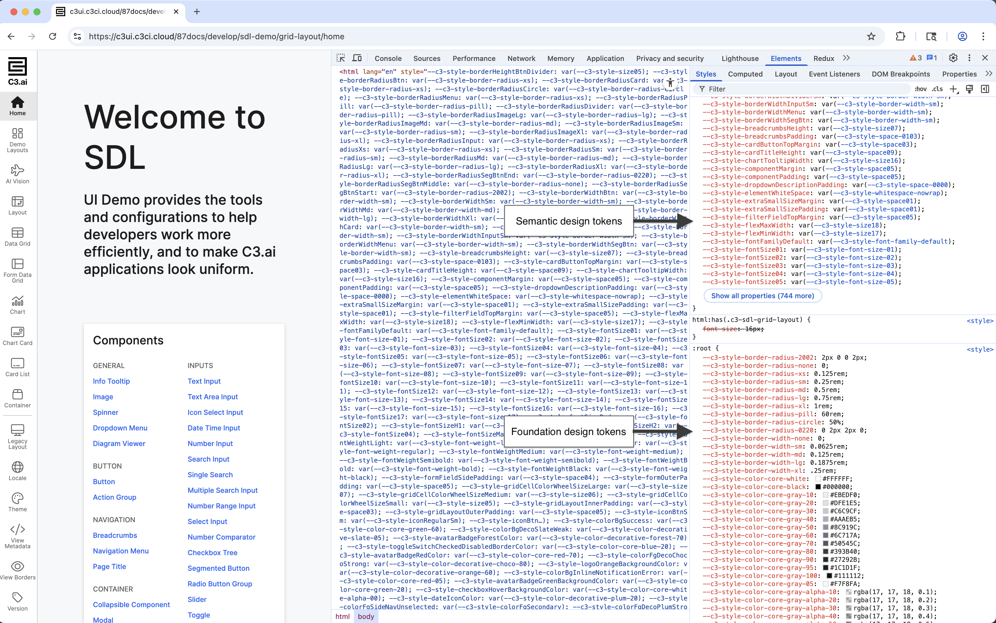
There are two types of tokens:
- Foundation tokens provide low-level values like spacing units, color swatches, and font sizes. These tokens form a curated, consistent design baseline.
- Semantic tokens represent higher-level styles such as
primary text colororcomponent background. A theme maps these semantic tokens to specific foundation values.
Design tokens are exposed as CSS variables and follow the standard var() syntax. You can use them in your own SCSS or CSS to apply styles that automatically respond to:
- Light or dark themes
- Classic or compact layouts
Use var() to apply tokens in SCSS
Use the var() function to reference a token.
Avoid hardcoded values like 16px or #fff. Design tokens update automatically based on the active theme and layout density.
padding: var(--c3-style-smallSizePadding) var(--c3-style-mediumSizePadding); // Responsive padding
font-size: var(--c3-style-fontSizeBody);                                     // Standard text size
background-color: var(--c3-style-componentBackgroundColor);                  // Platform surface color
color: var(--c3-style-fontColor); // Theme-adaptive text colorDiscover available tokens
Design tokens are automatically included as CSS variables in the rendered page. The best way to find and inspect them is through DevTools.
- Open the Elements panel in DevTools.
- Select a platform-rendered component, such as a button or grid header.
- Look at the computed styles for any CSS variable that starts with
--c3-style-. - You can also inspect the
:rootor host element to view the full list of applied tokens.
DevTools displays token values in the :root section of computed styles.
For additional reference, check these templates:
- UiSdlThemeTemplate — for color, font, and other theme-related tokens
- UiSdlDensityTemplate — for spacing and layout tokens
Example: Style a table with tokens
The following example defines a mixin that applies layout and visual styles using platform tokens. Apply the mixin to table cells or headers for consistent styling.
// {package}/src/ui/styling/TableStyles.scss

@mixin base-cell {
  border: 1px solid var(--c3-style-componentBorderColor);                      // Platform-standard border
  padding: var(--c3-style-smallSizePadding) var(--c3-style-mediumSizePadding); // Responsive spacing
  text-align: left;                                                            // Left-aligned text
  font-size: var(--c3-style-fontSizeBody);                                     // Consistent font size
  color: var(--c3-style-fontColor);                                            // Theme-based text color
}

td {
  @include base-cell;
  background-color: var(--c3-style-componentBackgroundColor);                  // Content background
}

th {
  @include base-cell;
  background-color: var(--c3-style-zebraStripeBackgroundColor);                // Alternate header background
}
Place this SCSS in a global file or a scoped .module.scss file depending on your project’s setup. Refer to the topic on how to style your custom component with SCSS for more information.
Provide fallback values (optional)
If needed, provide a fallback value in case a token is unavailable. This is rare — tokens should exist in all standard platform environments — but may be useful during migrations or early development.
font-size: var(--c3-style-fontSizeBody, 14px); // Use 14px if token is missing