Style using scoped CSS
C3 AI Platform's component library comes with detailed and beautiful styling; however, when making custom components, it can be beneficial to ensure that your custom css doesn't affect any other components by accident. For that, you can use *.module.scss files.
Uses
- Use when you want to add custom css that won't affect any other components.
By default, if you have a very generic css selector like:
  .c3-card {
    font-size: 14px;
  }
This style will be applied to every component with the c3-card class whenever a component that imports that css style is added to the page. The downside of this behavior is that you always need to be careful with the way to write your css selectors since they will "leak out" into the rest of the page.
When you use *.module.scss, this does not happen. Even if that component imports a scss module that has very generic selectors like c3-card, UI framework will make sure the styles are automatically scoped to only affect the component and not leak into other components in the same page.
Limitations
- Only
classNamesandidsdefined in the*.module.scssfile will not affect other components, elements that add styling here will act as normal unless wrapped in aclassNameorID. - To get the benefit of
*.module.scssfiles,stylesneeds to be imported from the file and then used with theclassNamesorids. See the example below for more info. classNamesthat are used in*.module.scssfiles are encoded at runtime, making them difficult to override and not human-readable.classNames/idsthat want to use*.module.scssstylings, need to directly import or be passedstyles.classNamesthat are not used withstyleswill not be able to utilize the styles.
Example
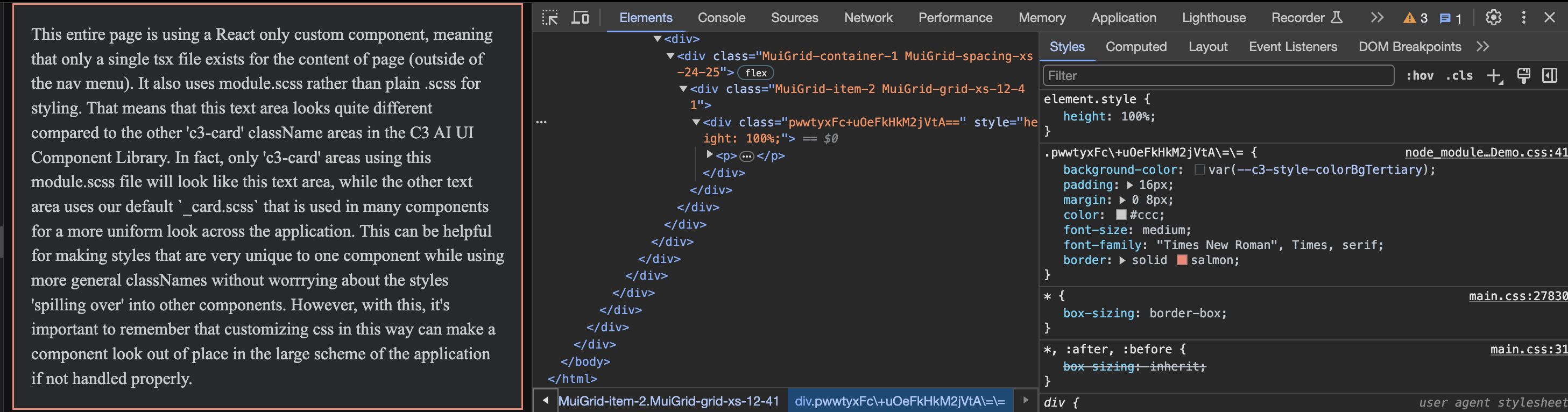
The following shows an example of how SDLDemo.CustomPageWithExternalLibrary.tsx uses CustomInfoPage.module.scss to ensure that only SDLDemo.CustomPageWithExternalLibrary.tsx uses the styles.
CSS
First, CustomInfoPage.module.scss is defined as normal using .c3-card to give styles specific to that className.
// CustomInfoPage.module.scss

.c3-card {
  background-color: #111;
  padding: 16px;
  margin: 0 8px;
  color: #ccc;
  font-size: medium;
  font-family:'Times New Roman', Times, serif;
  border: solid salmon;
}

.explanation-area {
  margin-right: 8px !important;
  margin-left: -8px !important;
}React
CustomInfoPage.module.scss is then imported into the React component with import styles from '@c3/ui/CustomInfoPage.module.scss'. styles is then used to actually get the style for each className with styles['c3-card'] as an example.
// SDLDemo.CustomPageWithExternalLibrary.tsx
import * as React from 'react';
import Grid from '@material-ui/core/Grid'
import styles from '@c3/ui/CustomInfoPage.module.scss';
import '@c3/css-library/components/base/_card.scss';

const CustomInfoPage = () => {

  return (
    <div>
      <Grid container spacing={24}>
        <Grid item xs={12} className={styles["explanation-area-two"]}>
          <div className={styles["c3-card"]} style={{height: '100%'}}>
            <p className={styles["explanation-text"]}> This entire page is using a React only custom component, meaning
            that only a single tsx file exists for the content of page (outside of the nav menu). It also uses module.scss
            rather than plain .scss for styling. That means that this text area looks quite different compared to the other
            'c3-card' className areas in the C3 AI UI Component Library. In fact, only 'c3-card' areas using this module.scss
            file will look like this text area, while the other text area uses our default `_card.scss` that is used in many
            components for a more uniform look across the application. This can be helpful for making styles that are very unique
            to one component while using more general classNames without worrrying about the styles 'spilling over' into
            other components. However, with this, it's important to remember that customizing css in this way can make a component
            look out of place in the large scheme of the application if not handled properly.</p>
          </div>
        </Grid>

      </Grid>
    </div>
  )
}

export default CustomInfoPage;
Below, you can see an image of how this component looks on the screen and the generated className from the component does not match c3-card as we would normally expect.