Add a modal to the application
This tutorial explains how to create a modal and integrate it into a page to display additional information.
Create a modal
To add a modal to your application, three components are necessary:
- Page Layout: Allows multiple component instances to be added to a page.
- The modal: Defines the modal structure and content.
- The grid: Triggers an event to open the modal and render it.
Define the modal
Add a new JSON file in examplePackage/ui/c3/meta:
examplePackage
└── ui
    └── c3
        └── meta
            └── examplePackage.ExampleModal.json
Define the UiSdlModal in examplePackage.ExampleModal.json:
/* examplePackage/ui/c3/meta/examplePackage.ExampleModal.json */
{
  "type": "UiSdlConnected<UiSdlModal>",
  "component": {
    "header": {
      "text": "This is an example"
    },
    "subHeader": {
      "text": "Of how to make a modal"
    }
  }
}
This example defines a modal with a header and subheader. See UiSdlModal for more configuration options.
Add the modal to a page
To integrate the modal into a page, modify the page layout file examplePackage.PageLayout.json:
/* examplePackage/ui/c3/meta/examplePackage.PageLayout.json */
{
  "type": "UiSdlConnected<UiSdlGridLayout>",
  "component": {
    "gridStyle": "FLUID",
    "gutter": 8,
    "display": "VERTICAL",
    "children": ["examplePackage.TurbineGrid"],
    "detachedFields": [
      {
        "id": "examplePackage.ExampleModal"
      }
    ]
  }
}
UiSdlGridLayout provides a detachedFields field for adding modals, ensuring they remain separate from other page elements.
Note: Modals are hidden by default. If you bundle the application and do not see the modal, this is expected behavior. Once the modal is added to the page, events can be sent to it to control when it opens and displays to the user.
Open the modal with an effect trigger
To open the modal based on user interaction, modify examplePackage.TurbineGrid.json to add an effectTrigger:
/* examplePackage/ui/c3/meta/examplePackage.TurbineGrid.json */
{
  "type": "UiSdlConnected<UiSdlDataGrid>",
  "component": {
    "dataSpec": {
      "dataType": "WindTurbine",
      "columnFields": [
        {
          "fieldName": "id",
          "label": "ID"
        },
        {
          "fieldName": "manufacturer",
          "label": "Manufacturer"
        },
        {
          "fieldName": "location",
          "label": "Location"
        }
      ]
    }
  },
  "effectTriggers": [{
    "trigger": "examplePackage.TurbineGrid.ROW_CLICK",
    "actions": [
      {
        "type": "examplePackage.ExampleModal.MODAL_OPEN",
        "payload": {
          "componentId": "examplePackage.ExampleModal"
        }
      }
    ]
  }]
}
This configuration assigns a trigger to row clicks in the grid, causing the modal to open when activated.
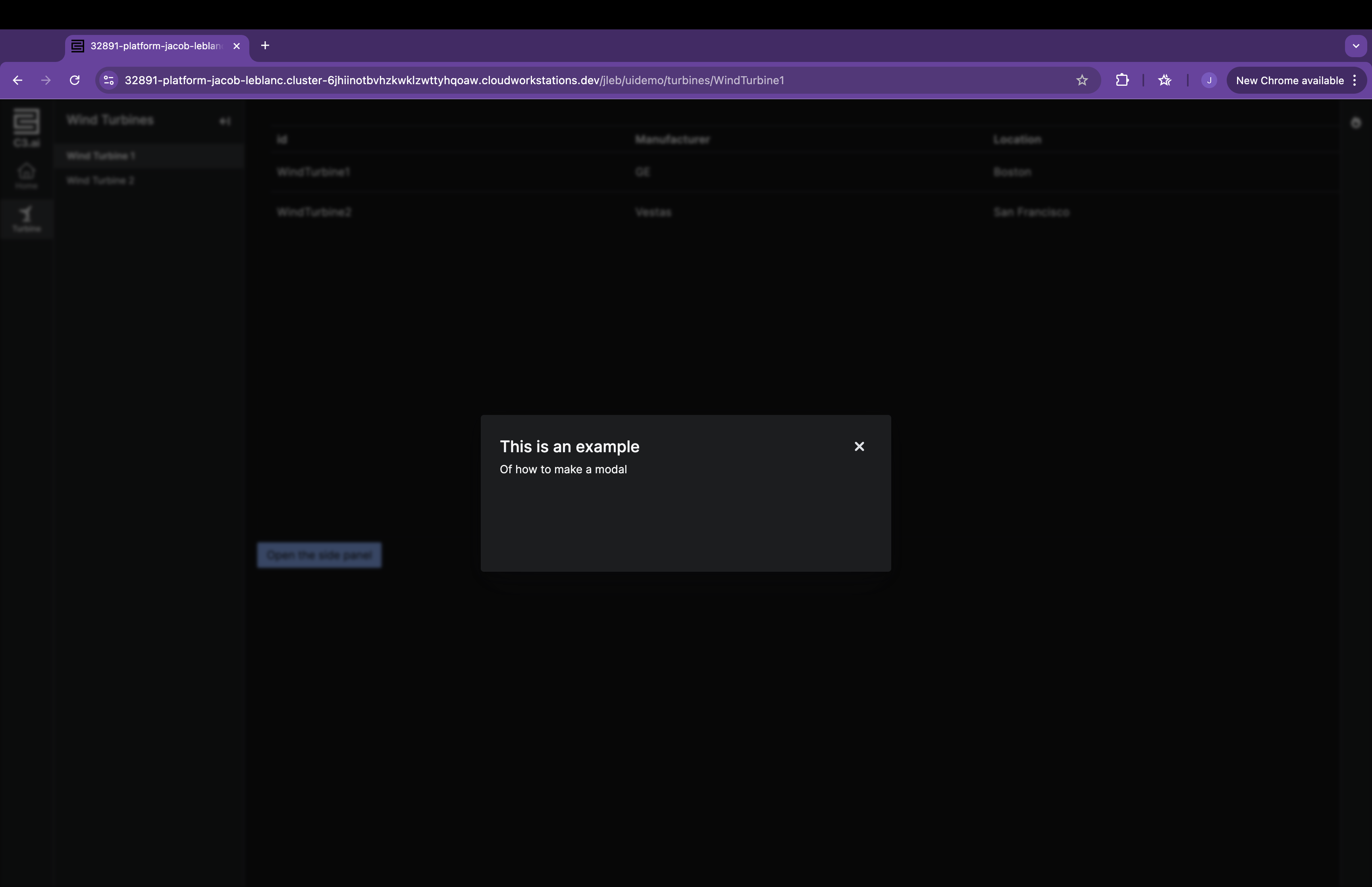
After implementing these changes, clicking a row in the grid will open the modal:
Clicking a row in the grid opens the modal: