Use side panels to hide and show information
This tutorial explains how to create a side panel and integrate it into a page for easy toggling of information visibility.
Create a side panel
To create a side panel, you need to define two files: one for the side panel itself and another for its section. This structure allows you to define each side panel section in a separate component reference, giving you extra flexibility to define rich sections.
Add a new JSON file in examplePackage/ui/c3/meta:
examplePackage
└── ui
    └── c3
        └── meta
            ├── examplePackage.PageLayout.json
            ├── examplePackage.TurbineGrid.json
            ├── examplePackage.NavMenu.json
            ├── examplePackage.ExampleSidePanel.json
            └── examplePackage.ExampleSidePanelSection.json
Define the UiSdlSidePanel in examplePackage.ExampleSidePanel.json:
/* examplePackage/ui/c3/meta/examplePackage.ExampleSidePanel.json */
{
  "type": "UiSdlConnected<UiSdlSidePanel>",
  "component": {
    "alignment": "RIGHT",
    "header": {
      "title": "This is an example",
      "subtitle": "Of a side panel",
      "closeIcon": "times"
    },
    "sections": [
      {
        "id": "examplePackage.ExampleSidePanelSection"
      }
    ]
  }
}
Define a corresponding section in examplePackage.ExampleSidePanelSection.json:
/* examplePackage/ui/c3/meta/examplePackage.ExampleSidePanelSection.json */
{
  "type": "UiSdlConnected<UiSdlSidePanelSection>",
  "component": {
    "title": "This is a section",
    "closedIcons": ["fire"]
  }
}
This side panel includes a header, a close icon, and sections with configurable content.
Add a side panel to a page
Modify examplePackage.PageLayout.json to integrate the side panel:
/* examplePackage/ui/c3/meta/examplePackage.PageLayout.json */
{
  "type": "UiSdlConnected<UiSdlGridLayout>",
  "component": {
    "gridStyle": "FLUID",
    "gutter": 8,
    "display": "VERTICAL",
    "children": ["examplePackage.TurbineGrid"],
    "navMenu": {
      "id": "examplePackage.NavMenu"
    },
    "detachedFields": [
      {
        "id": "examplePackage.ExampleSidePanel"
      }
    ]
  }
}Open the side panel with a button
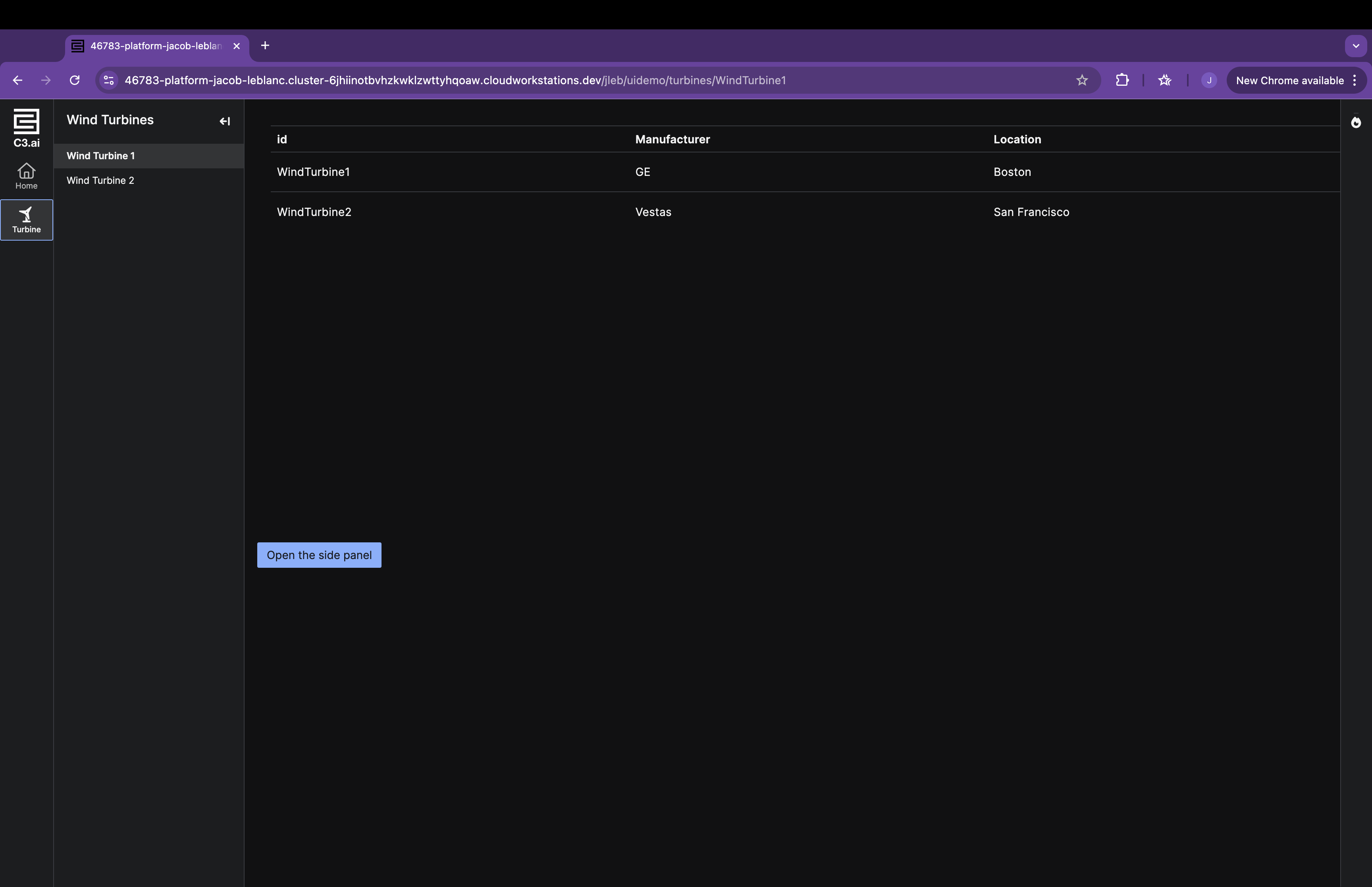
Define a button in examplePackage.ButtonOpenSidePanel.json:
/* examplePackage/ui/c3/meta/examplePackage.ButtonOpenSidePanel.json */
{
  "type": "UiSdlConnected<UiSdlButton>",
  "component": {
    "content": "Open the side panel"
  },
  "effectTriggers": [
    {
      "trigger": "examplePackage.ButtonOpenSidePanel.BUTTON_CLICK",
      "actions": [
        {
          "type": "examplePackage.ExampleSidePanel.SIDE_PANEL_OPEN",
          "payload": {
            "componentId": "examplePackage.ExampleSidePanel"
          }
        }
      ]
    }
  ]
}
Add the button to the page layout:
/* examplePackage/ui/c3/meta/examplePackage.PageLayout.json */
{
  "type": "UiSdlConnected<UiSdlGridLayout>",
  "component": {
    "gridStyle": "FLUID",
    "gutter": 8,
    "display": "VERTICAL",
    "children": ["examplePackage.TurbineGrid", "examplePackage.ButtonOpenSidePanel"],
    "navMenu": {
      "id": "examplePackage.NavMenu"
    },
    "detachedFields": [
      {
        "id": "examplePackage.ExampleSidePanel"
      }
    ]
  }
}
Click the button to open the side panel: