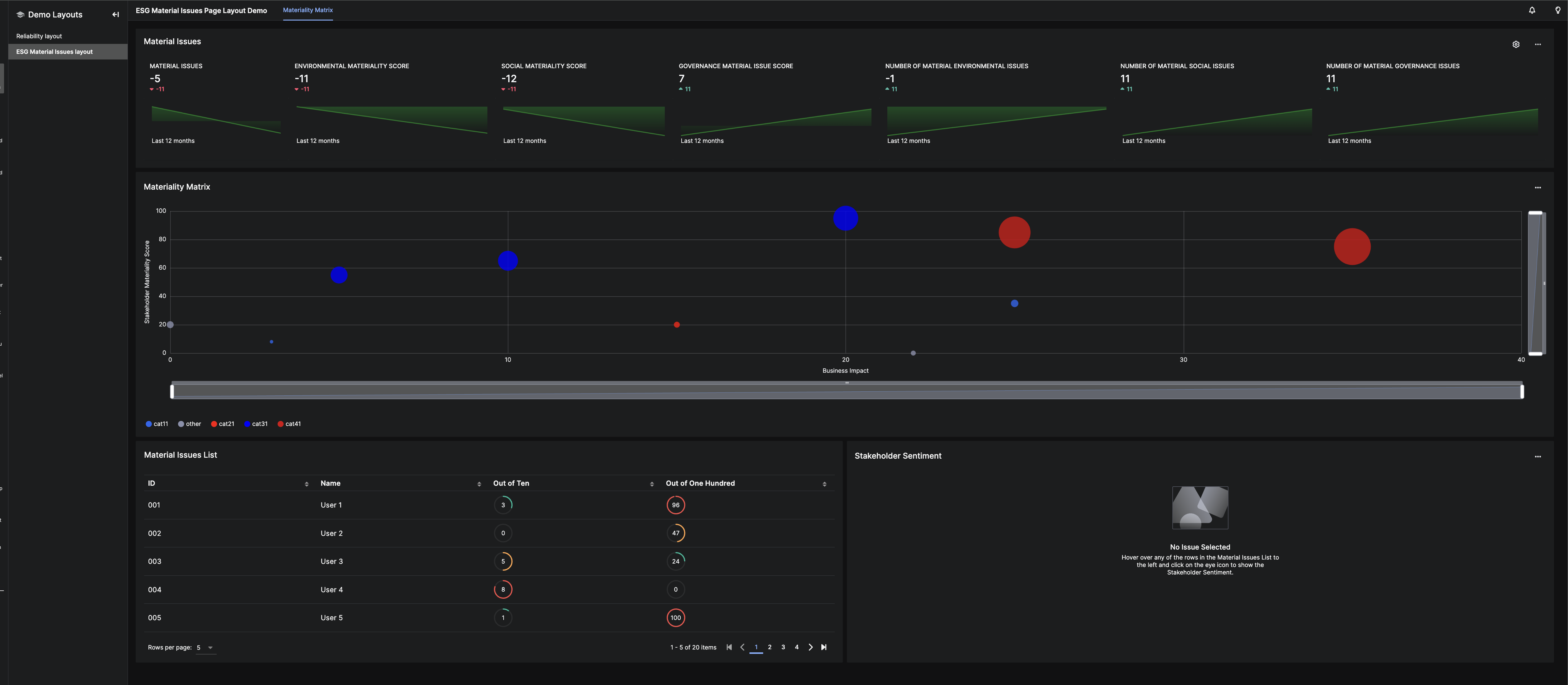
Build rich layouts using a grid system
The Grid Layout system organizes and distributes visual components in the UI by defining a grid and column sizes. The system follows a 12-column layout, dividing horizontal space into equal sections for flexible positioning.
Component properties and anatomy
Define one UiSdlGridLayout per page and use this instance as the entry point for the page.
Example layout:
The grid system structure:
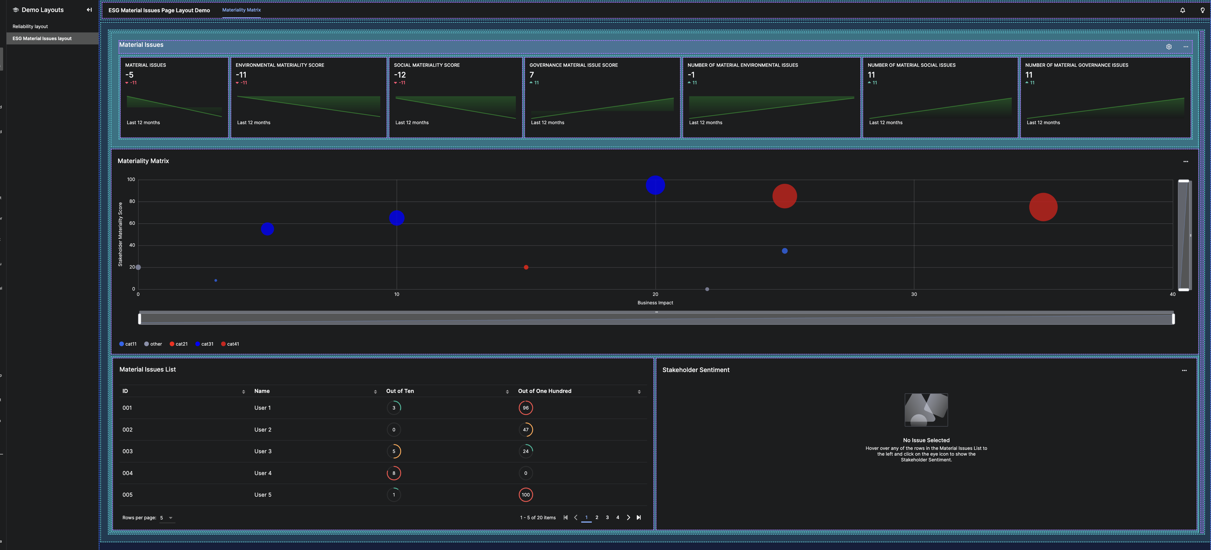
Properties
The properties gridStyle, fixedSize, display, gutter, and pagePadding control spacing and layout behavior. Refer to UiSdlGridLayout for details.
Grid layout main components
A Grid Layout includes four primary components:
- Header – A reference to a global page header. See UiSdlGridLayoutHeader.
- Nav Menu – A shared navigation menu component.
- Detached Fields – Elements outside the Grid Layout system, such as modals or side panels.
- Children – The main elements in the Grid Layout, structured using UiSdlGridContainer or UiSdlComponentContainer.
Grid layout system
Columns
A grid consists of 12 columns, allowing components to span multiple columns. Examples:
- First Row: Three components, each 4 columns wide
- Second Row: Two components, spanning 8 and 4 columns
- Third Row: Two components, spanning 4 and 8 columns
+----------------+----------------+----------------+
|                |                |                |
|    4 cols      |     4 cols     |    4 cols      |
|                |                |                |
|                |                |                |
+----------------+----------------+----------------+
|                                 |                |
|              8 cols             |    4 cols      |
|                                 |                |
|                                 |                |
+---------------------------------+----------------+
|                |                                 |
|    4 cols      |              8 cols             |
|                |                                 |
|                |                                 |
+----------------+---------------------------------+
Use UiSdlGridContainer to nest grids within a column:
+----------------+----------------+----------------+
|              8 cols             |                |
| +--------------+--------------+ |    4 cols      |
| |   |                         | |                |
| | 1 |      11   cols          | |                |
| |col|                         | |                |
| |   |                         | |                |
| +---+-------------------------+ |                |
|                                 |                |
+---------------------------------+----------------+
Define gutter and display settings to adjust spacing and orientation.
Containers
The Grid Layout system includes two types of containers:
- UiSdlGridContainer – Holds multiple child containers.
- UiSdlComponentContainer – Contains a single visualization component.
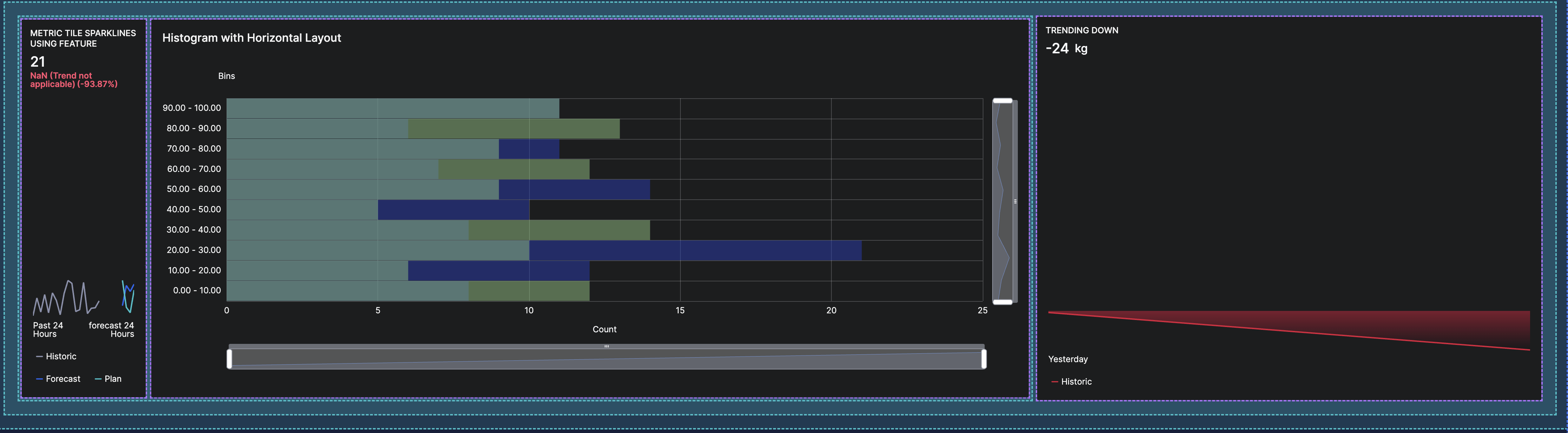
Example: Mixing ComponentContainer and GridContainer
To create a layout with a header and three horizontally arranged metric tiles:
- Define a
UiSdlGridContainerspanning 12 columns, setting children toVERTICALwith padding and gutter space. - Add a
UiSdlComponentContainerfor the full-width header component. - Use a nested
UiSdlGridContainerto arrange three metric tiles horizontally.
"children": [
  {
    "type": "UiSdlGridContainer",
    "column": 12,
    "display": "VERTICAL",
    "padding": 16,
    "gutter": 8,
    "background": "AUTO",
    "children": [
      {
        "type": "UiSdlComponentContainer",
        "isHeader": true,
        "childComponent": "SDLDemo.ReliabilityOverviewHeader"
      },
      {
        "type": "UiSdlGridContainer",
        "display": "HORIZONTAL",
        "gutter": 0,
        "children": [
          {
            "type": "UiSdlComponentContainer",
            "childComponent": "SDLDemo.TilesSparkline1"
          },
          {
            "type": "UiSdlComponentContainer",
            "childComponent": "SDLDemo.TilesSparkline2"
          },
          {
            "type": "UiSdlComponentContainer",
            "childComponent": "SDLDemo.ReliabilityOverviewCollectionList"
          }
        ]
      }
    ]
  }
]
This configuration defines a structured grid layout while maintaining flexibility and readability.