Reusable and non-reusable components
C3 AI Platform has a rich library of UI components, allowing you to incorporate data visualizations and build workflows into your application. You can also extend the library of available components, by building your components. This allows you to fully tailor visualizations and workflow to the needs of your end users.
Reusability as a decision factor
Determine how often you would reuse these features in that particular application or across the application. If you plan to not reuse them, create a custom component instance. If they are highly reusable, create a custom component Type.
Overview of custom component instances
A custom component instance implements one-off features by replacing any JSON component with a TSX file. This single-use component can be fully implemented and referenced as a TSX file instead of a JSON component.
Characteristics of custom components instances
- They don't receive props. The component author must manage the data and the props by utilizing the shared state, sending requests, or hard-coding properties. The component renders similarly to how
Appcomponents render in a default React application. - They can import other component instances, SDL components, sdl-react components, or any other external React components available.
- They are overridable at the file level.
A Note about custom SCSS files for React-only components
Custom .scss files can be used to style React-only components. These .scss files are not backed by a type, and must live in the /src/ui/styling folder.
Importing .scss files
- Currently, all
.scssfiles will be available at the path@c3/ui/[YourCustomComponentStyles.scss]
Creating React-only components
Your React-only component will work like any other React component with a couple of special rules.
Placing your component
Custom React-only component instances must live in the ui/c3/src/customInstances folder, must use a component ID as the file name and have a .tsx file extension. As long as the component is in the correct folder with the correct extension, it will be picked up correctly.
Using external react libraries in your component
External libraries can be used in your custom components as long as the external libraries are installed in the correct runtime. To install a library into the runtime of your application, you can add it to js-webpack_c3.json in the {yourPackage}/metadata/ImplLanguage.Runtime as seen in the uiDemo file below:
{
  "meta": {
    "deserSource": "meta://uiDemo/metadata/ImplLanguage.Runtime/js-webpack_c3.json"
  },
  "name": "js-webpack_c3",
  "libraries": ["npm @material-ui/core@3.9.4"]
}Using your component
There are two main ways your custom component instances can be consumed.
- First, if your component does not require any props, it can be used directly in a
.jsonfile and consumed as a UiSdlComponentRef. For example, we can see the use ofSDLDemo.CustomComponent, a React-only custom component instance, in this json:
{
  "type": "UiSdlLayoutNavMenu",
  "navMenu": {
    "id": "SDLDemo.NavMenu"
  },
  "children": [
    {
      "id": "SDLDemo.CustomComponent"
    }
  ]
}- Second, a custom component can also be used directly within another custom component. For example, we can see that
SDLDemo.CustomComponentcan also be imported by another custom component by importing it with the@c3/ui/components/{componentName}import.
import * as React from 'react';
import CustomComponent from '@c3/ui/components/SDLDemo.CustomComponent';

const PageContainer = () => {
  return <CustomComponent />;
};

export default PageContainer;Overview of custom component types
Custom components can be implemented as C3 AI Types and used in JSON files. This means they resemble the components in the Component Library and can benefit from more granular overridability and introspection that drives C3 AI Platform tools.
Characteristics of custom component types
- They receive props.
- Authors need to define the props as a C3 AI Type.
- They can import other component instances, SDL components, and external React components.
- Note that if an external component library is required, such as Semantic UI or Material UI, this must be included in the runtime declaration for that C3 AI package.
- The applications use them as JSON files.
- They can be overridden through a JSON-patch.
You can use one of the following approaches to manage the data rendered in your newly created component.
- Utilize the data management capability in the C3 AI UI Stack.
- Manually manage the data of the component.
Both approaches import and use a custom SCSS file to style the newly created component.
Use custom SCSS for the newly created component
Use the following example to create a custom SCSS file for your newly created component.
Create a SCSS file named MyCustomGrid in the package/src/ui/styling folder.
/**
 * The CSS variables are wrapped with the `var()`.
 * These variables respond to the theme and density changes.
 */

@mixin base-cell {
  border: 1px solid var(--c3-style-componentBorderColor);
  padding: var(--c3-style-smallSizePadding) var(--c3-style-mediumSizePadding);
  text-align: left;
  max-width: 33%;
  overflow: hidden;
  text-overflow: ellipsis;
  white-space: nowrap;
  font-size: var(--c3-style-fontSizeBody);
}

td {
  @include base-cell;
  background-color: var(--c3-style-componentBackgroundColor);
  color: var(--c3-style-fontColor);
}

th {
  @include base-cell;
  background-color: var(--c3-style-zebraStripeBackgroundColor);
}

table {
  width: 100%;
  border-collapse: collapse;
  table-layout: fixed;
}
This example uses the var function to determine the values for various properties, such as font size and background color. If you use the application in different themes and densities for example light theme, dark theme, or classic or dense density, wrap your CSS variables with the var function.
Custom component with custom values in the themes will not update its styling in conjunction with out-of-the-box components if the theme or density setting is changed.
You can find a list of available CSS properties, also known as semantic tokens, by inspecting the UiSdlThemeTemplate and UiSdlDensityTemplate Types.
To learn more about theme and styles, go Theme and Style documentation.
Utilize the data management capability of C3 AI UI Stack for the newly created component
This example demonstrates creating a simple grid component to render a data table and use the data management capability of C3 AI UI Stack to manage data.
The following screenshot displays the custom components that are discussed in the next sections.
To create this component, create the following five (5) files:
Note: The next few sections explicitly describe each file.
| File | Description |
|---|---|
MyCustomGrid.c3typ | Component Type file |
MyCustomGridReact.c3typ | React component Type file |
MyCustomGridReact.tsx | React implementation |
MyCustomGridDataSpec.c3typ | Data specification Type |
MyCustomGridDataSpec.ts | Data specification implementation |
Create the component Type file - MyCustomGrid.c3typ
MyCustomGrid.c3typ defines the custom component.
Create a .c3typ file named MyCustomGrid.c3typ in the {package}/src/ui/components folder with the following configuration:
/**
 * {package}/src/ui/components/MyCustomGrid.c3typ
 */
@typeScript
type MyCustomGrid extends UiSdlComponent<MyCustomGridDataSpec> {
  /**
   * The specification used for retrieving data displayed by the list.
   */
  @uiSdlDataSpec(dataDestinationField='data')
  dataSpec: ~
}Adding Date and Decimal Customization
To create a component with the date and decimal customization:
Create a
CustomComponent.c3typfile. Add the field you want to format.Typetype CustomComponent extends UiSdlComponent { textToDisplay: CustomFieldValue }Create a
CustomFieldValue.c3typfile that contains a value to format.- The UiSdlDynamicValueSpecParamFormat Type allows you to specify the format they want to apply to the value.
Typetype CustomFieldValue { value: number format: UiSdlDynamicValueSpecParamFormat }Render the CustomComponent Type.
Type{ "type" : "CustomComponent" "textToDisplay" : { "value" : 50.123, "format" : { "type" : "UiSdlNumberParamKindFormat", "spec" : { "style" : "decimal", "maximumFractionDigits" : 2 } } } }
Create React component Type - MyCustomGridReact.c3typ
This MyCustomGridReact.c3typ file gives you a React implementation for the grid. The component mixes or extends the ReactFunction and the previously created Type. The ReactFunction Type provides the abstract function which must be implemented in the MyCustomGridReact.tsx file.
Create a c3typ file named MyCustomGridReact.c3typ in the {package}/src/ui/components folder with the following configuration.
/**
 * {package}/src/ui/components/MyCustomGridReact.c3typ
 */
type MyCustomGridReact extends ReactFunction mixes MyCustomGrid {
  render: ~ tsx-client
}Implementation for the grid display - MyCustomGridReact.tsx
The React implementation to output the grid.
Create a tsx file named MyCustomGridReact.tsx in the {package}/src/ui/components folder with the following configuration.
/**
* {package}/src/ui/components/MyCustomGridReact.tsx
*/
import React from 'react';
import { MyCustomGrid as MyCustomGridProps } from '@c3/types';
import '@c3/ui/MyCustomGrid.scss';
const MyCustomGrid = (props: MyCustomGridProps) => {
const tableHeader = (
<tr>
{props.dataSpec.columnFields.map((columnField) => (
<th>{columnField}</th>
))}
</tr>
);
const tableRows = props.data?.objs?.map((datum) => (
<tr key={datum.id}>
{props.dataSpec.columnFields.map((columnField) => (
<td>{datum[columnField]}</td>
))}
</tr>
));
return (
<table>
{tableHeader}
{tableRows}
</table>
);
};
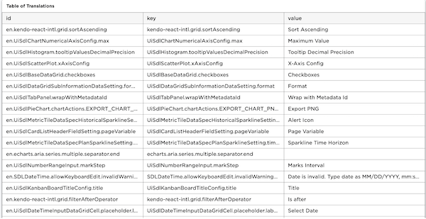
export default MyCustomGrid;Use a JSON configuration file to add the component to the application in the {package}/ui/c3/meta/MyApp/MyApp.TranslationTable.json, as shown in the following example:
{
  "type": "UiSdlConnected<MyCustomGrid>",
  "component": {
    "dataSpec": {
      "dataType": "Translation",
      "columnFields": ["id", "key", "value"]
    }
  }
}Create data specification Type - MyCustomGridDataSpec.c3typ
The type file specifies how data is fetched and returned to the component.
Create a c3typ file named MyCustomGridDataSpec.c3typ in the {package}/src/ui/components folder with the following configuration.
/**
 * {package}/src/ui/components/MyCustomGridDataSpec.c3typ
 */
type MyCustomGridDataSpec mixes UiSdlFieldBasedDataSpec {
  toPartiallyAppliedActions: ~ ts-client

  /**
   * The names of the columns in the data
   */
  columnFields: [string]

  /**
   * The action used to retrieve data.
   */
  actionName: string = 'fetch'

  /**
   * The arguments to pass to the action, where the keys are the parameter
   * names and the values are the corresponding arguments.
   */
  actionArgs: json
}Implement data specification - MyCustomGridDataSpec.ts
The data specification implementation takes the data spec and returns a partially applied action that determines the arguments for the data fetch.
Create a ts file named MyCustomGridDataSpec.ts in the {package}/src/ui/components folder with the following configuration.
/**
 * {package}/src/ui/components/MyCustomGridDataSpec.ts
 */
import { getDataTypeName } from '@c3/ui/UiSdlComponentDataSpec';

export function toPartiallyAppliedActions(
  dataSpec: MyCustomGridDataSpec,
  _config?: MyCustomGrid,
): UiSdlPartiallyAppliedActionInfo[] {
  const dataType = getDataTypeName(dataSpec);
  const actionName = 'fetch';
  const args = {
    spec: {
      limit: -1,
      include: dataSpec.columnFields.join(','),
      filter: '1 == 1',
    },
  };

  return [
    {
      partiallyAppliedAction: {
        typeName: dataType,
        actionName: actionName,
        args: args,
      },
    },
  ];
}Manually manage the data fetch and render in the newly created component
In this approach, you do not need to define a dataSpec type and the related implementation file. Instead, use the built-in React hooks and the native JavaScript fetch function to fetch data and update the state of a component.
The following screenshot displays the custom components that are discussed in the next sections.
To create this component, create the following three (3) files:
The next few sections explicitly describes each file.
| File | Description |
|---|---|
MyCustomGridCustomData.c3typ | Component Type file |
MyCustomGridCustomDataReact.c3typ | React component Type file |
MyCustomGridCustomDataReact.tsx | React implementation |
The component type file - MyCustomGridCustomData.c3typ
MyCustomGridCustomData.c3typ defines the custom component.
Create a .c3typ file named MyCustomGridCustomData.c3typ in the {package}/src/ui/components folder with the following configuration:
/**
 * {package}/src/ui/components/MyCustomGridCustomData.c3typ
 */

/*
 * Use the `UiSdlNoData` parameter
 * when you extend the UiSdlComponent,
 * to specify that there is
 * no C3 AI dataSpec associated with this Type.
 */
type MyCustomGridCustomData extends UiSdlComponent<UiSdlNoData>Extend the ReactFunction type - MyCustomGridCustomDataReact.c3typ
MyCustomGridCustomDataReact.c3typ extends the abstract ReactFunction Type. The ReactFunction Type provides the abstract function which must be implemented in the React .tsx file.
Create a .c3typ file named MyCustomGridCustomData.c3typ in the {package}/src/ui/components folder with the following configuration:
/**
 * {package}/src/ui/components/MyCustomGridCustomDataReact.c3typ
 */
type MyCustomGridCustomDataReact extends ReactFunction mixes MyCustomGridCustomData {
  render: ~ tsx-client
}Use React to display data in the grid - MyCustomGridCustomDataReact.tsx
Create a tsx file named MyCustomGridCustomDataReact.tsx in the {package}/src/ui/components folder with the following configuration.
/**
* {package}/src/ui/components/MyCustomGridCustomDataReact.tsx
*/
import React, { useState, useEffect } from 'react';
import '@c3/ui/MyCustomGrid.scss';
const MyCustomGridCustomData = () => {
const [dataToRender, setDataToRender] = useState([]);
useEffect(() => {
const fetchData = async () => {
// Publicly available dataset with no authentication required.
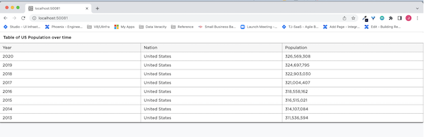
const apiUrl = 'https://datausa.io/api/data?drilldowns=Nation&measures=Population';
const response = await fetch(apiUrl);
const data = await response.json();
setDataToRender(data.data);
};
fetchData();
}, []);
const columnFields = ['Year', 'Nation', 'Population'];
const tableHeader = (
<tr>
{columnFields.map((columnField) => (
<th>{columnField}</th>
))}
</tr>
);
return (
<table>
{tableHeader}
{dataToRender.length &&
dataToRender.map((datum) => (
<tr key={datum.id}>
{columnFields.map((columnField) => {
const value = columnField === 'Population' ? datum[columnField].toLocaleString() : datum[columnField];
return <td>{value}</td>;
})}
</tr>
))}
</table>
);
};
export default MyCustomGridCustomData;Use a JSON configuration file to add your component to the application, as specified in the following example:
/**
 * {package}/ui/c3/meta/MyApp/MyApp.PopulationTable.json
 */
{
  "type" : "UiSdlConnected<MyCustomGridCustomData>",
  "component" : {}
}Custom Component interactions with other components and application state
Custom components are able to interact with other components through Redux and application state. For more information on these topics, see the document here.
In the sections below, we will demonstrate the following:
- How custom components can interact with other components
- How custom components can interact with application state
These will enable users to learn how to use custom components to interact with the other types of supported C3 AI UI Framework components. To see a list of components and when to use each one, see the section [Overview of external react components].
Interacting with other components
Using Redux we can read and or update another component's state. In this example, we will demonstrate how to use the Switch component from material-ui library to change whether or not the name column of a UiSdlDataGrid will be sorted as ascending or descending.
- We will start by creating a
Switchcomponent from material-ui library. To do so, we will create a component calledSwitchComponent.tsxin{package}/ui/c3/src/muidirectory.
import React from 'react';
import Switch from '@material-ui/core/Switch';
import FormControlLabel from '@material-ui/core/FormControlLabel';

const SwitchComponent = (props) => {
  return <FormControlLabel control={<Switch />} label={props.label} />;
};

export default SwitchComponent;- Next, we will create a custom component instance called
SDLDemo.SwitchContainer.tsxin{package}/ui/c3/src/customInstancesthat will referenceSwitchComponent. We will do this because of two reasons: a.SDLDemo.SwitchContainer.tsxis a custom component instance that can be referenced as a UiSdlComponentRef. This means the component can be referenced from declarative components or imported from other custom components. In the following example, we will use this component and reference it from a declarative component. b.SwitchComponentis a custom component that can be imported and reused by other custom components, but is not a UiSdlComponentRef. This type of component is considered a external react component that can take in props from the component instance it is declared in. In this example, theSwitchComponenttakes in thelabelprop that will set thelabelof theSwitch.
For more details on the differences between custom component instances and external react components, please see the section [Overview of external React components].
import React from 'react';
import SwitchComponent from '@c3/app/ui/src/mui/SwitchComponent';

const SwitchContainer = () => {
  return (
    <div>
      <SwitchComponent label="Change the sort of the name field" />
    </div>
  );
};

export default SwitchContainer;- Next, we will create a declarative component in
{package}/ui/c3/meta/SDLDemo.DataGridSortColumn.jsonthat usesUiSdlDataGridto display some data from theSDLDemoMachineentity type.
{
  "type": "UiSdlConnected<UiSdlDataGrid>",
  "component": {
    "header": {
      "title": "Data Grid"
    },
    "paginationConfig": {
      "pageSize": 10,
      "pagination": true
    },
    "filterBar": true,
    "dataSpec": {
      "dataType": "SDLDemoMachine",
      "columnFields": [
        {
          "fieldName": "name",
          "label": "Name",
          "searchable": true,
          "sortable": true
        },
        {
          "fieldName": "statusLabel",
          "label": "SDLDemoMachine.status",
          "searchable": true
        }
      ]
    }
  }
}- Now that we have created all of our desired components, we need to create a component to display both the
SDLDemo.DataGridSortColumnandSDLDemo.SwitchContainercomponents. We will create a file in{package}/ui/c3/meta/SDLDemo.CustomComponentInteractionPage.jsonto display both components like so:
{
  "type": "UiSdlConnected<UiSdlLayoutMetadataNavMenu>",
  "component": {
    "navMenu": {
      "id": "SDLDemo.NavMenu"
    },
    "children": [
      {
        "id": "SDLDemo.SwitchContainer"
      },
      {
        "id": "SDLDemo.DataGridSortColumn"
      }
    ]
  }
}- We need to change the
SwitchComponentso that itscheckedvalue is set based on what theSDLDemo.DataGridSortColumncomponent'snamecolumn'ssortColumn.descendingvalue set to. In order to do so, you need to use theaddReduxActionListenerandgetConfigFromStatefunctions.
The addReduxActionListener function is useful for when you need to listen to a component action. It takes in two parameters:
- The action to listen to.
- A callback that contains two parameters - the action and current Redux state at that moment.
You can find the existing actions to listen to on the <Component>.c3typ with the @uiSdlActionCreator(actionType='<Action To Listen>') annotation.
- In the
addReduxActionListenercallback function, we can then listen to theSDLDemo.DataGridSortColumncomponent'sINITIAL_RENDERaction, and we can callgetConfigFromStateto retrieve thesortColumn.descendingvalue from theSDLDemo.DataGridSortColumncomponent.
The getConfigFromState function will take in three parameters:
- The ID of the component to retrieve the state from.
- Reference to the redux state
- An array of strings that specifies the path to retrieve the necessary metadata for your configuration. For more information on this, see the document here to understand how to retrieve values from redux.
The SwitchComponent can be updated to read the sortColumn.descending configuration from SDLDemo.DataGridSortColumn by using addReduxActionListener and getConfigFromState functions to initialize the Switch component's checked field.
import React from 'react';
import Switch from '@material-ui/core/Switch';
import { ReactReduxContext } from 'react-redux';
import { getConfigFromState } from '@c3/ui/UiSdlConnected';
import FormControlLabel from '@material-ui/core/FormControlLabel';

const SwitchComponent = (props) => {
  const [isChecked, setIsChecked] = React.useState(false);

  addReduxActionListener(`${DATA_GRID_COMPONENT_ID}.INITIAL_RENDER`, (action, state) => {
    const sortColumnDescending = getConfigFromState(DATA_GRID_COMPONENT_ID, state, ['sortColumn', 'descending']);
    setIsChecked(sortColumnDescending);
  });

  return <FormControlLabel control={<Switch checked={isChecked} />} label={props.label} />;
};

export default SwitchComponent;
With these changes, the Switch component's checked state is set based on the name sortColumn.descending value.
- The next thing we would like to do is to update the
sortColumn.descendingvalue when the user toggles theSwitchcomponent. In order to do so, we have to dispatch a redux action to trigger a reducer or epic to update thesortColumn.descendingconfiguration ofSDLDemo.DataGridSortColumnand change the sorting criteria for the grid data.
Redux state is immutable and can only be updated when an action is dispatched and a corresponding reducer function is called to update the Redux state. In this example, we will go one step further and actually create an epic instead of just a reducer because an epic will help us interact with our backend. We can send a data request to send a request to the database and return the data sorted for us by column name. In our custom component, we need to create both an action and a epic in {package}/src/UiSdlDataGrid.c3typ so that we can sort the data by the column field name.
In UiSdlDataGrid.c3typ, we will create the action and an epic:
@uiSdlActionCreator(actionType='SORT_CHANGE')
changeSortAction: function(id: string,
                            field: string,
                            descending: boolean,
                            sortNullsLast: boolean): UiSdlSortChangeAction ts-client

@uiSdlEpic(actionType='SORT_CHANGE')
sortChangeEpic: private function(actionStream: UiSdlActionsObservable,
                                        stateStream: UiSdlStatesObservable): UiSdlActionsObservable ts-client
and define the action and reducer in {package}/src/UiSdlDataGrid.ts:
export function changeSortAction(
  id: string,
  field: string,
  descending: boolean,
  sortNullsLast: boolean,
): UiSdlSortChangeAction {
  return {
    type: id + '.SORT_CHANGE',
    payload: {
      componentId: id,
      field: field,
      descending: descending,
      sortNullsLast: sortNullsLast,
    },
  };
}

export const sortChangeEpic: Epic<AnyAction, AnyAction, ImmutableReduxState> = (actionStream, stateStream) => {
  return actionStream.pipe(
    mergeMap(function (action: UiSdlSortChangeAction) {
      const { componentId, descending, sortNullsLast } = action.payload;
      const dataSourceId = getCollectionDataSourceId('dataSpec', componentId);
      const descendingString = descending ? 'descending' : 'ascending';
      // This has to be true if descending and false if ascending for nulls to always be sorted last
      const fetchNullsLast = sortNullsLast ? descending : false;
      let orderString;
      if (action.payload.field) {
        orderString = descendingString + '(' + action.payload.field + ', ' + fetchNullsLast + ')';
      } else {
        orderString = '';
      }
      return of(
        mergeArgumentsAction(
          dataSourceId,
          {
            spec: {
              order: orderString,
            },
          },
          componentId,
        ),
        requestDataAction(dataSourceId),
        changeSortColumnAction(componentId, action.payload.field, action.payload.descending),
      );
    }),
  );
};- Next we need to create a new file in
{package}/src/UiSdlSortChangeAction.c3typto listen to actions of typeSORT_CHANGE
type UiSdlSortChangeAction mixes UiSdlReduxAction<UiSdlSortChangePayload>and create another new file in {package}/src/UiSdlSortChangePayload.c3typ which will specify how to change the descending for the name field:
type UiSdlSortChangePayload mixes UiSdlComponentActionPayload {

  /**
   * The field to sort on.
   */
  field: string

  /**
   * True to sort in descending order, false to sort in descending order.
   */
  descending: boolean

  /**
   * If true, null values will come before non-null values. If false, null values will come after non-null values.
   */
  sortNullsLast: boolean
}
- With these changes,
SwitchComponentwe can dispatch theSORT_CHANGEaction to change whether thesortColumn.descendingvalue should be acending or descending based on theSwitchcomponent'scheckedfield value.
import React from 'react';
import Switch from '@material-ui/core/Switch';
import { ReactReduxContext } from 'react-redux';
import { getConfigFromState } from '@c3/ui/UiSdlConnected';
import FormControlLabel from '@material-ui/core/FormControlLabel';
import { useDispatch } from '@c3/ui/UiSdlUseDispatch';

const SwitchComponent = (props) => {
  const dispatch = useDispatch();
  const [isChecked, setIsChecked] = React.useState(false);

  addReduxActionListener(`${DATA_GRID_COMPONENT_ID}.INITIAL_RENDER`, (action, state) => {
    const sortColumnDescending = getConfigFromState(DATA_GRID_COMPONENT_ID, state, ['sortColumn', 'descending']);
    setIsChecked(sortColumnDescending);
  });

  const handleChange = (event: React.ChangeEvent<HTMLInputElement>) => {
    const checked = event.target.checked;
    dispatch({
      type: `${DATA_GRID_COMPONENT_ID}.SORT_CHANGE`,
      payload: {
        componentId: DATA_GRID_COMPONENT_ID,
        field: 'name',
        descending: checked,
      },
    });
    setIsChecked(checked);
  };

  return <FormControlLabel control={<Switch checked={isChecked} onChange={handleChange} />} label={props.label} />;
};

export default SwitchComponent;
Toggling the Switch component should now change whether the name column should be sorted in an ascending or descending manner.
Interacting with application state
Application state is useful when you need to share state between multiple components. In the example below, we will create an TextField and a Button from the material-ui library and use the text input from the TextField to configure the header text of a UiSdlDataGrid.
- We will start by creating the
InputandButtoncomponent. To do so, we will create a component calledSDLDemo.CustomApplicationStateDemo.tsxin{package}/ui/c3/src/customInstancesdirectory and render both theTextFieldandButtoncomponent.
import React from 'react';
import TextField from '@material-ui/core/TextField';
import Button from '@material-ui/core/Button';
import Grid from '@material-ui/core/Grid';

const CustomApplicationStateDemo = (props) => {
  return (
    <Grid container spacing={1} alignItems="flex-end">
      <Grid item xs>
        <TextField id="input-with-button" label="Input" fullWidth />
      </Grid>
      <Grid item>
        <Button variant="contained" color="primary">
          Update
        </Button>
      </Grid>
    </Grid>
  );
};

export default CustomApplicationStateDemo;- Next, we need to create our application state. In order to do so, you need to create two files, a
.c3typfile and a.jsonfile. The.c3typfile contains the information about what the application state stores and allows us to leverage the application state capabilities. The.jsonfile is used to create an instance of the application state that will enable other components to reference your application state by internally creating a slice in the redux state which can be referenced by any component.
We will create a .c3typ file in {package}/src/SDLDemoApplicationStateDemo.c3typ and it will contain a variable called headerText. This field will be used to update the header text for the instance of the UiSdlDataGrid component we will create next.
@typeScript
type SDLDemoApplicationStateDemo mixes UiSdlApplicationState {
  headerText: string = 'Default Content'
}
Next, we will create our .json file in {package}/ui/c3/meta/SDLDemo.ApplicationStateDemo.json. The file will contain the defaultvalue of headerText which will be set to Default Content.
{
  "type": "SDLDemoApplicationStateDemo",
  "headerText": "Default Content"
}- Now we will create a new file in
{package}/ui/c3/meta/SDLDemo.GridApplicationStateDemo.jsonwhich will be an instance ofUiSdlDataGridand reference the application state instanceSDLDemoApplicationStateDemowe created in the previous step. TheUiSdlDataGridcomponent'sheader.titlefield will be able to read the value from application state because theheader.titlefield takes in aUiSdlDynamicValueSpecwhere you can dynamically specify how to set the value forheader.title. For more details, please see UiSdlDynamicValueSpec.
In order to set the header.title to the value in our application state parameter, we need to specify the following fields:
typeto specify that the value we are retrieving is dynamic.dynamicValueto specify a translation to dynamically set the value to a specific keyvarsto specify what the variable indynamicValueshould be assigned to.
In order to create the dynamicValue properly, we need to navigate to a translation file in {package}/metadata/Translation/en.csv and in the package, specify the key we want to dynamically set.
en.csv should look like this:
id,locale,key,value
en.SDLDemo.GridApplicationState.title,en,SDLDemo.GridApplicationState.title,{title}
Now we should be able to dynamically set the header.title.dynamicValue as SDLDemo.GridApplicationState.title and to set the vars to the headerText in our application state like so:
{
  "type": "UiSdlConnected<UiSdlDataGrid>",
  "component": {
    "paginationConfig": {
      "pageSize": 10,
      "pagination": true
    },
    "header": {
      "title": {
        "type": "UiSdlDynamicValueSpec",
        "dynamicValue": "SDLDemo.GridApplicationState.title",
        "vars": {
          "title": {
            "type": "UiSdlApplicationStateValueParam",
            "id": "SDLDemo.ApplicationStateDemo",
            "path": "headerText"
          }
        }
      }
    },
    "dataSpec": {
      "dataType": "SDLDemoMachine",
      "columnFields": [
        {
          "fieldName": "name",
          "label": "Name",
          "searchable": true
        }
      ]
    }
  }
}- Next, we will create a file in
{package}/ui/c3/meta/SDLDemo.CustomApplicationStateInteractionPage.jsonto display all the components together. We have addedapplicationStateReffield so that components in theSDLDemo.CustomApplicationStateInteractionPage.jsonfile will have access toSDLDemo.ApplicationStateDemowe created in the previous step.
{
  "type": "UiSdlConnected<UiSdlLayoutMetadataNavMenu>",
  "applicationStateRef": {
    "type": "UiSdlApplicationStateRef",
    "id": "SDLDemo.ApplicationStateDemo"
  },
  "component": {
    "navMenu": {
      "id": "SDLDemo.NavMenu"
    },
    "children": [
      {
        "id": "SDLDemo.CustomApplicationStateDemo"
      },
      {
        "id": "SDLDemo.GridApplicationStateDemo"
      }
    ]
  }
}- Once this is done, we can update
SDLDemo.CustomApplicationStateDemoto read theheaderTextfrom application state. In order to do so, we can use theaddReduxActionListenerand thegetConfigFromApplicationStatefunctions.
For more information on addReduxActionListener, please see the section about interacting with other components.
The getConfigFromApplicationState function will take in three parameters:
- The ID of the application to retrieve the state from.
- A reference to the redux state
- An array of strings that specifies the path to retrieve the necessary metadata for your configuration. For more information on this, see the document here to understand how to retrieve values from redux.
In the example below, we will initialize the text input of the TextField component to be initialized with the value from SDLDemo.ApplicationStateDemo.headerText.
import React from 'react';
import TextField from '@material-ui/core/TextField';
import Button from '@material-ui/core/Button';
import Grid from '@material-ui/core/Grid';
import { ReactReduxContext } from 'react-redux';
import { getConfigFromApplicationState } from '@c3/ui/UiSdlApplicationState';

const CustomApplicationStateDemo = (props) => {
  const [text, setText] = useState('');
  const APPLICATION_STATE_ID = 'SDLDemo.ApplicationStateDemo';

  // Needs to be called after the application is first initialized so that the input can be set
  // to the value from application state.
  addReduxActionListener(`${APPLICATION_STATE_ID}.APPLICATION_STATE_INITIALIZE`, (action, state) => {
    const headerText = getConfigFromApplicationState(APPLICATION_STATE_ID, state, ['headerText']);
    setText(headerText);
  });

  return (
    <Grid container spacing={1} alignItems="flex-end">
      <Grid item xs>
        <TextField id="input-with-button" label="Input" value={text} fullWidth />
      </Grid>
      <Grid item>
        <Button variant="contained" color="primary">
          Add
        </Button>
      </Grid>
    </Grid>
  );
};

export default CustomApplicationStateDemo;- Now that we can read from our application state, we also want to be able to update the
headerTextvalue in our application state. In order to do so, we want to enable the user to type in some text in theTextFieldcomponent, and when the user clicks theButton, theheaderTextvalue from our application state will be updated. Because theSDLDemo.GridApplicationStateDemocomponent'sheader.titlefield listens for changes on theheaderTextfield in application state, theheader.titlewill also be updated to the submitted text value.
To do so, we need to update SDLDemoApplicationStateDemo to contain an action and a reducer so that we can update application state properly. Actions specify what change you want to make to your redux state and reducers specify how to update the redux state as needed.
Now we will update SDLDemoApplicationStateDemo.c3typ to contain the action and reducer that will modify the headerText value in application state:
@typeScript
type SDLDemoApplicationStateDemo mixes UiSdlApplicationState {
  headerText: string = 'Default Content'

  /**
   * Triggered when we want to update the header text stored in application state
   */
  @uiSdlActionCreator(actionType='UPDATE_HEADER_TEXT')
  updateHeaderTextAction: private function(stateId: string, newHeaderText: string): UiSdlReduxAction ts-client

  /**
   * Listens for actions of type `UPDATE_HEADER_TEXT`, and updates the header text.
   *
   * @param state
   *           Redux state
   * @param action
   *           Redux action
   * @returns a new Redux state
   */
  @uiSdlReducer(actionType='UPDATE_HEADER_TEXT')
  headerTextUpdateReducer: private inline function(state: !UiSdlReduxState,
                                                    action: UiSdlReduxAction): UiSdlReduxState ts-client
}- Then we can create a file in
{package}/src/SDLDemoApplicationStateDemo.tswhich will implement the functionality forupdateHeaderTextActionandheaderTextUpdateReducer:
import { UiSdlReduxAction } from '@c3/ui/UiSdlReduxAction';
import { ImmutableReduxState } from '@c3/ui/UiSdlConnected';
import { setConfigInApplicationState } from '@c3/ui/UiSdlApplicationState';

export function updateHeaderTextAction(stateId: string, newHeaderText: string): UiSdlReduxAction {
  return {
    type: stateId + '.UPDATE_HEADER_TEXT',
    payload: {
      stateId,
      headerText: newHeaderText,
    },
  };
}

export function headerTextUpdateReducer(state: ImmutableReduxState, action: UiSdlReduxAction): UiSdlReduxAction {
  return setConfigInApplicationState(action.payload.stateId, state, ['headerText'], action.payload.headerText);
}- Once implemented, we can update
SDLDemo.CustomApplicationStateDemo.tsxto then dispatch theUPDATE_HEADER_TEXTaction so that when theButtonis clicked, the input value from theTextFieldwill be taken and will update theheaderTextin our application state. This will then update theheader.titlefield on theSDLDemo.GridApplicationStateDemocomponent.
import React, { useState } from 'react';
import TextField from '@material-ui/core/TextField';
import Button from '@material-ui/core/Button';
import Grid from '@material-ui/core/Grid';
import { getConfigFromApplicationState, setConfigInApplicationState } from '@c3/ui/UiSdlApplicationState';
import { addReduxActionListener } from '@c3/app/ui/src/epicRegistry';
import { useDispatch } from '@c3/ui/UiSdlUseDispatch';

const CustomApplicationStateDemo = (props) => {
  const dispatch = useDispatch();
  const [text, setText] = useState('');
  const APPLICATION_STATE_ID = 'SDLDemo.ApplicationStateDemo';

  // Needs to be called after the application is first initialized so that the input can be set to the value from
  // application state.
  addReduxActionListener(`${APPLICATION_STATE_ID}.APPLICATION_STATE_INITIALIZE`, (action, state) => {
    const headerText = getConfigFromApplicationState(APPLICATION_STATE_ID, state, ['headerText']);
    setText(headerText);
  });

  const handleInputChange = (event) => {
    setText(event.target.value);
  };

  const handleClick = () => {
    dispatch({
      type: `${APPLICATION_STATE_ID}.UPDATE_HEADER_TEXT`,
      payload: {
        stateId: APPLICATION_STATE_ID,
        headerText: text,
      },
    });
  };

  return (
    <Grid container spacing={1} alignItems="flex-end">
      <Grid item xs>
        <TextField id="input-with-button" label="Input" value={text} onChange={handleInputChange} fullWidth />
      </Grid>
      <Grid item>
        <Button variant="contained" color="primary" onClick={handleClick}>
          Update
        </Button>
      </Grid>
    </Grid>
  );
};

export default CustomApplicationStateDemo;
When a new input is provided in the TextField and the Button is clicked, SDLDemo.GridApplicationStateDemo component's header.title field should be updated correctly based on the update in application state.
Retrieving and using data for Custom Components
When creating your own custom components, you'll often need to fetch and display data from specific data sources. In the following example, we will create a custom component using the material-ui library Table component to display data from the SDLDemoMachine entity type. The SDLDemoMachine data will be stored in application state so it can be used in your custom component.
By fetching and storing SDLDemoMachine data in the application state, both this UI component, and any other UI component can get information and subscribe to changes to the data, making the logic easier to manage, and minimizing the amount of requests to the server.
- First, we should create a custom component called
SDLDemo.DemoFetchGrid.tsxin{package}/ui/c3/customInstances/SDLDemo.DemoFetchGrid.tsxand import thematerial-uilibrary to display theTablecomponent.
import React from 'react';
import Table from '@mui/material-ui/core/Table';
import TableHead from '@mui/material-ui/core/TableHead';
import TableRow from '@mui/material-ui/core/TableRow';
import TableCell from '@mui/material-ui/core/TableCell';
import TableBody from '@mui/material-ui/core/TableBody';

const DemoFetchGrid = () => {
  const rows = [{ name: 'PF-193', category: 'I', status: 'RUNNING' }];

  return (
    <Table>
      <TableHead>
        <TableRow>
          <TableCell>Name</TableCell>
          <TableCell>Category</TableCell>
          <TableCell>Status</TableCell>
        </TableRow>
      </TableHead>
      <TableBody>
        {rows.map((row) => {
          return (
            <TableRow key={row.name}>
              <TableCell>{row.name}</TableCell>
              <TableCell>{row.category}</TableCell>
              <TableCell>{row.status}</TableCell>
            </TableRow>
          );
        })}
      </TableBody>
    </Table>
  );
};

export default DemoFetchGrid;- Next, we should create a function to query your data. In this example, we will create an Entity Type in
{package}/src/SDLDemoMachine.c3typwith some fields.
entity type SDLDemoMachine mixes SeedData, Named {
    category: string
    status: string enum('RUNNING', 'NOT_RUNNING')
    getMachinesByStatus: function(name: string): [SDLDemoMachine] js-server
}
We will also create the implementation logic to query the desired data. Create a file in {package}/src/SDLDemoMachine.js with the following implementation:
function getMachinesByStatus(category) {
  return SDLDemoMachine.fetch(Filter.eq('status', status));
}
The example above uses the Filter to query for machines with a particular status.
- Now that we have a data model that allows persisting data, we should make sure we have seed data so we can test the application logic. Create a new file in
{package}/seed/SDLDemoMachine/SDLDemoMachine.csvand add the following data about machines:
name,category,status
PF-193,I,RUNNING
LA-655,II,NOT_RUNNING
This is the data that we will be displaying on the grid.
- Now that we've created the data and the
SDLDemoMachinetype, we can create an instance of application state. In our application state instance, we will create theFETCH_MACHINES_BY_STATUSaction on SDLDemoApplicationStateDemo so we can to query theSDLDemoMachineentity.
For more details about creating an instance of application state, please see the section Interacting with application state.
We will create the .c3typ file in {package}/src/SDLDemoApplicationStateDemo.c3typ:
@typeScript
type SDLDemoApplicationStateDemo mixes UiSdlApplicationState
In this .c3typ file, we will add three functions - fetchMachinesByStatusAction to create the redux action for fetching the machine by status, fetchMachinesByStatus to query for the SDLDemoMachine data, and storeMachinesReducer to store the SDLDemoMachine data in Redux application state.
@typeScript
type SDLDemoApplicationStateDemo mixes UiSdlApplicationState {

  @uiSdlActionCreator(actionType='FETCH_MACHINES_BY_STATUS')
  fetchMachinesByStatusAction: private final function(applicationStateId: string):
  !UiSdlReduxAction<UiSdlComponentActionPayload> ts-client

  @uiSdlEpic(actionType='FETCH_MACHINES_BY_STATUS')
  fetchMachinesByStatus: private function(actionStream: UiSdlActionsObservable,
                                    stateStream: UiSdlStatesObservable): UiSdlActionsObservable ts-client

  @uiSdlReducer(actionType='STORE_MACHINES')
  storeMachinesReducer: private member function(actionStream: !UiSdlActionsObservable,
                                           stateStream: !UiSdlStatesObservable): !UiSdlActionsObservable ts-client
}- Then we need to create the implementation of the functions. In
{package}/src/SDLDemoMachine.ts, we will create the following functions:
export function fetchMachinesByStatusAction(componentId: string) {
  return {
    type: componentId + '.FETCH_MACHINES_BY_STATUS',
    payload: {
      applicationStateId: componentId,
    },
  };
}

export function fetchMachinesByStatus(
  actionStream: UiSdlActionsObservable,
  _stateStream: UiSdlStatesObservable,
): UiSdlActionsObservable {
  return actionStream.pipe(
    mergeMap(function (action: UiSdlLoadedDataHandleAction) {
      const { componentId } = action.payload;
      return ajax('SDLDemoMachine', 'getMachinesByStatus', { status: 'RUNNING' }).pipe(
        mergeMap(function (event) {
          const data = event.response;
          return of({
            type: `${componentId}.STORE_MACHINES`,
            payload: {
              componentId,
              data,
            },
          });
        }),
      );
    }),
  );
}

export function storeMachinesReducer(
  state: ImmutableReduxState,
  action: UiSdlLoadedDataHandleAction,
): ImmutableReduxState {
  const applicationStateId = action.payload.componentId;
  return setConfigInApplicationState(applicationStateId, state, 'machines', action.payload.data);
}
fetchMachinesByStatusAction specifies the Redux action to dispatch when retrieving the SDLDemoMachine data.
fetchMachinesByStatus will use the ajax method to query data from a Type. In this case, we are querying the SDLDemoMachine Type and the getMachinesByStatus action. After the data is fetched, we will dispatch the action SDLDemo.ApplicationStateDemo.STORE_MACHINES which will be used to store the data in Redux.
storeMachinesReducer will store the data in metadata > applications > byId > SDLDemo.ApplicationStateDemo > machines Redux slice using the setConfigInApplicationState method.
- We then need to create a corresponding
.jsonfile in{package}/ui/c3/meta/SDLDemo.ApplicationStateDemo.jsonwhich is the instance of our application state. In this file we will create aneffectTriggerto specify that when the application state is initialized, we will dispatch theSDLDemo.ApplicationStateDemo.FETCH_MACHINES_BY_STATUSaction.
{
  "type": "SDLDemoApplicationStateDemo",
  "effectTriggers": [
    {
      "trigger": "SDLDemo.ApplicationStateDemo.APPLICATION_STATE_INITIALIZE",
      "actions": [
        {
          "type": "SDLDemo.ApplicationStateDemo.FETCH_MACHINES_BY_STATUS"
        }
      ]
    }
  ]
}
When SDLDemo.ApplicationStateDemo is initialized, it will dispatch the action SDLDemo.ApplicationStateDemo.APPLICATION_STATE_INITIALIZE which will in turn dispatch the SDLDemo.ApplicationStateDemo.FETCH_MACHINES_BY_STATUS action. Internally, the fetchMachinesByStatus epic is listening to the SDLDemo.ApplicationStateDemo.FETCH_MACHINES_BY_STATUS action; this epic will execute the server request that fetches the data. That epic then dispatches the action SDLDemo.ApplicationStateDemo.STORE_MACHINES, along with the fetched data as a payload. That action will trigger a reducer to store the result of the query in the metadata > applications > byId > SDLDemo.ApplicationStateDemo > machines Redux slice.
- Now that we have our custom component and our application state instance created, we need to put them both on the same page so that they can interact with each other. To do so, we will create a file in
{package}/ui/c3/meta/SDLDemo.CustomComponentFetchPage.jsonand put both theCustomComponentFetchandSDLDemo.ApplicationStateDemocomponents together:
{
  "type": "UiSdlConnected<UiSdlLayoutMetadataNavMenu>",
  "applicationStateRef": {
    "type": "UiSdlApplicationStateRef",
    "id": "SDLDemo.ApplicationStateDemo"
  },
  "component": {
    "navMenu": {
      "id": "SDLDemo.NavMenu"
    },
    "children": [
      {
        "id": "SDLDemo.DemoFetchGrid"
      }
    ]
  }
}
And an associated route to view the page in {package}/metadata/UiSdlRoute/UiRoute.csv:
targetModuleName,targetPageName,name,urlPath
SDLDemo,CustomComponentFetchPage,/sdl-demo/custom/custom-component-fetch-data,/sdl-demo/custom/custom-component-fetch-data- Now in
{package}/ui/c3/src/SDLDemo.DemoFetchGrid.tsx, we need to listen to theSDLDemo.ApplicationStateDemo.FETCH_MACHINES_BY_STATUSaction. This is becauseSDLDemo.ApplicationStateDemo.FETCH_DATAinternally calls theSDLDemo.ApplicationStateDemo.STORE_MACHINESaction to store the data in themetadata > applications > byId > SDLDemo.ApplicationStateDemo > machinesRedux slice. In order to retrieve this data, we need extend our custom component to add a function calleddataStoreListenerthat will use theaddReduxActionListenerfunction to listen when theSDLDemo.ApplicationStateDemo.STORE_MACHINESaction is called. When this function is called, thegetConfigFromApplicationStatefunction can be used to retrieve the data in theSDLDemo.ApplicationStateDemo > machinesRedux slice and to display it in our custom component.
We can update {package}/ui/c3/src/SDLDemo.DemoFetchGrid.tsx like so:
import React from 'react';
import Table from '@mui/material-ui/core/Table';
import TableHead from '@mui/material-ui/core/TableHead';
import TableRow from '@mui/material-ui/core/TableRow';
import TableCell from '@mui/material-ui/core/TableCell';
import TableBody from '@mui/material-ui/core/TableBody';
import { addReduxActionListener } from '@c3/app/ui/src/epicRegistry';
import { getConfigFromApplicationState } from '@c3/ui/UiSdlApplicationState';

const DemoFetchGrid = () => {
  const [rows, setRows] = React.useState([]);

  const APPLICATION_STATE_ID = 'SDLDemo.ApplicationStateDemo';

  const dataStoreListener = () => {
    addReduxActionListener(`${APPLICATION_STATE_ID}.STORE_MACHINES`, (action, state) => {
      const machines = getConfigFromApplicationState(APPLICATION_STATE_ID, state, ['machines'])?.toJS();
      setRows(machines);
    });
  };

  React.useEffect(() => {
    dataStoreListener();
  }, []);

  return (
    <Table>
      <TableHead>
        <TableRow>
          <TableCell>Name</TableCell>
          <TableCell>Category</TableCell>
          <TableCell>Status</TableCell>
        </TableRow>
      </TableHead>
      <TableBody>
        {rows.map((row) => {
          return (
            <TableRow key={row.name}>
              <TableCell>{row.name}</TableCell>
              <TableCell>{row.category}</TableCell>
              <TableCell>{row.status}</TableCell>
            </TableRow>
          );
        })}
      </TableBody>
    </Table>
  );
};

export default DemoFetchGrid;
With the example above, the custom component is just displaying the SDLDemoMachine data from application state, but it can now modify and enhance the data as needed.
Retrieving data within Custom Components
In other use cases, you may want the component itself to fetch and handle the data. This example will walk through how to make a custom component that fetches data directly.
- First, we should create a custom component called
CustomFetchComponent.tsxin{package}/ui/c3/src/CustomFetchComponent.tsxand import thematerial-uilibrary to display theTablecomponent.
import React from 'react';
import Table from '@mui/material-ui/core/Table';
import TableHead from '@mui/material-ui/core/TableHead';
import TableRow from '@mui/material-ui/core/TableRow';
import TableCell from '@mui/material-ui/core/TableCell';
import TableBody from '@mui/material-ui/core/TableBody';

const CustomFetchComponent = (props) => {
  const rows = [{ name: 'PF-193', category: 'I', status: 'RUNNING' }];

  return (
    <Table>
      <TableHead>
        <TableRow>
          <TableCell>Name</TableCell>
          <TableCell>Category</TableCell>
          <TableCell>Status</TableCell>
        </TableRow>
      </TableHead>
      <TableBody>
        {rows.map((row) => {
          return (
            <TableRow key={row.name}>
              <TableCell>{row.name}</TableCell>
              <TableCell>{row.category}</TableCell>
              <TableCell>{row.status}</TableCell>
            </TableRow>
          );
        })}
      </TableBody>
    </Table>
  );
};

export default CustomFetchComponent;- Next, we should create a function to query your data. In this example, we will create an Entity Type in
{package}/src/SDLDemoMachine.c3typwith some fields.
entity type SDLDemoMachine mixes SeedData, Named {
    category: string
    status: string enum('RUNNING', 'NOT_RUNNING')
    getMachinesByStatus: function(name: string): [SDLDemoMachine] js-server
}
We will also create the implementation logic to query the desired data. Create a file in {package}/src/SDLDemoMachine.js with the following implementation:
function getMachinesByStatus(category) {
  return SDLDemoMachine.fetch(Filter.eq('status', status));
}
The example above uses the Filter to query for machines with a particular status.
- Now that we have a data model that allows persisting data, we should make sure we have seed data so we can test the application logic. Create a new file in
{package}/seed/SDLDemoMachine/SDLDemoMachine.csvand add the following data about machines:
name,category,status
PF-193,I,RUNNING
LA-655,II,NOT_RUNNING
This is the data that we will be displaying on the grid.
- Now that we have our custom component, we can put them both on the same page to also have the UiSdlNavMenu and any other components for the page. To do so, we will create a file in
{package}/ui/c3/meta/SDLDemo.CustomComponentFetchPage.jsonand put both theCustomComponentFetchcomponent there:
{
  "type": "UiSdlConnected<UiSdlLayoutMetadataNavMenu>",
  "component": {
    "navMenu": {
      "id": "SDLDemo.NavMenu"
    },
    "children": [
      {
        "id": "CustomFetchComponent"
      }
    ]
  }
}
And an associated route to view the page in {package}/metadata/UiSdlRoute/UiRoute.csv:
targetModuleName,targetPageName,name,urlPath
SDLDemo,CustomComponentFetchPage,/sdl-demo/custom/custom-component-fetch-data,/sdl-demo/custom/custom-component-fetch-data- Now in
{package}/ui/c3/src/CustomFetchComponent.tsx, we can add the UiSdlUseC3Action hook to fetch the data. Since we are trying to callgetMachinesByStatusonSDLDemoMachine, we will set those as theactionNameandtypeNamerespectively. Additionally, if we want this fetch to happen more than once, we can optionally set theinvalidatorsarray to make the fetch happen more than once. In this case, we will use a button to re-fetch data.
We can update {package}/ui/c3/src/CustomFetchComponent.tsx like so:
import React from 'react';
import Table from '@mui/material-ui/core/Table';
import TableHead from '@mui/material-ui/core/TableHead';
import TableRow from '@mui/material-ui/core/TableRow';
import TableCell from '@mui/material-ui/core/TableCell';
import TableBody from '@mui/material-ui/core/TableBody';
import { useC3Action } from '@c3/ui/UiSdlUseC3Action';

const CustomFetchComponent = (props) => {
  const [rows, setRows] = React.useState([]);
  const [value, setValue] = React.useState(1);

  const APPLICATION_STATE_ID = 'SDLDemo.ApplicationStateDemo';

  const actionSpec = {
    typeName: 'SDLDemoMachine',
    actionName: 'getMachinesByStatus',
    argsArray: ['RUNNING'], // Pass status as positional argument
    invalidators: [value],
    method: 'POST',
  };

  const actionResponse = useC3Action(actionSpec);

  React.useEffect(() => {
    if (actionResponse.status === 'done') {
      setRows(actionResponse.data);
    }
  }, [actionResponse]);

  const updateFetch = () => {
    setValue(value + 1);
  };

  return (
    <>
      <Table>
        <TableHead>
          <TableRow>
            <TableCell>Name</TableCell>
            <TableCell>Category</TableCell>
            <TableCell>Status</TableCell>
          </TableRow>
        </TableHead>
        <TableBody>
          {rows.map((row) => {
            return (
              <TableRow key={row.name}>
                <TableCell>{row.name}</TableCell>
                <TableCell>{row.category}</TableCell>
                <TableCell>{row.status}</TableCell>
              </TableRow>
            );
          })}
        </TableBody>
      </Table>
      <button onClick={updateFetch}> Click here to re-fetch data </button>
    </>
  );
};

export default CustomFetchComponent;
With the example above, the custom component is just displaying the SDLDemoMachine data from server, but it can now modify and enhance the data as needed.
Overview of external React components
You can use external React components as building blocks for both custom component instances and custom component types.
You can author external React components outside the C3 AI UI Infrastructure, co-locate them with your C3 AI package ui code or just reuse a component from an existing component library such as Semantic UI or Material UI.
An example of such an implementation is the sdl-react component library that contains React presentational and atomic components that are reused to implement our SDL Component Library.
Characteristics of external React components
- They are pure React components.
- They don't define props as C3 AI Types, instead you can define them in the same file.
- They are created inside an application package under
ui/src/and imported from@c3/app/ui/src. This makes them overridable at the file level. - Alternatively, they can be published as a third-party React library and imported from their NPM package, like
sdl-react. - Can be imported from custom component instances or custom component types.
Differences between external React components and custom component instances
- Custom component instances are utilized as a UiSdlComponentRef. This allows them to be referenced in declarative components and imported in other custom component instances. They are located in the
{package}/ui/c3/src/customInstancesdirectory. - Custom component instances do not accept any props. This is because they can be referenced through declarative components as a UiSdlComponentRef, which does not allow props to be passed in.
- External react components can be imported from other custom components, but should not be used as a UiSdlComponentRef. They are located anywhere in the
{package}/ui/c3/src/**directory, except for the{package}/ui/c3/src/customInstancesdirectory. - External react components can accept props because they are only referenced through
.tsxfiles located in{package}/ui/c3/src/**. - External react components are not limited to
.tsxfiles; they can also be.tsfiles. These files can contain helper functions or code that is reusable across any.tsor.tsxfile in the{package}/ui/c3/src/**directory.
For an example illustrating the differences between custom component instances and external react components, please refer to the section [Interacting with other components].
Overview of component
| Authoring Mechanism | Flexibility | Reusability | Ownership | Introspection | Overridability | Development Cost | Technical debt |
|---|---|---|---|---|---|---|---|
| Custom Component Instance | High | None | App | None | File basis | Low | High* |
| External React Component | High | Medium* | App | None | None - File basis | Low | Medium* |
| Custom Component Type | High | Medium* | App | Medium* | JSON Patch | Medium | Low |
| SDL Component Type | Low | High | Studio | High | JSON Patch | High | None |
*: Scores marked with an asterisk depend on the complexity of the implementation, and each application author can decide how thick or thin their abstractions are. The base score given takes into account the base balance between development cost and technical debt (maintenance cost).
- Flexibility
Lowmeans authors have to follow particular patterns and guidelines.Highallows authors to decide everything.
- Reusability
Nonemeans they cannot be reused and require copy-paste to replicate the functionality.Mediummeans they can be reused but props don't follow a particular pattern that can accelerate usage.Highmeans they follow a pattern that can accelerate usage.
- Ownership
Appmeans the application author will own them.Studiomeans they get support and maintenance from the Studio team.
- Introspection
Nonemeans the application cannot examine the props/data at runtime.Mediummeans the application can gather data from the prop definitions as types.Highmeans the application follow a particular pattern and use annotations that provide more metadata.
- Overridability
Nonemeans dependent packages cannot override.File basismeans dependent packages can override a whole file.JSON Patchmeans dependent packages can override, extend or remove configurations in JSON files.
- Development Cost
Lowmeans it is straightforward to fully implement since it is pure React.Mediummeans there are extra requirements for authoring.Highmeans authors need to consider a lot of abstractions, guidelines, and a particular definition of done.
- Technical Debt
Nonemeans it conforms to SDL and follows implementation guidelines.Lowmeans it will need major refactoring and is compatible with most of the UI Infrastructure stack features.Mediummeans it might include some patterns that are not documented, are application specific or don't conform with SDL and guidelines.Highmeans it is a one-off solution and reusability is done through copy-paste and/or will require refactoring to conform to SDL, guidelines, and UI Infrastructure stack features.
A Note about Custom SCSS Files
There are some conventions around bundling and deploying custom .scss files, as outlined below.
- When a custom
.scssfile is backed by a custom React type, and the name of the.scssfile matches that of the custom React type- The
.scssfile must live somewhere in thesrcfolder.
- The
- When the
.scssfile is not backed by a type- The
.scssfile must live in the/src/ui/stylingfolder.
- The
Known discrepancy in Development Mode bundling through VS Code
When running the UI bundler from VS Code, you might notice that any .scss file in the /src folder will be picked up and loaded by the repo watcher, however it is recommended to keep custom .scss files not backed by a type in the /src/ui/styling folder to avoid discrepancies between Production and Development mode.
Importing .scss files
- Currently, all
.scssfiles will be available at the path@c3/ui/[YourCustomComponentStyles.scss]
Example scenarios
The following section includes real life examples and use cases. The examples provided are found in the uiDemo package.
Whole page is a custom feature
If this custom feature doesn't need any overridability or reusability, the whole page should be implemented in a custom component instance.
- Start UI Demo application and navigate to
https://UI_DEMO_URL/custom/page. - Connect your VS Code to that application to inspect the source code. For this example, refer to:
uiDemo
├── uiDemo.c3pkg.json
├── metadata
│   └── UiSdlRoute
│       └── UiRoute.csv
└── ui
    └── c3
        └── src
            └── customInstances
                └── SDLDemo.CustomPage.tsx
URL: /sdl-demo/custom/page
Implementation
SDLDemo.CustomPage.tsx - custom component instance for the whole page, it imports the navigation component instance and renders a Radar Chart
One component in one page is custom
- Start UI Demo application and navigate to
https://UI_DEMO_URL/custom/component. - Connect your VS Code to that application to inspect the source code. For this example, refer to:
uiDemo
├── uiDemo.c3pkg.json
├── metadata
│   └── UiSdlRoute
│       └── UiRoute.csv
└── ui
    └── c3
        └── src
            └── customInstances
                └── SDLDemo.CustomComponentPage.json
                └── SDLDemo.CustomComponent.tsx
URL: /sdl-demo/custom/component
Implementation:SDLDemo.CustomComponentPage.json - Component instance for the pageSDLDemo.CustomComponent.tsx - custom component instance to render a Radar Chart
The custom component has to be rendered multiple times with different properties
Connect your VS Code to that application to inspect the source code. For the following examples, refer to:
uiDemo
├── uiDemo.c3pkg.json
├── metadata
│   |── UiSdlRoute
│   |    └── UiRoute.csv
|   |
|   └── ImplLanguage.Runtime
|        └── js-webpack_c3.json
├── src
│   |── ui
│       |── custom
│       |   └── UiCustomChartReact.c3typ
|       |
|       └── styling
|           └── ChipsArray.scss
└── ui
    └── c3
        │── src
        │    └── customInstances
        │        └── SDLDemo.CustomExternalComponent_One.tsx
        │        └── SDLDemo.CustomExternalComponent_Two.tsx
        │    └── mui
        |        └── ChipsArray.tsx
        └── meta
            └── Custom
                └── customType
                    └── SDLDemo.CustomComponentTypePage.json
                    └── SDLDemo.CustomComponentType_One.json
                    └── SDLDemo.CustomComponentType_Two.json
Two solutions:
1) Custom component instances with External React Component
URL: /sdl-demo/custom/external/
Implementation:ChipsArray.tsx - Pure React component which imports material-uiSDLDemo.CustomExternalComponent_One.tsx - Wrapper to pass props to ChipsArray.tsxSDLDemo.CustomExternalComponent_Two.tsx - Wrapper to pass props to ChipsArray.tsx
This example highlights a pure React component,
ChipsArray.tsx, which imports two external components from the material-ui library: Chip and Button.In order to use this third-party library, it needs to be added to the
js-webpack_c3.jsonfile:JSON{ "meta": { "deserSource": "meta://uiDemo/metadata/ImplLanguage.Runtime/js-webpack_c3.json" }, "name": "js-webpack_c3", "libraries": ["npm @material-ui/core@3.9.4"] }To pass different props, a
.tsxwrapper is created which passes different props to the pure React component. These wrappers are then referenced in the.jsonconfiguration file. While these props are not dynamic (cannot be changed at runtime), they do allow some level of flexibility.Custom
.scssmay be imported at@c3/ui/[YourCustomScssFile.scss]JavaScript// ChipsArray.tsx import '@c3/ui/ChipsArray.scss';The custom
.scssfiles should be created insrc/ui/stying. See here for more information about custom styling.The
material-uilibrary must be added in the runtime for the C3 AI packageuiDemo. See {@type ImplLanguage.Runtime} for more information.JSON// /uiDemo/metadata/ImplLanguage.Runtime/js-webpack_c3.json { "meta": { "deserSource": "meta://uiDemo/metadata/ImplLanguage.Runtime/js-webpack_c3.json" }, "name": "js-webpack_c3", "libraries": ["npm @material-ui/core@3.9.4"] }
2) Custom component type with external react component UI Demo example
URL: /sdl-demo/custom/type/
Implementation:SDLDemo.CustomComponentTypePage.jsonSDLDemo.CustomComponentType_One.jsonSDLDemo.CustomComponentType_Two.jsonUiCustomChartReact.c3typ