3D Scatter Plot Visualization
Create a 3D scatter plot in Visual Notebooks. 3D scatter plots show the values of three variables along three axes; the pattern of the resulting points reveals any correlation(s) present.
Configuration
| Field | Description |
|---|---|
Select visualization type (default=Scatter Plot) | Chart type selection - An option to select a different chart type. |
| x-axis Required | The feature to show on the x-axis - Select the column containing the feature you would like to visualize on the x-axis. |
| y-axis Required | The feature to show on the y-axis - Select the column containing the feature you would like to visualize on the y-axis. |
| z-axis Required | The feature to show on the z-axis - Select the column containing the feature you would like to visualize on the z-axis. |
| Groupby / point shape (default=none) | Select grouping - Optionally select a categorical column to have data points from different categories displayed as different shapes. |
| Point color (default=none) | Select coloring - Optionally select a numerical column to color points on the chart based on this numerical value. |
| Point size (default=none) | Select point sizing - Optionally select a numerical column that determines how large the data points are displayed. |
Charting Precision (default=Medium) | Specify speed-to-render tradeoff - Select a charting precision to set how many points will be rendered on the chart. Fewer points will usually make for a faster, more responsive chart at the cost of less accurate representation of the data. |
Missing Value Treatment (default=Drop rows with missing values in any of the selected columns) | Dealing with missing values - Select Impute missing to fill any numeric missing values with the mean value of that column. Select Drop rows with missing values in any of the selected columns to remove rows with missing values. |
Visualization Settings
General
| Field | Description |
|---|---|
| Title (default=none) | Title for the chart - An optional title that appears at the top of the chart. |
Color Theme (default=Colorful) | Visualization color scheme - Select Colorful, Monochrome, or Grayscale. |
Color legend name (default=None) | How to name the legend - Select a name for the color legend. |
Axes
| Field | Description |
|---|---|
X-Axis Label (default=X-Axis name) | Adjust x-axis label - Add a different label to the x-axis. |
Y-Axis Label (default=Y-Axis name) | Adjust y-axis label - Add a different label to the y-axis. |
Z-Axis Label (default=Z-Axis name) | Adjust z-axis label - Add a different label to the z-axis. |
Label appearance (default=Regular) | Adjust label appearance - Change label appearance (Regular, Bold, Hide). |
Label font size (default=Regular) | Adjust label font size - Change font size (Regular, Large, Small). |
X-Axis orientation (default=Left) | Adjust x-axis orientation - Change font size (Left, Right). |
Y-Axis orientation (default=Right) | Adjust y-axis orientation - Change font size (Left, Right). |
Z-Axis orientation (default=Right) | Adjust z-axis orientation - Change font size (Left, Right). |
Bubble
| Field | Description |
|---|---|
Smallest Bubble Size (default=Medium) | Adjust bubble size - Change bubble size (Extra Small, Small, Medium, Large). |
Bubble Size Definition (default=Radius) | Define the bubble size - Select radius or area to define the size of the bubble. |
Bubble Transparency (default=Opaque) | Select bubble transparency - Select "Opaque" or "Define Opacity" by selecting 25%, 50% or 75%. |
Bubble Outline (default=None) | Add a bubble outline - Add and define a bubble outline by increasing the stroke from 1 to 4. |
Groups
| Field | Description |
|---|---|
| Group Legend Name (default=none) | Legend custom label - Add a custom label for the groupby legend. |
| Category Names (default=none) | Legend group custom labels - Add custom labels for groups in the legend. |
Node Inputs/Outputs
| Input | A Visual Notebooks dataframe |
|---|---|
| Output | A 3D scatter plot in Visual Notebooks |
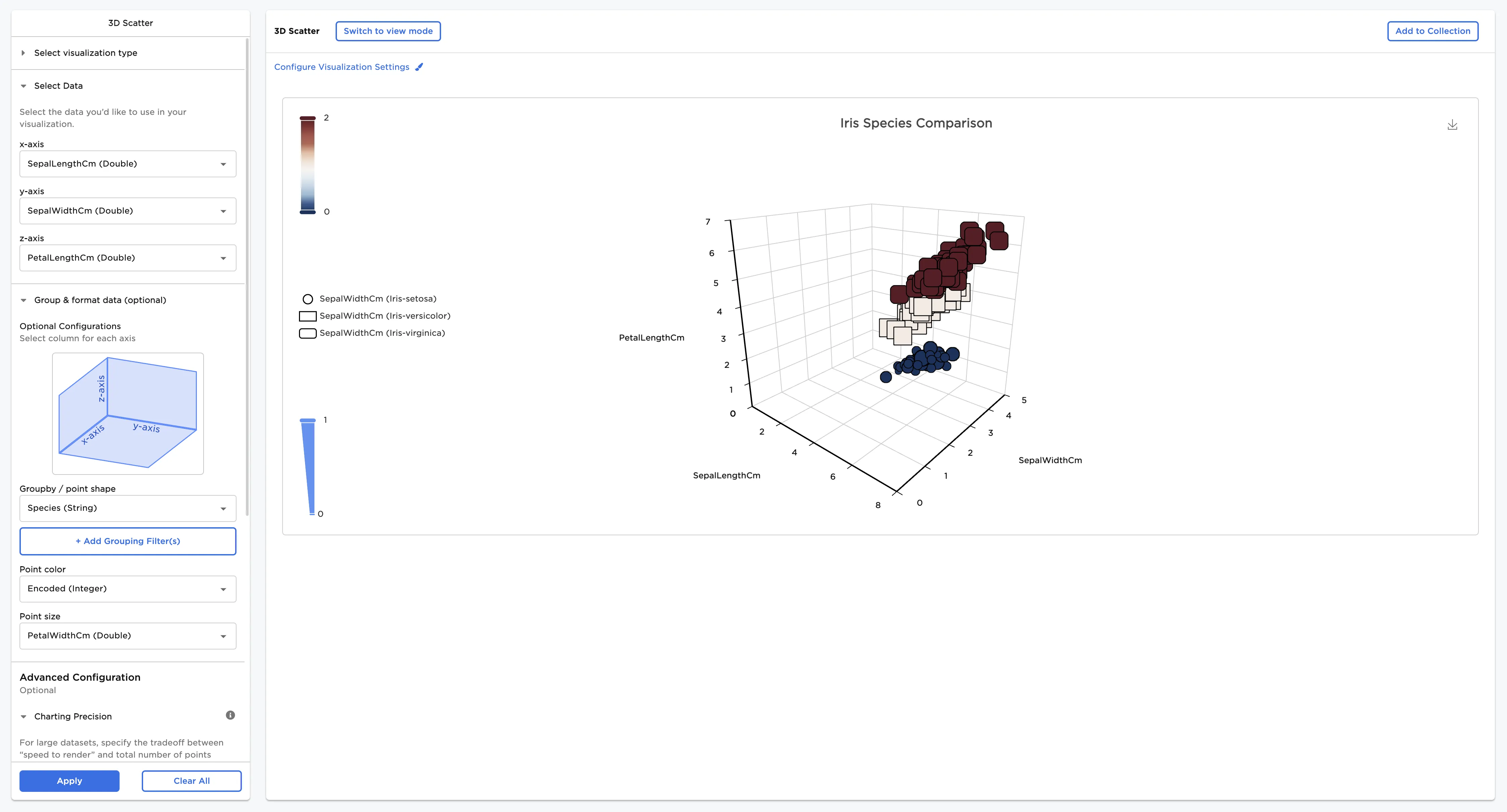
Figure 1: Example scatter plot
Examples
The following examples use a 3D scatter plot to see the relationships between different variables in different species of Iris flowers. To follow along, download the example data from the Visual Notebooks sample datasets.
- Connect an existing node to the 3D Scatter node.
- Select a field for the x-axis. In this case, "SepalLengthCm" is selected in the x-axis field.
- Select a field for the y-axis. In this case, SepalWidthCm is selected in the y-axis field.
- Select a field for the z-axis. In this case, PetalLengthCm is selected in the z-axis field.
- Select Apply.
The chart in Figure 2 plots the sepal length and width and the petal length.
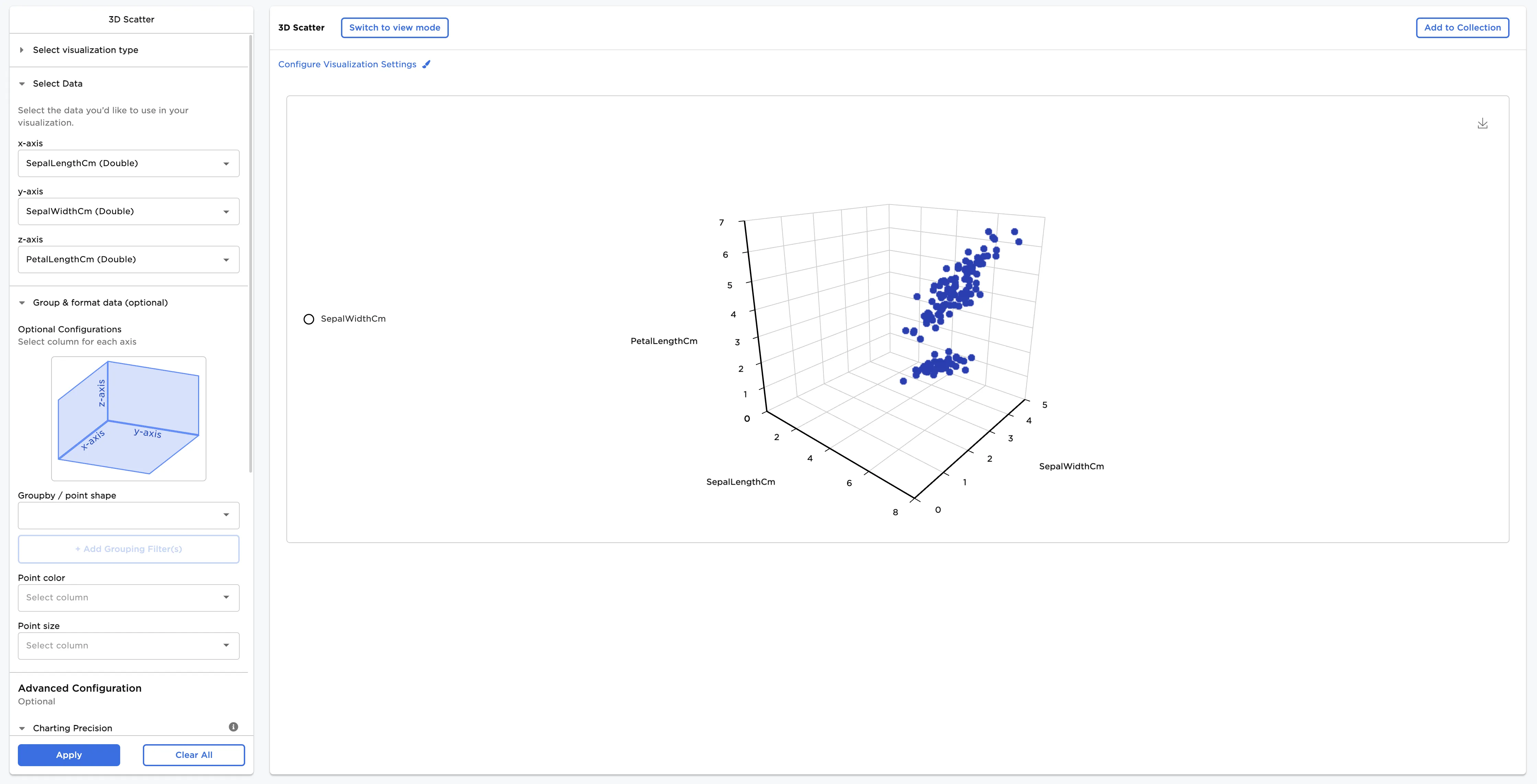
Figure 2: Example basic 3D scatter plot
Optionally, Groupby / point shape and Point color information can be added. In this case, Species (String) has been selected for Groupby / point shape and Encoded (Integer) has been selected for Point color. Both choices represent the species.
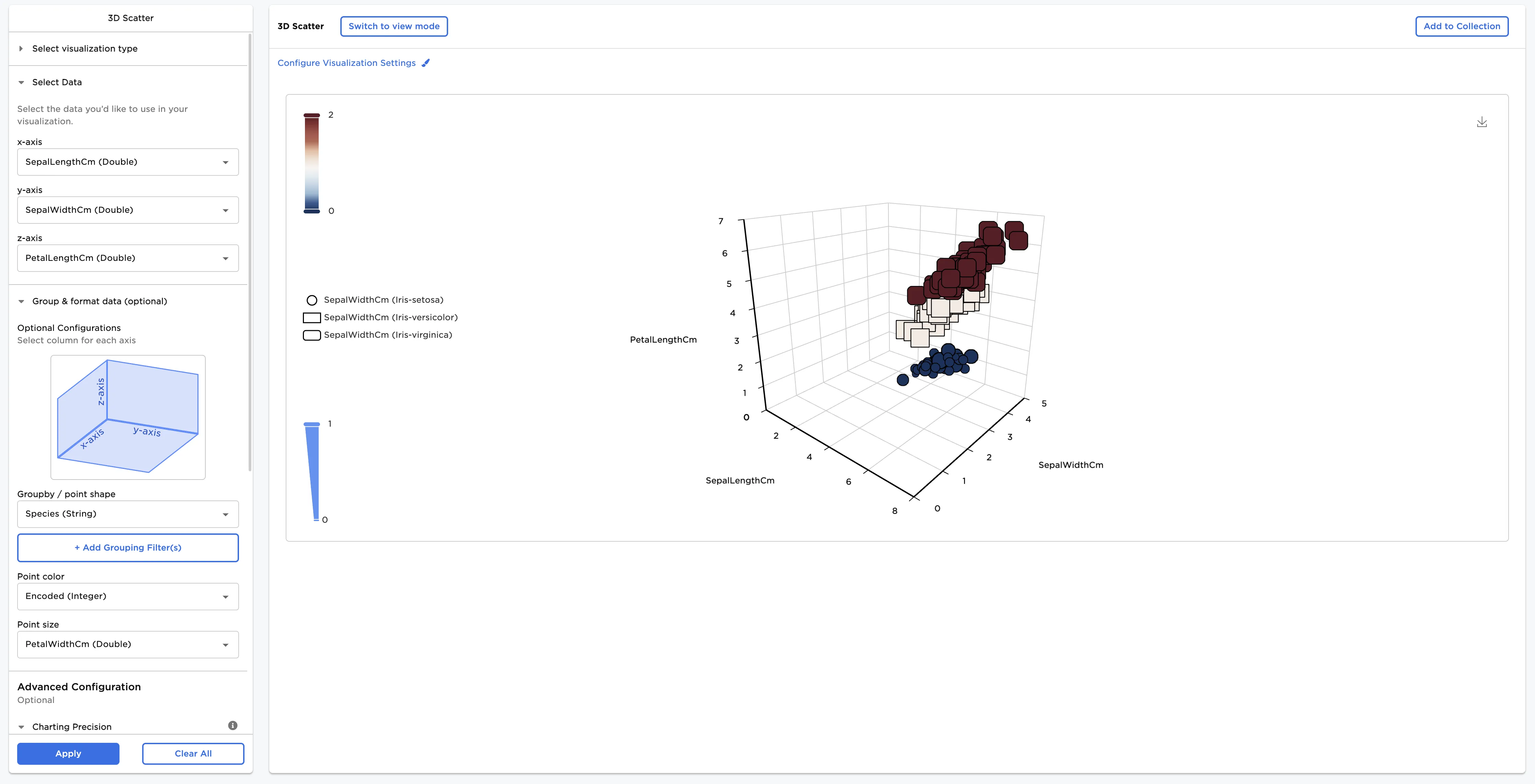
Figure 3: Example grouped 3D scatter plot
Adjust the settings in the Configure Visualization Settings menu. In this case, the defaults were changed to these selections:
- Title: "Iris Species Comparison"
- Bubble Outline: 1
The dataframe in Figure 4 shows the same chart by species with the new configurations.
Figure 4: Example configured 3D scatter plot