Creating Box Plots in Visual Notebooks
Create a Box Plot in Visual Notebooks. Box Plots are used to visualize the distribution of a dataset.
Configuration
| Field | Description |
|---|---|
| Name (default=none) | Field to name the chart - An optional user-specified node name displayed in the workspace, both on the node and in the dataframe as a tab. |
Select visualization type (default=Box Plot) | Chart type selection - An option to select a different chart type. |
| Select Data Required | List of numeric columns - A list of available numeric columns in the dataset that can be used in the plot. |
| Use approximate solution Required | Approximate solution option - Toggle the button to turn on/off using approximate solution. |
| Group Data (default=none) | Optional chart design - Group Y-axis by is the available option. Available strings are in the Group Y-axis by dropdown. This field overlays the y-axis data over the x-axis data and creates a legend. |
Add Grouping Filter(s) (default=Select all) | Filter groups - Clear the checkbox beside a group name to remove that group from the chart. Only the groups selected are shown on the chart. |
Visualization Settings
General
| Field | Description |
|---|---|
| Title (default=none) | Title for the chart - Enter a title to display at the top of the chart. |
Color Theme (default=Colorful) | Visualization color scheme - Select Colorful, Monochrome, or Grayscale. |
Show Statistics (default=off) | Show/Hide statistics - Toggle on/off to show statistics. |
Show Multiple Plots in Parallel View (default=off) | Shows parallel charts - Toggle on/off to show multiple plots in parallel. When off, there is an option to display a selected number of plots per row. |
Legend
| Field | Description |
|---|---|
| Legend labels (default=y-axis labels) | Legend labels - Add custom labels for the Group Y-Axis by option selection. |
Legend size (default=Regular) | Legend size - Adjust label size. Select Regular, Large, or Small. |
Legend position (default=top right) | Legend position - Change legend position. Select Top right, Top left, Bottom right, or Bottom left. |
Node Inputs/Outputs
| Input | A Visual Notebooks dataframe |
|---|---|
| Output | A Box plot in Visual Notebooks |
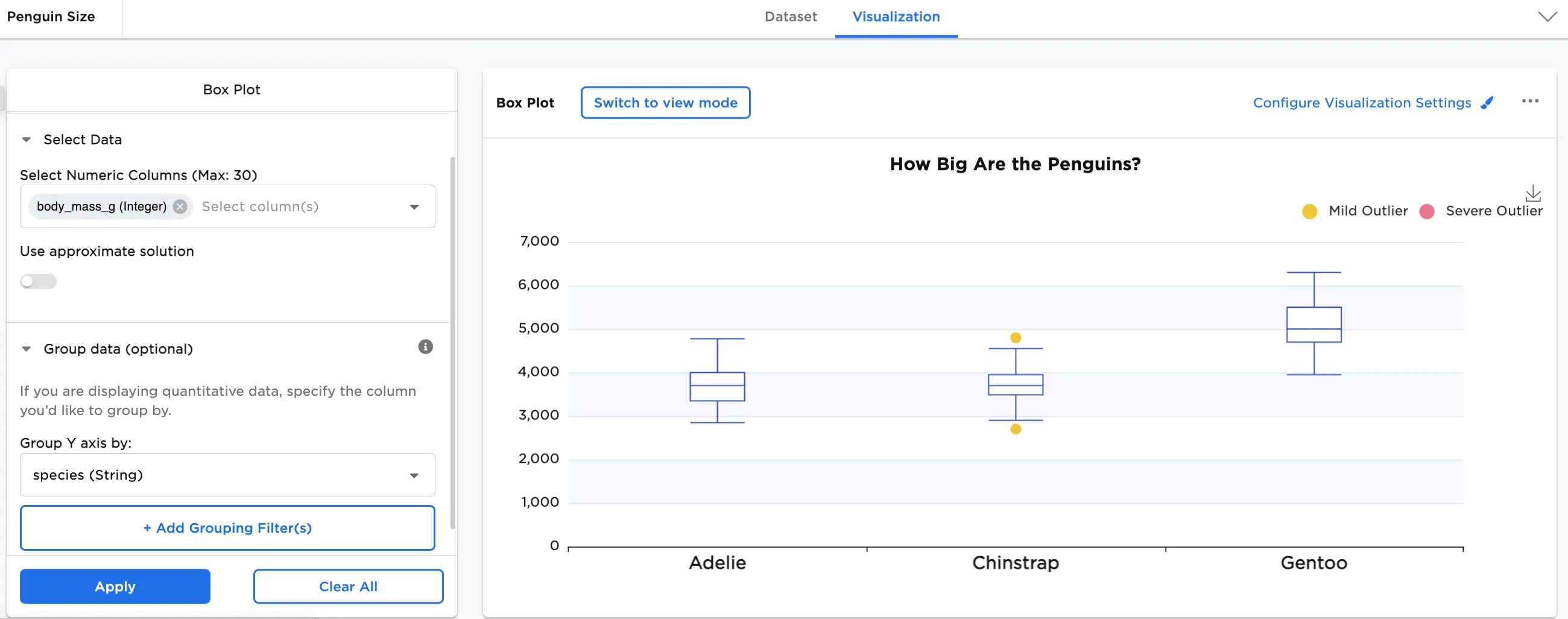
Figure 1: Example box plot
Examples
Many scientists research penguins for various studies ranging from behavior and predator threats to genetics (their relationship with other species) and migratory patterns. To protect and conserve species is only one reason they are researched so often.
The below examples show a box plot to see the relationship between different variables in different species of penguins. The example data is available in the Visual Notebooks sample datasets.
- Connect an existing node to the Box Plot node.
- (optional) If you would like to differentiate this node, enter a name in the Name field. In this case, "Penguin Size" has been entered. This name also appears in the node and as a tab in the dataset.
- Double-click the Box Plot node. If the Visualization is blank, switch to Dataset and select Run, then switch back to Visualization.
- Select one or more numeric fields to view. In this case, the "body_mass_g" field is selected.
- Select Apply.
The dataframe shown below is used in this example. It represents the distribution of penguin body mass measurements in grams against the median measurement. The median is displayed as the horizontal line inside the rectangle.
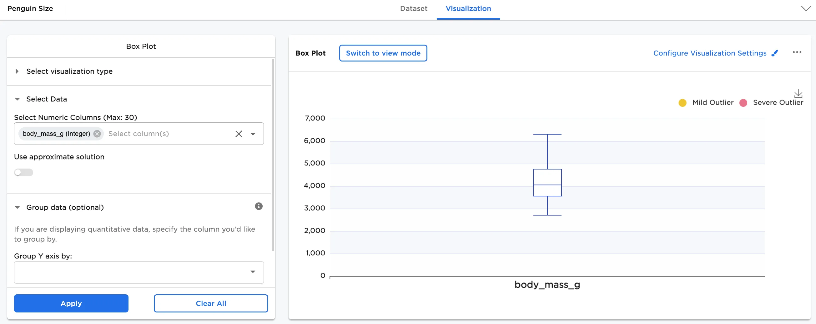
Figure 2: Example basic box plot
Next, add Group Y-Axis by information to break down the data by category. In this case, species (String) is added. In Configure Visualization Settings, make additional adjustments. In this case, the defaults were changed to these selections:
- A plot title is added
- 3 plots per row is selected
- Show Statistics is toggled on
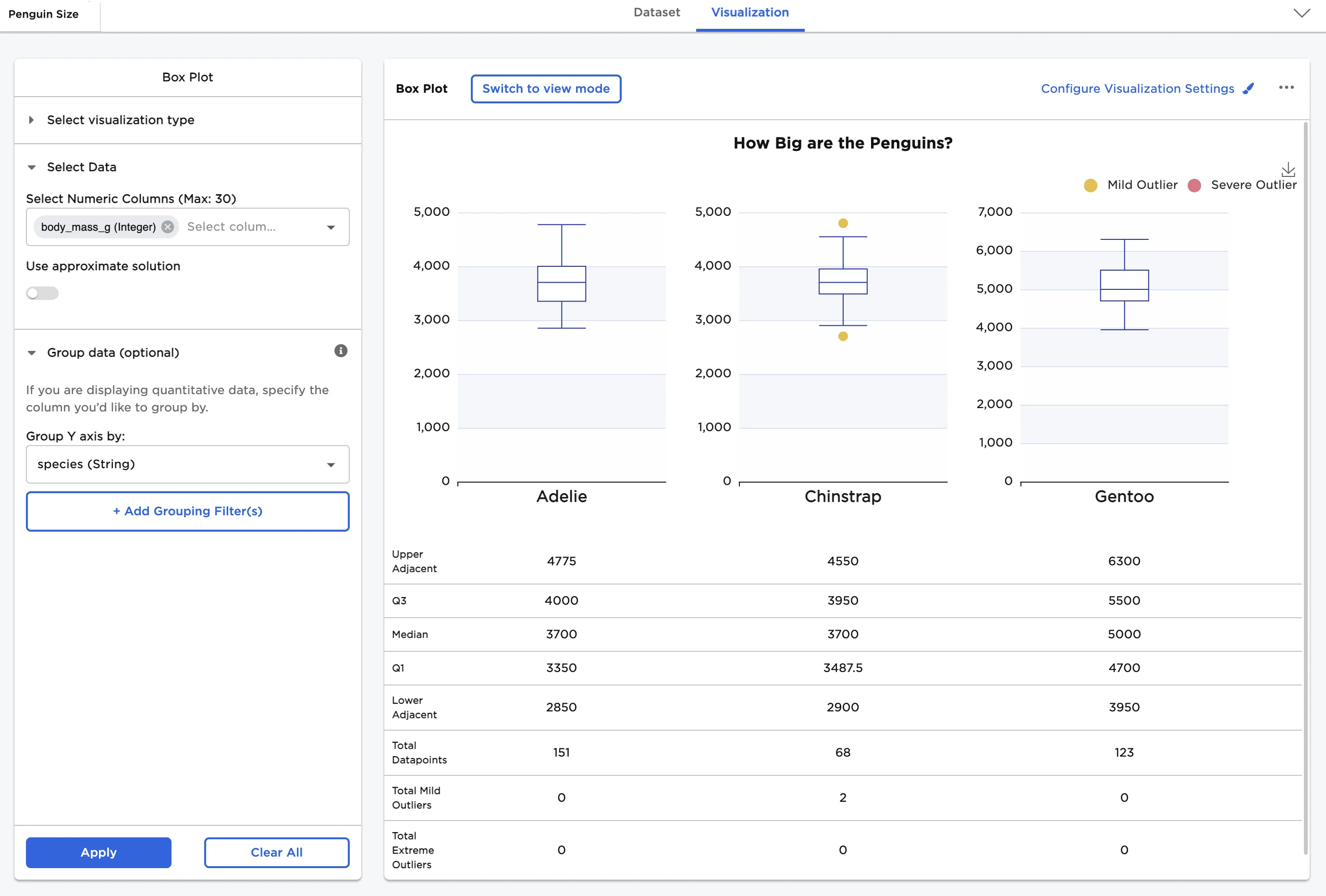
Figure 3: Example box plot grouped by Y with statistics
In the following examples, the visualization has been configured to include multiple plots in parallel view and to show Statistics.
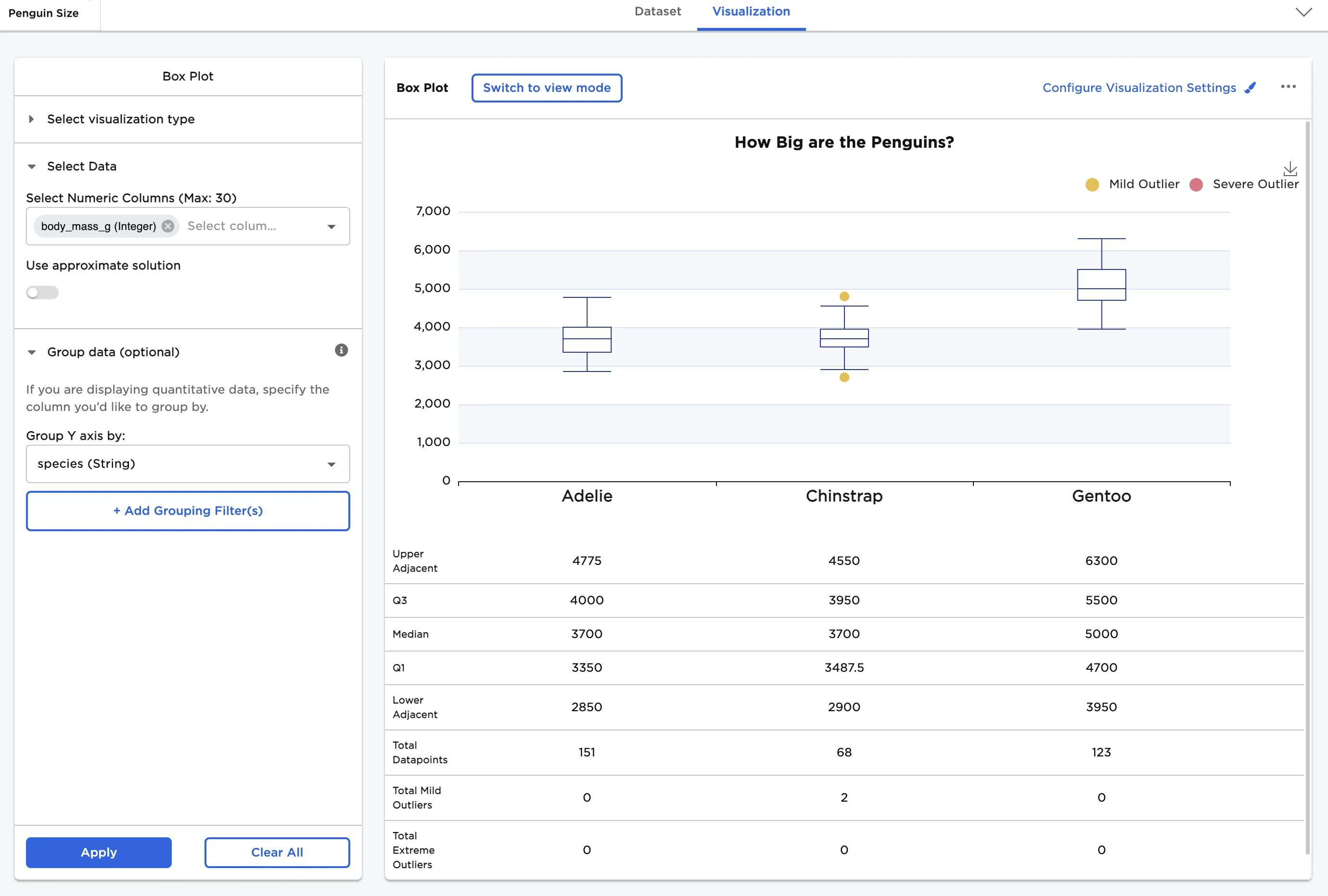
Figure 4: Example box plots in parallel view with statistics
Next, a comparison of bill length vs. bill depth is shown. To create this view, select both "bill_length_mm" and "bill_depth_mm" for the Select Numeric Columns field.
In Configure Visualization Settings, adjust other settings. In this case, the defaults were changed to these selections:
- Show multiple plots in parallel view is toggled on
- bill_length_mm label is changed to "Bill Length"
- bill_depth_mm label is changed to "Bill Depth"
The dataframe in Figure 5 shows the comparison of bill length distribution to bill depth distribution in millimeters.
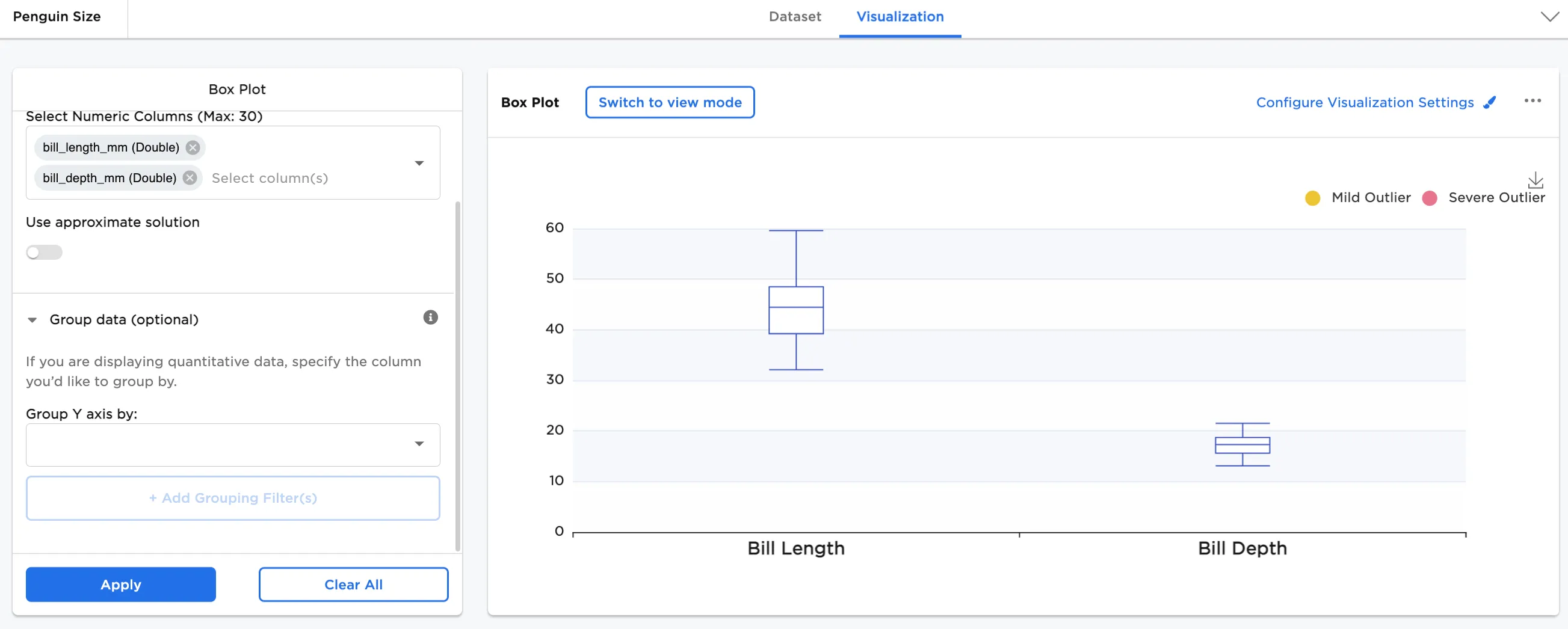
Figure 7: Example bill length and depth
Finally, we compare bill length by species and bill depth by species with statistics.
- Select both "bill_length_mm" and "bill_depth_mm" for the Select Numeric Columns field
- In Group Y-axis by, select species (String)
In Configure Visualization Settings, adjust other settings. In this case, the defaults were changed to these selections:
- bill_length_mm label is changed to "Bill Length"
- bill_depth_mm label is changed to "Bill Depth"
- Show Statistics is toggled on
- Show multiple plots in parallel view is toggled on
The dataframe shown below shows the comparison between the bill length distribution by species and the bill depth distribution by species.
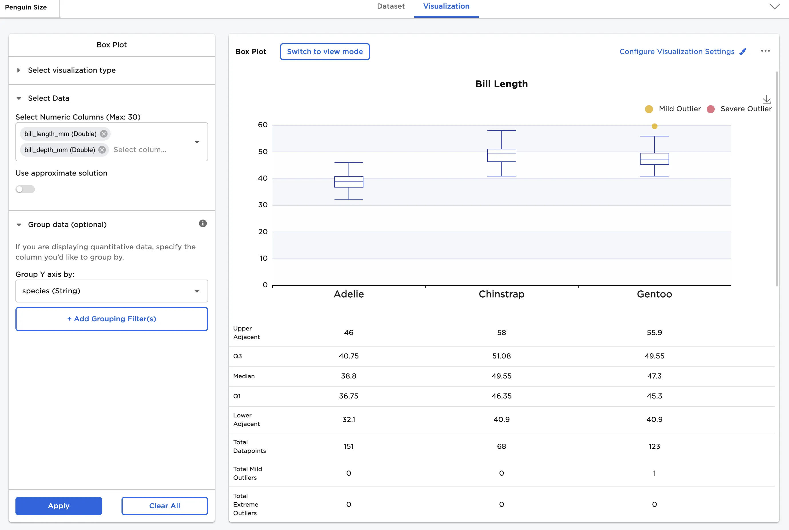
Figure 9: Example bill length by species with statistics
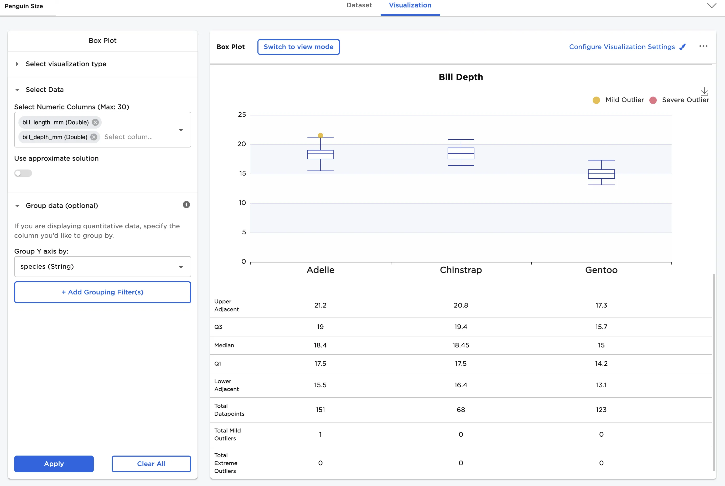
Figure 11: Example bill depth by species with statistics
Background – Quartile Calculation
The Box Plot node produces the first and third quartiles (Q1 and Q3) of your data as part of its output. Interestingly enough, quartile calculation is not an exact science. There are over a dozen commonly used algorithms to calculate quartiles, all of which produce different results. In Visual Notebooks, we use an algorithm that, when met with a quartile index that is a non-integer, uses a weighted average of the two values in your data that surround that quartile index. This weighted average depends on the position of the quartile index in that interval. This algorithm is equivalent to how quartiles are calculated by numpy.percentile by default. Here is the algorithm:
Our Quartile Algorithm
Let us assume that $ColumnData$ is an array of your column data that has been sorted in ascending order and is 0-indexed. And let us assume that $i$ is the quartile we are calculating (usually $1$ or $3$).
First, we calculate a value $Numerator$:
Next, we calculate a value $Index$:
Now, we calculate a value $Remainder$ (this is almost always an integer):
Now, we define a value $NextID$ as:
Now, we calculate the weighted average $q$ between the datapoints corresponding to $Index$ and $NextID$:
And this $q$ is the quartile value we show in the Box Plot node.