Histogram
Create a Histogram in Visual Notebooks. Histograms are a type of bar chart for numeric data that group data points into logical ranges or bins.
Configuration
| Field | Description |
|---|---|
| Name default=none | Field to name the chart An optional user-specified node name displayed in the workspace, both on the node and in the dataframe as a tab. |
Select visualization type default=Histogram | Chart type selection An option to select a different chart type. |
| Add Data *Required | List of numeric columns A list of available dataset numeric columns that can be used in the chart. The maximum number of columns is 30. |
Overlay multiple histograms default=off | Option to view data from multiple charts together Toggle the button to turn on/off the overlay feature. |
| Group Data default=none | Optional chart design Group Y-axis by is the available option in Histograms. Available strings are in the Group Y-axis by dropdown. This field overlays the y-axis data over the x-axis data and creates a legend. |
Add Grouping Filter(s) default=Select all | Filter groups Clear the checkbox beside a group name to remove that group from the chart. Only the groups selected are shown on the chart. |
Binning Strategy default=Automatic | Select binning strategy An optional strategy for grouping the data. Select Automatic, Specify Number of Bins, Specify Bin Width, or Custom Bin Ranges. |
Visualization Settings
General
| Field | Description |
|---|---|
| Title default=none | Title for the chart Enter a title to display at the top of the chart. |
Color Theme default=Colorful | Visualization color scheme Select Colorful, Monochrome, or Grayscale. |
Max Plots per Row default=2 | Select the number of maximum plots per row Type a number or scroll up/down to increase or decrease the number of plots per row. This selection cannot be blank. |
Show Density Line default=off | Shows trendline Toggle on/off to show or hide the trendline of the data. |
Hide Histogram Bars default=off | Hide bars Toggle on/off to show or hide the histogram bars. |
Legend
| Field | Description |
|---|---|
Legend size default=Regular | Adjust the legend size Adjust the size of the legend label. Select Regular, Large, or Small. |
Legend position default=Top right | Change the legend position Change legend position. Select Top right, Top left, Bottom right, or Bottom left. |
Node Inputs/Outputs
| Input | A Visual Notebooks dataframe |
|---|---|
| Output | A Histogram in Visual Notebooks |

Figure 1: Example histogram
Examples
Many scientists research sharks because they teach us more about treating illnesses, designing better ships, undersea intelligence, and even swimwear. Sharks rarely get cancer, their wound heal faster than humans, and their skin has low-drag glide through water.
The below examples show histograms to compare different species of sharks. To follow along in the example,
- Connect the data or an existing node to the Histogram node.
- Double click on the Histogram node. If the Visualization is blank, switch to Dataset and select Run, then switch back to to Visualization.
- Select one (or more) numeric fields to view. In this case, the "length_inches (Double)" field is selected.
- Select Apply.
The dataframe shown in Figure 2 is used in this example. It represents the length of sharks in inches.
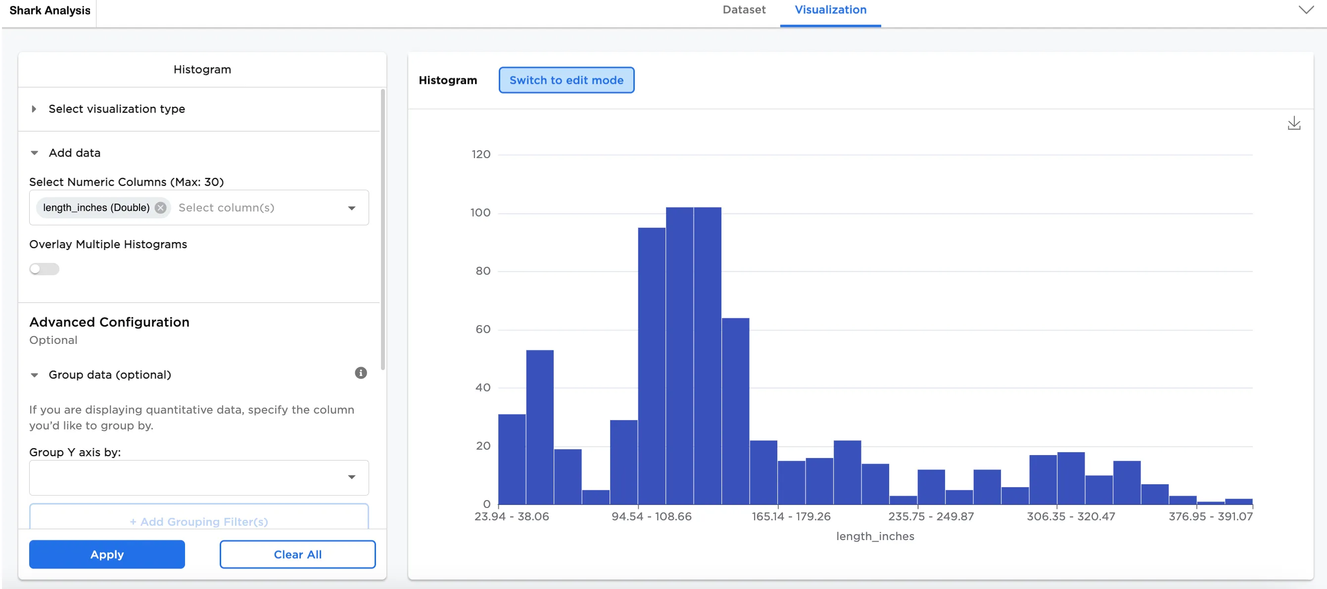
Figure 2: Example basic histogram
Optionally, more data can be added. In this case, a second numeric column has been added, speed (Double).
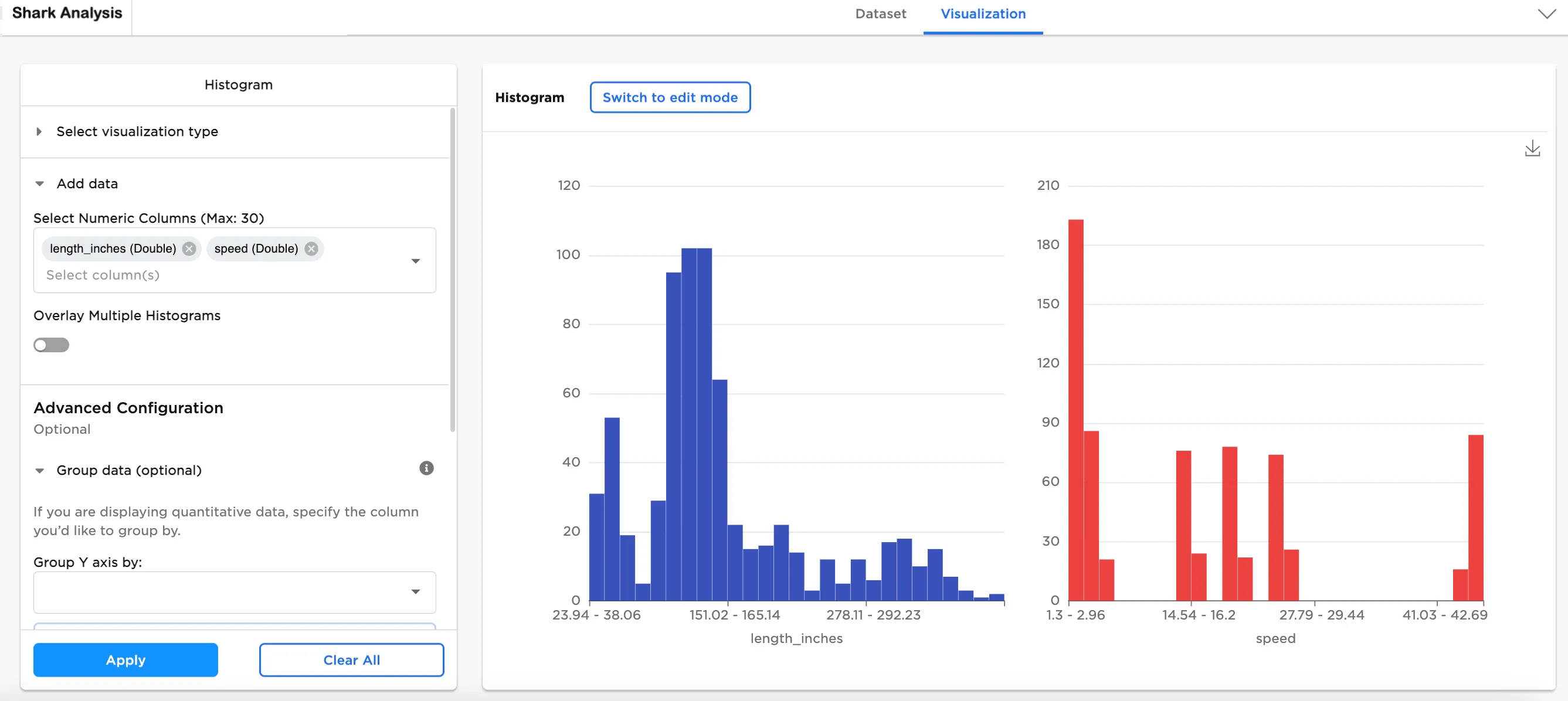
Figure 3: Example histogram with two numeric columns added
By toggling on Overlay Multiple Histograms, both histograms can be seen together.
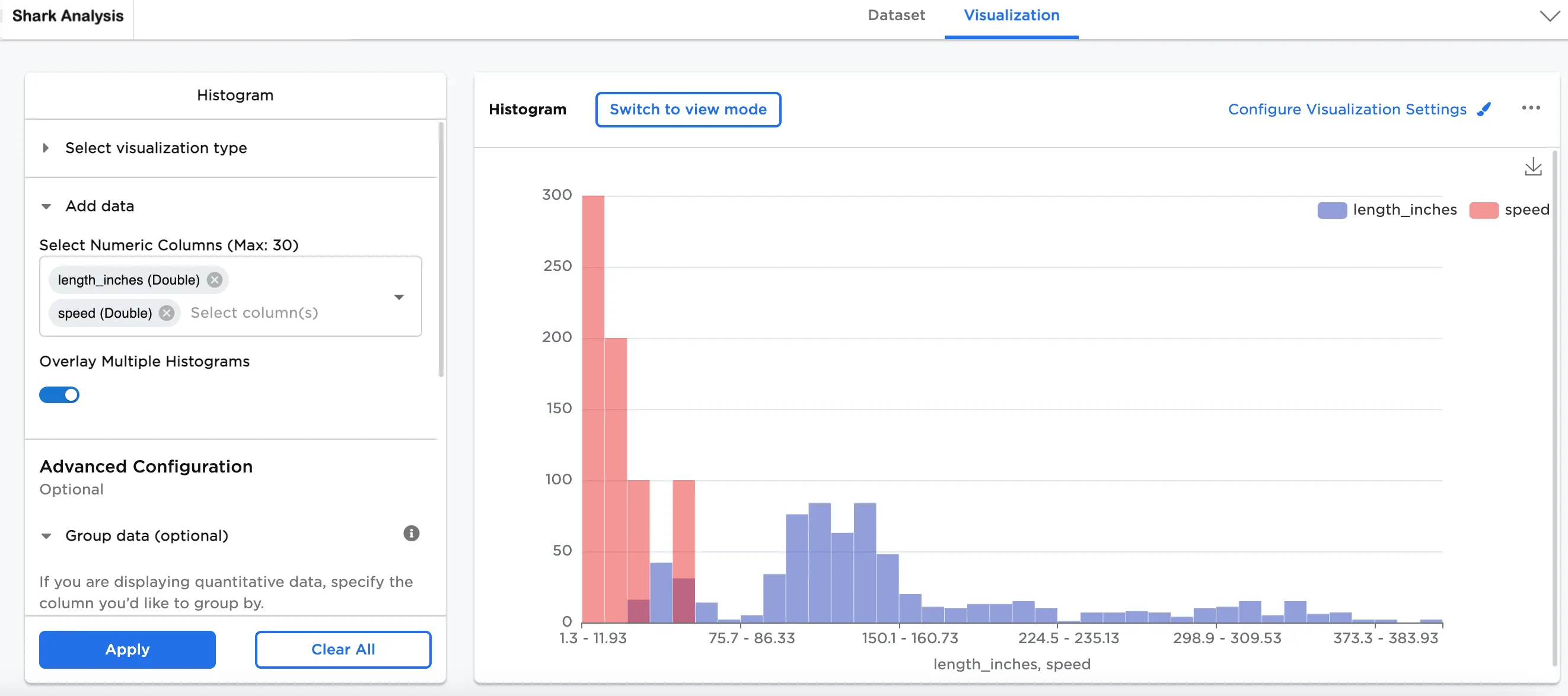
Figure 4: Overlaid multiple histograms
Another option is to group the data using the add Group Y-axis by field. In this case, shark (String) has been added. By adding this, the histograms are split into two plots: one plot shows length and the other shows speed. Different shark species are represented as different colors.
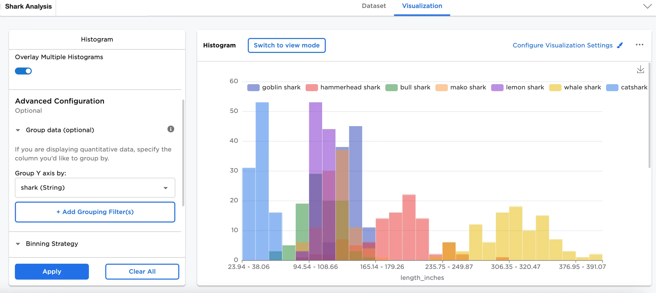
Figure 5a: Example overlaid length plot
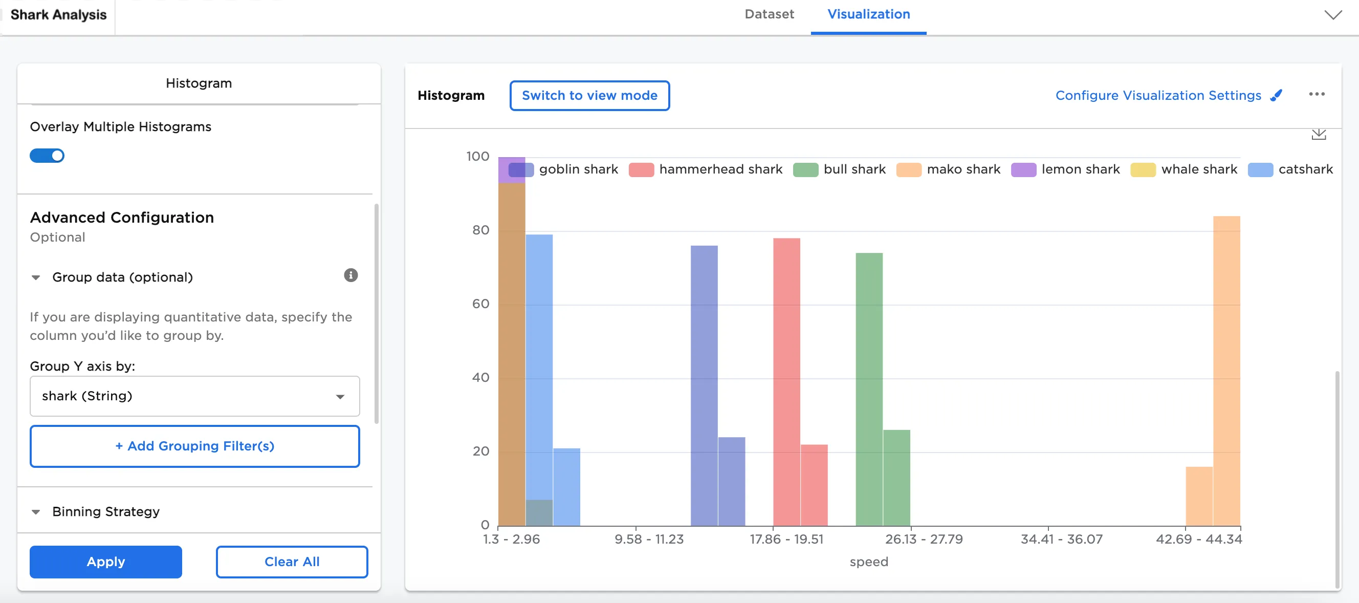
Figure 5b: Example overlaid speed plot
Other visualization options have been configured here to include:
- Show Density Line is toggled on
- Legend labels have been shortened
- The Legend has been moved to the bottom right
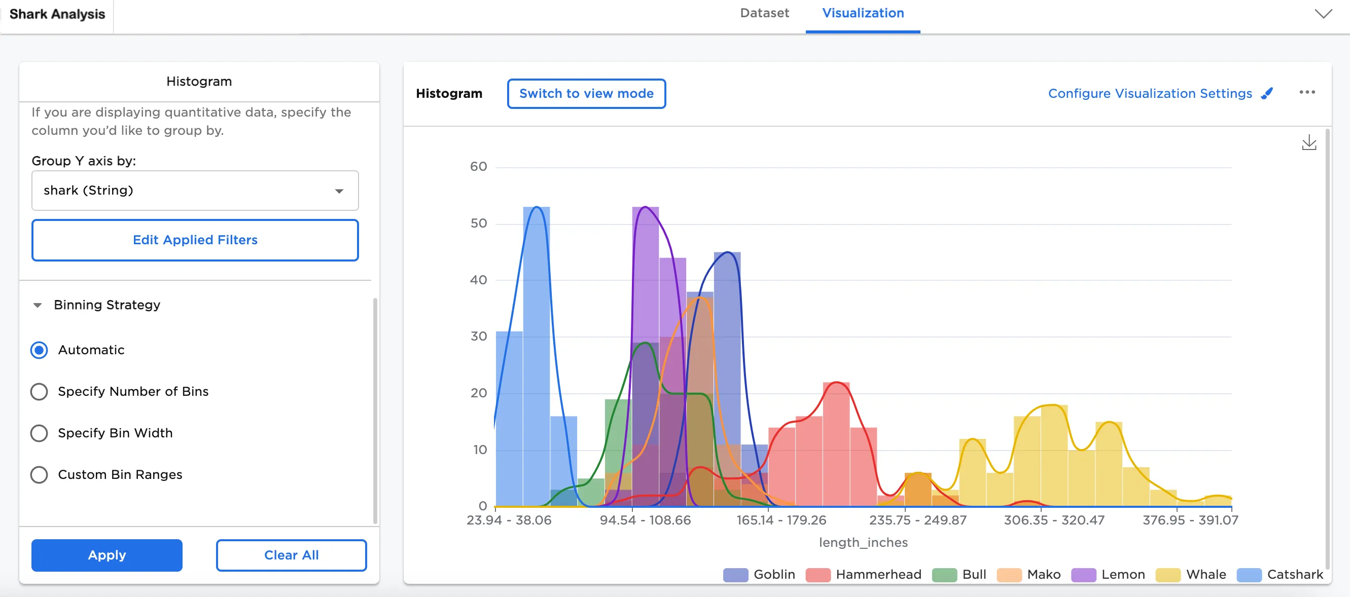
Figure 6a: Example histogram with density line
Another option is to remove the bars from the chart. In Configure Visualization Settings toggle on Hide Histogram Bars. This allows you to see the trendline on its own.
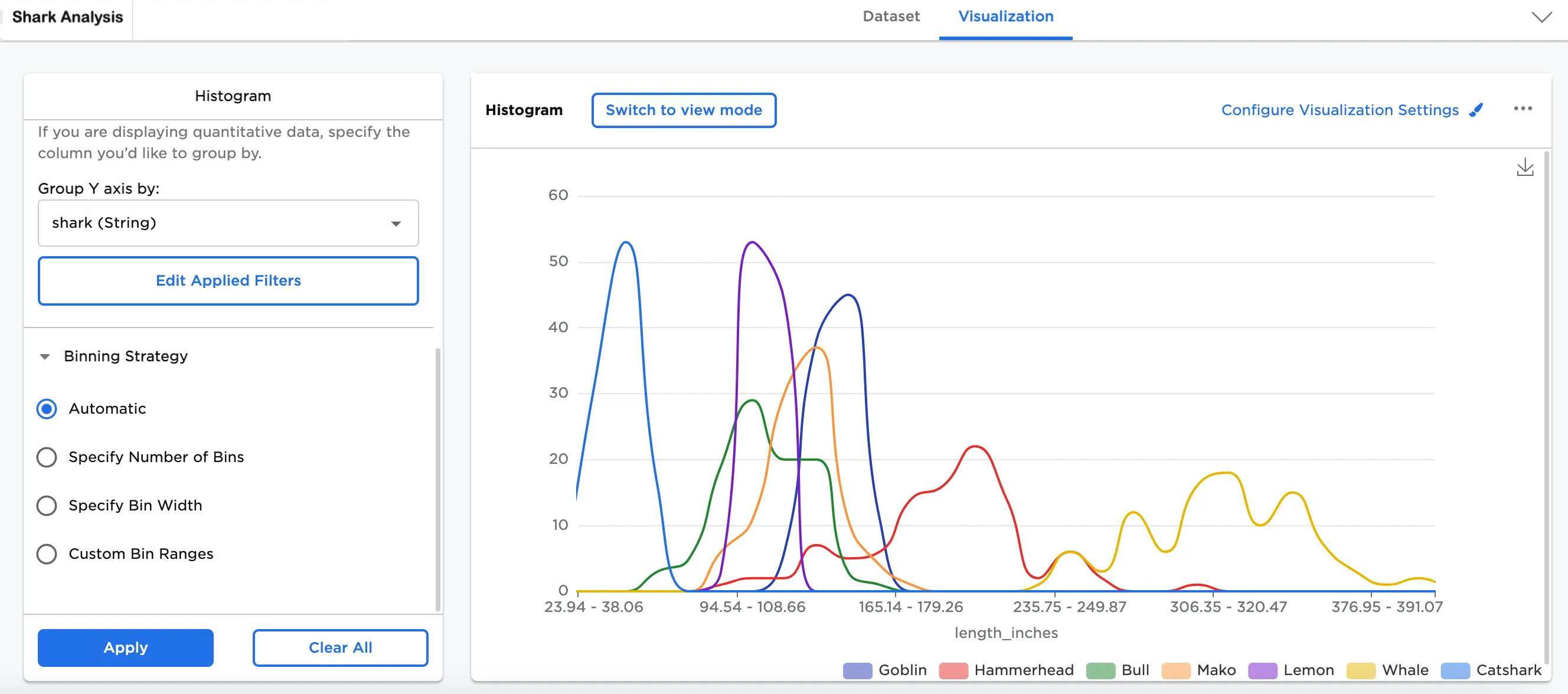
Figure 6b: Example hidden histogram bars
Another optional feature is Binning Strategy. So far, Figures 1 to 5b represent the Automatic binning strategy. Figures 6 to 8 represent the same data with different ways of binning the data.
- Specify Number of Bins allows you to modify the number of bins. This option slices the data into the specified number of bins. In this case, "10" bins has been selected.
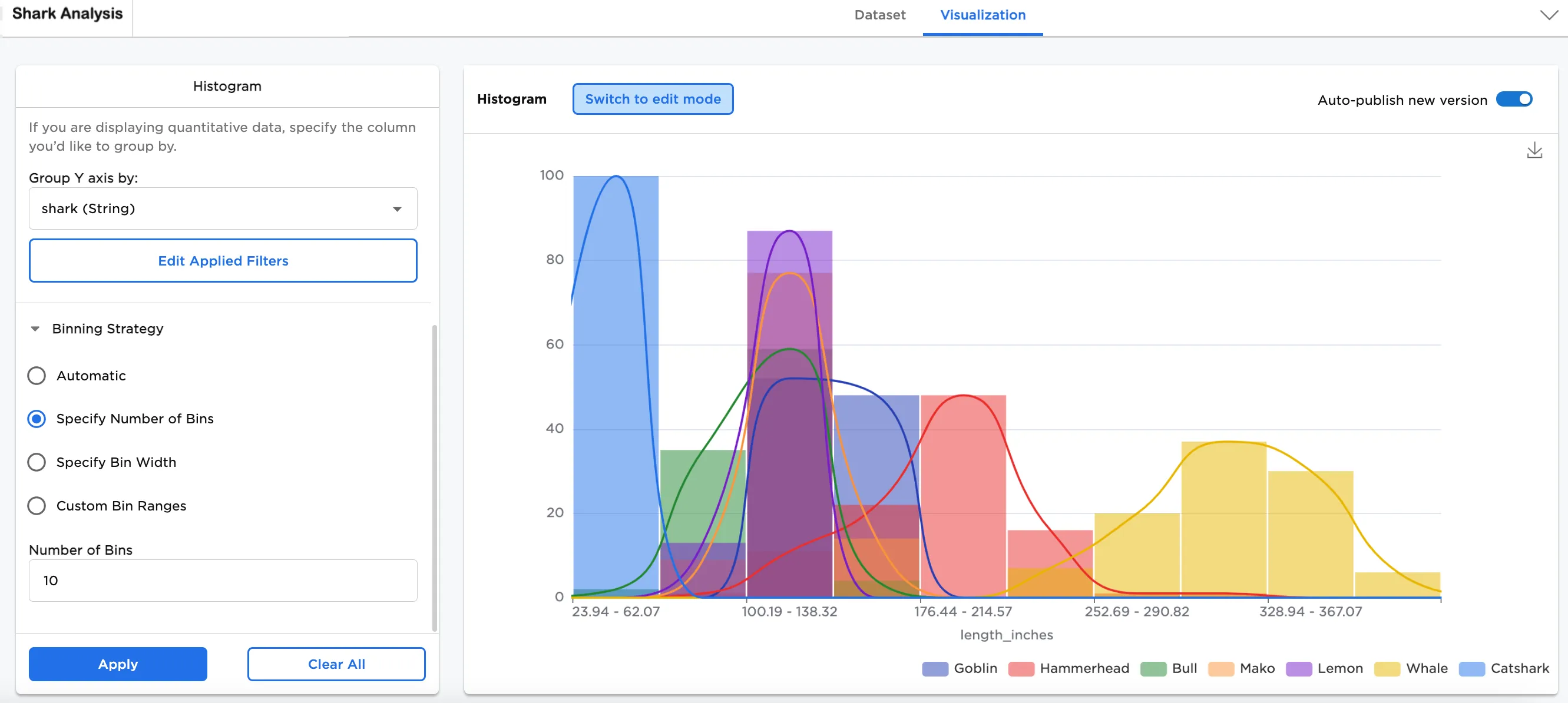
Figure 7: Example specified number of bins
- Specify Bin Width allows you to modify the width of the bins. This option fits the data into the selected bin width. In this case, "5" has been selected for the width.
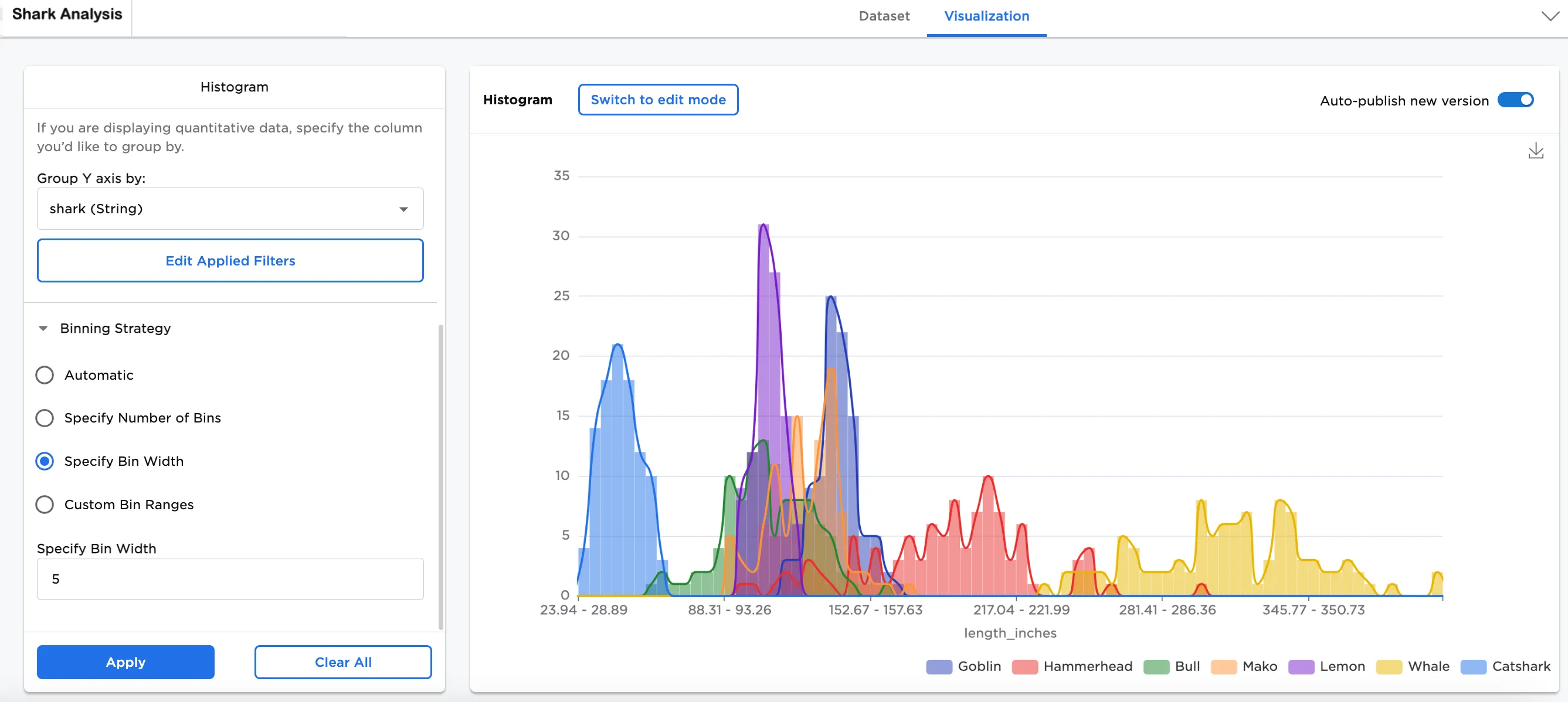
Figure 8: Example specified bin width
- Custom Bin Ranges allows you to bucket the data into the bin width specifically created. In this case, 4 bins have been created: "1 < 50"; "50 < 100"; "100 < 150"; "150 < 200".
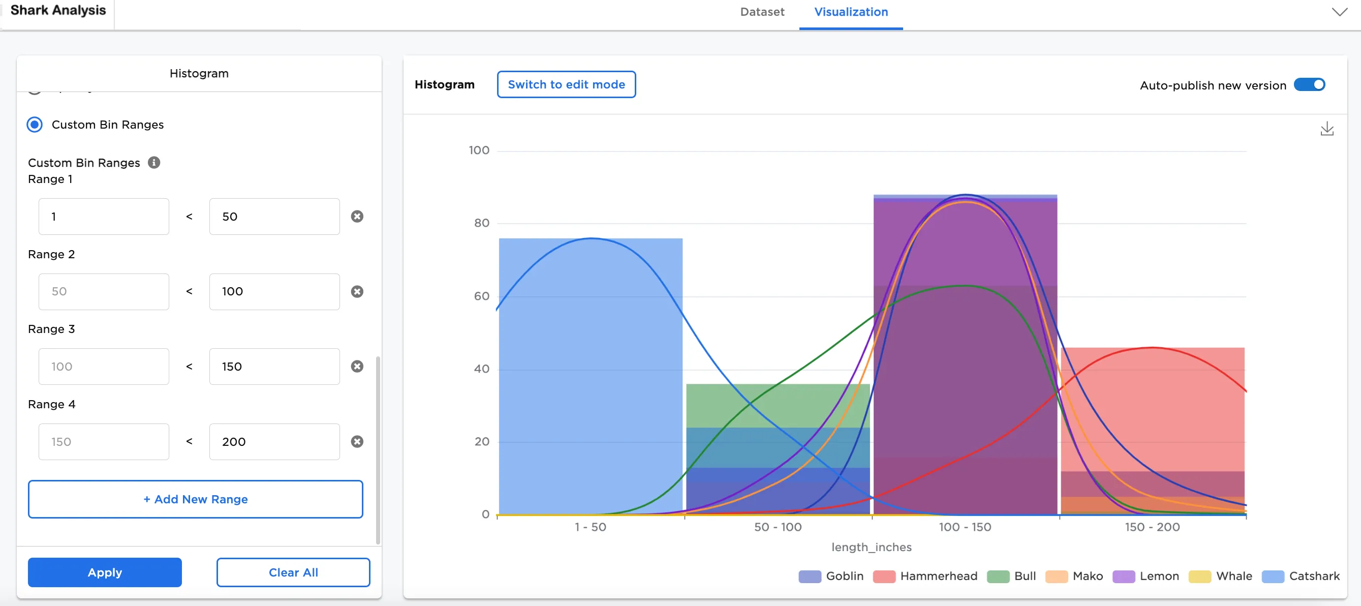
Figure 9: Example custom bin range