Normal and QQ Plots
Create a Normal Probability and Quantile-to-Quantile (QQ) Plot in Visual Notebooks.
Normal Probability Plots are graphical assessments of whether a dataset is approximately normally distributed. QQ Plots are graphical assessments for determining if two datasets come from populations with a common distribution.
Configuration
| Field | Description |
|---|---|
| Name default=none | Field to name the chart An optional user-specified node name displayed in the workspace, both on the node and in the dataframe as a tab. |
Select visualization type default=Normal and QQ Plots | Chart type selection An option to select a different chart type. |
| Select Data *Required | List of numeric columns A list of available dataset numeric columns that can be used in the chart. The maximum number of columns is 30. |
Plot Type default=Normal Probability Plot | Option to select plot type Select Normal Probability Plot or QQ Plot. |
| Group Data default=none | Optional chart design Group Y-axis by is the available option. The Group Y-axis by dropdown shows available string choices to break down the data by the selected string. |
Add Grouping Filter(s) default=Select all | Filter groups Clear the checkbox beside a group name to remove that group from the chart. Only the groups selected are shown on the chart. |
Visualization Settings
General
| Field | Description |
|---|---|
| Title default=none | Title for the chart Enter a title to display at the top of the chart. |
Color Theme default=Colorful | Visualization color scheme Select Colorful, Monochrome, or Grayscale. |
Max Plots per Row default=2 | Select the number of maximum plots per row Type a number or scroll up/down to increase or decrease the number of plots per row. This selection cannot be blank. |
Confidence Level default=90% | Select confidence level Choose the confidence level of the data. Select 90%, 95%, 99%, or Custom. |
Legend
| Field | Description |
|---|---|
Legend size default=Regular | Adjust the legend size Adjust the size of the legend label. Select Regular, Large, or Small. |
Legend position default=Top right | Change the legend position Change legend position. Select Top right, Top left, Bottom right, or Bottom left. |
Node Inputs/Outputs
| Input | A Visual Notebooks dataframe |
|---|---|
| Output | A Normal Probability or QQ Plot in Visual Notebooks |
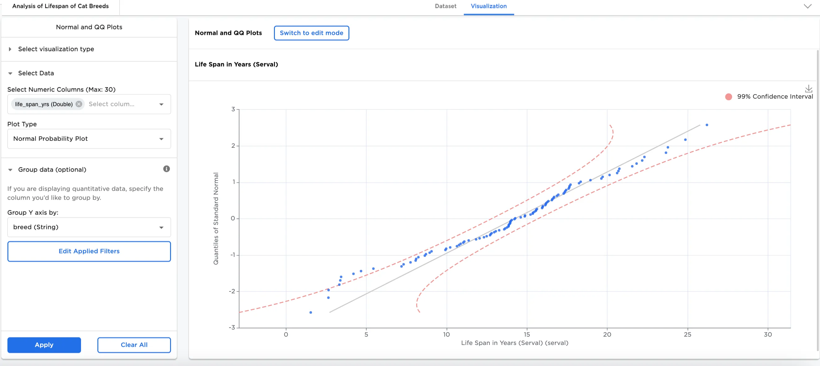
Figure 1a: Example normal probability plot
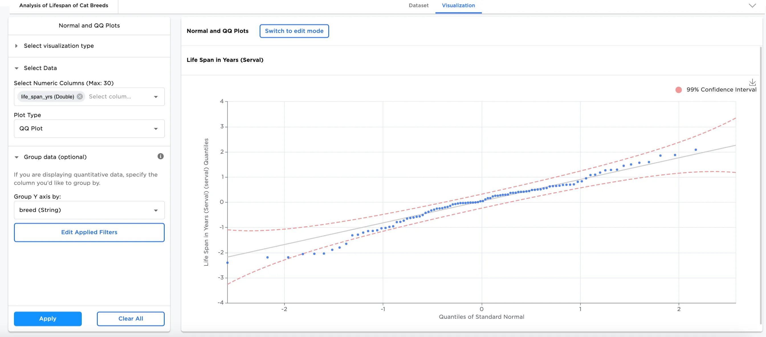
Figure 1b: Example qq plot
Examples
Scientists often research cats to understand more about the role of nutrition in making new cat foods and to study aging in our feline friends. The below examples use normal probability and QQ plots to compare the lifespan of different breeds of cats.
- Connect the data or an existing node to the Normal/QQ Plot node.
- Double click the Normal/QQ Plot node. If the Visualization is blank, switch to Dataset and select Run, then switch back to to Visualization.
- Select one or more numeric fields to view. In this case, the "life_span_yrs (Double)" field is selected.
- Select Apply.
Figures 2a and 2b represent the probability of the lifespan of different cat breeds from the example data in normal and qq plots. The normal plot shows whether the lifespan of cats is approximately normally distributed, whereas the qq plot shows whether the data aligns along the mean line.
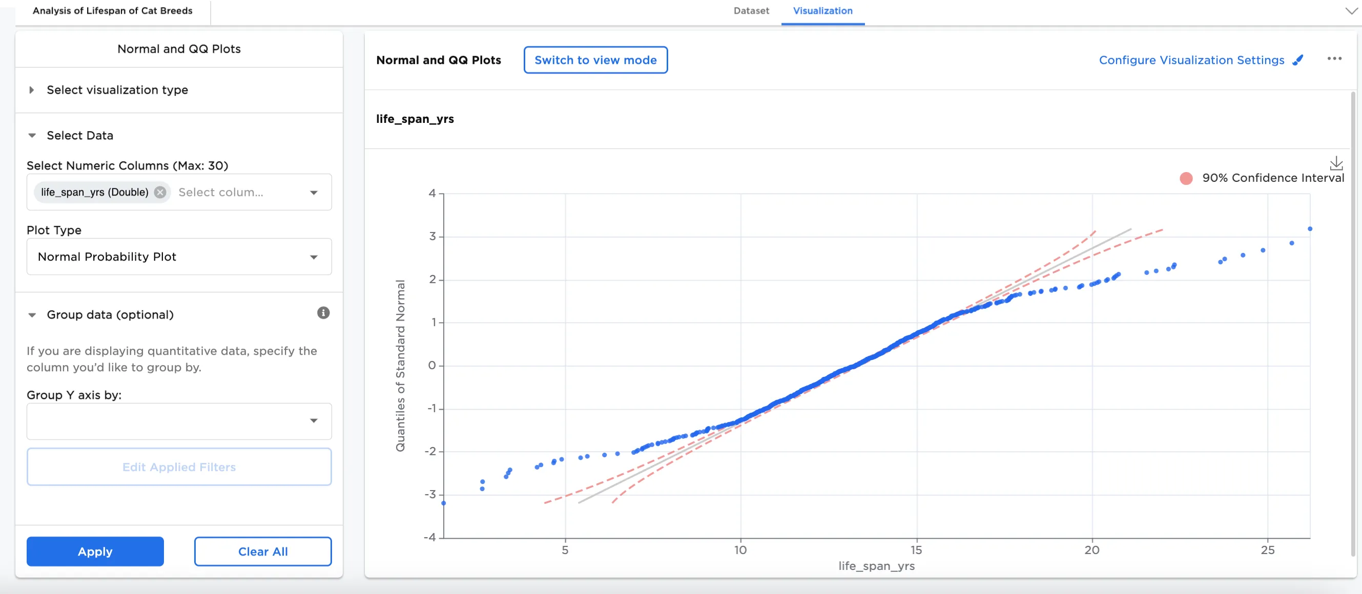
Figure 2a: Example basic normal probability plot
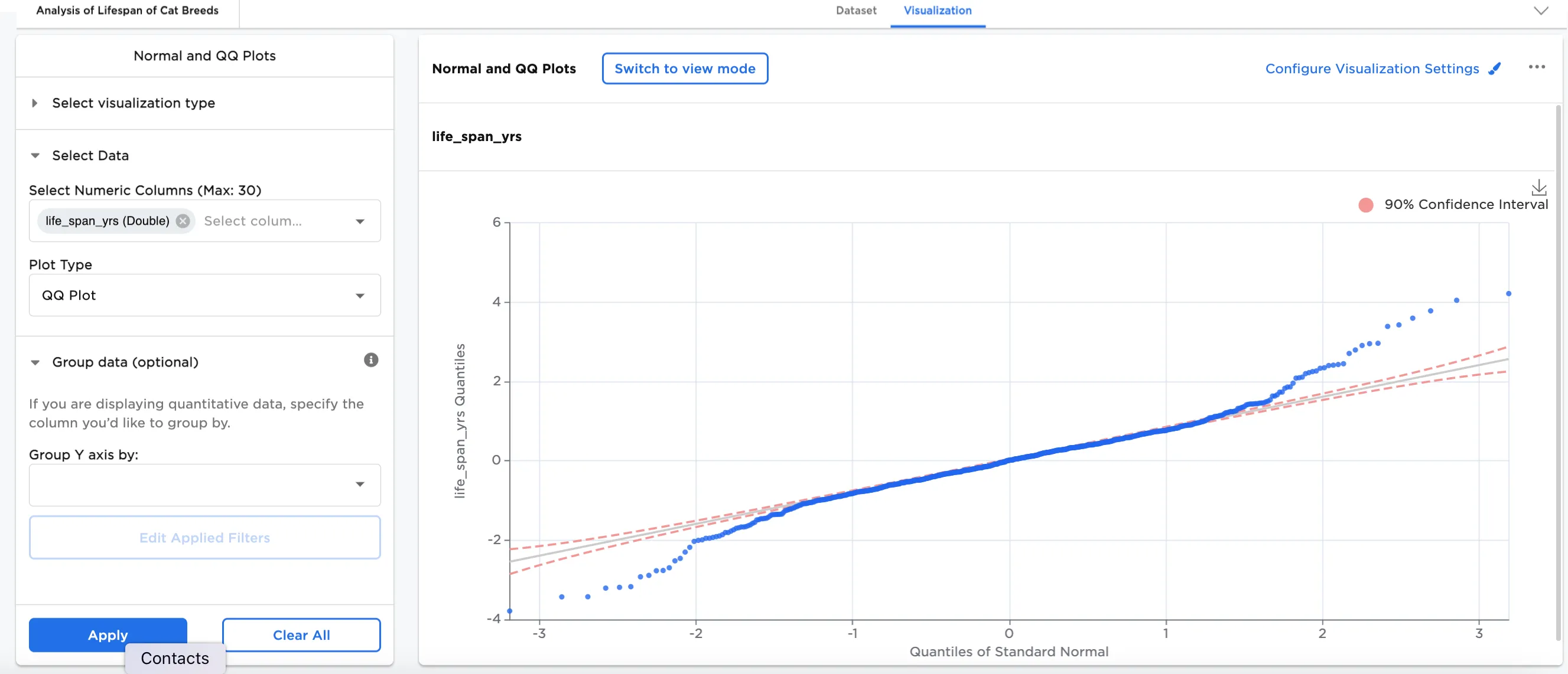
Figure 2b: Example basic qq plot
Both plots are derived from the same input data. Figure 2c is an example of the input data added into Visual Notebooks. It contains identifying characteristics of different cat breeds.
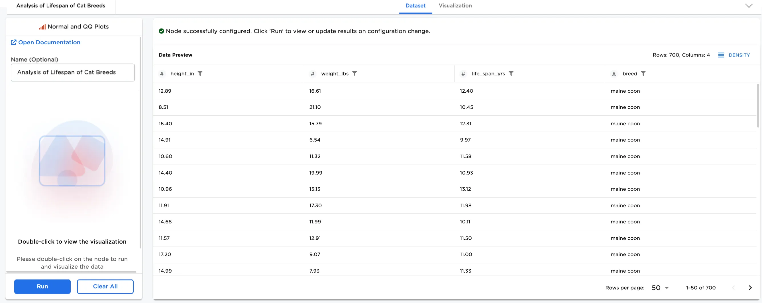
Figure 2c: Example input data
Optionally, more data can be added. In this case, Group Y-Axis by, breed (String), has been added to show the breakdown by breed.
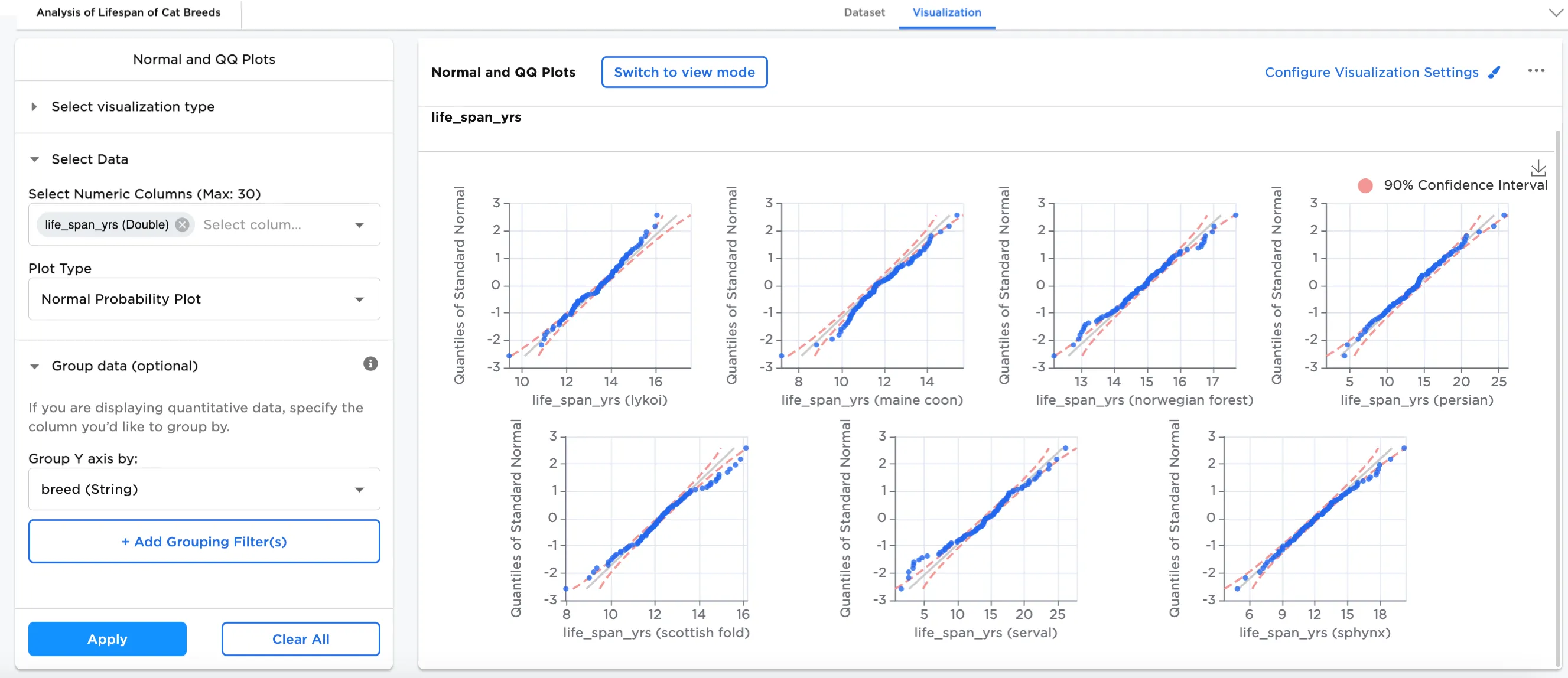
Figure 3a: Example normal plot by breed
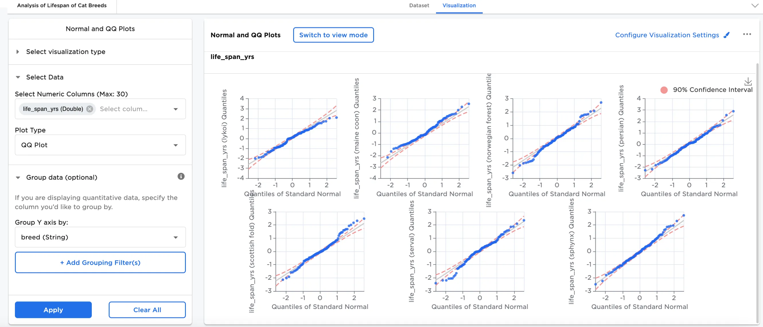
Figure 3b: Example qq plot by breed
In this example, in Configure Visualization Settings, the Confidence Interval has been changed to from 90% to 99% and a title has been added, "Life Span in Years"
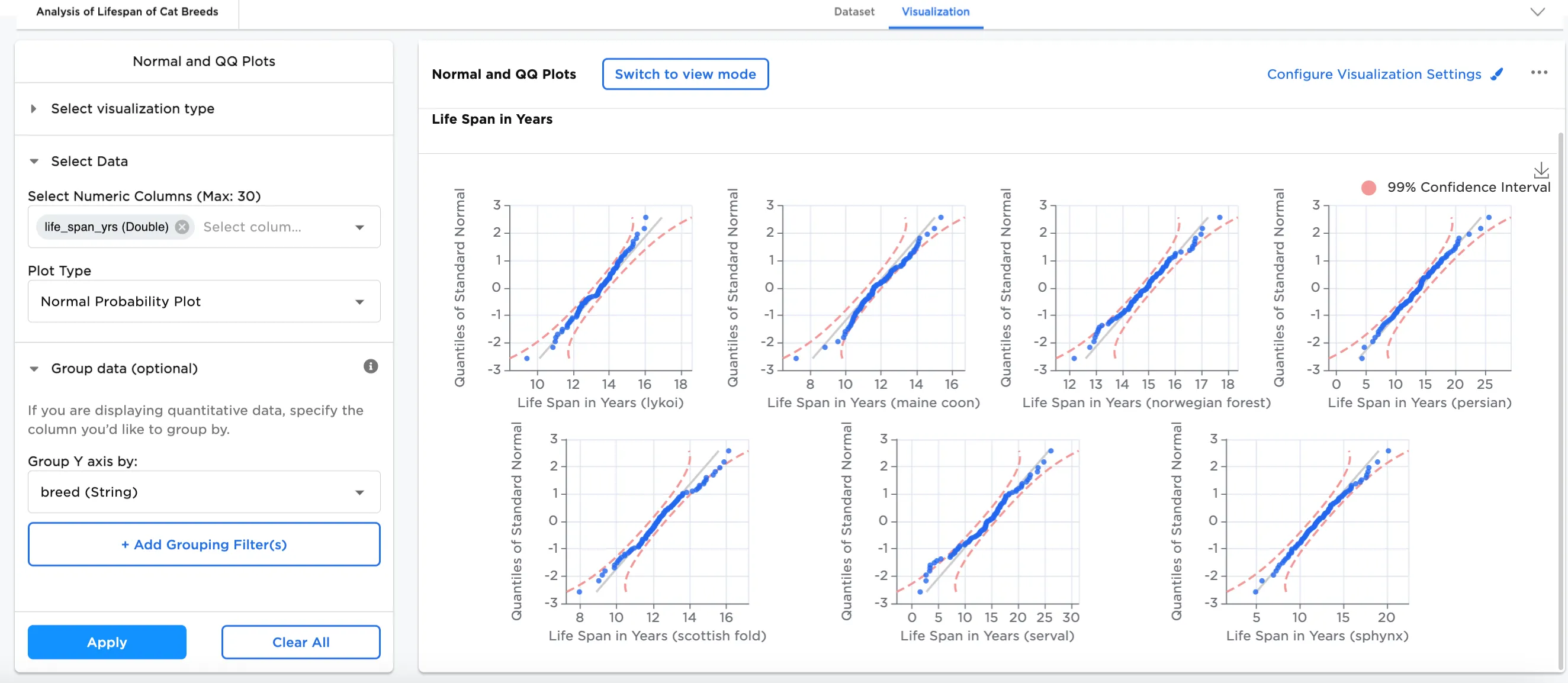
Figure 4a: Example normal plot with 99% confidence interval
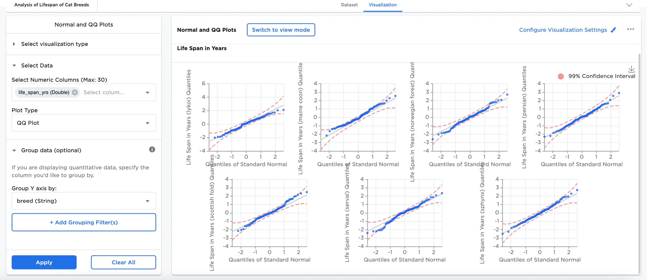
Figure 4b: Example qq plot with 99% confidence interval
This example shows both normal and qq plots, and uses Add Group Filter(s), filters for Maine Coon and Norwegian Forest cats to see the difference in their lifespans. The title has been updated in Configure Visualization Settings to "Life Span in Years (Maine Coon vs. Norwegian Forest)". The 99% confidence level remains the same.
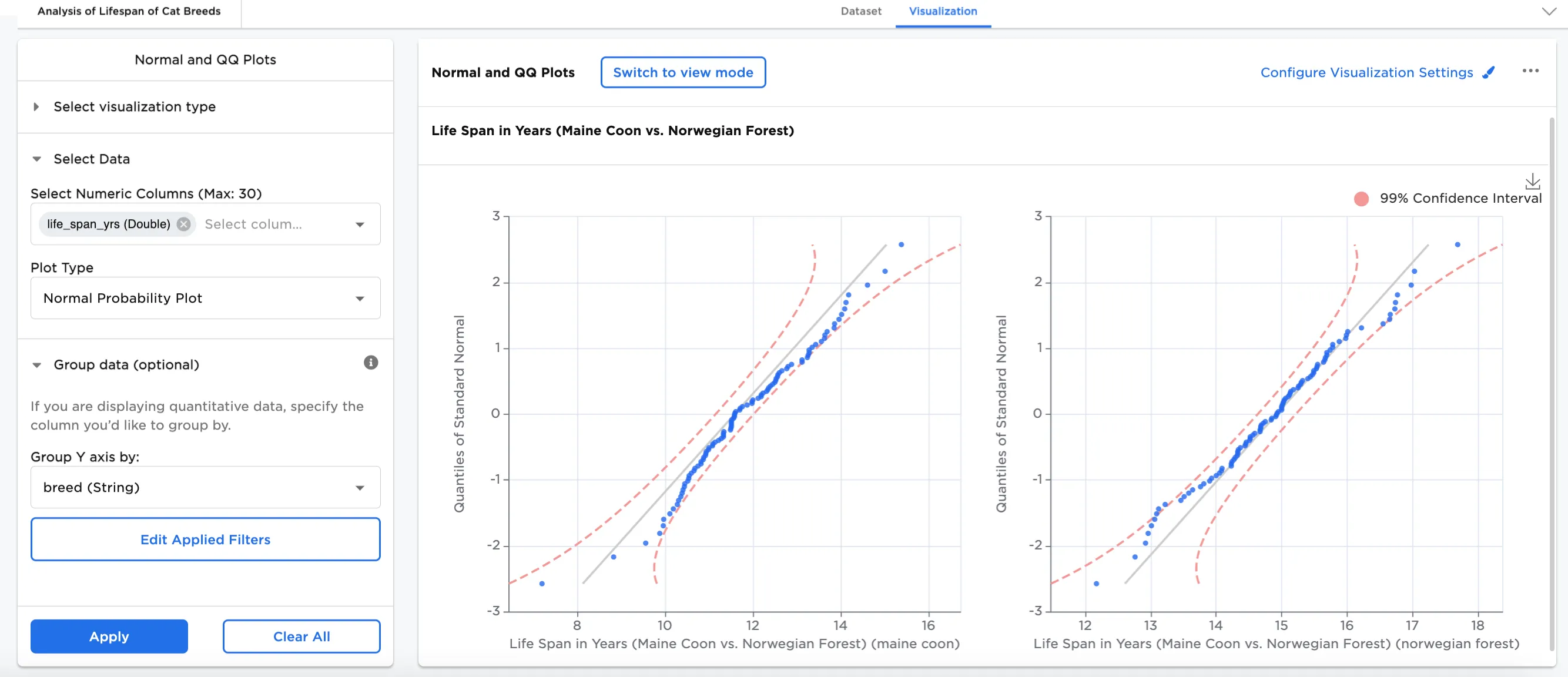
Figure 5a: Example normal plot filtered for Maine Coon and Norwegian Forest
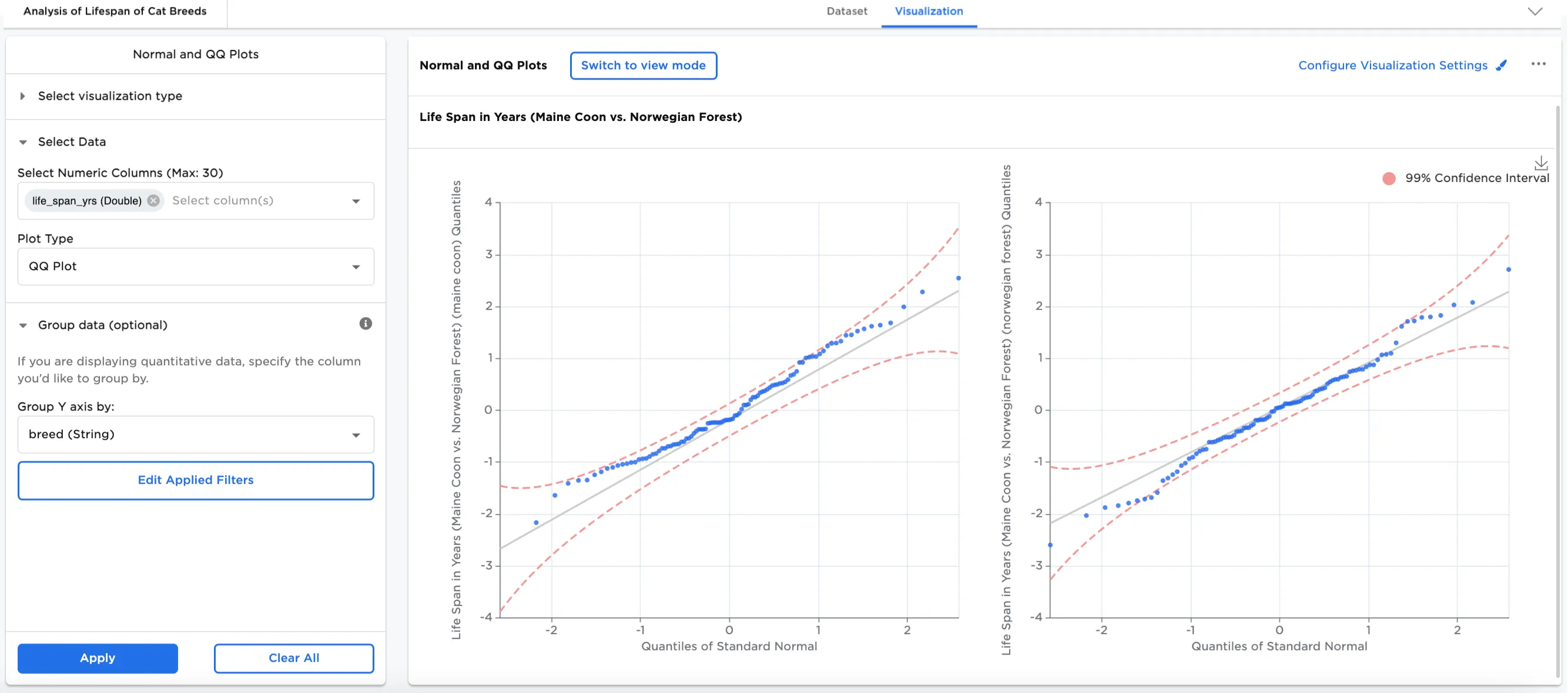
Figure 5b: Example qq plot filtered for Maine Coon and Norwegian Forest