Calendar Heat Map Visualization
Create one or more 12-month heat maps of your numerical data in Visual Notebooks.
Configuration
| Field | Description |
|---|---|
| Select visualization type | The type of graph or map used to depict your data Specify a graph or map from the following options: Line Chart, Pie/Donut Chart, Calendar Heat Map, Scatter Plot, Pair Plot, Correlation Matrix, and Autocorrelation Plot. |
| Select Numeric Columns (Max:30) | Columns of numeric data to perform calculation upon Select one or more columns of numeric data so that the function specified in the Aggregation field can be applied to them. |
| Select a Time Series Column | Column that determines the timestamp of numerical data represented in the map or graph Select a column that indicates the timestamp for each numerical data point used. |
| Frequency | Interval of the timestamps in the time series column Specify whether to use the timestamp data at the level of month, or the level of day. Note that even if timestamp data is provided down to the second, you can still specify a monthly frequency so that the data is rolled up to the monthly level. Day is the most detailed level the system provides for calendar heat map visualizations. |
| Aggregation | Function applied to data Choose one of the following functions to apply to the data specified in Select Numeric Columns (Max:30): average, minimum, maximum, sum, and count. |
| Group Y axis by | Column for further breaking out the data Optionally select a column to use for further breaking out the data. The data is broken out into individual heat maps for each value in the selected column. |
| Add Grouping Filter(s) | Column value for filtering the data If you provided a value for the Group Y axis by parameter, optionally choose one or more specific values for the column. This results in one heat map for each of the specified values. |
Visualization Settings
| Field | Description |
|---|---|
| Title | Title of the heatmap or graph Specify a title for the heat map or graph. |
| Color Theme | Color theme of the of the heat map Optionally choose a color theme for the heat map from the following options: Colorful (Default), Monochrome, and Grayscale. |
| Orientation | Orientation of the heat map Optionally choose whether the months of the heat map proceed left to right, or top to bottom. |
| Legend label | Explanation of the legend Optionally enter a description of what the heat map colors represent. |
| Legend size | Size of the legend Optionally choose from one of the following preset sizes for the legend: Regular, Large, or Small. |
| Legend position | Where the legend is located Optionally choose to place the legend at the top right, top left, bottom right, or bottom left of the heat map. |
Node Inputs/Outputs
| Input | A Visual Notebooks dataframe |
|---|---|
| Output | A calendar heat map in Visual Notebooks |
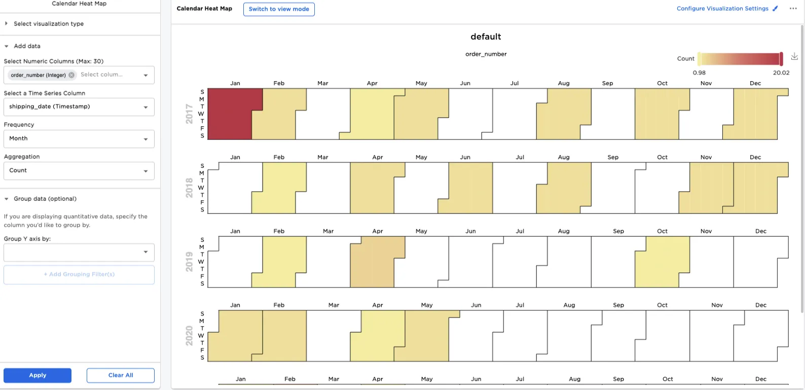
Figure 1: Example dataframe output
Examples
The image that follows shows the input data from a shipping node, which includes order numbers, payment methods, and shipping dates. The rows of data are sorted with the shipping dates in reverse chronological order.
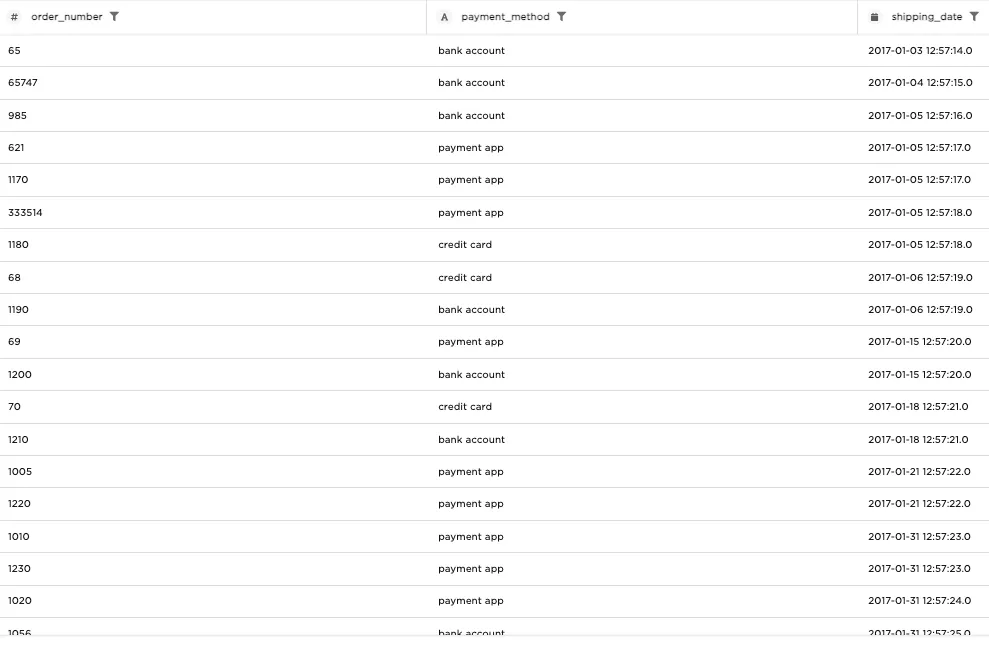
Figure 2: Example input data
A calendar heat map takes numerical data and indicates how it is distributed over time, based on color intensity. In our first example, we generate a heat map showing how many orders are placed each month, by doing the following:
- Connect an input node to the Calendar Heat Map node.
- For Select Numeric Columns (Max: 30), select "order_number".
- For Select a Time Series Column, select "shipping_date".
- For Frequency, select "Month".
- For Aggregation, select "Count".
- Select Apply.
Even though the timestamp data is given down to the minute, the data in the heat map is counted at the level of month. Additionally, the data indicates that of all the months in 2017 - 2020, January 2017 had the greatest number of orders.
Figure 3: Heat map showing monthly order count
Next, we take the heat map just generated, and modify it to show detail at the level of day. To create the heat map, do the following:
- For Frequency, select "Day".
- Select Apply.
Now we can see much greater detail about the distribution of orders in January 2017. The heat map shows that there were two days during January 2017 where five orders were placed. Hovering over one of those two red tiles indicates that January 31 was one of the heavy order days.
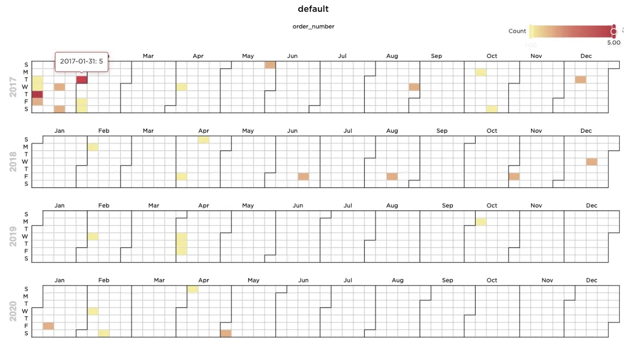
Figure 4: Heat map showing daily order count
The next example builds on the previous one by showing not just how many orders were placed in any given month, but how many were paid for by credit card, how many were paid for by bank account, and how many were paid for by payment app. To construct the heat map, do the following:
- For Group Y axis by, select "payment_method".
- Select Apply.
The original calendar heat map is now broken out into three heat maps -- one each for payments by credit card, bank account, and payment app. According to the new heat map, there were no credit card payments in 2019 or 2020, since those years are completely missing from the credit card heat map.
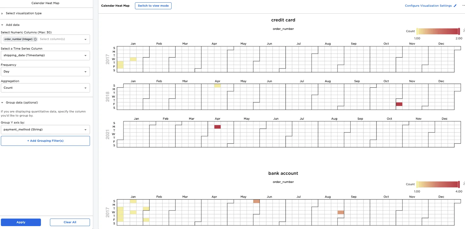
Figure 5: Three heat maps showing order count broken out by payment type
The previous example generated three heat maps, one for each payment type. To filter your result to show only a heat map for orders paid for by payment app, do the following:
- Select Add Grouping Filter(s).
- Clear all groups expect for "payment app".
- Select Apply Filters.
- Select Apply.
Only one heat map remains, and it shows that only one order was placed by payment app in February 2018, February 2019, and February 2020. Notice that each time, the order was placed toward the beginning of the month, which may mean that a particular customer placed yearly orders in early February.
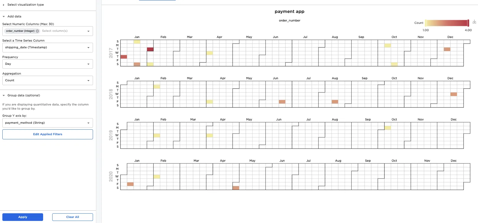
Figure 6: Filtered results showing only purchases made by payment apps
The previous example showed that for orders paid for by payment apps, a maximum of four orders were placed on any given day. To filter out days that only contain one order, move the left slider in the legend. After doing this, notice that in the new heat map, there are no orders in 2019. (This is consistent with the previous example, which showed a maximum of a single order being placed by payment apps on any given day in 2019.)
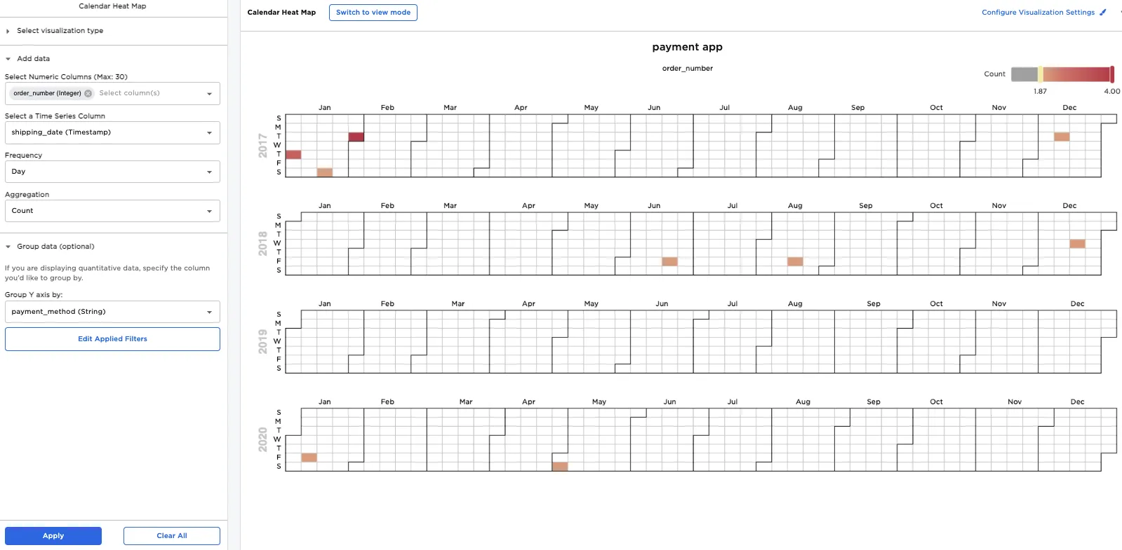
Figure 7: Heat map showing days where at least two payment app orders took place