Line Chart
Create a line chart in Visual Notebooks.
Configuration
| Field | Description |
|---|---|
Name default=Line Chart | A user-specified node name displayed in the workspace |
Select visualization type default=Line Chart | The type of visualization |
| Add data *Required | Data to plot Drag columns from the auto-populated sidebar onto the graph axes. You must drag data onto the x-axis and y-axis. Additional series and a second y-axis are optional. |
| Group Y axis by default=none | Y-axis grouping Select a column to group by from the auto-populated dropdown menu. This is useful if you have timeseries data. |
Add Grouping Filter(s) default=Select all | Groups to plot Select groups to plot in the line chart. Only the groups selected are shown on the chart. |
Visualization Settings
| Field | Description |
|---|---|
| Title default=none | Title of the visualization The title is centered at the top of the chart. |
Color Theme default=Colorful | Visualization color scheme Select colorful, monochrome, or grayscale. |
Line Style default=Solid | Line formatting Select solid or dashed. |
Line Markers default=None | Symbol on each point of the line Select dots, crosses, or none. |
Line Width default=2 px | Width of line Select 0.5 px, 1 px, 2 px, or 3 px. |
| Label default=none | Axis label Enter a label for the x-axis, y-axis, and secondary y-axis. |
Label appearance default=Regular | Label formatting Select regular, bold, or hide. |
Label font size default=Regular | Font size Select regular, large, or small. |
Order default=Ascending | X-axis order Select ascending or descending. |
Force Axis to Start at Zero default=Off | Y-axis range Force the y-axis to start at zero instead of the lowest point. |
Include Major Lines default=Off | Show grid lines Show grid lines from the y-axis. |
| Y-axis column labels default=name of the column | Label for columns in the legend Enter a label for columns shown on the y-axis. |
Legend size default=Regular | Size of the legend Select regular, large, or small. |
Legend position default=Top right | Position of the legend on the screen Select top right, top left, bottom right, or bottom left. |
Node Inputs/Outputs
| Input | A Visual Notebooks dataframe |
|---|---|
| Output | A line chart in Visual Notebooks |
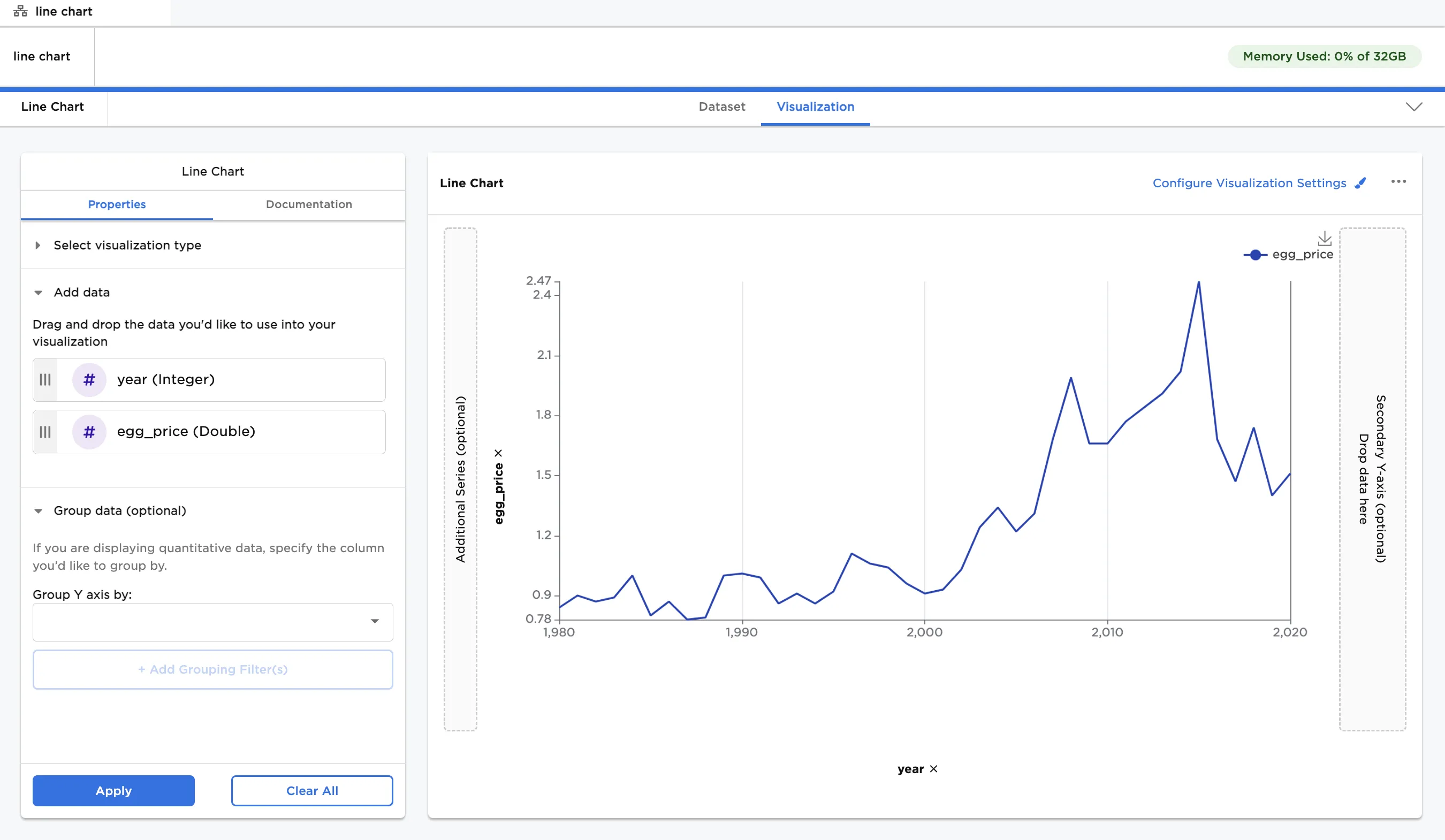
Figure 1: Example line chart
Examples
- Connect a Line Chart node to an existing node.
- Drag columns onto the x-axis and y-axis.
- Select "Run" to create a line chart with the default settings.
Figure 2: Example line chart with default settings
- The dataframe shown below is used in the remaining examples.
- The dataframe shows fictitious prices of eggs and milk in California, New York, and Texas from 1980 to 2020.
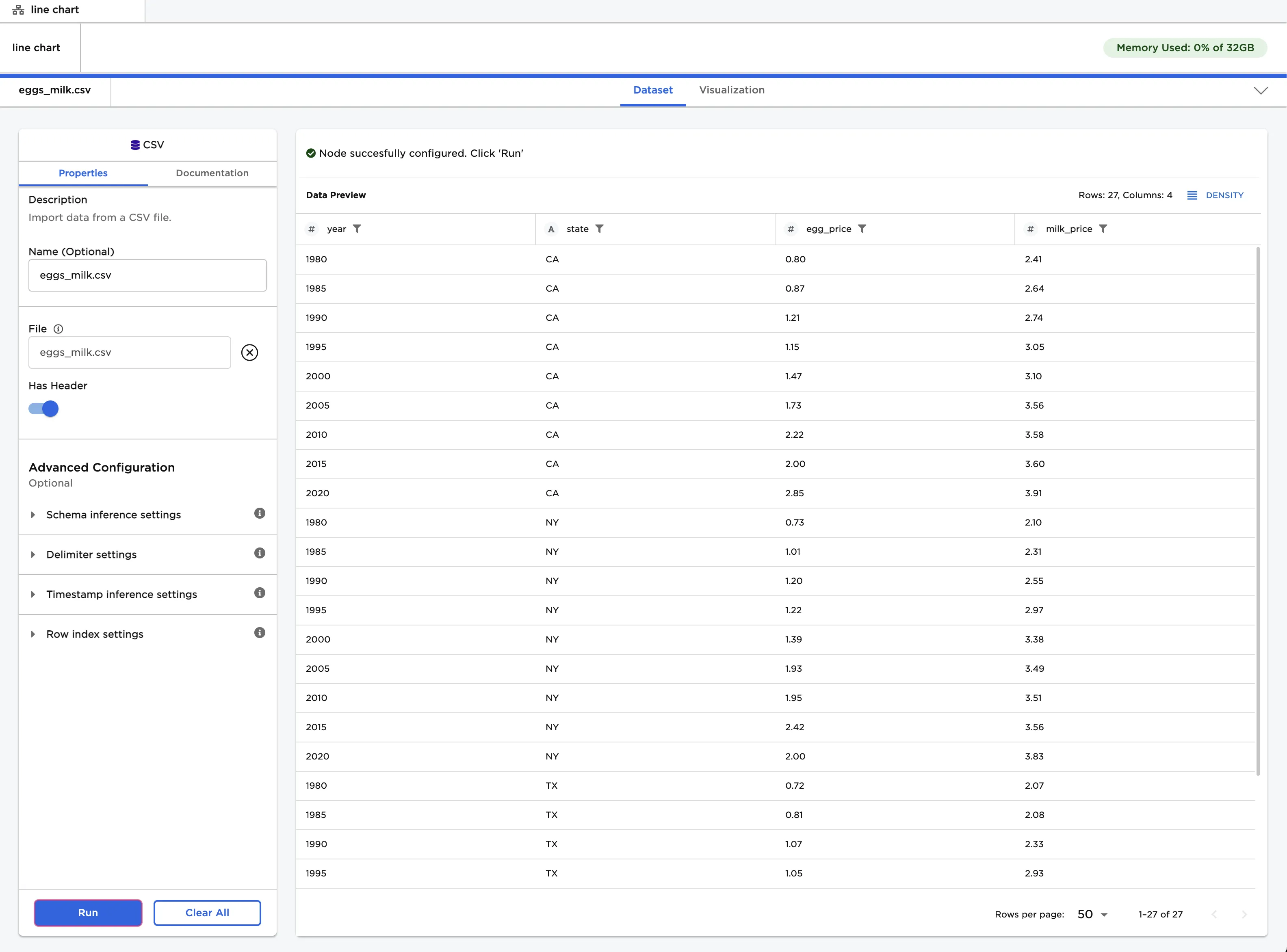
Figure 3: Example input data
- You can group prices by state when charting the data. Drag the "year" column onto the x-axis, and drag the "egg_price" and "milk_price" columns onto the y-axis and the additional series section.
- Select "state (String) from the auto-populated dropdown menu in the "Group Y axis by" field.
- Select "Run" to create a line chart.
- Notice that the resulting line chart has egg and milk prices over time grouped by state.
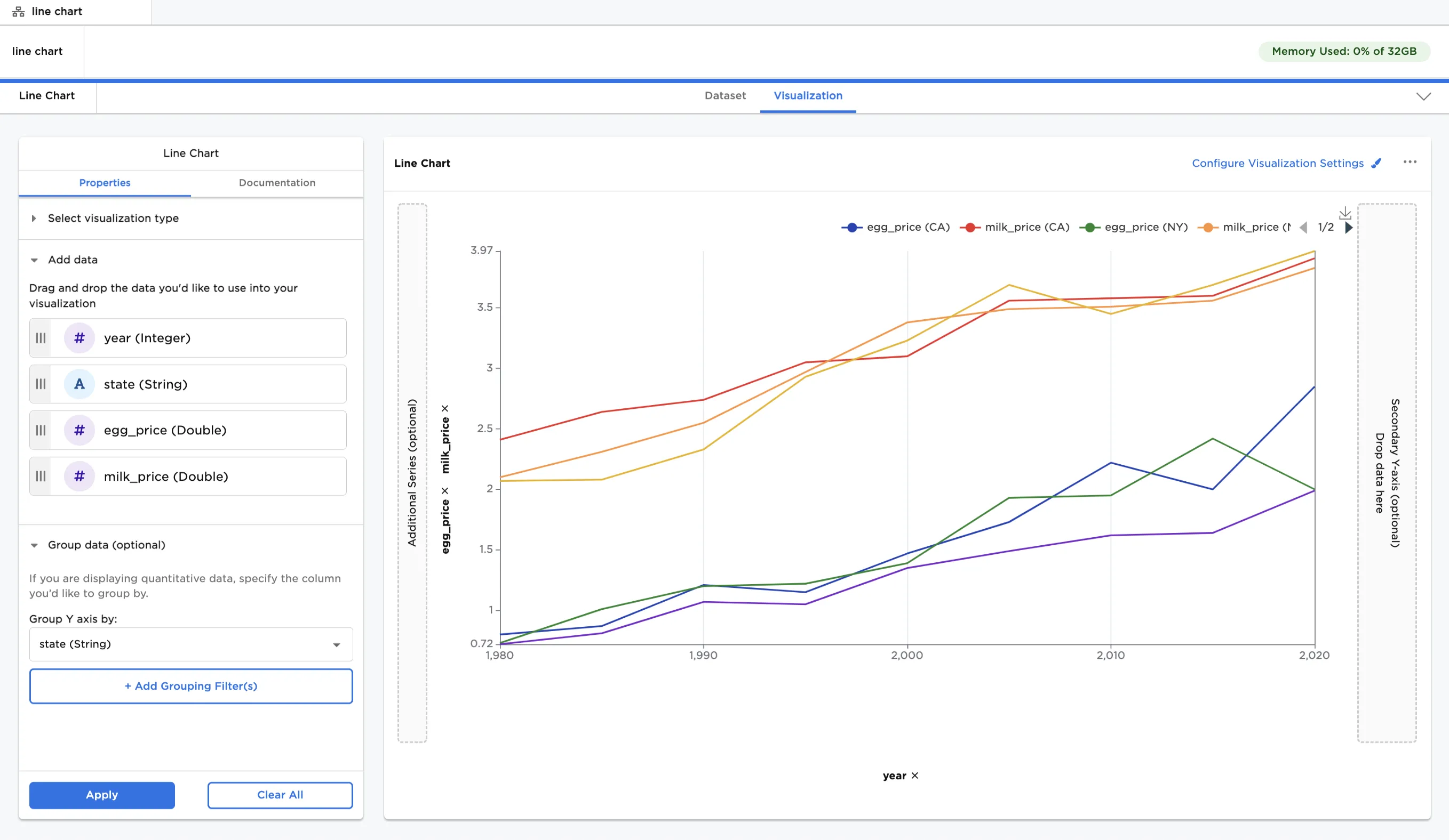
Figure 4: Example line chart with grouped data on the Y-axis
- Select all "egg_price" labels in the legend to temporarily remove them from the visualization.
- This makes it easier to examine only certain lines on the plot.
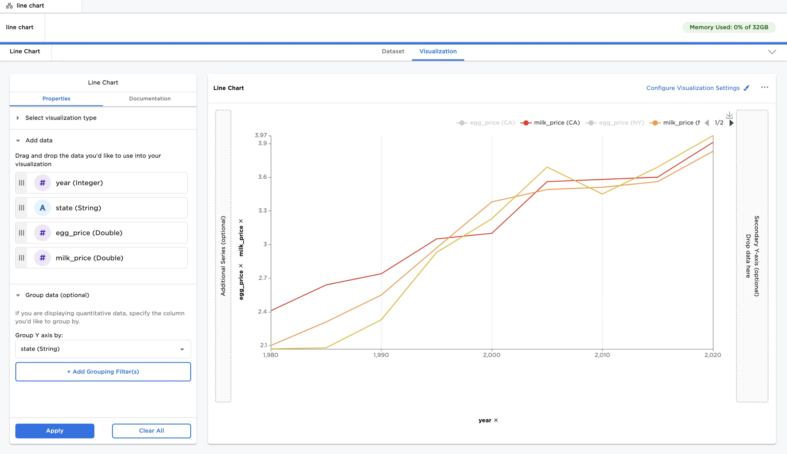
Figure 5: Example line chart with some data temporarily hidden
- Select "Configure Visualization Settings"
- Use these options to change the appearance of the plot.
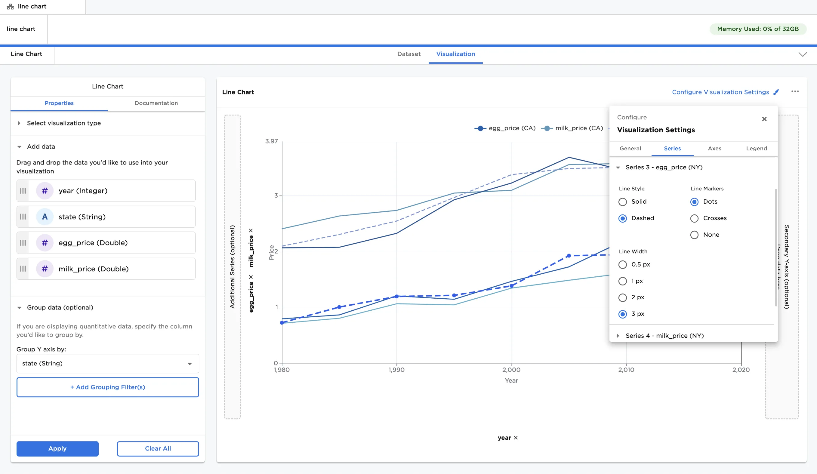
Figure 6: Example line chart with custom visualization settings