Pie/Donut Chart
| Parameter | Description |
|---|---|
Name default=Pie/Donut Chart | A user-specified node name displayed in the workspace |
Select visualization type default=Pie/Donut Chart | The type of visualization |
| Select Numeric Columns (Max: 30) Required | Data to visualize Select at least one numeric column from the auto-populated dropdown menu. Additional numeric columns are represented on additional pie charts. If all of the columns in the menu appear dimmed, use a "Columns - Type Converter" node to convert the desired column to a numeric data type. |
| Group Y axis by: default=none | Pie chart labels Select a column to group by from the auto-populated dropdown menu. The values in this field become the labels on the pie chart. |
Add Grouping Filter(s) default=Select all | Groups to chart Select groups to include in the pie chart. Only the groups selected are shown on the chart. |
| Aggregation default=none | Data aggregation method Select average, minimum, maximum, sum, or count. If you have multiple occurrences of the pie chart labels, this field determines how to display the duplicate data. |
| Chart Title label default=none | Title of the visualization The title is left-aligned at the top of the chart. You can enter additional titles for additional series. |
Color Theme default=Colorful | Visualization color scheme Select colorful, monochrome, or grayscale. |
Minimum Percentage default=0 | Data threshold Enter an integer between 0 and 100. Data that makes up less than the specified percentage of the dataset is collapsed into a category labeled "other". |
Styling default=Pie Chart | Chart appearance Select pie chart or donut chart. |
Change ordering default=Largest to smallest (clockwise) | Data order Select "largest to smallest (clockwise)" or "smallest to largest (anti-clockwise)". |
Label default=Off | Show labels on chart Toggle this switch on to show labels pointing to each section of the pie chart. |
Value default=Off | Show values on chart Toggle this switch on to show the value of each section of the pie chart. |
Percentage default=Off | Show percentages on chart Toggle the switch on to show the percentage of each section of the pie chart. |
Specify number precision default=2 | Rounding precision Enter a number between 0 and 100. This field determines how many decimal places to use when rounding. |
Show legend default=On | Legend Toggle this switch off to hide the legend. |
Legend size default=Regular | Size of the legend Select regular, large, or small. |
Legend position default=Top right | Position of the legend on the screen Select top right, top left, bottom right, or bottom left. |
| Input | A Visual Notebooks dataframe |
| Output | A pie or donut chart in Visual Notebooks |
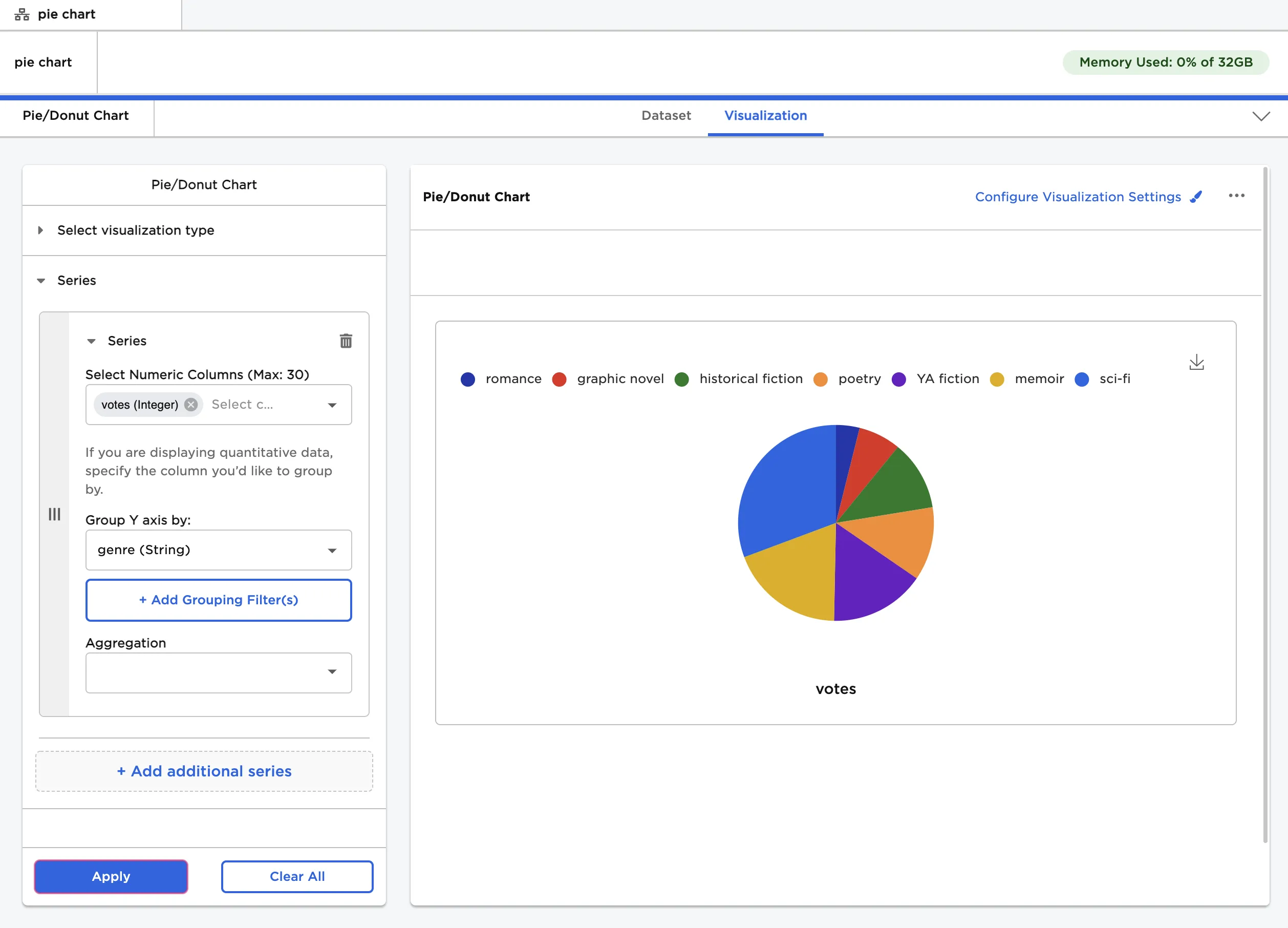
Figure 1: Example pie chart 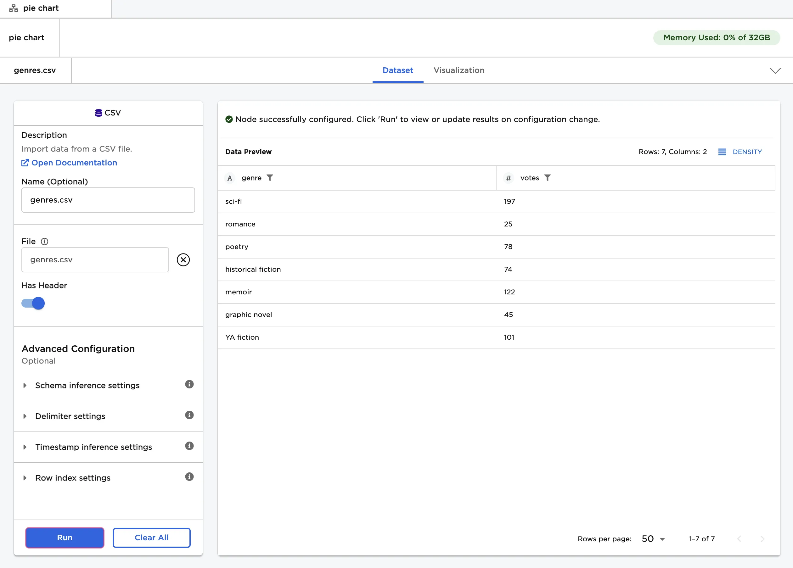
Figure 2: Example input data
Figure 3: Example pie chart with default settings 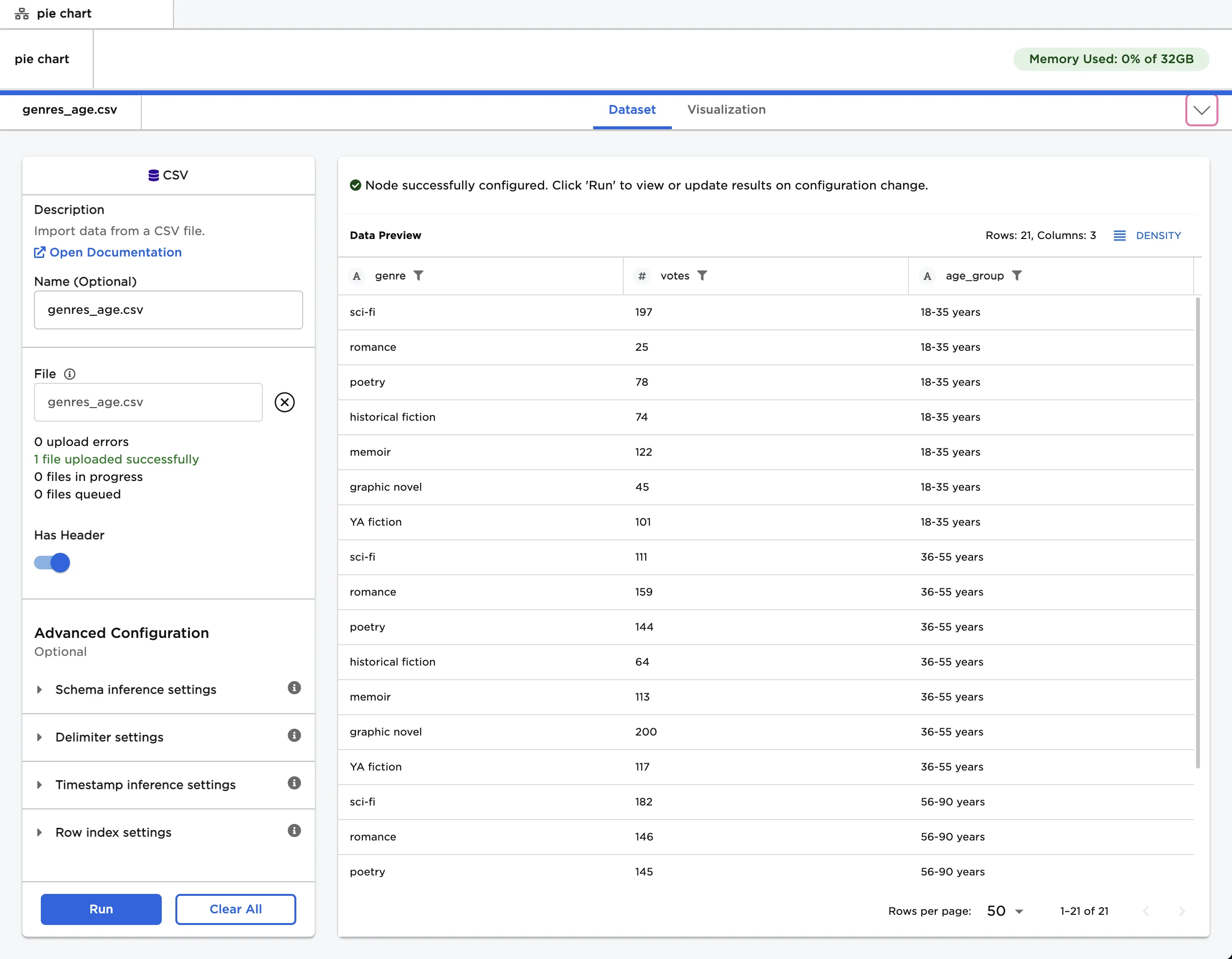
Figure 4: Example input data with an additional column 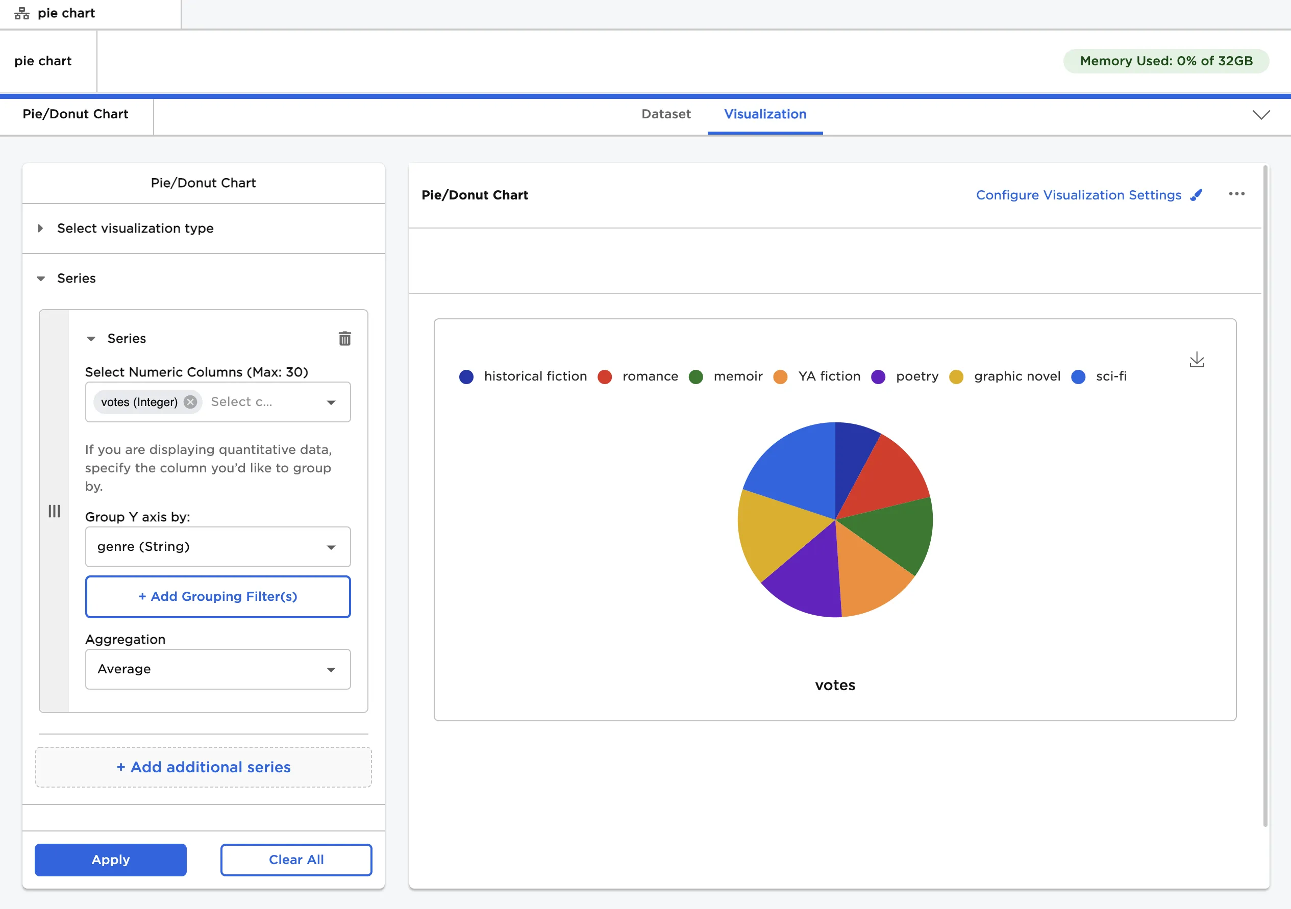
Figure 5: Example pie chart with the average number of votes for each genre 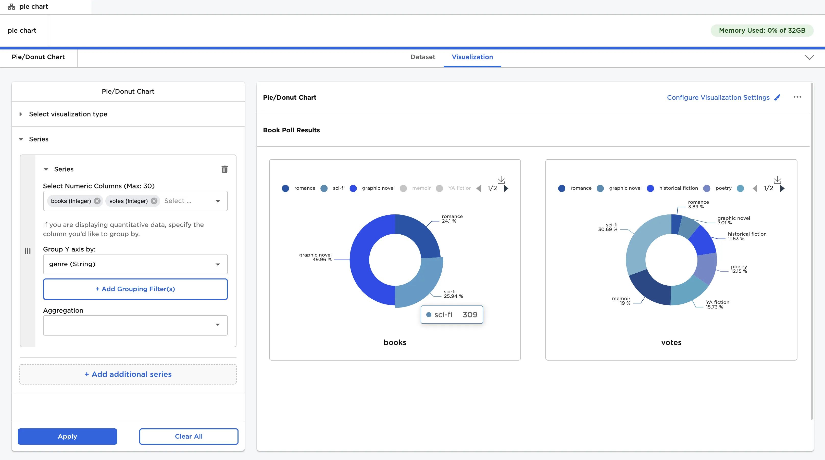
Figure 6: Example charts with custom visualization settings