Scatter Plot
Create a Scatter Plot in Visual Notebooks. Scatter plots show the values of two variables along two axes; the pattern of the resulting points reveals any correlation present.
Configuration
| Field | Description |
|---|---|
| Name | Field to name the chart An optional user-specified node name displayed in the workspace, both on the node and in the tab. |
| Select visualization type | Chart type selection An option to select a different chart type. |
| Add data | List of columns A list of available dataset columns that can be used in the chart. |
| Fields(s): | x-axis and y-axis selections Select which fields to use for the x-axis and which to select for the y-axis. |
| Group Data | Optional chart design Make optional selections for the chart display. |
| Group Y-axis by | Select grouping An optional grouping for the y-axis. This field overlays the y-axis data over the x-axis data and creates a legend. |
| Add Grouping Filter(s) | Filter groups Clear groups to remove them from the plot. Only the groups selected are shown on the chart. |
| Bubble Size | Change bubble size An optional selection to double the bubble size for a grouping. |
| Outlier Detection | Detect outlier data An optional toggle to enable outlier detection on the y-axis. |
Visualization Settings
General
| Field | Description |
|---|---|
| Title | Title for the chart An optional title for the chart can be added that appears at the top of the chart. |
| Color Theme | Visualization color scheme Select colorful, monochrome, or grayscale. |
| Line of Best Fit | Trendline Toggle a trendline on or off. |
| X-Axis Grid Lines | Major and Minor gridlines Toggle on/off to show major gridlines, minor gridlines, or both. |
| Y-Axis Grid Lines | Major and Minor gridlines Toggle on/off to show major gridlines, minor gridlines, or both. |
| Max Points per Series | Limit the maximum points in the series A slider bar to show from 250 to 1000 points per series. Higher points per series increases accuracy, and fewer points per series help to identify general similarities and differences. |
Bubble
| Field | Description |
|---|---|
| Smallest Bubble Size | Adjust bubble size Select a different bubble size for readability. |
| Bubble Size Definition | Define the bubble size Select radius or area to define the size of the bubble. |
| Bubble Transparency | Select bubble transparency Select "Opaque" or "Define Opacity" by selecting 25%, 50% or 75%. |
| Bubble Outline | Add a bubble outline Add and define a bubble outline by increasing the stroke from 1 to 4. |
Axes
| Field | Description |
|---|---|
| Y-Axis Label | Adjust y-axis labels Add a different label to the y-axis. |
| Y-Axis Label Appearance | Adjust y-axis label appearance Change label appearance (Regular, Bold, Hide). |
| Y-Axis Label Font Size | Adjust y-axis label font size Change font size (Regular, Large, Small). |
| Y-Axis Label Grid Lines | Adjust y-axis grid lines Toggle to include major gridlines. |
| X-Axis Label | Adjust x-axis labels Add a different label to the x-axis. |
| X-Axis Label Appearance | Adjust x-axis label appearance Change label appearance (Regular, Bold, Hide). |
| X-Axis Label Font Size | Adjust x-axis label font size Change the font size (Regular, Large, Small). |
| X-Axis Order | x-axis order Change the order from ascending to descending. |
| X-Axis Label Grid Lines | Adjust x-axis grid lines Toggle to include major gridlines. |
Legend
| Field | Description |
|---|---|
| Legend Custom Label | Legend custom labels Add custom labels for the Group Y-Axis by option. |
| Legend Size | Legend size Adjust legend size (Regular, Large, Small). |
| Legend Position | Legend position Change legend position (top right, top left, bottom right, bottom left). |
Node Inputs/Outputs
| Input | A Visual Notebooks dataframe |
|---|---|
| Output | A scatter plot in Visual Notebooks |
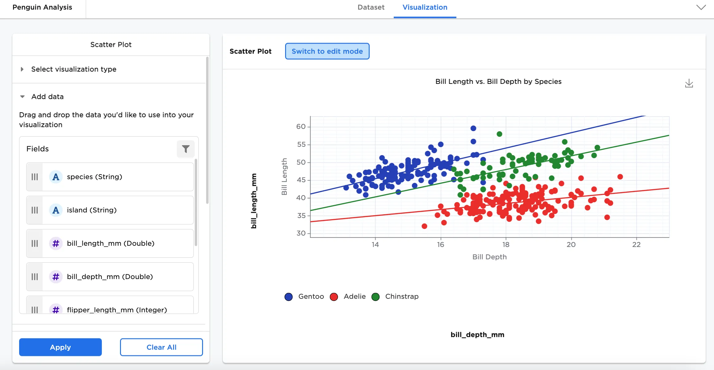
Figure 1: Example scatter plot
Examples
Many scientists research penguins for various studies ranging from behavior and predator threats to genetics (their relationship with other species) and migratory patterns. To protect and conserve species is only one reason they are researched so often.
The below examples show a scatter plots to see the relationship between different variables in different species of penguins.
- Connect an existing node to the Scatter Plot node.
- (optional) If you would like to differentiate this node, enter a name in the Name field. In this case, "Penguin Analysis" has been entered. This name appears in the node and as a tab in the dataset.
- Double click the Scatter Plot node. If the Visualization is blank, switch to Dataset and select Run, then switch back to Visualization.
- Select a field for the x-axis. In this case, "bill_depth_mm" is dragged to the x-axis field.
- Select a field for the Y-Axis. In this case, "bill_length_mm" is dragged to the Y-Axis field.
- Select Apply.
The dataframe in Figure 2 plots the length and depth of penguin bills.
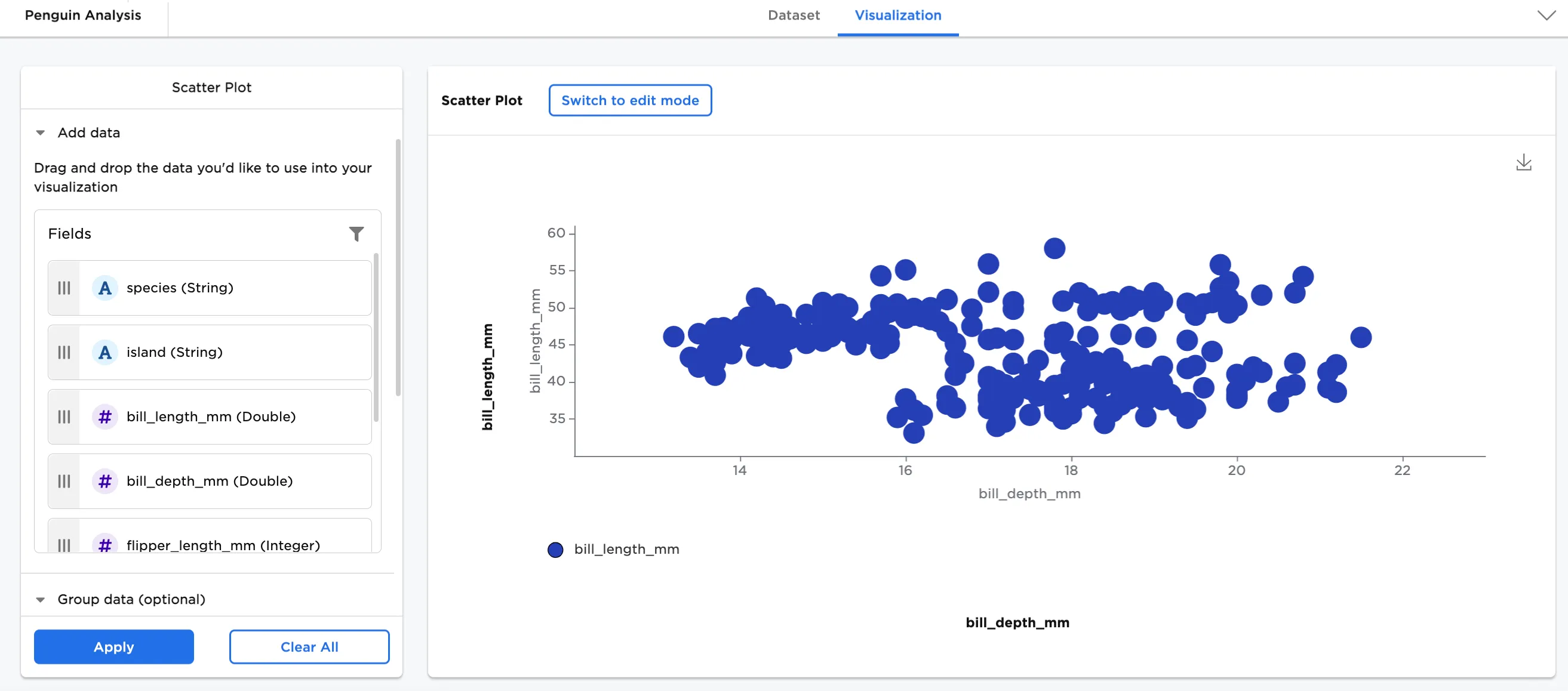
Figure 2: Example basic scatter plot
Optionally, Group Y-Axis by information can be added. In this case, species (String) has been added.
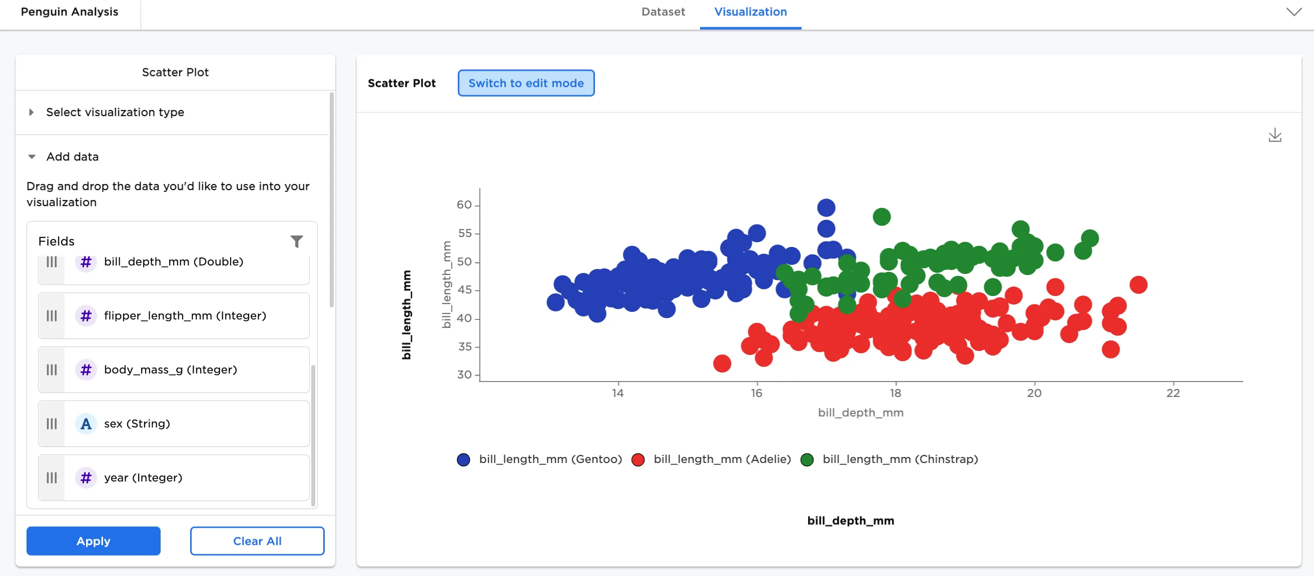
Figure 3: Example scatter plot grouped by y-axis
In Configure Visualization Settings, adjust your settings. In this case, the defaults were changed to these selections:
- title: "Bill Length vs. Bill Depth by Species"
- Line of Best Fit is toggled on
- minor and major x-axis gridlines toggled on
- minor and major y-axis gridlines toggled on
- bubble size: small
- legend labels:
- bill_length_mm (Gentoo) is changed to "Gentoo"
- bill_length_mm (Adelie) is changed to "Adelie"
- bill_length_mm (Chinstrap) is changed to "Chinstrap"
The dataframe in Figure 4 shows the same chart by species with the new configurations.
Figure 4: Example configured scatter plot