Pair Plot
Create a Pair Plot in Visual Notebooks. A Pair Plot is a matrix of scatter plots that lets you see the relationship between different variables in a dataset.
Configuration
| Field | Description |
|---|---|
| Name default=none | Field to name the chart An optional user-specified node name displayed in the workspace, both on the node and in the tab. |
Select visualization type default=Pair Plot | Chart type selection An option to select a different chart type. |
| Add data Required | List of columns A list of available numeric columns in the dataset that can be used in the chart. |
| Group Data default=none | Optional chart design Make optional selections for the chart display. |
| Group Y-axis by default=none | Select grouping Group Y-axis by is the available option in Pair Plot. Available strings are in the Group Y-axis by dropdown. This field overlays the y-axis data over the x-axis data and creates a legend. |
Add Grouping Filter(s) default=Select all | Filter groups Clear groups to remove them from the plot. Only the groups selected are shown on the chart. |
Advanced Configuration default=Impute with mean | Missing value treatment An optional selection for treatment of missing values. Options include Impute with mean (add the mean in place of missing values) or Drop rows with missing values in any of the selected columns. |
Visualization Settings
General
| Field | Description |
|---|---|
| Title default=none | Title for the chart An optional title for the chart can be added that appears at the top of the chart. |
Color Theme default=Colorful | Visualization color scheme Select Colorful, Monochrome, or Grayscale. |
Include Top Diagonal default=on | Include the top diagonal chart Toggle the addition of the top right chart on or off. |
Legend
| Field | Description |
|---|---|
Legend labels default=y-axis labels | Legend labels Add custom labels for the Group Y-Axis by option selection. |
Legend size default=Regular | Legend size Adjust label size (Regular, Large, Small). |
Legend position default=top right | Legend position Change legend position (Top right, Top left, Bottom right, Bottom left). |
Node Inputs/Outputs
| Input | A Visual Notebooks dataframe |
|---|---|
| Output | A Pair Plot in Visual Notebooks |
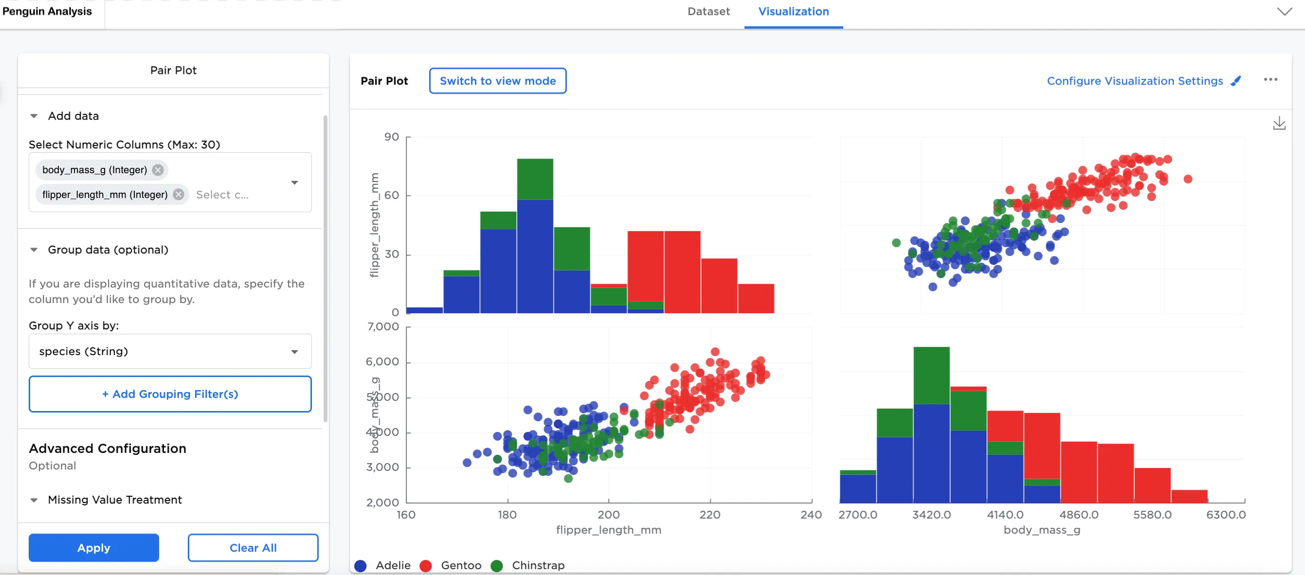
Figure 1: Example pair plot
Examples
Many scientists research penguins for various studies ranging from behavior and predator threats to genetics (their relationship with other species) and migratory patterns. To protect and conserve species is only one reason they are researched so often.
The below examples show a matrix of scatter plots to see the relationship between different variables in different species of penguins.
- Connect an existing node to the Pair Plot node.
- (optional) If you would like to differentiate this node, enter a name in the Name field. In this case, "Penguin Analysis" has been entered. This name appears in the node and as a tab in the dataset.
- Double-click the Pair Plot node. If the Visualization is blank, switch to Dataset and select Run, then switch back to Visualization.
- Under Add data, Select Numeric Columns. In this case, body_mass_g (Integer) and flipper_length_mm (Integer) are selected.
- Select Apply.
The dataframe in Figure 2 is used in this example. It illustrates the scatter plot against the histogram by penguin flipper length by body mass, and then the histogram and scatter plot against body mass by flipper length. This view shows the overlap of the distribution of these values.
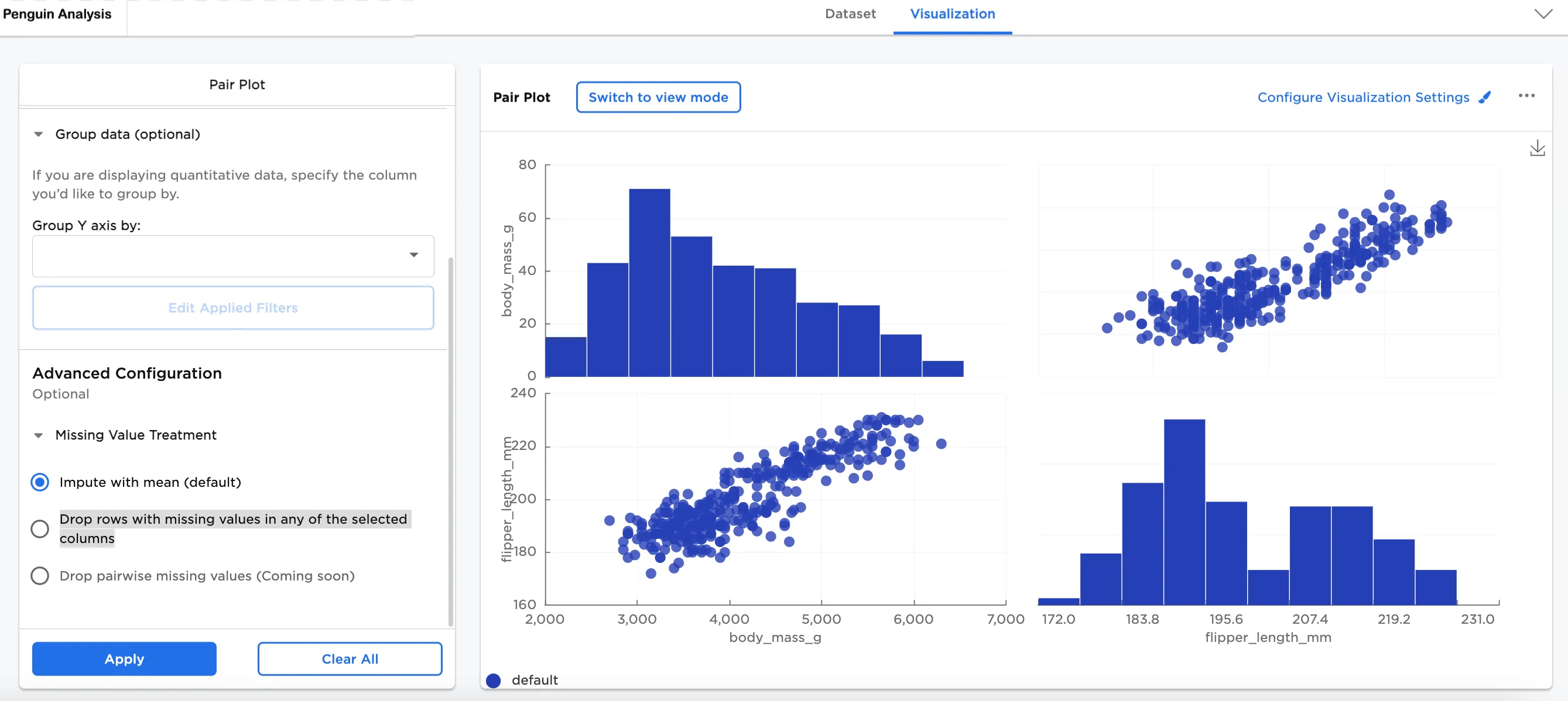
Figure 2: Example basic pair plot
Optionally, Group Y-Axis by information can be added. In this case, species (String) has been added. This view lets us see the breakdown by species within the plots.
In Configure Visualization Settings, adjust your settings. In this case, the defaults were changed to these selections:
- Legend labels:
- Gentoo label is changed to "Gentoo"
- Adelie label is changed to "Adelie"
- Chinstrap label is changed to "Chinstrap"
Figure 3a shows the breakdown by species within the histogram.
Figure 3a: Example pair plot grouped by y-axis (species)
In this example, island (String) has been added as the Group Y-Axis by field instead. Notice that there are some differences in the distribution of the data by species, but there isn't much difference in the spread.
In Configure Visualization Settings, adjust your settings. In this case, the defaults were changed to these selections:
- Legend labels:
- Torgerson label is changed to "Torgerson"
- Biscoe label is changed to "Biscoe"
- Dream label is changed to "Dream"
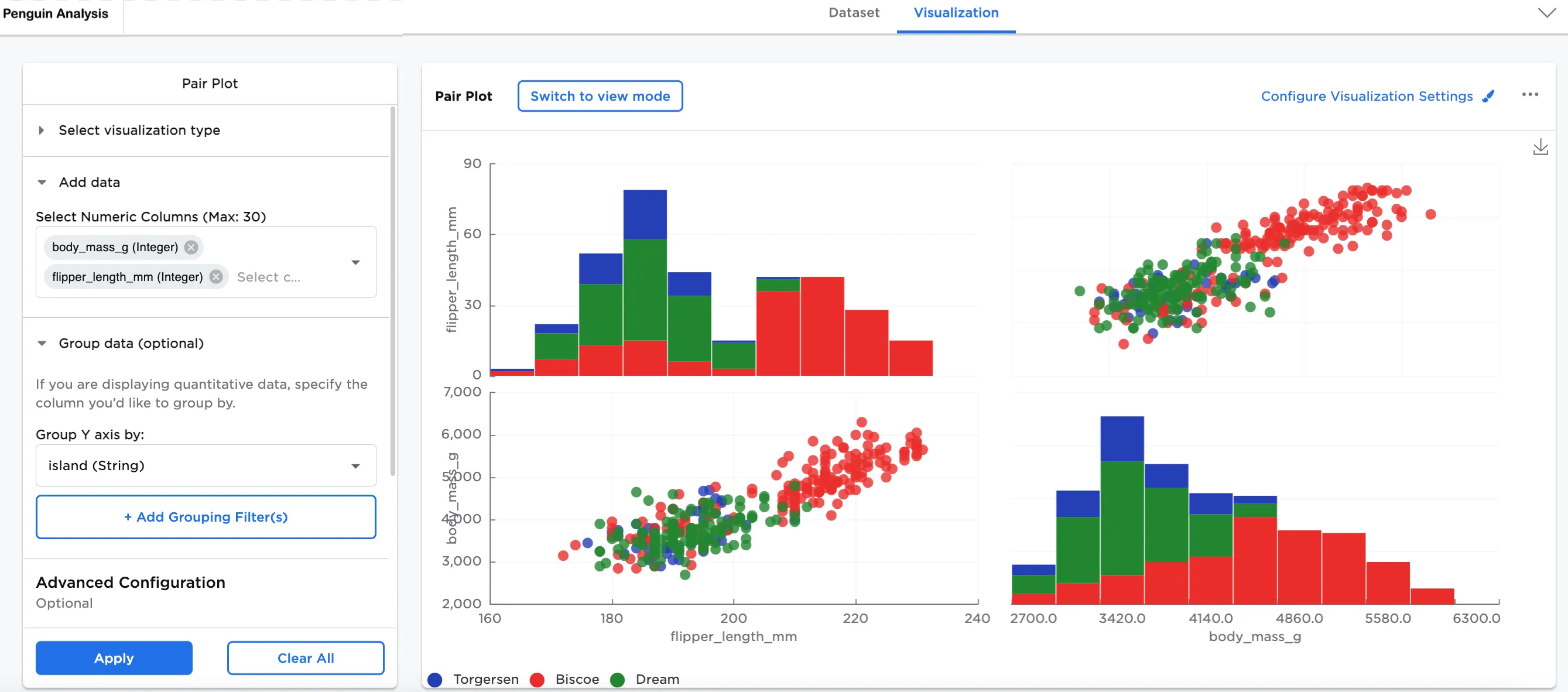
Figure 3b: Example pair plot grouped by y-axis (island)
Another option is Add Grouping Filter to the Group Y-axis by data. Filtering allows you to find patterns that might be relevant for your data. The dataframe in Figure 4a-4c shows the same plots by island with a filter added to Add Grouping Filter.
Figure 4a shows the plots filtered by Biscoe island vs. Dream island only. Here, we see that penguins on Biscoe island have both longer flippers and higher body mass.
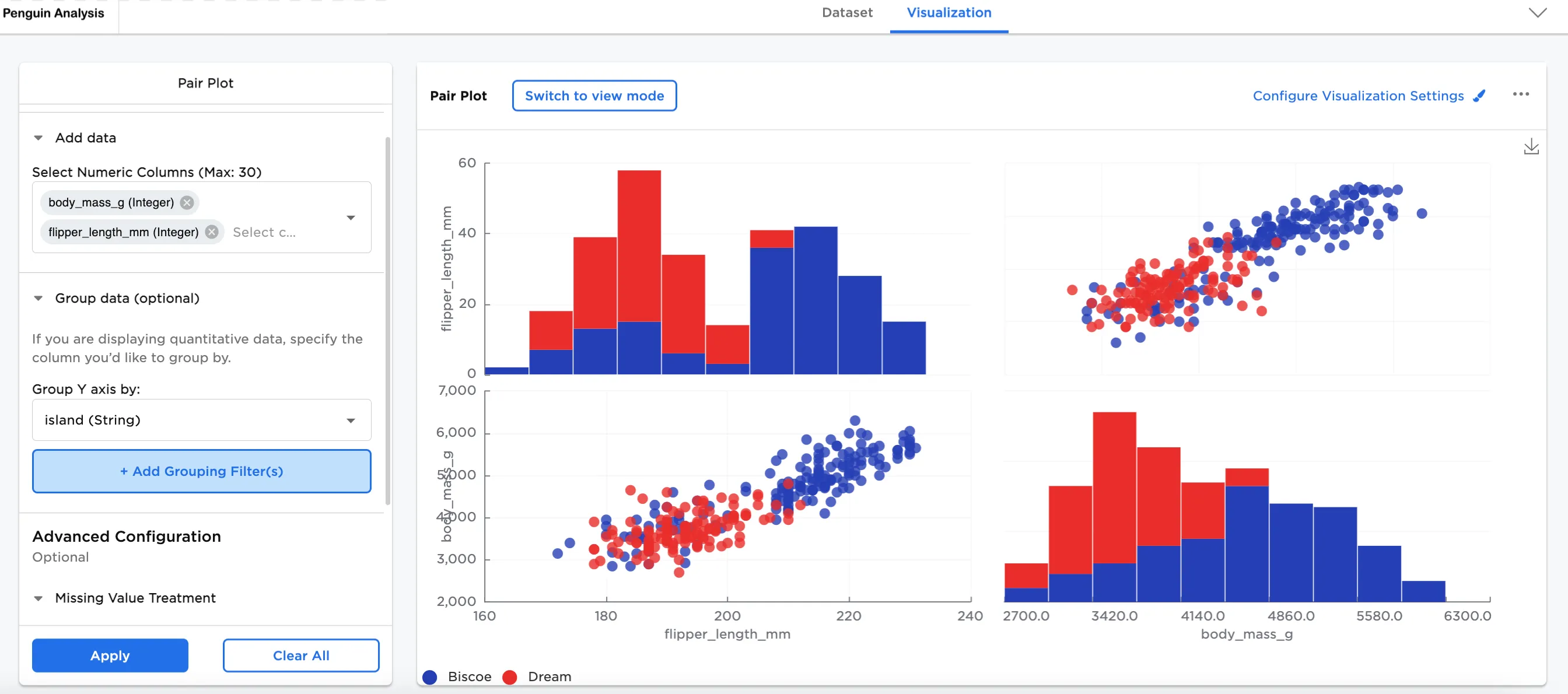
Figure 4a: Example island filtered by Biscoe and Dream
Figure 4b shows the plots filtered by Torgerson island vs. Biscoe island only. In this case also, Biscoe island penguins have longer flippers and higher body mass than those on Torgerson island.
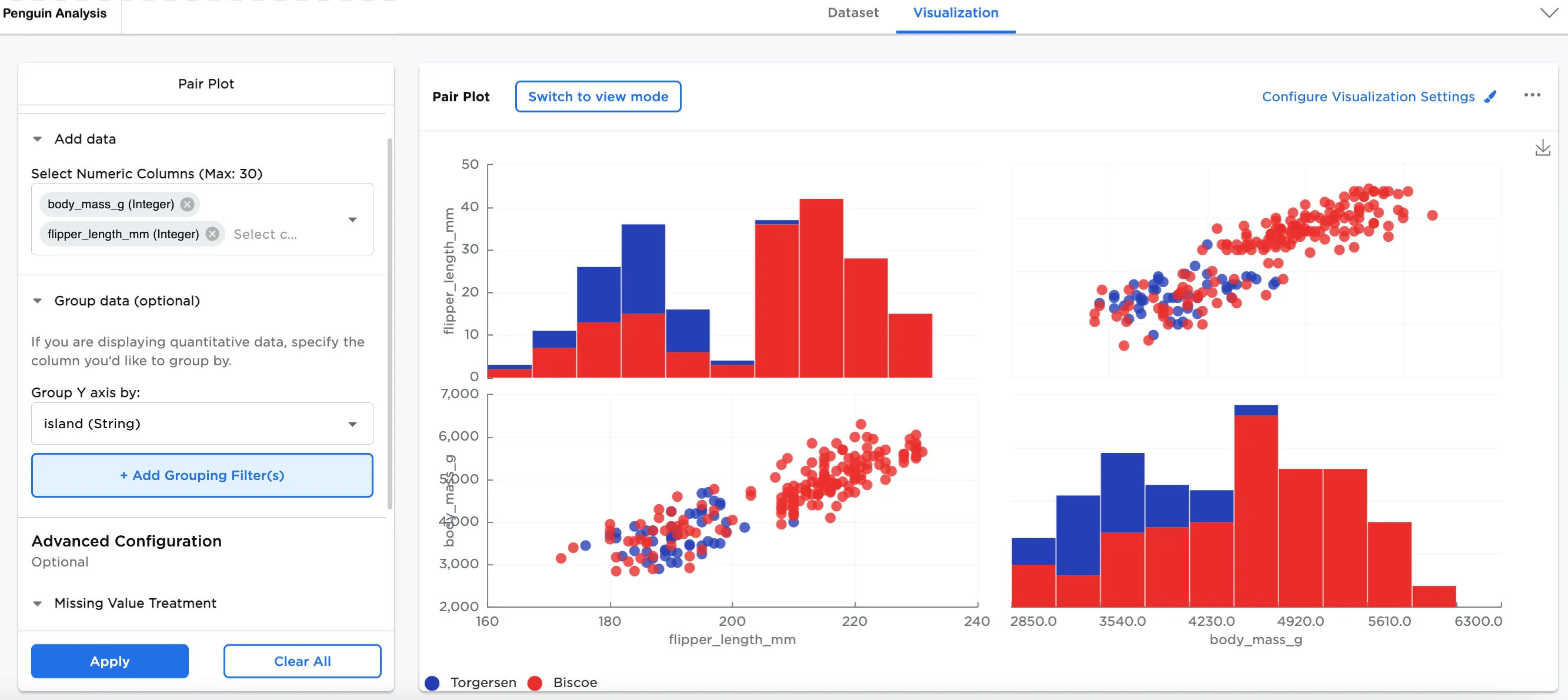
Figure 4b: Example island filtered by Torgerson and Biscoe
Figure 4c shows the plots filtered by Torgerson island vs. Dream island only. In this plot, we see that the penguins on both islands are more similar in flipper length and body mass.
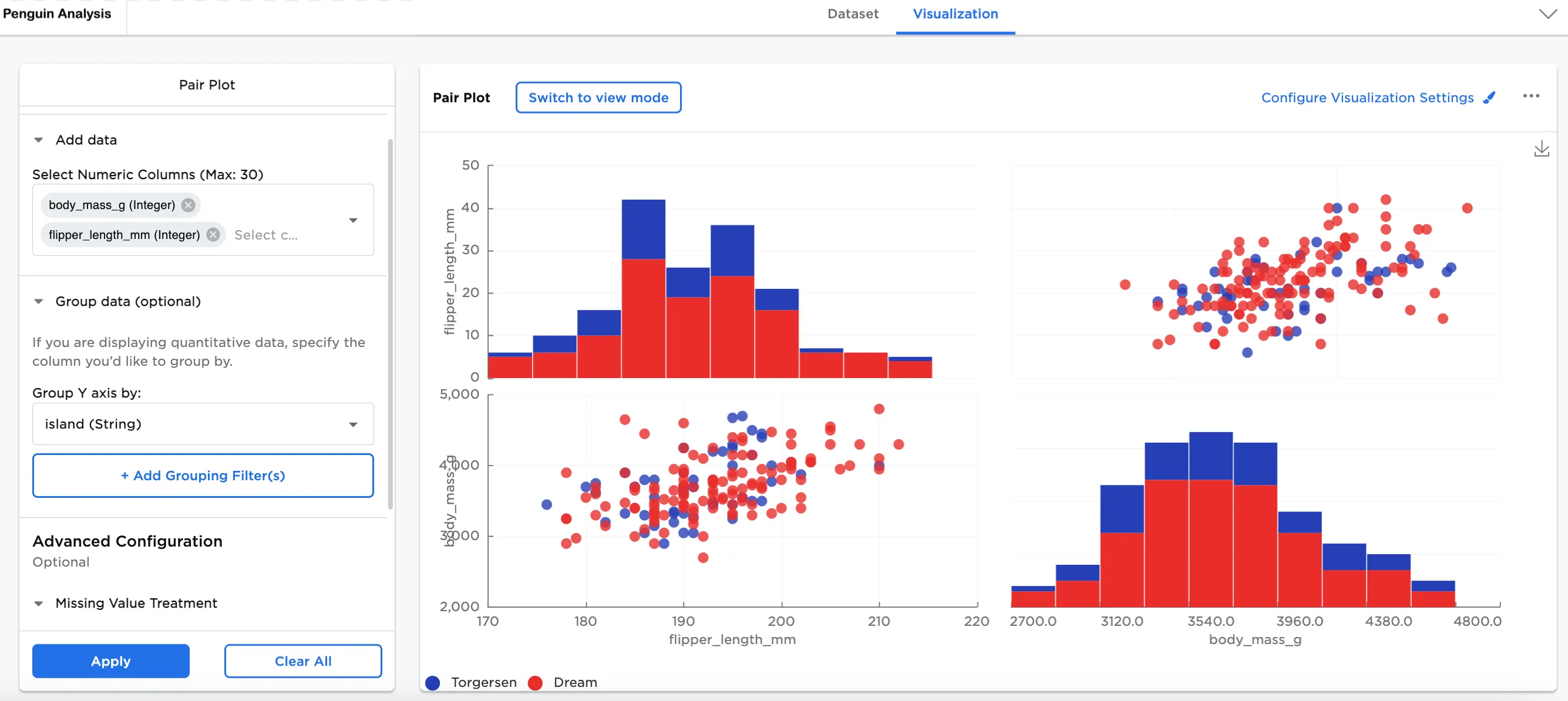
Figure 4c: Example island filtered by Torgerson and Dream