Correlation Matrix
Create a correlation matrix in Visual Notebooks.
Configuration
| Field | Description |
|---|---|
Name (default=Correlation Matrix) | A user-specified node name displayed in the workspace |
Select visualization type (default=Correlation Matrix) | The type of visualization |
Add data (default=Select All Numeric Columns) | Data to visualize: Select all numeric columns or select columns manually. |
| Select column(s): (default=none) | Columns to include in the visualization |
If "Select columns manually" is selected in the field above, select columns from the auto-populated dropdown menu. If all of the column in the dropdown menu appear dimmed, use a "Columns - Type Converter" node to convert the desired columns to a numeric data type. |
Visualization Settings
| Field | Description |
|---|---|
| Title (default=none) | Title of the visualization: The title is centered at the top of the chart. |
Color Theme (default=Colorful) | Visualization color scheme: Select colorful, monochrome, or grayscale. |
Include Top Diagonal (default=On) | Top half of the matrix: Toggle this switch off to only show the bottom half of the correlation matrix. |
Show Correlation (r) Values (default=On) | Correlation values: Leave the toggle switch on to show correlation values on the matrix. These values can be between -1 and 1. A value close to 1 indicates that two features are correlated, while a value close to 0 indicates that two features are not correlated. A value close to -1 indicates that two features are inversely correlated. |
Show Probability (p) Values (default=Off) | Probability values: Toggle this switch on to show probability values on the matrix. These values can be between 0 and 1. A value close to 1 indicates that the perceived correlation between two features is likely coincidental and due to random noise in the data. A value close to 0 indicates that the correlation is legitimate and likely not caused by randomness in the data. |
Legend size (default=Regular) | Size of the legend: Select regular, large, or small. |
Node Inputs/Outputs
| Input | A Visual Notebooks dataframe |
|---|---|
| Output | A correlation matrix in Visual Notebooks |
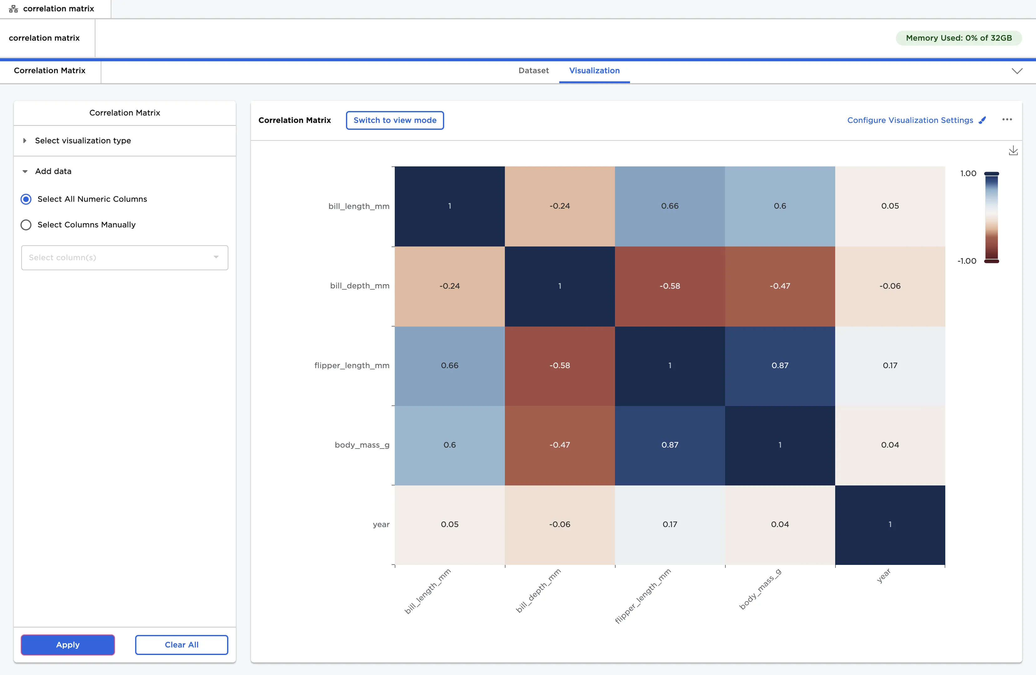
Figure 1: Example correlation matrix
Examples
- Connect a Correlation Matrix node to an existing node.
- The dataframe shown below is used in this example. It contains identifying characteristics of three species of penguins, and a column with the year the penguin was studied.
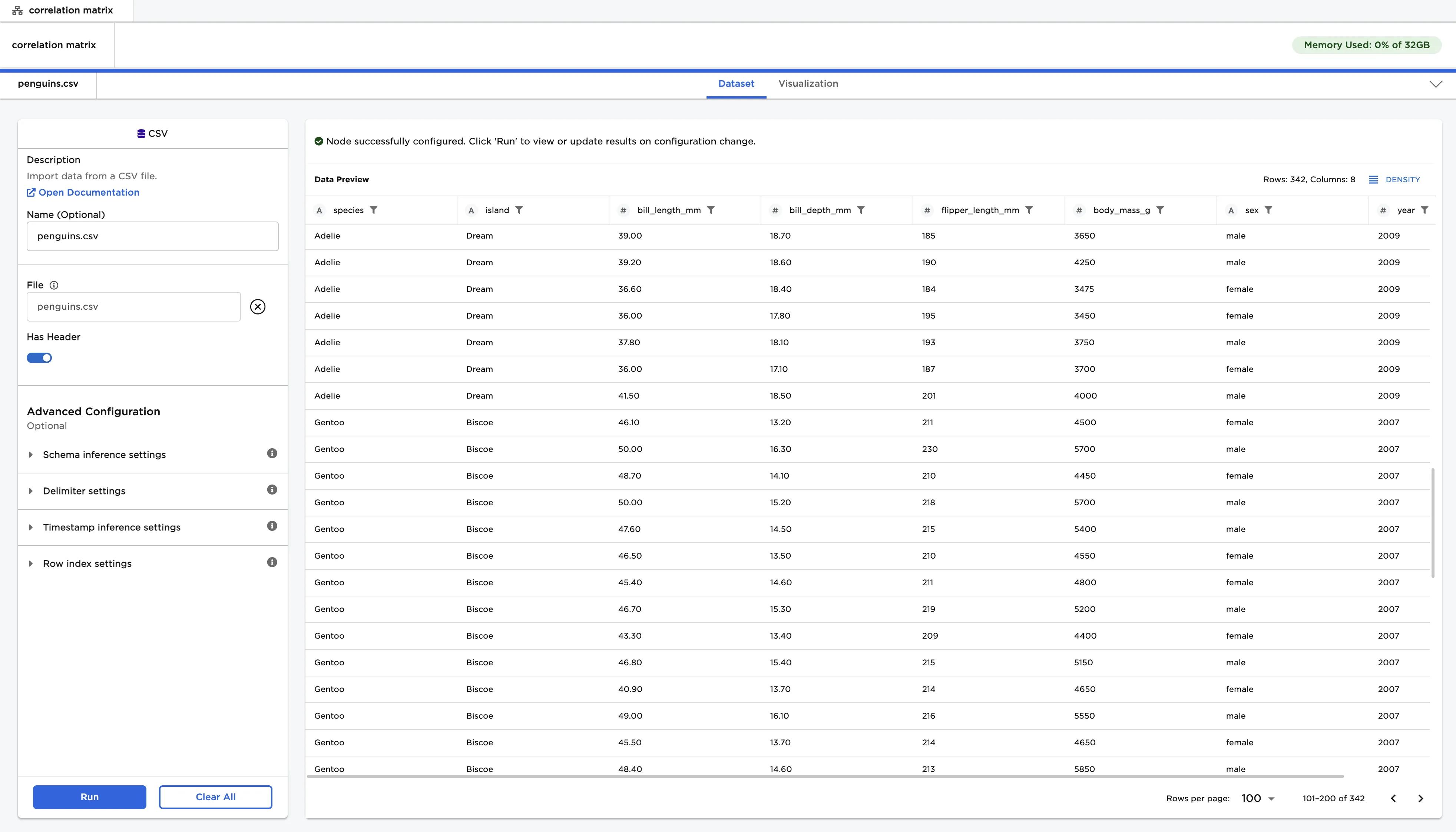
Figure 2: Example input data
- Select "Apply" to create a correlation matrix with the default settings.
- Reading a correlation matrix is similar to reading a bingo board. Find the label for one feature along the vertical side, and find a label for a different feature along the horizontal side. Follow the lines for both features until you find the square where they intersect. By default, squares are labeled with correlation values.
- A correlation value close to 1 indicates that the two features are highly correlated. If you were to chart both features, the charts would have a similiar shape. A value close to 0 indicates that the two features are not correlated. A value close to -1 indicates that the values are inversely correlated. If you were to chart both features, the charts would look like mirror images of each other.
- Notice that there is a diagonal line of
1values going from the top left corner to the bottom right corner. At each of these squares, a feature intersects with itself. - Also note that the graph is symmetrical along the diagonal row of 1s. The top right corner of the graph is the same as the bottom left corner.
- From this correlation matrix, you can see that flipper length and body mass are highly correlated. The rest of the columns are somewhat correlated, except for the "year" column. This makes sense, as the year column is not at all related to the physical characteristics of the penguins.
Figure 3: Example correlation matrix with default settings
- Select "Configure Visualization Settings".
- Toggle the "Include Top Diagonal" switch off to only show the bottom half of the correlation matrix.
- Since the matrix is symmetrical along the diagonal line of 1s, you can view only half of the matrix without losing any information.
- Toggle the "Show Probability (p) Values" switch on.
- The probability value shows whether the correlation is valid or coincidental. A value close to 1 indicates there is a high chance that the perceived correlation is just random, while a value close to 0 indicates there is a low chance that the correlation is random.
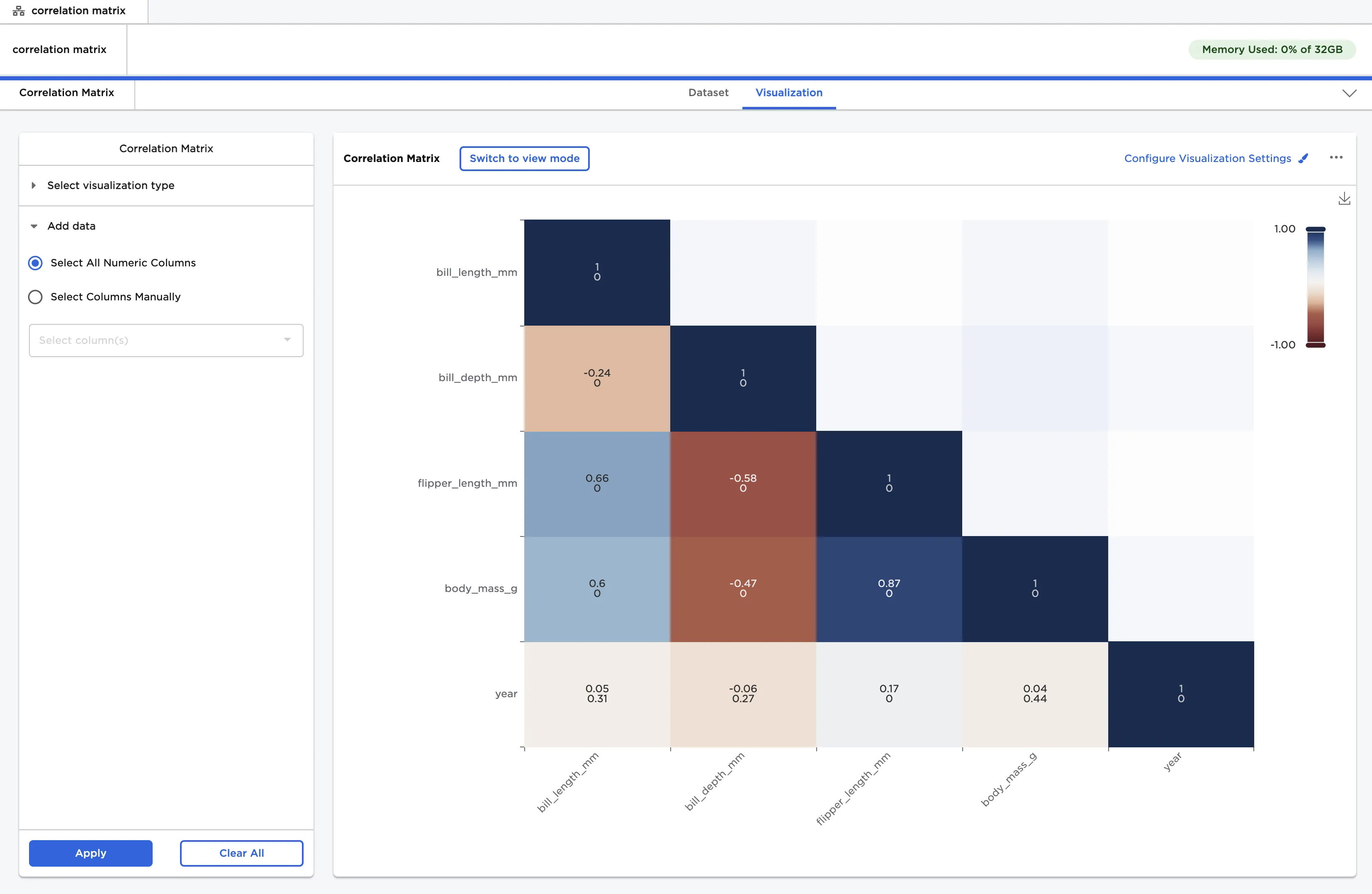
Figure 4: Example correlation matrix with probability values
- Use the "Configure Visualization Settings" menu to change the appearance of the correlation matrix.
- Drag the sliders on the legend to view squares of the correlation matrix that have correlation values within the selected range.
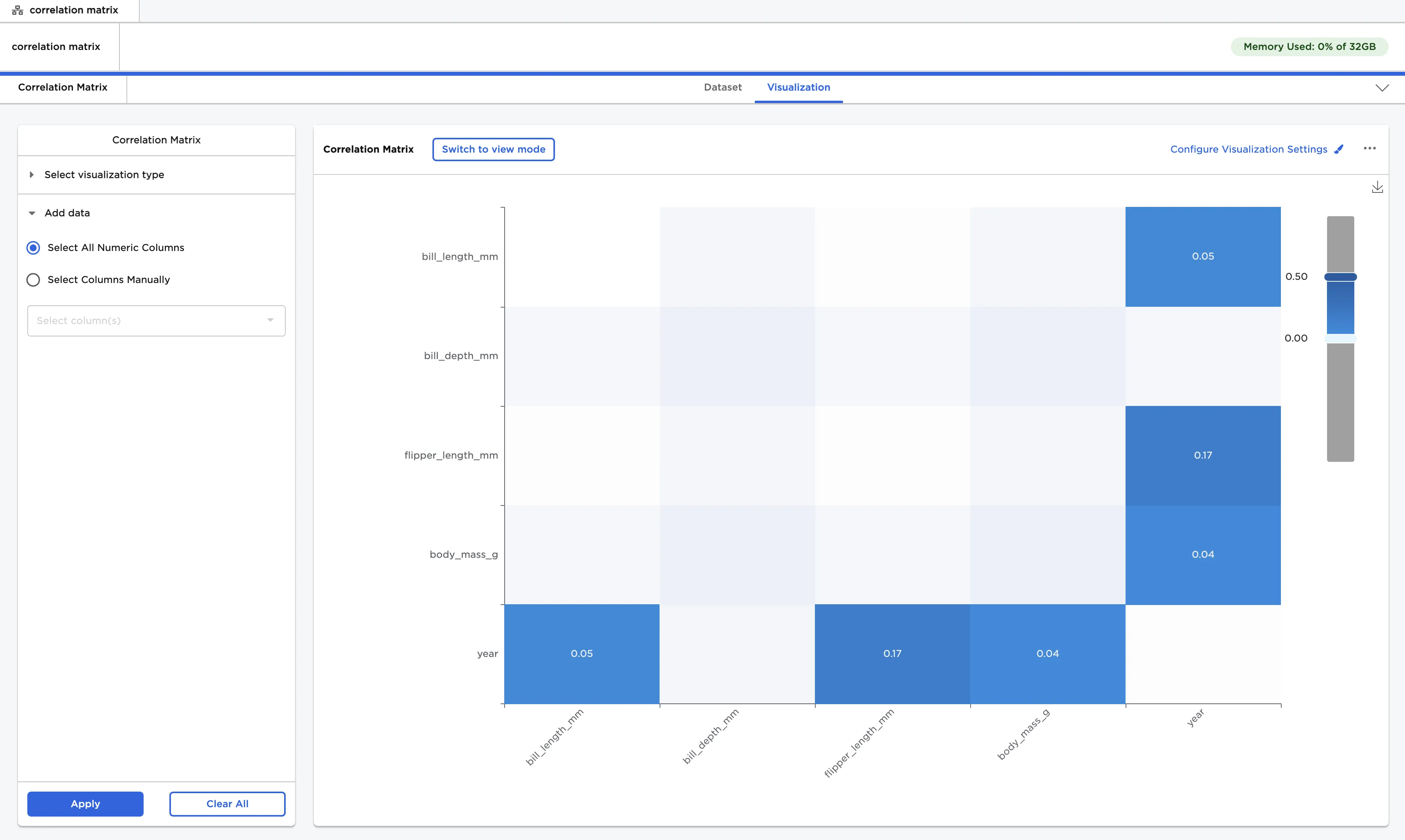
Figure 5: Example correlation matrix with custom visualization settings