Creating Autocorrelation Plots in Visual Notebooks
Create an autocorrelation plot or partial autocorrelation plot in Visual Notebooks.
- Autocorrelation plots are used to determine whether present timeseries data is correlated with past time series data. These plots provide valuable insight for timeseries analysis.
- Partial autocorrelation plots are mainly used to fine-tune hyperparameters for timeseries forecasting models.
Configuration

Configuration sidebar
| Field | Description |
|---|---|
| Name (default=none) | Name of the node - A user-specified node name displayed in the workspace, both on the node and in the dataframe as a tab. |
Select visualization type (default=Autocorrelation Plot) | The type of visualization - Use this field to switch to a different visualization node. |
| Select DateTime Column Required | Data to plot - Select a timeseries column from the dropdown menu. If all the columns in the menu appear dimmed, use a Columns - Type Converter node to convert the desired column to a date type. |
| Select Numeric Series Required | Data to plot - Select a numeric column from the dropdown menu. |
| Group Y axis by (default=none) | Y-axis grouping - Select a column to group by from the dropdown menu. |
Add Grouping Filter(s) (default=Select all) | Filter groups - Clear the checkbox beside a group name to remove that group from the chart. Only the groups selected are shown on the chart. |
Maximum Lag Variables for Autocorrelation (default=5000) | Autocorrelation lag - Select 50, 100, 200, 500, 1000, 5000, or 10000. This is the maximum number of units the data will be shifted when making the plot. |
Maximum Lag Variables for Partial Autocorrelation (default=50) | Partial autocorrelation lag - Select 50, 100, 200, 500, 1000, 5000, or 10000. This is the maximum number of units the data will be shifted when making the plot. |
Missing Value Treatment (default=Impute with mean) | Filter groups - Select Impute with mean to fill any numeric missing values with the mean value of that column. Select Drop rows with missing values in any of the selected columns to remove rows with missing values. |
Visualization Settings
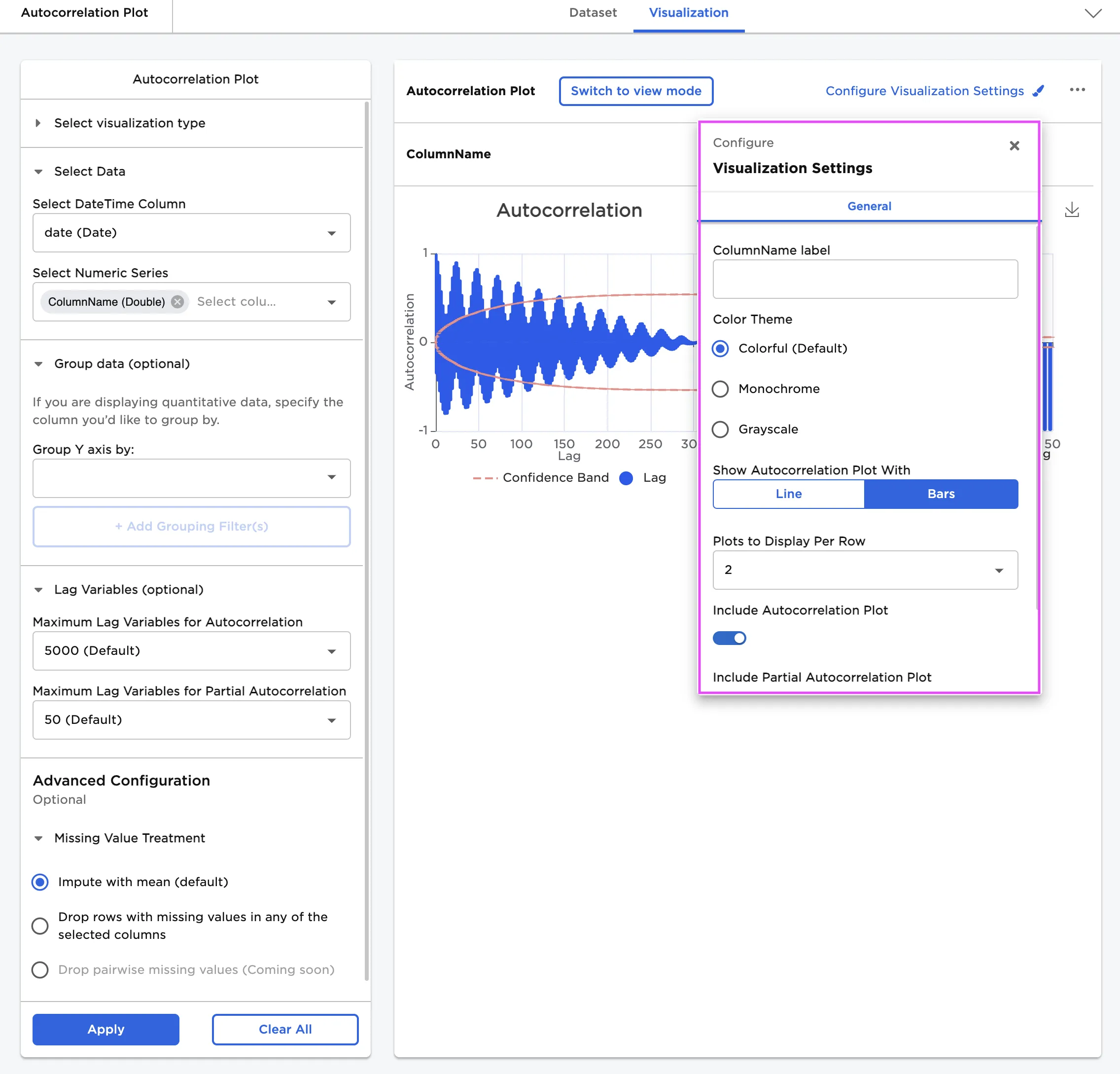
Visualization settings menu
| Field | Description |
|---|---|
| Chart Title label (default=name of the column used as the numeric series) | Title of the visualization - The title is displayed at the top of the chart. |
Color Theme (default=Colorful) | Visualization color scheme - Select Colorful, Monochrome, or Grayscale. |
Show Autocorrelation Plot With (default=Bars) | Plot appearance - Select Bars or Line. |
Plots to Display Per Row (default=2) | Multiple plot display - Select 1, 2, 4, or 6. |
Include Autocorrelation Plot (default=On) | Show autocorrelation plot - Toggle this switch off to hide the autocorrelation plot. |
Include Partial Autocorrelation Plot (default=On) | Show partial autocorrelation plot - Toggle this switch off to hide the partial autocorrelation plot. |
Show 95% Confidence Interval Band (default=On) | Show confidence interval - Toggle this switch off to hide the lines that signify the confidence interval. |
Node Inputs/Outputs
| Input | A Visual Notebooks dataframe |
|---|---|
| Output | An autocorrelation plot and a partial autocorrelation plot in Visual Notebooks |
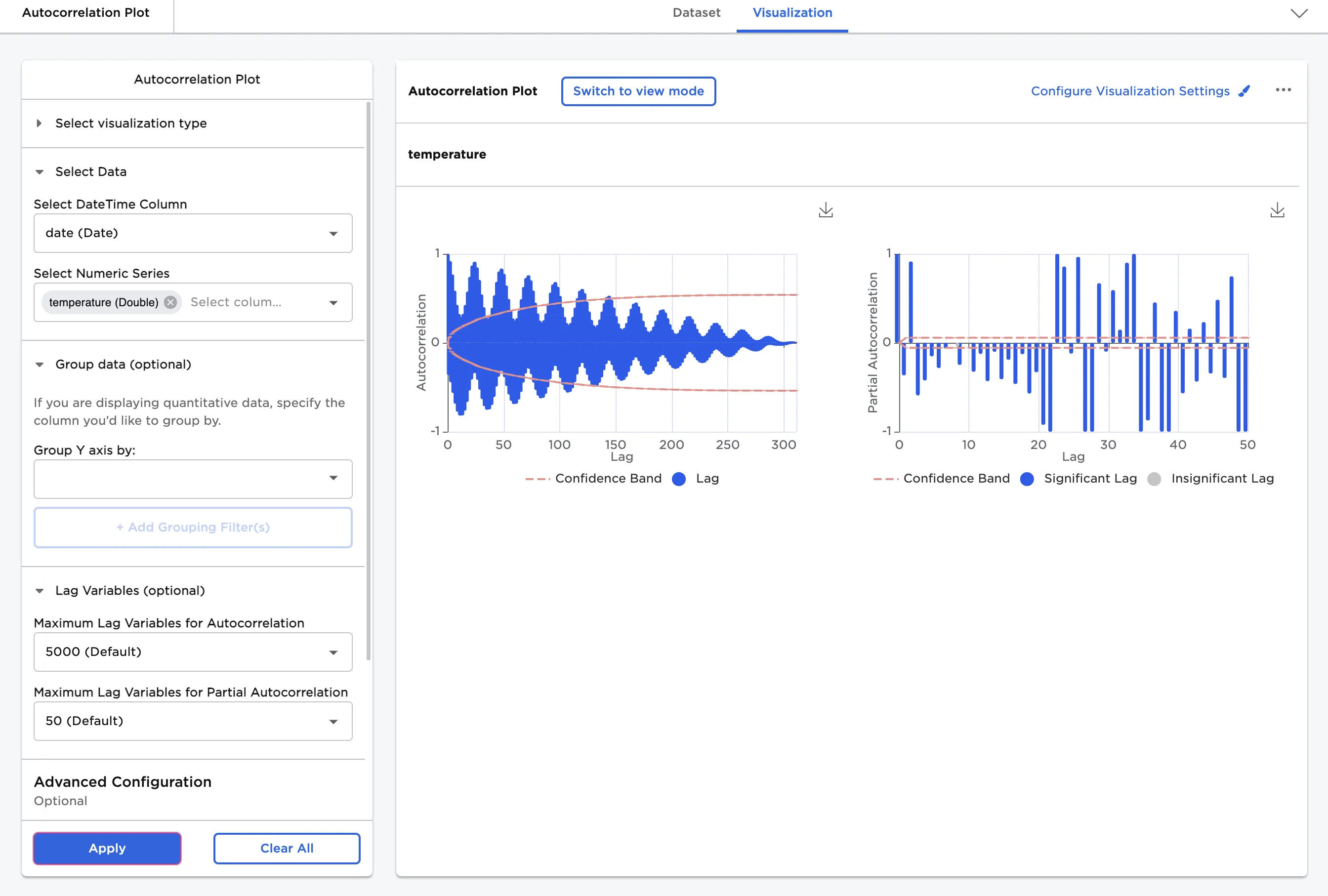
Figure 1: Example autocorrelation plot
Examples
The dataframe in Figure 2 contains the monthly maximum and minimum temperatures in Celsius from 2004 to 2014 from Kathmandu Station in Nepal. Although there are slight variations, temperature data is typically very correlated with itself because it follows a repeatable pattern. The maximum temperature in January one year is pretty similar to the maximum temperature in January the following year. The temperature in January is likely significantly different from the temperature in June. Use the Autocorrelation Plot node to visualize these temperature patterns.
The example data is available in the Visual Notebooks sample datasets.
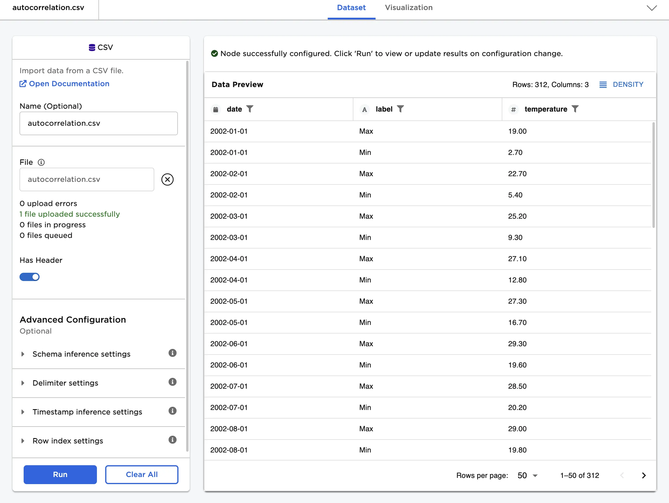
Figure 2: Example input data
Use the data in Figure 2 to create an autocorrelation plot and partial autocorrelation plot.
- Connect an Autocorrelation Plot node to an existing node. In this example, connect the node to a CSV node that contains the example data.
- Select date (Date) for the Select DateTime Column field.
- Select temperature (Double) for the Select Numeric Series field.
- Select Apply to create an autocorrelation plot with the default settings.
Figure 3 shows the resulting autocorrelation and partial autocorrelation plots. Use the following guidelines to read the two plots:
- If the bars on the plot are close to 1, the data is positively correlated.
- If the bars on the plot are close to -1, the data is negatively correlated.
- The numbers on the x-axis correspond to the amount of lag used for the correlation. For example, a value of 5 on the x-axis indicates the correlation between the original dataset and the dataset lagged 5 positions.
- The first bar at position 0 is always 1 because the original dataset is correlated with itself.
- Bars that fall within the red line aren't considered statistically significant.
The autocorrelation plot on the left confirms what we know about temperature cycles:
- The bars at the beginning of the plot are close to 1, as the temperatures in January and February and very similar.
- The bars become closer to -1 around lag 12 on the x-axis.
- Since there are two data points per month--a maximum and minimum temperature, the bar at the 12 mark represents the temperature in June.
- The temperatures in June are very different than the temperatures in January, so the negative correlation makes sense.
- The plot becomes very positively correlated again around lag 24 on the x-axis, which represents the temperatures for January 2003.
- The temperatures in January 2003 are similar to the temperatures in January 2002, so the positive correlation is expected.
- This cycle of positive and negative correlations repeats on the plot for all of the years represented in the data.
- The correlation highs and lows get smaller as the years go on until they dip below the red line. The farther away we get from the initial January 2002 data, the harder it becomes to find meaningful correlations.
- Autocorrelation plots can be used to find changes in trends over time.
To the right of the autocorrelation plot is a partial autocorrelation plot. This plot is challenging to interpret with the maximum and minimum temperatures mixed together, so we'll group the data in the next step and revisit this plot.
Figure 3: Example autocorrelation plot with the default settings
In the example data, we have two measurements for each month--the maximum temperature and the minimum temperature. We can use the grouping function to split these into different plots. The temperature patterns won't change, so we should expect to see plots that look similar to the plots we made above without grouping the data.
- Select label (String) for the Group Y axis by field.
- Select Run to create plots grouped by the maximum/minimum label.
Now we have an autocorrelation plot and partial autocorrelation plot for both the maximum temperature data and the minimum temperature data. As expected, both autocorrelation plots look pretty similar to the plot above. Adding a grouping option narrows the data so there is only one data point for each month, which makes reading the lag values along the x-axis a bit more intuitive. Both the maximum and minimum autocorrelation plots show a strong negative correlation at lag 6 months and a strong positive correlation at lag 12 months. These correlations correspond to temperatures in June and temperatures in January, respectively. The cycle of seasonal temperature changes repeats until the lags becomes too far away from the initial January 2002 data point.
Grouping the data also helps us understand the partial autocorrelation plot.
Autocorrelation plots find the correlation between the original dataset and the dataset lagged for each data point. By nature of the calculation, all of the lags between the original data and the target lag impact the correlation. For example, if you try to find the correlation between lag 5 and lag 0, lags 1, 2, 3, and 4 have some amount of influence on the correlation.
Partial autocorrelation plots attempt to isolate each correlation by removing the impact of each intermediary lag. To continue the example above, if you wanted to find the correlation between lag 5 and lag 0 using the partial autocorrelation function, you would find the amount of impact lags 1, 2, 3, and 4 have in the correlation and subtract those values to get the direct correlation.
Partial autocorrelation plots are often more difficult to read than autocorrelation plots, and are typically used when fine-tuning hyperparameters for timeseries forecasting models. Taking a general look at the partial autocorrelation plots in Figure 4 shows cycles of negative correlation followed by cycles of positive correlation that line up with the temperature patterns present in the data.
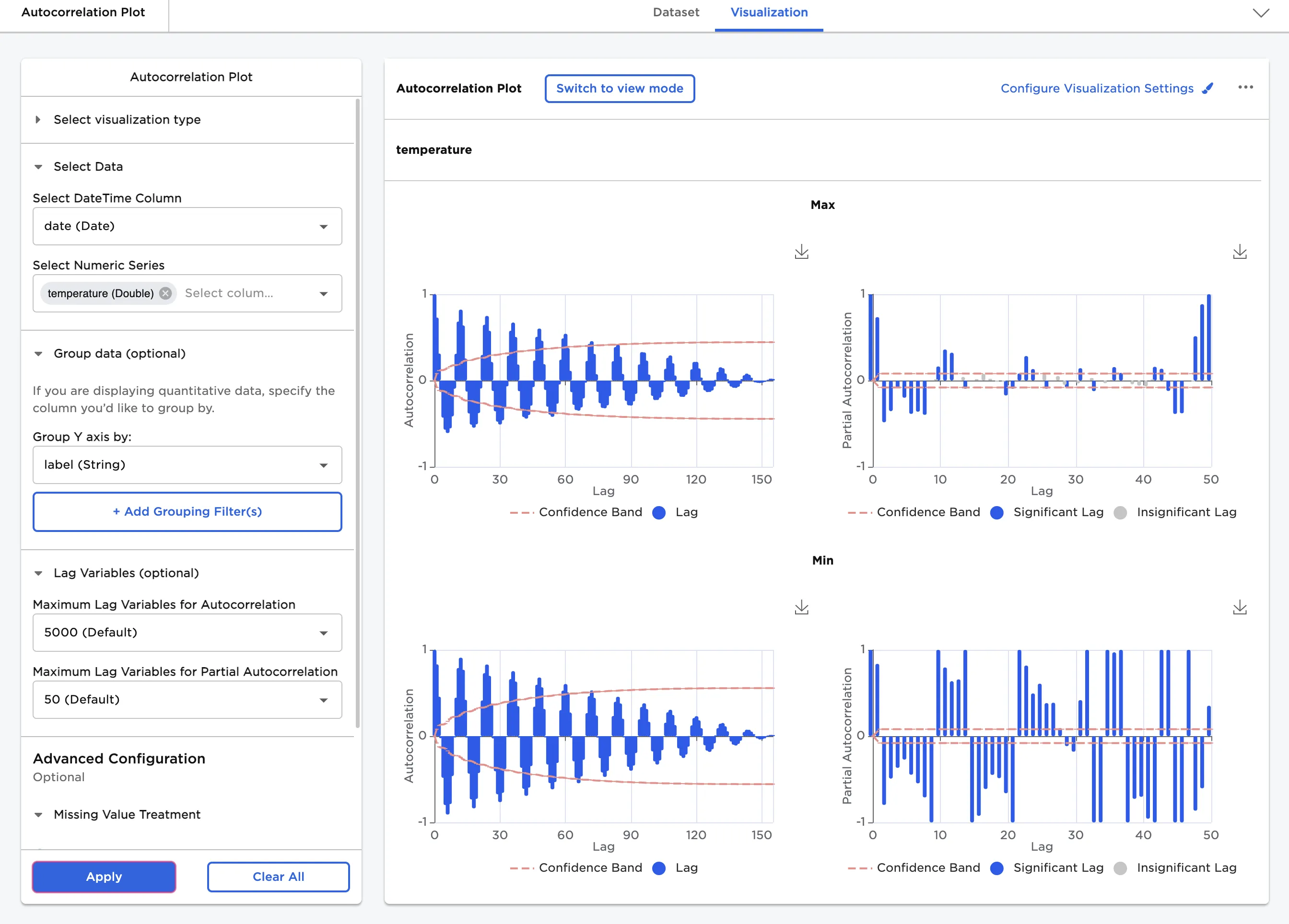
Figure 4: Example autocorrelation plot with grouped data
By default, Visual Notebooks only renders up to 5000 values for autocorrelation plots and up to 50 values for partial autocorrelation plots. If your data has more than 50 rows, you may want to change these values to see full plots for your data. In Figure 5, the Maximum Lag Variables for Partial Autocorrelation field is set to 100.
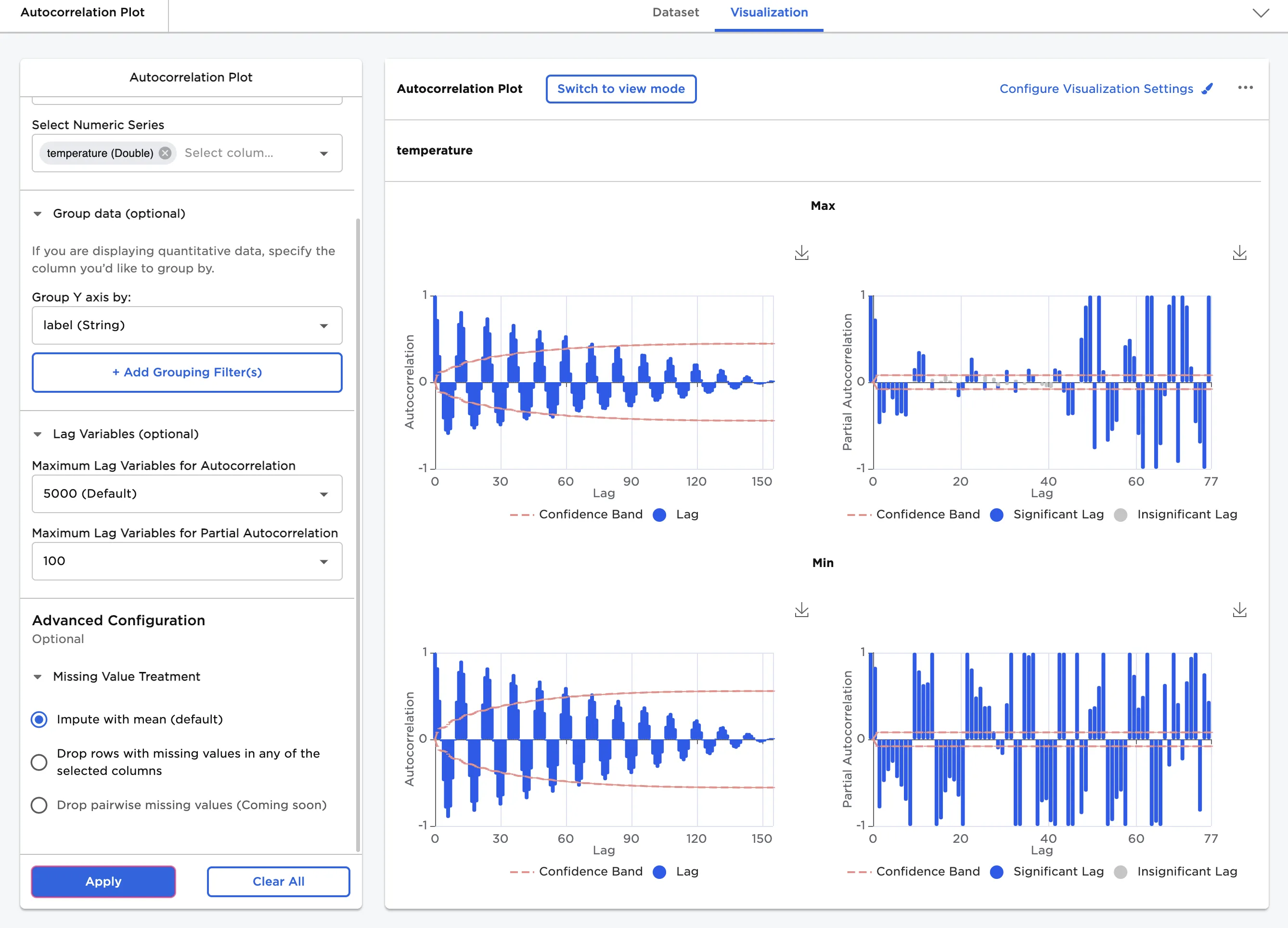
Figure 5: Example autocorrelation plot with altered maximum lag
Use the Configure Visualization Settings menu to change the appearance of the autocorrelation plot. To create the plots shown in Figure 6, make the following changes:
- Select Configure Visualization Settings.
- Add a title.
- Change Color Theme to Monochrome.
- Change Show Autocorrelation Plot With to Line.
- Select 1 for the Plots to Display Per Row field.
- Toggle the Show 95% Confidence Interval Band switch off.
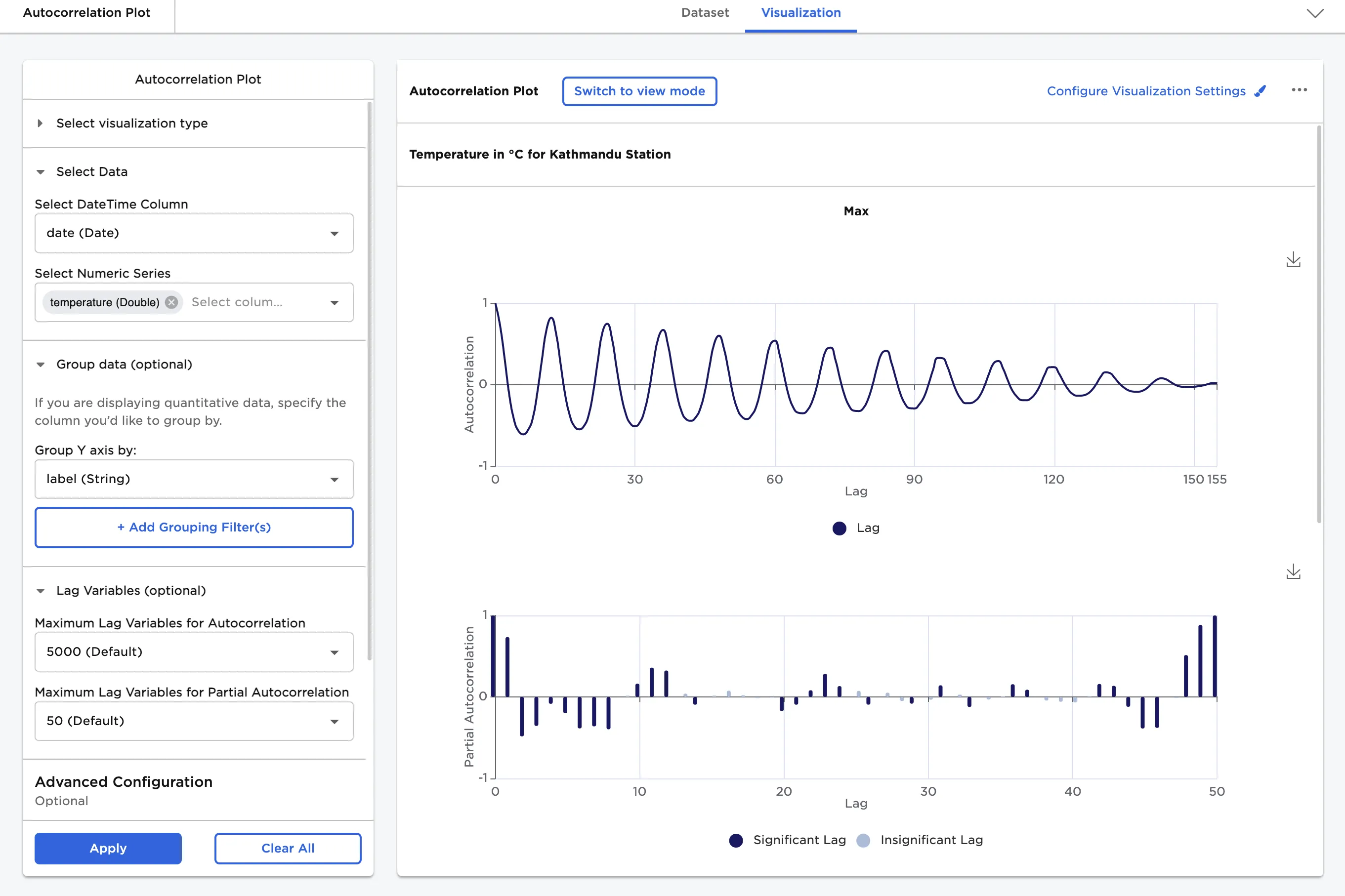
Figure 6: Example autocorrelation plot with custom visualization settings