Creating Bar Charts in Visual Notebooks
Create a bar chart in Visual Notebooks. Bar charts display categorical data as rectangles that are proportional to the values they represent.
Configuration
| Field | Description |
|---|---|
| Name (default=none) | Name of the node - A user-specified node name displayed in the workspace, both on the node and in the dataframe as a tab. |
Select visualization type (default=Bar Chart) | The type of visualization - Use this field to switch to a different visualization node. |
| Select Numeric Columns Required | Data to plot - Select numeric columns from the dropdown menu. |
Aggregation (default=Average) | Data to plot - Select Average, Minimum, Maximum, Sum, or Count. |
| Group Y axis by (default=none) | Y-axis grouping - Select a column to group by from the dropdown menu. |
Add Grouping Filter(s) (default=Select all) | Filter groups - Clear the checkbox beside a group name to remove that group from the chart. Only the groups selected are shown on the chart. |
Visualization Settings
General
| Field | Description |
|---|---|
| Chart Title label (default=none) | Title of the visualization - The title is centered at the top of the chart. |
Color Theme (default=Colorful) | Visualization color scheme - Select Colorful, Monochrome, or Grayscale. |
Legend
| Field | Description |
|---|---|
| Label (default=none) | Data labels - Enter labels for the data shown on the bar chart. |
Show legend (default=On) | Chart legend - Toggle this switch off to hide the legend. |
Legend size (default=Regular) | Size of the legend - Select Regular, Large, or Small. |
Legend position (default=Top right) | Position of the legend on the screen - Select Top right, Top left, Bottom right, or Bottom left. |
Bar Chart Type & Arrangement
| Field | Description |
|---|---|
Bar Chart Type (default=Simple Bar) | The type of bar chart - Select Simple Bar, Stacked Bar, Clustered Bar, 100% Stacked Bar, Stacked Cluster Bar, Double Stack Bar, or Double Cluster Bar. Stacked cluster bar, double stack bar, and double cluster bar can only be used when there are two Group Y axis by fields. |
Arrangement of Bar Chart Data (default=Columns, Group 2, Group 1) | Data arrangement - Drag and drop the fields to change the way data is displayed. |
Bar Totals
| Field | Description |
|---|---|
Show Bar Totals (default=On) | Numeric labels for the bars - Toggle this switch off to hide the total shown at the top of each bar. |
Decimal Places (default=2) | Number of decimal places to display - Enter an integer between 0 and 15. |
| Prefix (default=none) | Characters prepended to the bar total - Enter one or more characters. Given characters are added before the bar total and followed by a space. |
| Suffix (default=none) | Characters appended to the bar total - Enter one or more characters. Given characters are added after the bar total following a space. |
Stacked Bar Subtotals
| Field | Description |
|---|---|
Show Subtotal Value (default=Off) | Stacked bar section totals - Toggle this switch on to show the subtotals in each section of the stacked bar. |
Show Subtotal % (default=Off) | Stacked bar section percentages - Toggle this switch on to show the subtotal percentage in each section of the stacked bar. |
Decimal Places (default=2) | Number of decimal places to display - Enter an integer between 0 and 15. |
| Prefix (default=none) | Characters prepended to the subtotal - Enter one or more characters. Given characters are added before the stacked bar subtotal and followed by a space. |
| Suffix (default=none) | Characters appended to the subtotal - Enter one or more characters. Given characters are added after the stacked bar subtotal following a space. |
Add Bar Connectors
| Field | Description |
|---|---|
Show Bar Connectors (default=Off) | Line between stacked bars - Toggle this switch on to show lines that connect bars of the same type. |
Vertical / Horizontal
| Field | Description |
|---|---|
Orientation (default=Vertical) | Bar chart orientation - Select Vertical, Horizontal, or Mirror Horizontal. |
Axis Label Ordering
| Field | Description |
|---|---|
Axis Label Ordering (default=Smallest to largest) | Bar chart order - Order the x-axis labels from Smallest to largest, Largest to smallest, or using Custom Ordering. Ordering is based on the combined total of the first bar in each group. |
Node Inputs/Outputs
| Input | A Visual Notebooks dataframe |
|---|---|
| Output | A bar chart in Visual Notebooks |
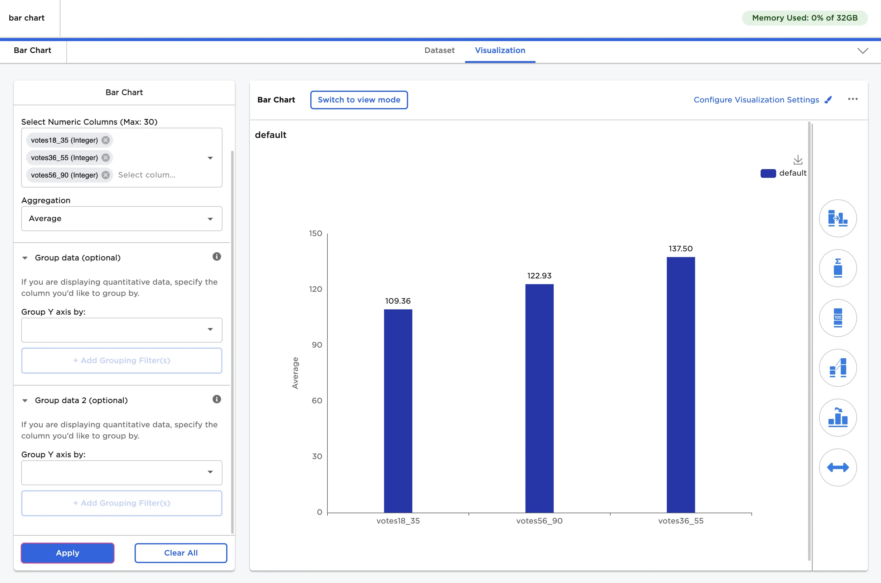
Figure 1: Example bar chart
Examples
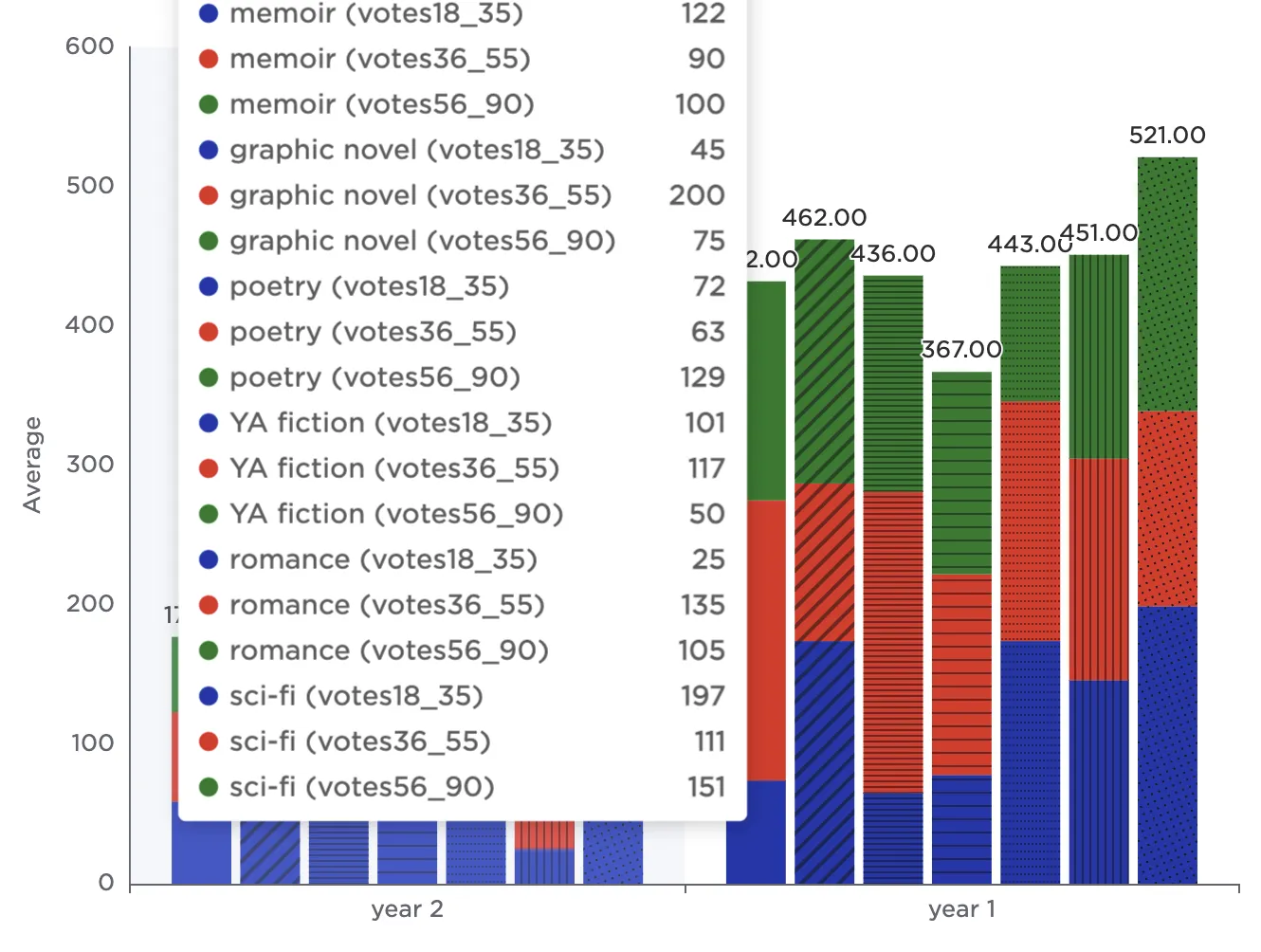
The dataframe in Figure 2 is used in this example. It contains the results of a poll about favorite book genres conducted over two years. Results are separated by age group.
The example data is available in the Visual Notebooks sample datasets.
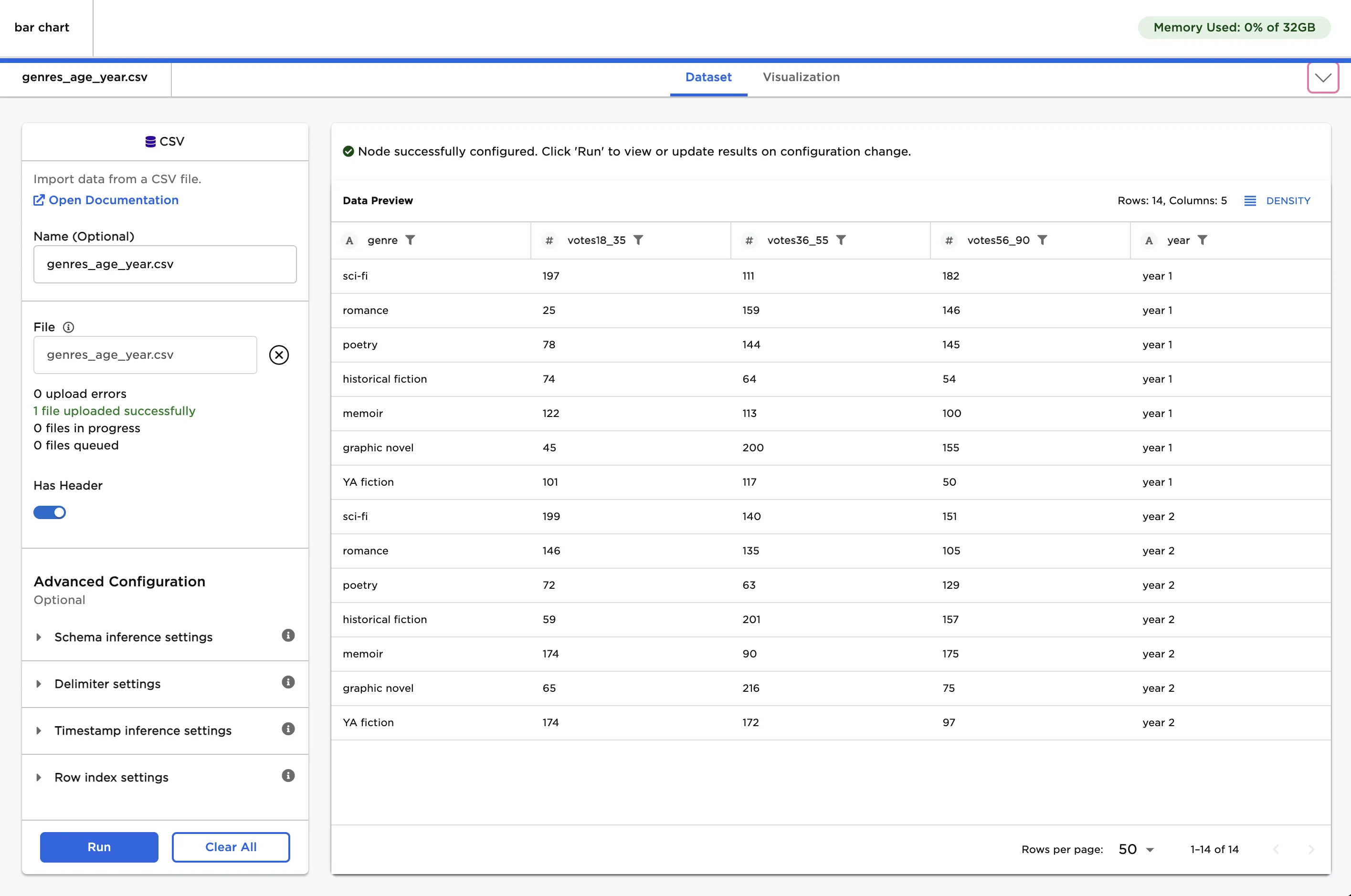
Figure 2: Example input data
Use the data in Figure 2 to create a bar chart.
- Connect a Bar Chart node to an existing node.
- Select the three votes columns for the Select Numeric Columns field.
- Select Apply to create a simple bar chart with the default settings.
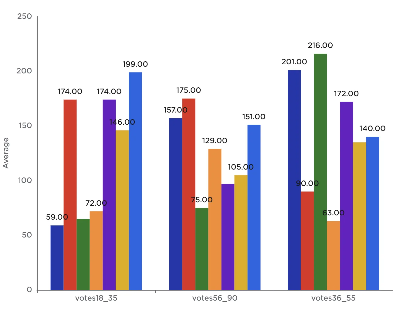
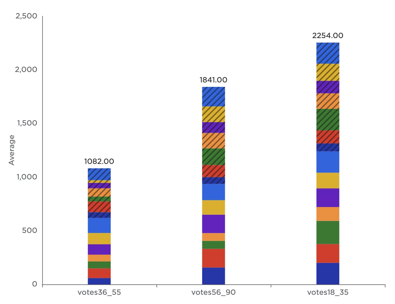
Notice that the resulting bar chart displays the average number of votes in each age group across all genres.
Figure 3: Example bar chart with the default settings
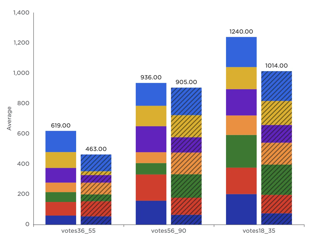
To group the results of the poll by genre, select genre (String) for the Group Y axis by field. Notice that by default, Visual Notebooks creates a separate simple bar chart for each genre.
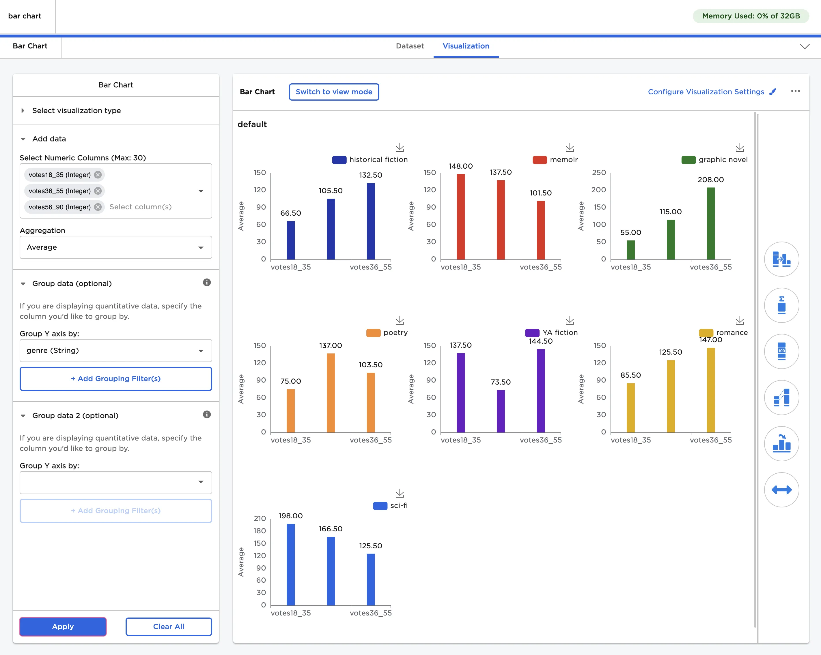
Figure 4: Example bar chart with grouped data
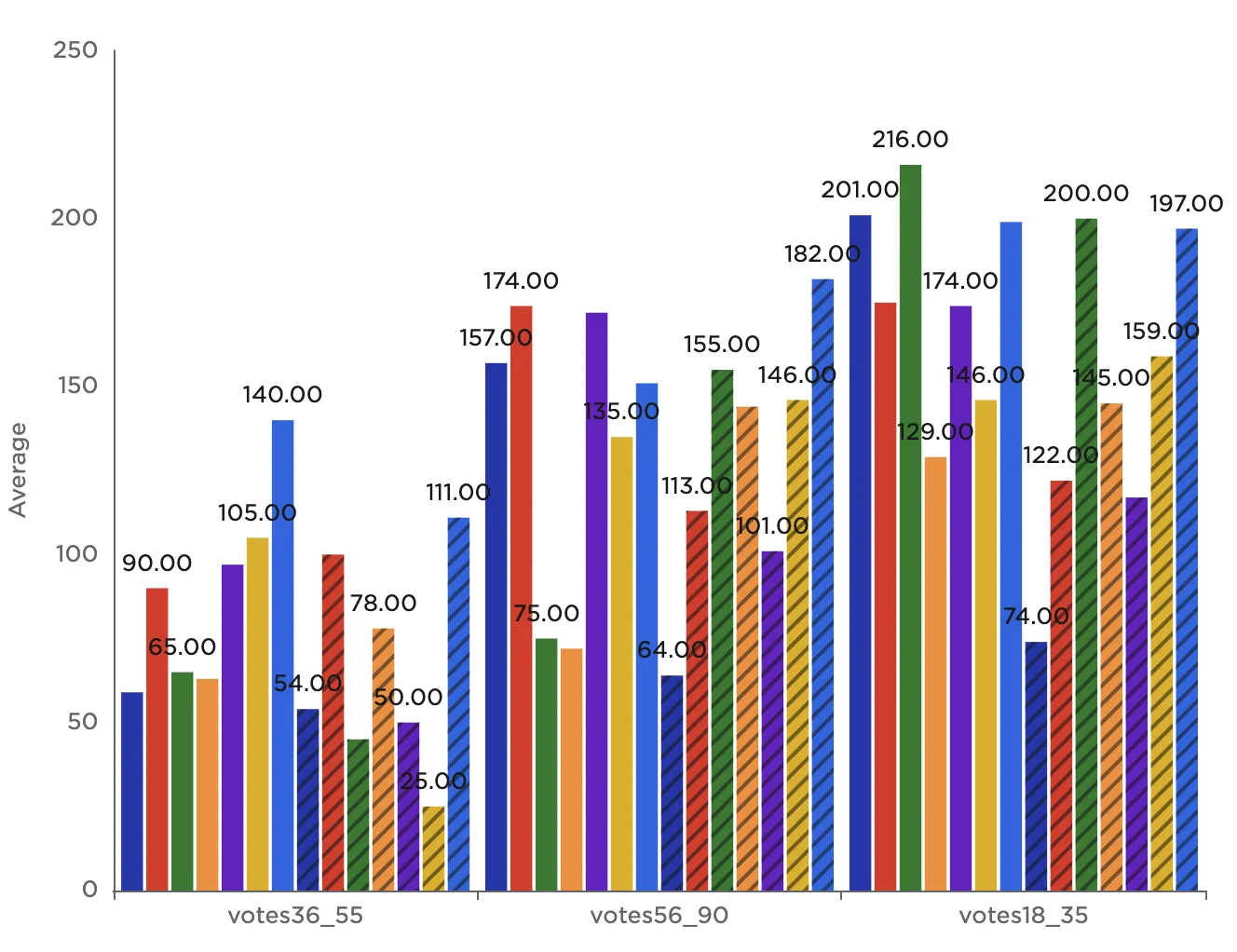
Note that to the right side of the visualization is a series of icons. Each icon opens a separate settings menu. Select the first icon, Bar Chart Type & Arrangement to change the type of bar chart displayed. When grouping data by one field, you can use a simple bar, stacked bar, clustered bar, or 100% stacked bar.
- Stacked bar stacks the individual bar charts atop each other.
- Clustered bar displays the individual bar charts clustered together.
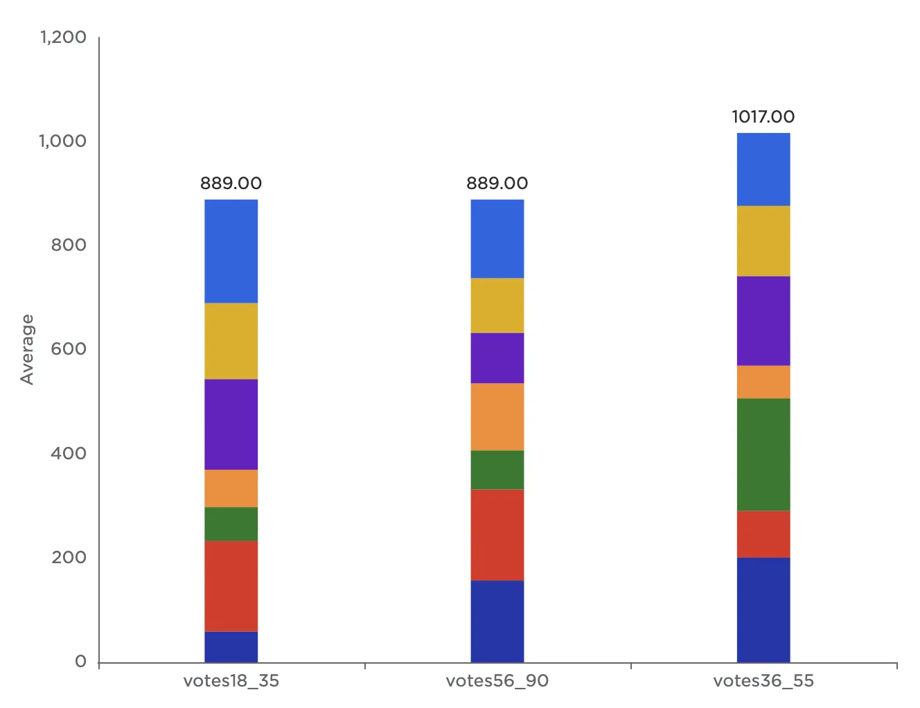
- 100% stacked bar is a variation on stacked bar that converts all stacked bar subtotals to a percentage out of 100. This makes it easier to compare the values among categories with different totals.
 Stacked bar
 Clustered bar
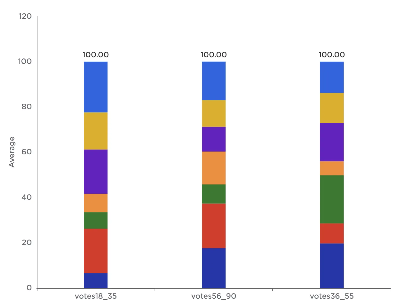 100% stacked bar
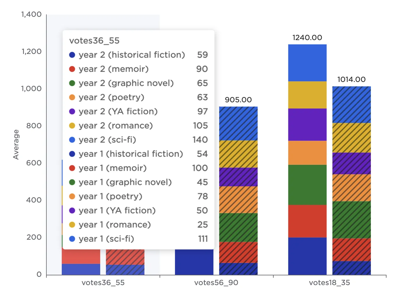
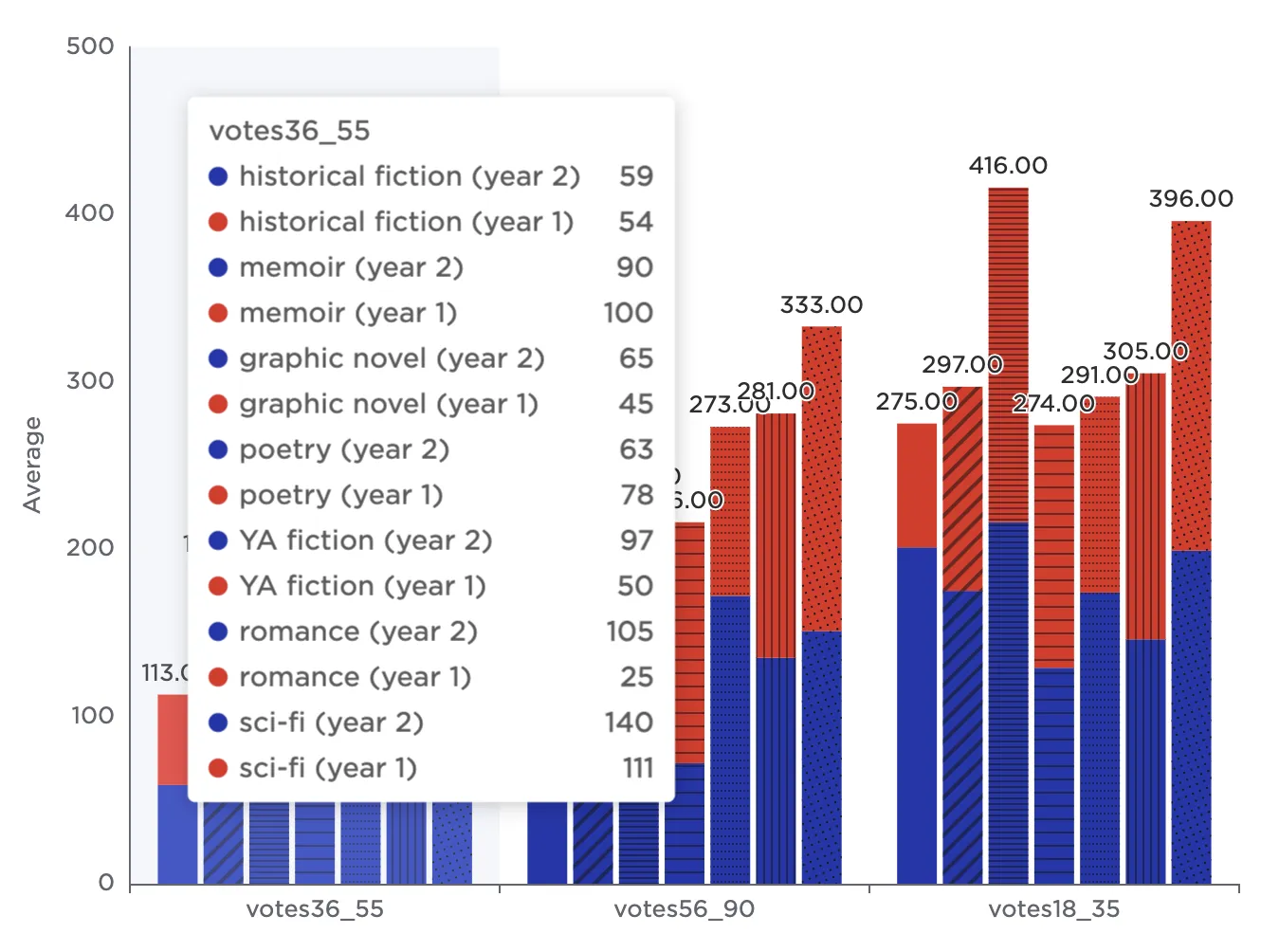
To visualize the results of the study separated first by genre and then by year, expand the Group data 2 (optional) section and select year (String) from the dropdown menu. Notice that by default, Visual Notebooks displays a page of simple bar charts that show the study results collected in year 2 separated by genre. Scroll down to view a similar page of simple bar charts that show the study results collected in year 1 separated by genre.
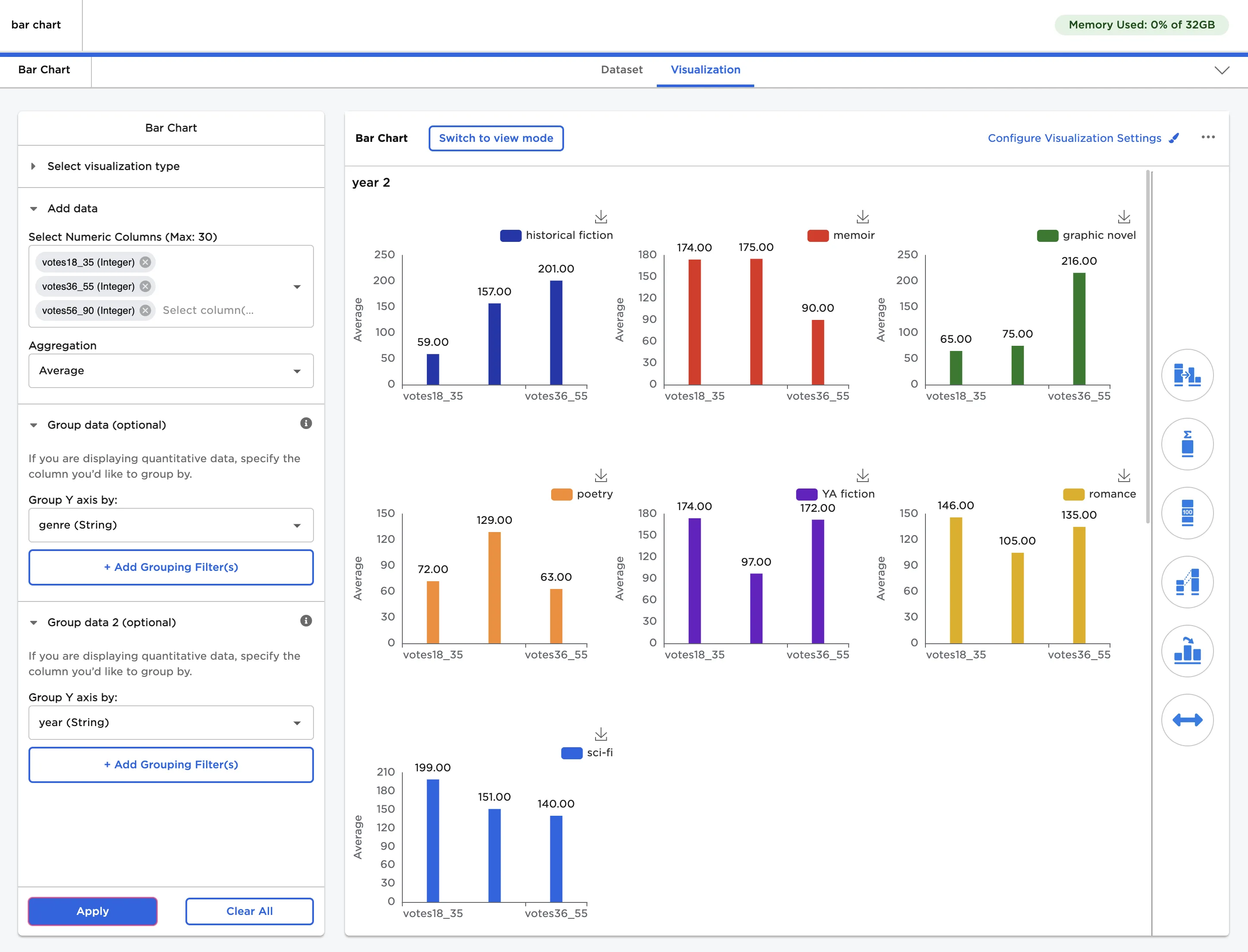
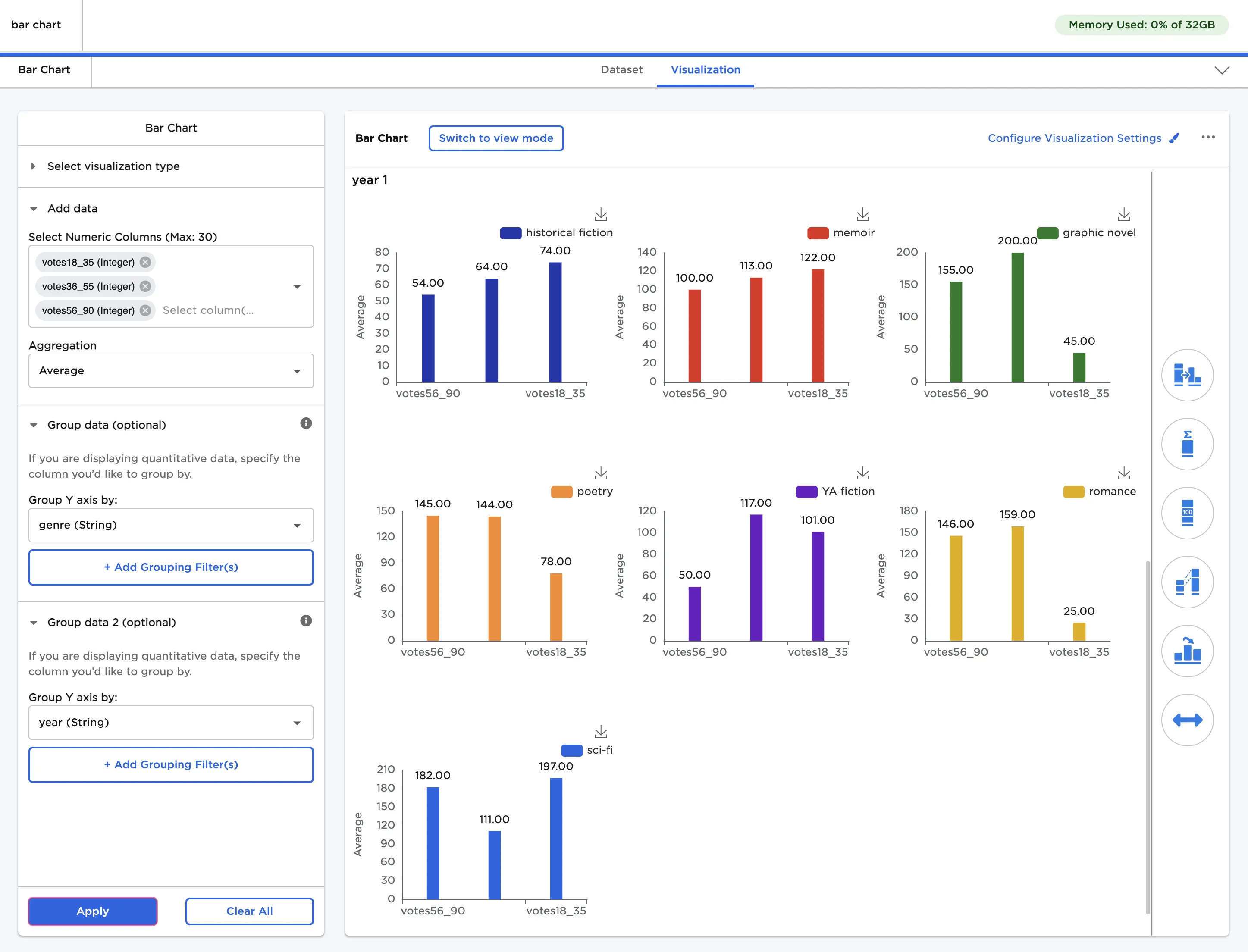
Figure 5: Example bar chart with data grouped by two fields
Open the Bar Chart Type & Arrangement menu to change the type of bar chart displayed. When grouping data by two fields, a stacked cluster bar, double stacked bar, or double cluster bar is recommended.
- Stacked cluster bar displays multiple stacked bars side by side.
- Double stacked bar stacks all categories and groupings into single stacked bars.
- Double cluster bar displays all bar charts clustered together across all groupings.
 Stacked cluster bar
 Double stacked bar
 Double cluster bar
Beneath the Bar Chart Type field is a drag and drop list that can be used to change the way data is displayed in the bar chart. This field lets you emphasize different components of the data depending on the story you are trying to tell.
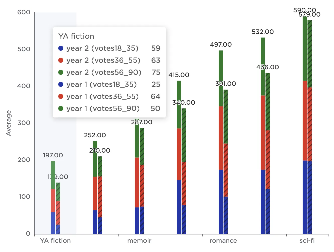
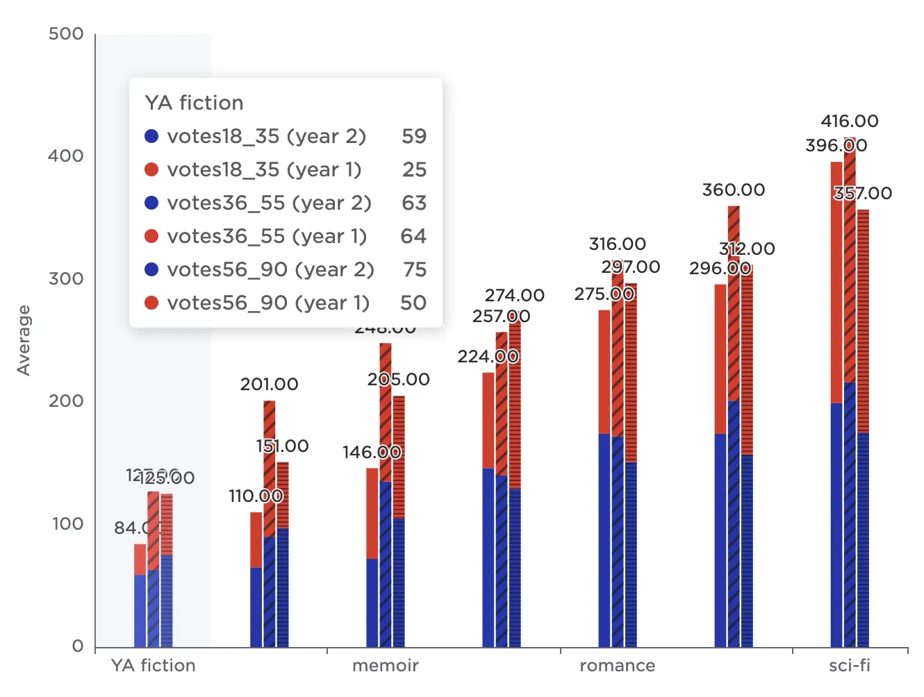
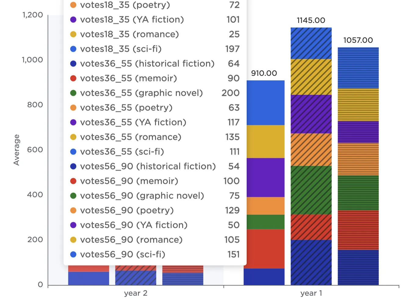
All variations are shown as stacked cluster bars in the following example, but you can change the arrangement of data in any type of bar chart. When changing the arrangement with a stacked cluster bar, the first field corresponds to the label at the bottom of the bar chart. The second field corresponds to the individual stacked bars. The third field corresponds to the vertical categories that are stacked atop each other within each bar.
The images below show all six possible combinations for the sample data. In this example, Columns refers to the number of votes per age group, Group 1 refers to the genre, and Group 2 refers to the year of the study. To construct each chart, keep the fields that were configured in previous examples, then drag the Columns, Group 1, and Group 2 boxes in the Arrangement of Bar Chart Data field into the desired order.
- View 1 illustrates how the people in each age group changed their votes over the life of the study.
- View 2 illustrates how the people in each group split their votes across the different genres.
- View 3 illustrates how the number of votes each genre received changed over the years.
- View 4 illustrates how the number of votes each genre received varied across age groups.
- View 5 illustrates how conducting the study over multiple years resulted in different number of votes across each age group.
- View 6 illustrates how conducting the study over multiple years affected the number of votes each genre received.
 View 1: Columns, Group 2, Group 1
 View 2: Columns, Group 1, Group 2
 View 3: Group 1, Group 2, Columns
 View 4: Group 1, Columns, Group 2
 View 5: Group 2, Columns, Group 1
 View 6: Group 2, Group 1, Columns
Select the "year 2 (historical fiction)" and "year 1 (historical fiction)" labels in the legend to temporarily remove them from the visualization. This makes it easier to examine only certain data.
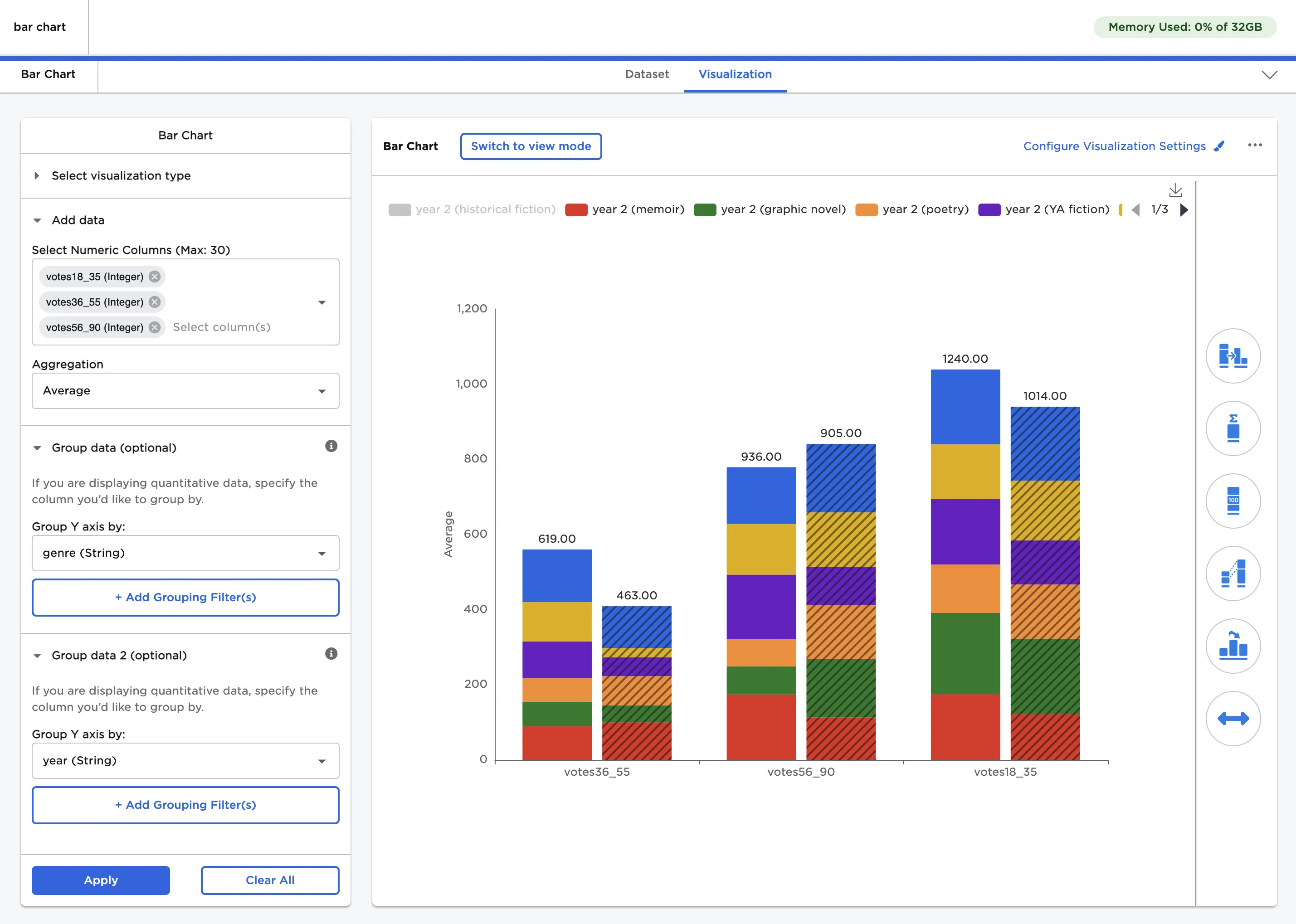
Figure 6: Example bar chart with some data temporarily hidden
Use the other menus to the right of the visualization to change the appearance of the bar chart. To create the bar chart shown in Figure 7, make the following changes:
- Change Color Theme to Monochrome.
- Change Bar Chart Type to Stacked Bar.
- Enter "0" in the Decimal Places field in the Bar Totals menu.
- Enter "votes" in the Prefix field in the Bar Totals menu.
- Toggle the Show Bar Connectors switch on.
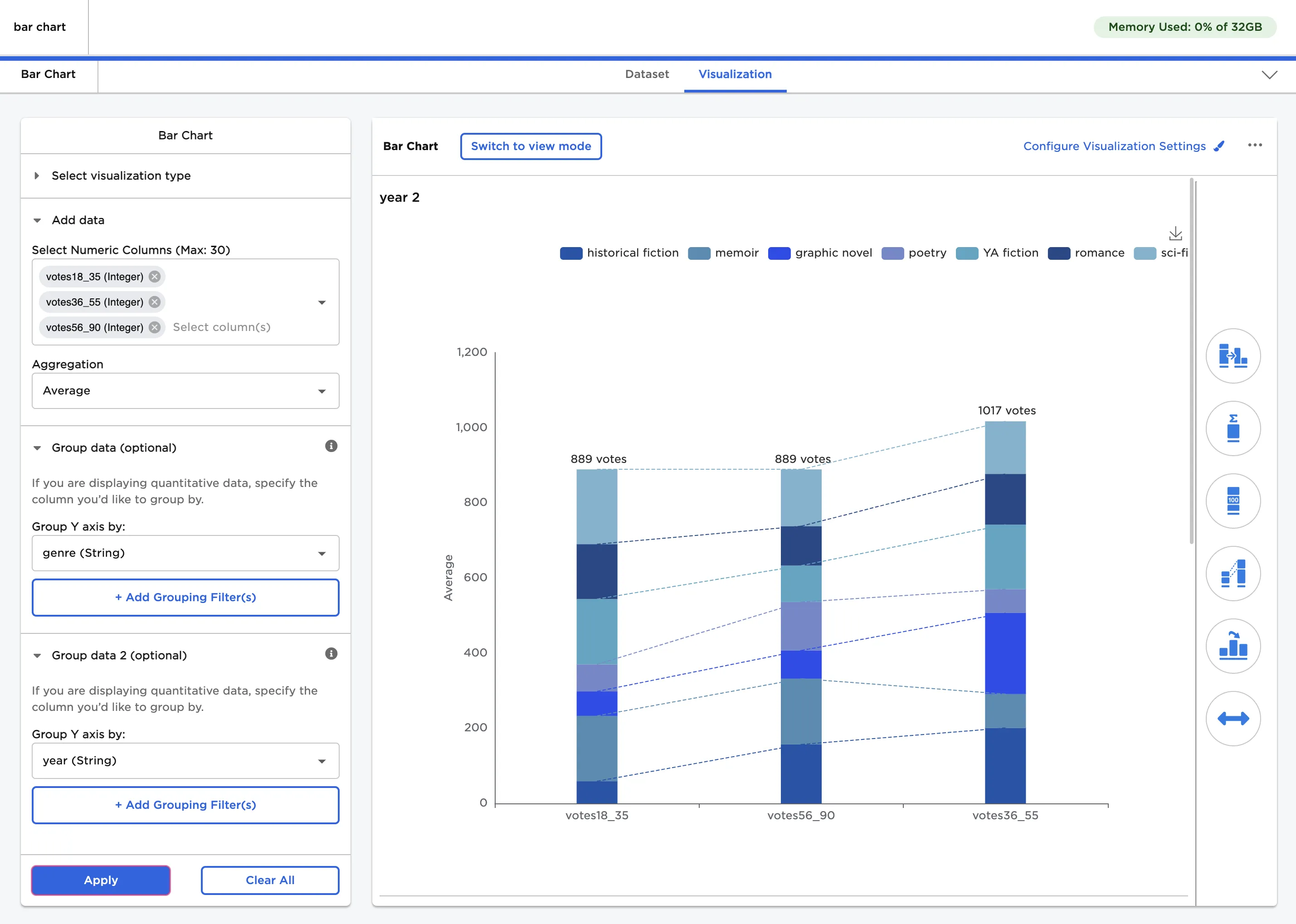
Figure 7: Example bar chart with custom visualization settings