Sankey
Create a Sankey diagram in Visual Notebooks. A Sankey diagram is a type of flow chart that shows how values change from one condition to another. A Sankey diagram is particularly useful when visualizing complex flows with multiple layers of conditions.
Configuration
| Field | Description |
|---|---|
| Select visualization type | Chart type selection An option to select a different chart type. |
| Source Column | The feature with the source condition Select the column containing the feature that is the starting condition. |
| Target Column | The feature with the target condition Select the column containing the feature that is the target condition. |
| Value Column | Select value of the flow Optionally select a numeric column that represents the values of each instance of the start and end conditions. When the value column is not selected, the Sankey diagram uses the count of each source and destination as their aggregated value. |
| Aggregation | Select value aggregation type Identify how you want to aggregate your source and destination values. Aggregation methods include Average, Minimum, Maximum, and Sum. |
| Missing Value Treatment | Dealing with missing values Select Impute missing to fill numeric missing values with the mean of the values that have the same source and target combination. Select Drop rows with missing values in any of the selected columns to remove rows with missing values. |
Visualization Settings
General
| Field | Description |
|---|---|
| Title | Title for the chart An optional title that appears at the top of the chart. |
| Color Theme | Visualization color scheme Select Colorful, Monochrome, or Grayscale. |
| Orientation | Orientation of Sankey diagram Select Horizontal or Vertical orientation. |
Nodes
| Field | Description |
|---|---|
| Node Alignment | Select node alignment Align your nodes to the Left, align them to the Right, or Justify the alignment. |
| Node Text Alignment | Align the description text relative to the node Align the text to the Left, Right, or Center of the node. |
| Node Color | Choose color scheme of nodes Select Equal colors, Color by level, or Color nodes individually |
| Node Decal Pattern | Use decal pattern for nodes Toggle to turn on or off the decal pattern for nodes |
Links
| Field | Description |
|---|---|
| Link Colors | Adjust node color Choose the link color to be the same as the Source node color, same as the Target node color, Gradient from source to target, or the color Grey |
Node Inputs/Outputs
| Input | A Visual Notebooks dataframe |
|---|---|
| Output | A Sankey diagram in Visual Notebooks |
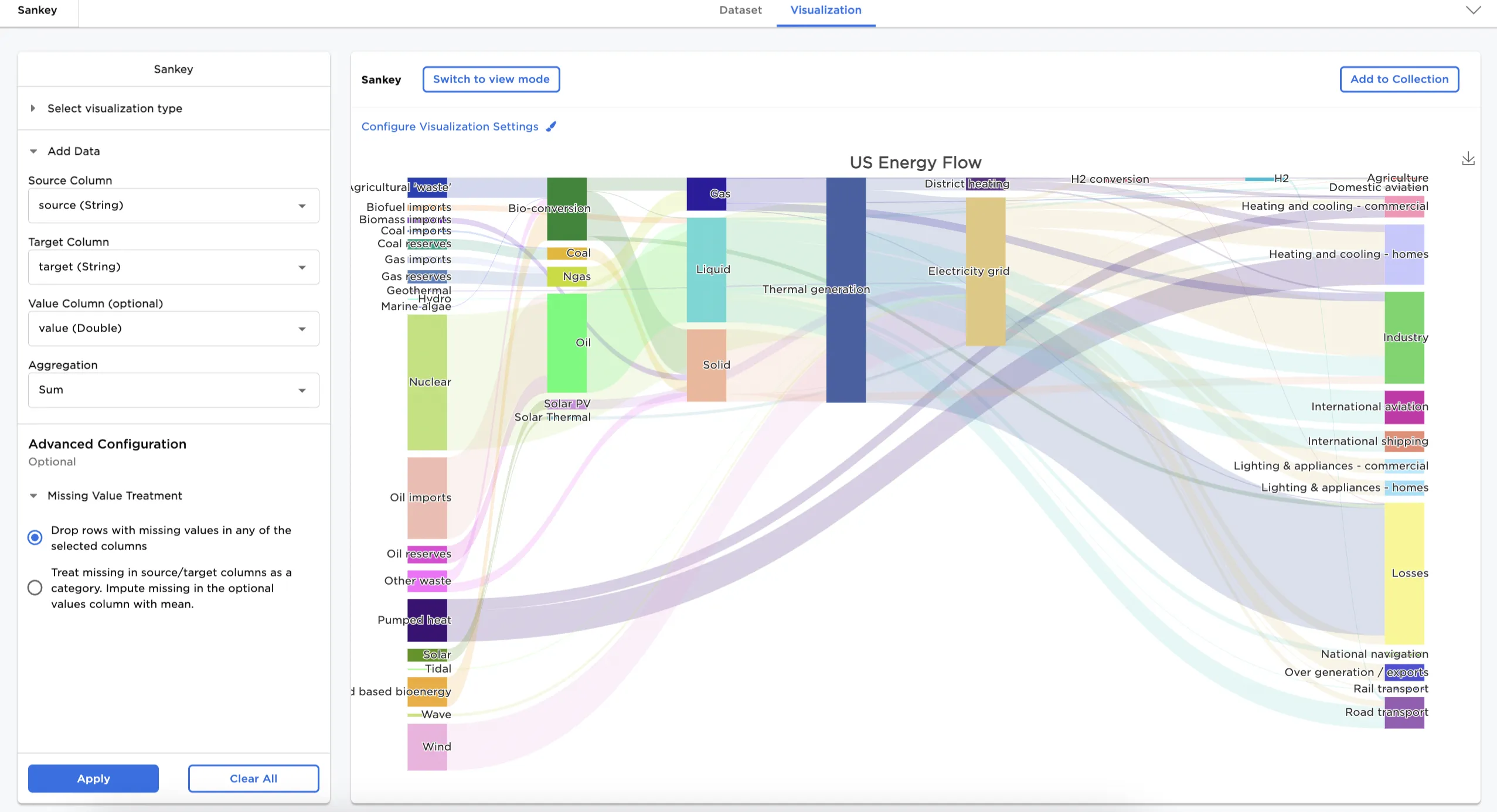
Figure 1: Example Sankey diagram
Examples
The following examples use a Sankey diagram to show how energy flows from different sources (how the energy is generated) to their destinations (how the energy is consumed).
- Connect an existing node to the Sankey node.
- Select a field for the source. In this case, Source is selected in the source column.
- Select a field for the target. In this case, Target is selected in the target column.
- To show the amount of energy, instead of just the count of each category, Value is selected as the value column.
- Select Sum as the aggregation as it's important to show the total amount of energy flow in this case
- Select Apply.
Figure 2 shows a Sankey diagram across different energy sources.
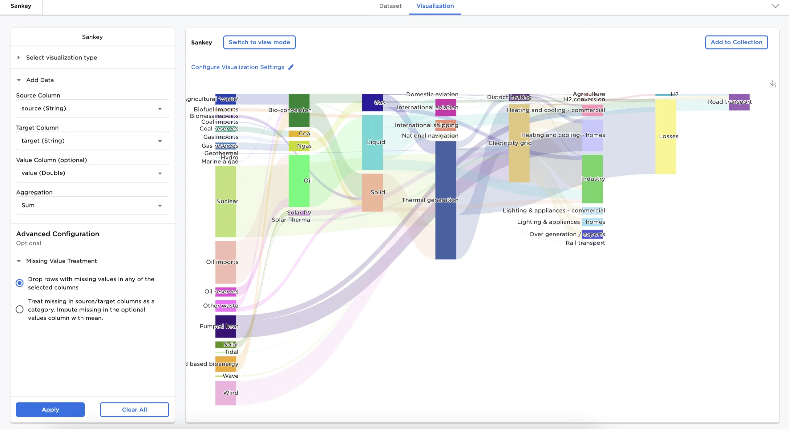
Figure 2: Example basic Sankey diagram
Adjust the settings in the Configure Visualization Settings menu. In this case, the defaults were changed to these selections:
- Title: US Energy Flow
- Node alignment: Justify
The dataframe in Figure 3 shows the same chart with the nodes justified and a new title.
Figure 3: Example configured Sankey diagram