Machine Learning in Visual Notebooks
Visual Notebooks offers machine learning nodes to perform:
- Classification
- Regression
- Timeseries Forecasting
- Unsupervised Clustering
- Unsupervised Anomaly Detection
Machine learning nodes are equipped with features to perform automated hyperparameter optimization. Furthermore, these nodes offer detailed analysis for model performance.
Visual Notebooks ML Pipelines
Training a machine learning model in Visual Notebooks uses a dedicated visual notebook type called "ML Pipeline".
The dedicated visual notebook type includes:
- Interfaces for constructing and training pipelines involving multiple estimator steps that are to be combined into a single model
- Interfaces for retraining, versioning, and tracking pipelines for MLOps
- Interfaces for searching published trained pipelines
The Visual Notebooks ML Pipeline Builder canvas, shown in the following figure, differs from the traditional Visual Notebooks visual notebook canvas by splitting the screen into two sections. Section 1 is used to define the training and validation datasets, while Section 2 is used to define the machine learning steps and associated inputs and outputs of the pipeline.
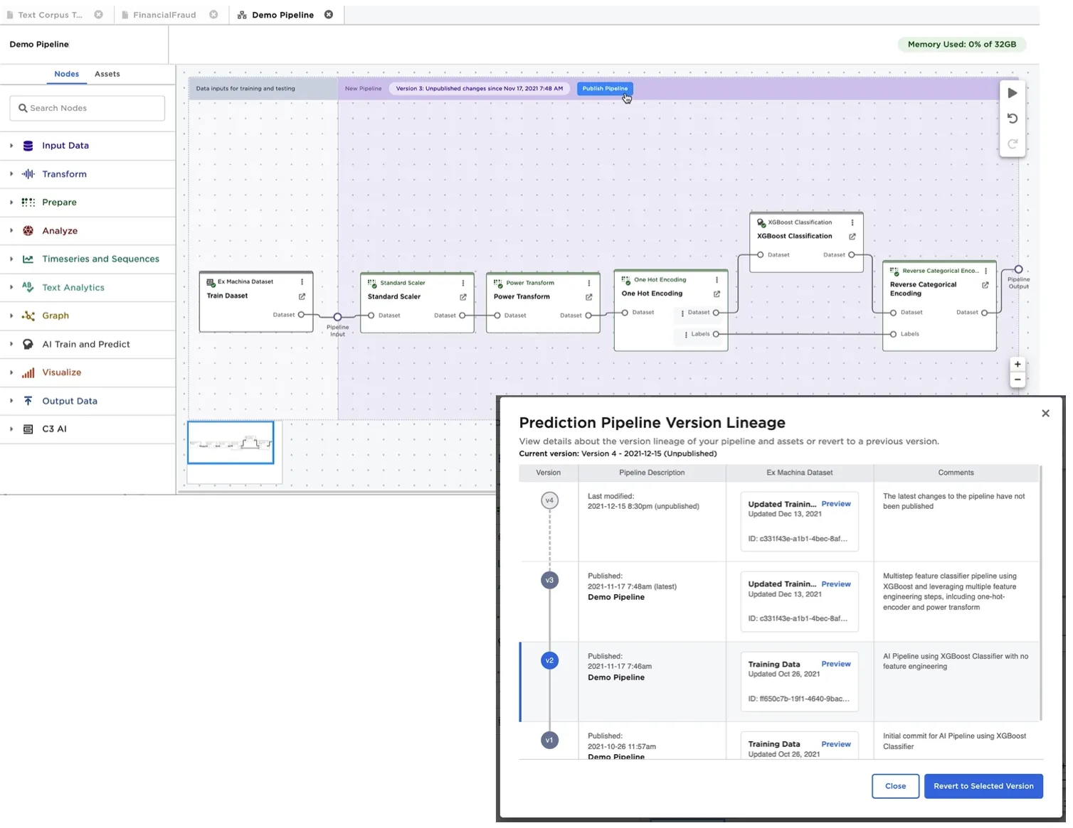
Figure 1: Visual Notebooks visual ML Pipeline builder
After training a pipeline, a user may publish the pipeline to the Ex Machina pipeline registry. Each pipeline is versioned to accommodate and track future re-training and logic changes. The training/validation datasets used to train a specific version of a pipeline are linked to the published pipeline for reference and model reproducibility. A trained pipeline can be loaded into a visual notebook for inference by dragging it from the assets tab. Figure 2 shows the following, typical usage scenario:
- New data to be used for predictions is loaded from an external data source, in this case BigQuery.
- The data is forwarded to a trained pipeline, and predictions are generated.
- Predictions are persisted using a Visual Notebooks dataset or by upserting the data back to a database.
- The predictions visual notebook is configured to run at a regular frequency (for example, weekly) to automate ongoing predictions. If a pipeline is retrained, a user can set visual notebooks to either use the latest version of a published pipeline when performing predictions, or to use a specific version of a pipeline.
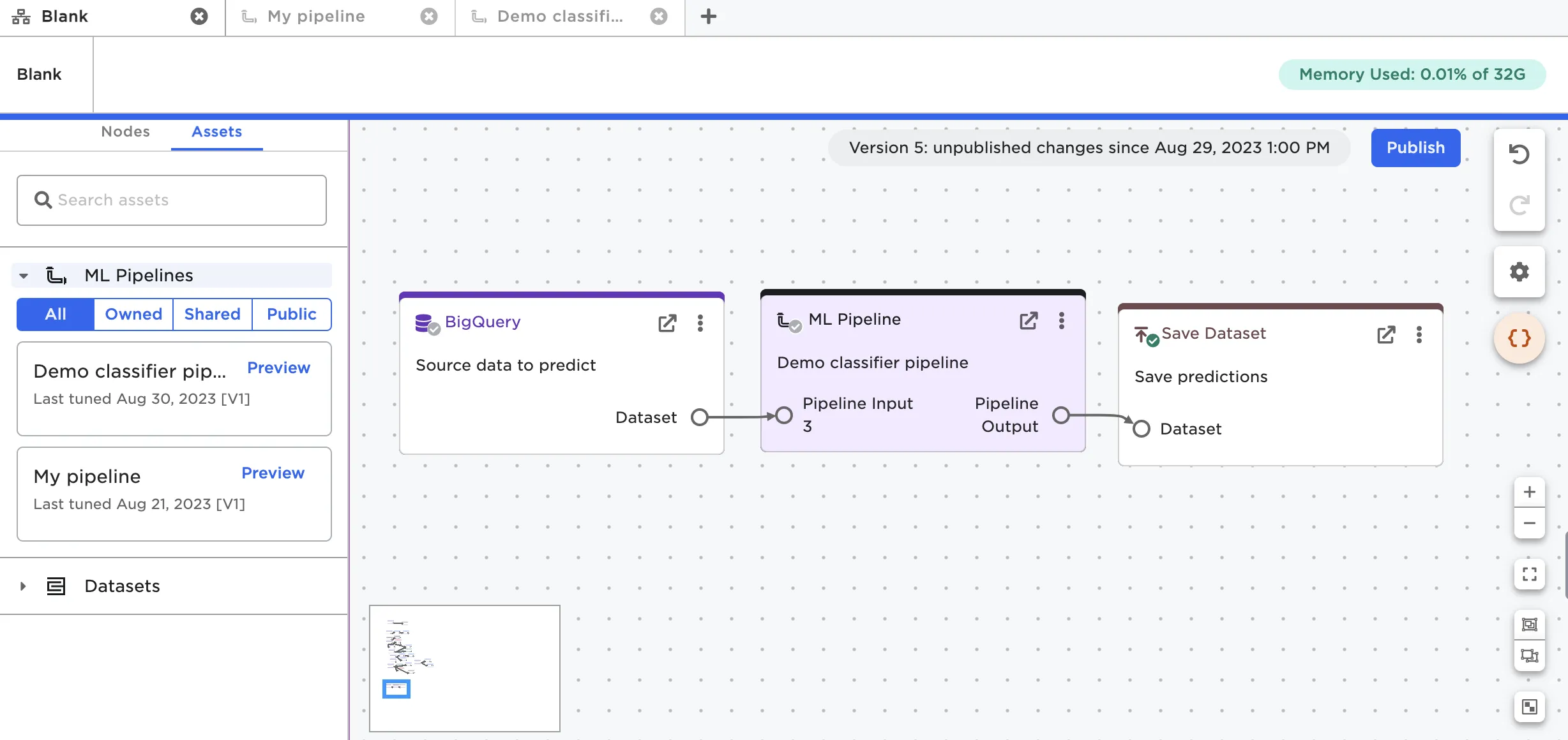
Figure 2: Using a trained ML Pipeline within an Visual Notebooks visual notebook for predictions
Types of Machine Learning Algorithms Supported
Visual Notebooks supports algorithms capable of performing the following objectives
- Classification
- Regression
- Timeseries Forecasting
- Unsupervised Clustering
- Unsupervised Anomaly Detection
Classifier: XGBoost Classifier Example
Visual Notebooks offers a number of algorithms for classification including:
- Distributed Random Forest
- XGBoost
- Gradient Boosting Machines Classifier
- Generalized Linear Models (includes Logistic Regression)
Alternatively, a dedicated node called "Model Search Classifier" allows training multiple algorithms simultaneously to identify which algorithms perform best.
The XGBoost classifier is one of the more powerful algorithms supported. This node allows multiple advanced options including:
- Automated encoding for string based columns
- Automated missing value treatments
- Ability to define validation/test or cross-validation settings
- Ability to perform hyperparameter optimization
- Including ability to define early stopping conditions for hyperparameter search.
When training a model, we may train dozens of variations based on different hyperparameters. The variations are depicted in the node's leaderboard as shown in Figure 3.
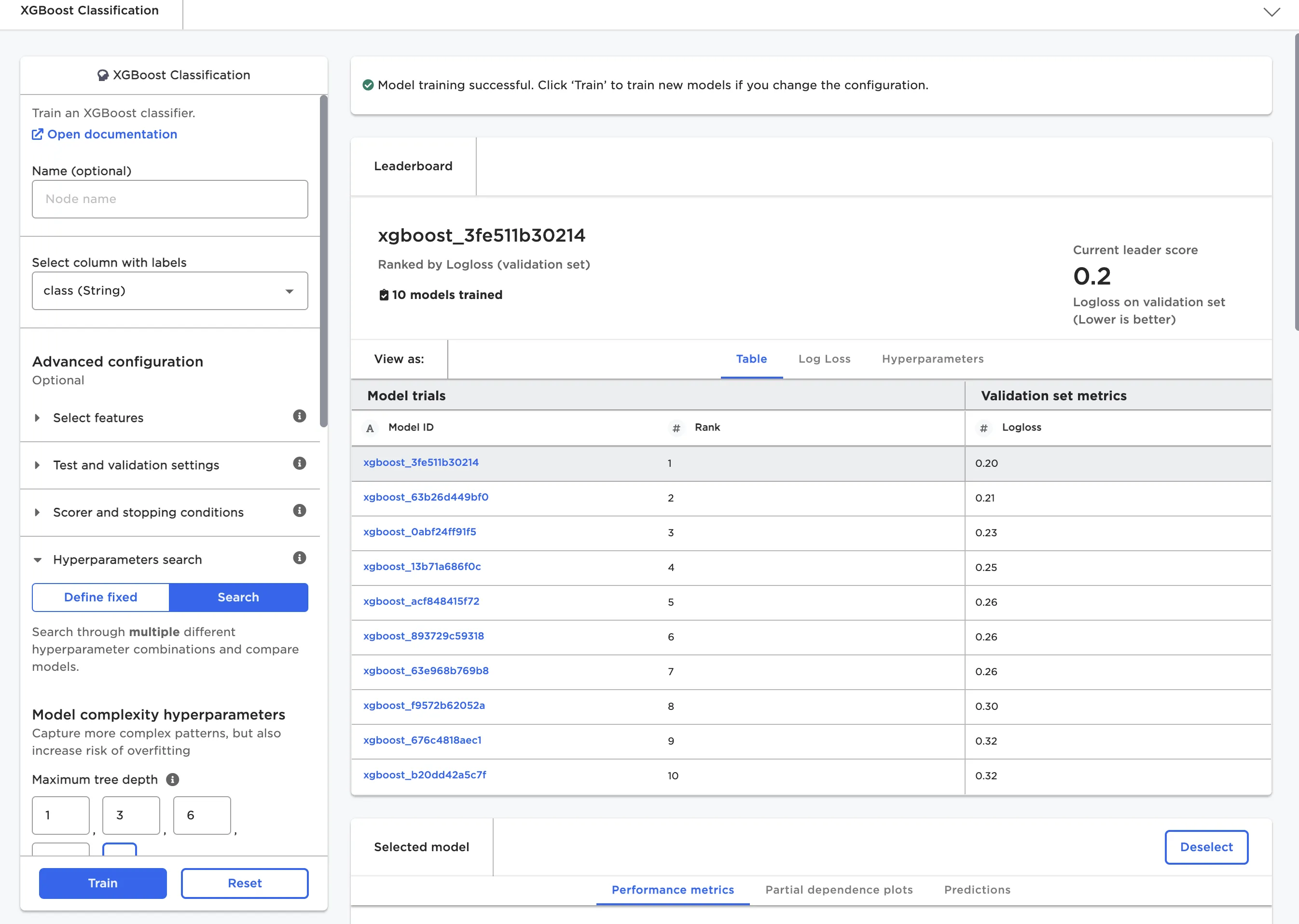
Figure 3: Leaderboard for XGBoost classifier
Once a set of model candidates have been trained, the user selects a model for deeper inspection. As depicted in Figure 4, detailed metrics on a test set are automatically generated, along with model characteristics.
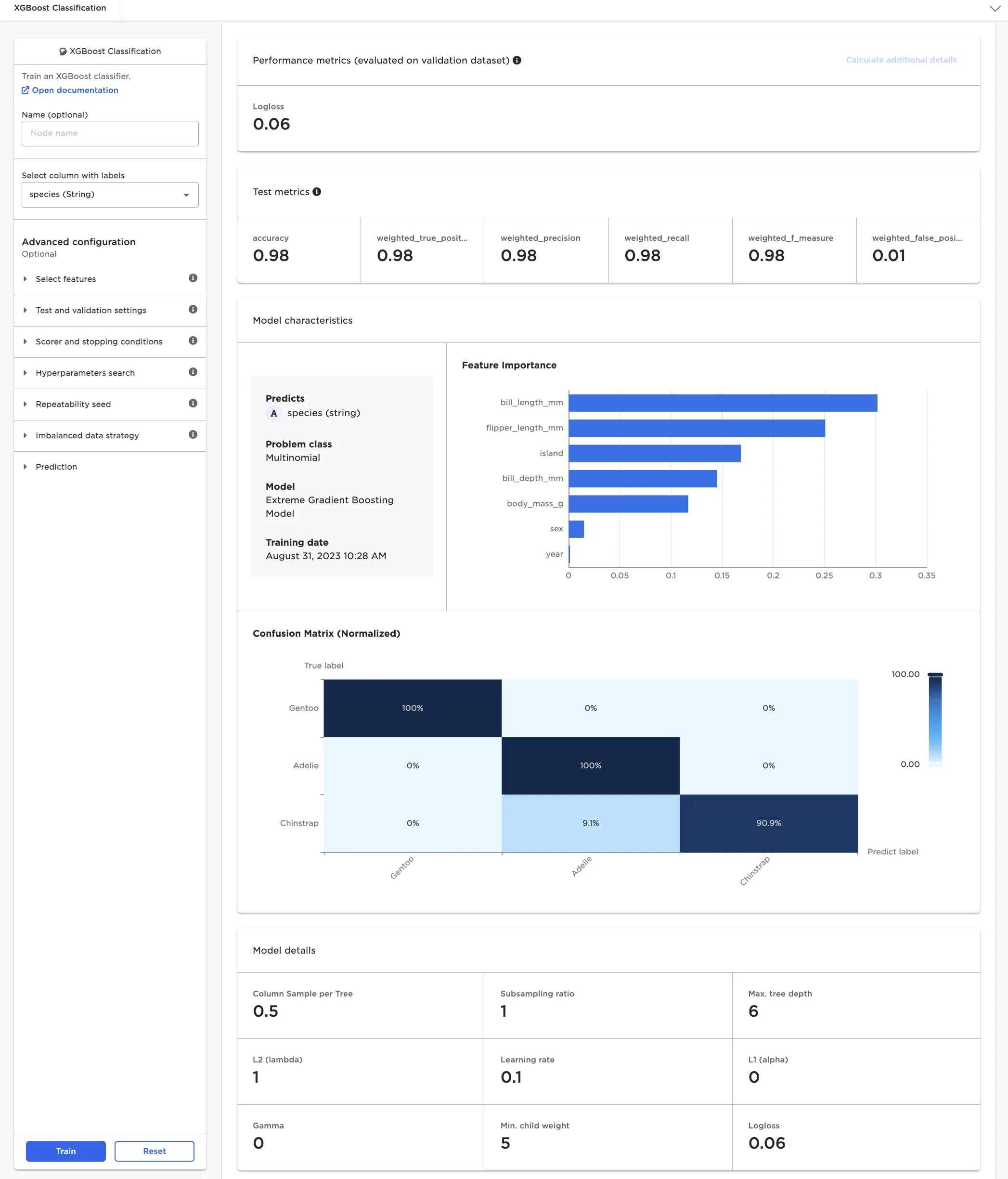
Figure 4: Model details for multinomial classifier model
Unsupervised Clustering: K-Means Example
Each category of machine learning algorithm has its own variation of a leaderboard and model insights.
For unsupervised clustering problems, there is no clear method to rank a leaderboard based on a scoring metric alone. One way to identify an appropriate number of clusters "k" without overfitting is to inspect the leaderboard as an "elbow plot", plotting for different values of "k" scoring metrics such as "Sum of Error Within Cluster" or "Silhouette Score".
When inspecting the "Elbow plot of Silhouette Score", a good model and choice for clusters "k" is found at the curve's maximum. Note the "Silhouette Score" of a model is a time consuming calculation to perform, and thus the "Elbow plot of Silhouette Score" can only be calculated once all models have been trained as an additional calculation step.
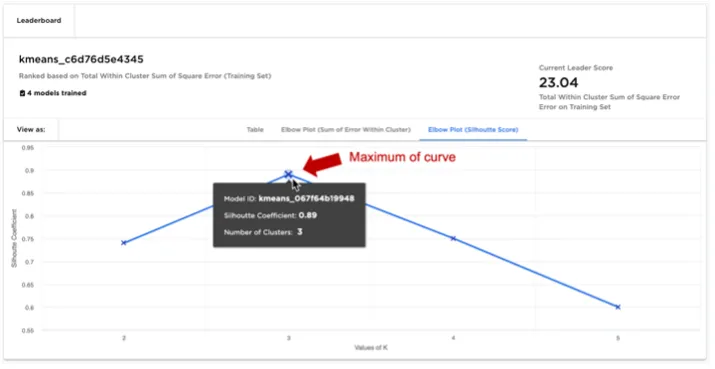
Figure 5: K-Means leaderboard with elbow plot of silhouette score
After selecting a K-Means model from the leaderboard, the user can examine a specific cluster in detail:
- The user is provided with visualizations that highlight which features are most influential in determining whether a given data point falls within the selected cluster.
- A "surrogate decision" tree is rendered to help explain how the selected cluster differs from all other data points. Surrogate decision trees are helpful to visualize cluster characteristics where the number of features is large, prohibiting the use of simple scatter plots to visualize clusters.
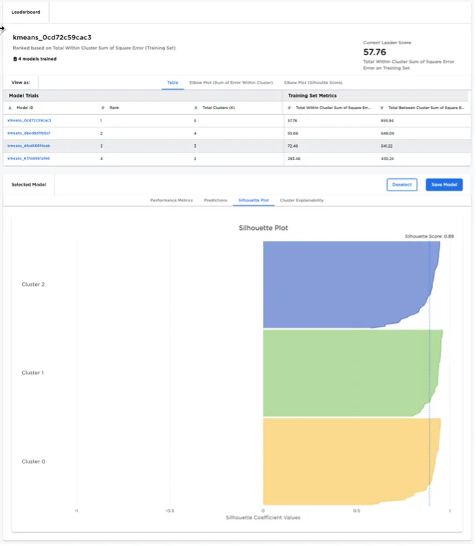
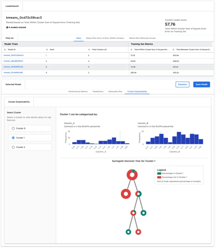
Figure 6: K-Means node model explainability