Working with Nodes in Visual Notebooks
Nodes contain the majority of Visual Notebooks's functionality. You can think of each node as a line of code, or as a specific action you'd like to accomplish with your data. Use nodes to import and export data, wrangle data, create new features, train machine learning models, make visualizations, and more. Nodes are accessible within visual notebooks and ML pipelines.
Selecting nodes
To start working with data in Visual Notebooks, first find a node that matches the action you are trying to accomplish. For example, if you want to upload a CSV file, find the CSV node. If you'd like to train an XGBoost model, find the XGBoost node. If you'd like to rename columns in your data, find the Columns - Rename node. All available nodes are listed in the sidebar on the left side of the canvas. Nodes are grouped by section to make it easier to find the one you're looking for. When looking for a specific node, use the search bar at the top of the node palette.
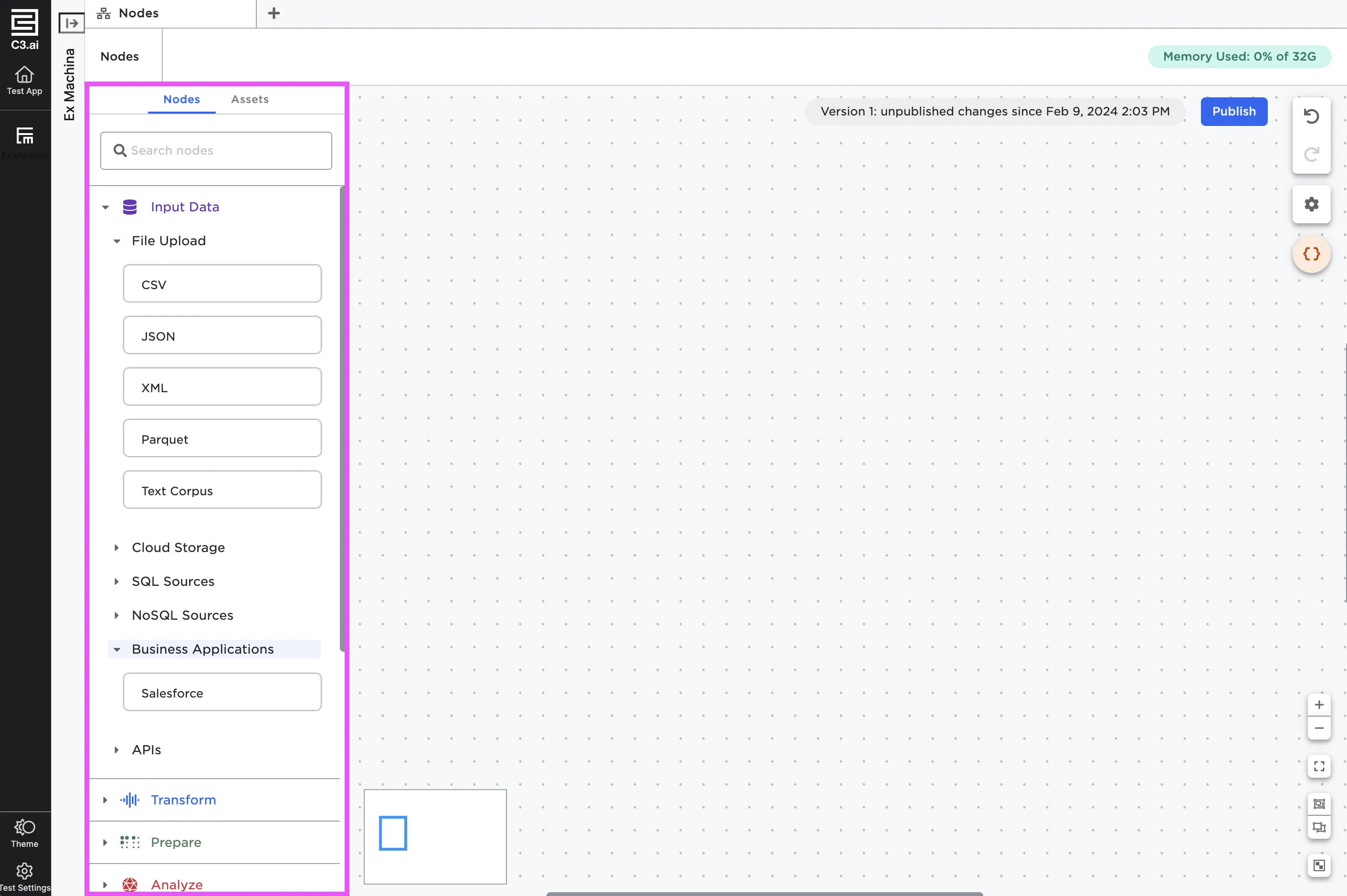
Figure 1: Nodes in the node palette
To use a node, select it and drag it onto the canvas. You can also double click on a node in the node palette to add it to the canvas.
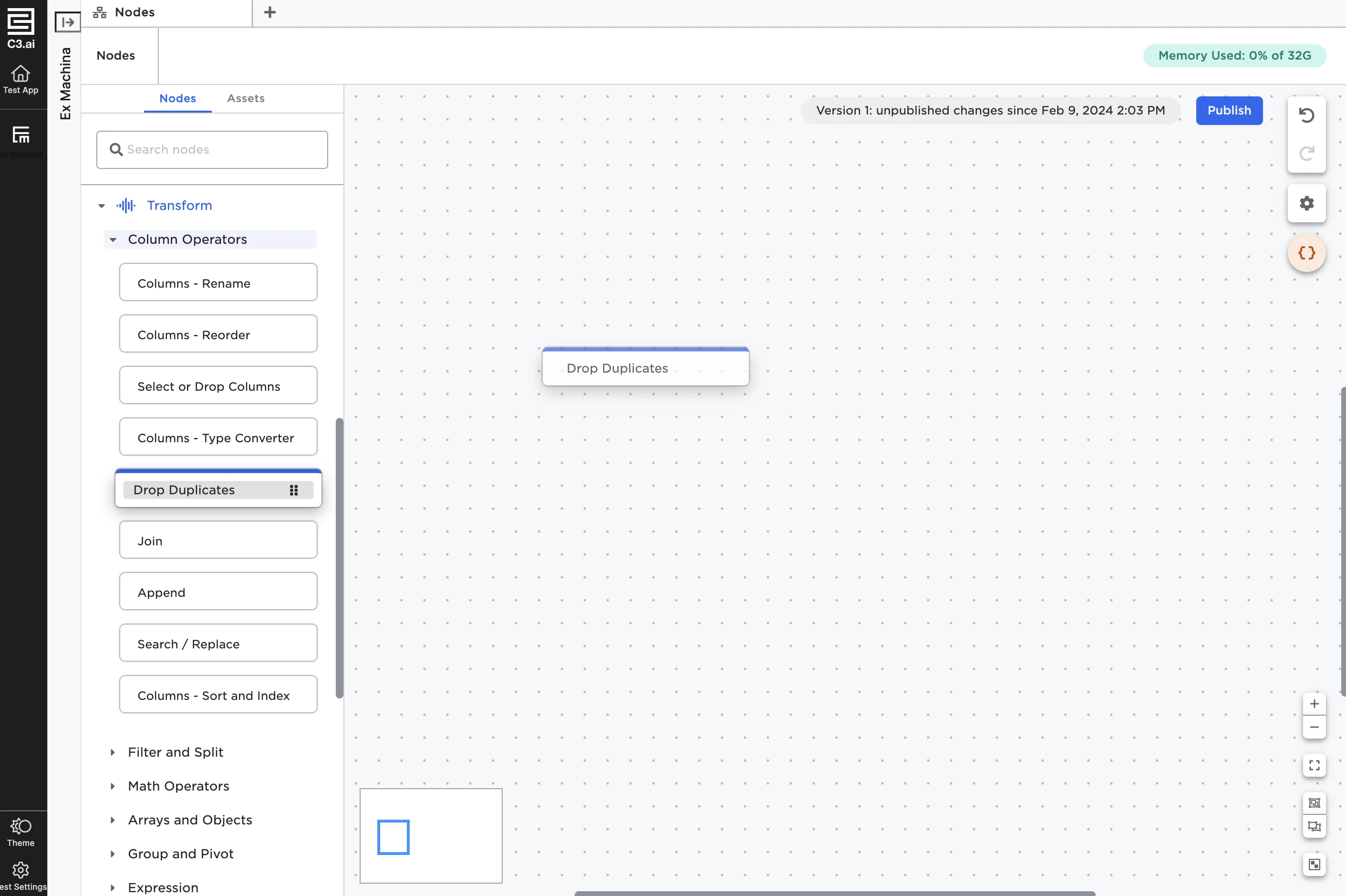
Figure 2: Drag and drop nodes onto the canvas
Node components
Nodes show up on the canvas as rectangles with a colored bar across the top. Each node has at least one port either on the right or the left side. These act as input and output ports of each node.
Every node has an arrow icon in the top right corner. This button opens the node in a full screen view.
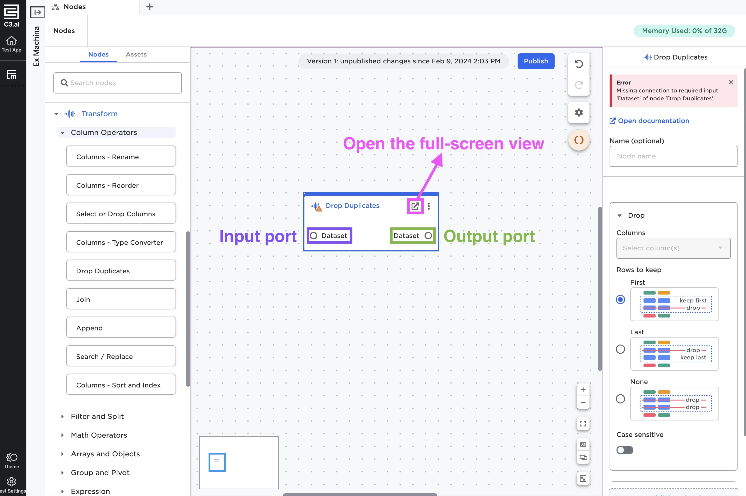
Figure 3: An annotated node
To the right of the full screen button is a three button menu. Selecting the menu brings up a menu with the following options:
- View details: Open the node in a full-screen view.
- Force rerun: Run the current node and all nodes before it.
- Clone: Clone the node with its existing configuration options.
- Delete: Delete the node.
- Add description: Add additional information about what the node is doing. If you add a description, a pencil icon appears to the left of the node.
- Group: Create a group that contains the current node.
- Ungroup: Remove the node from a group.
- Export to CSV: Export the dataframe to a CSV.
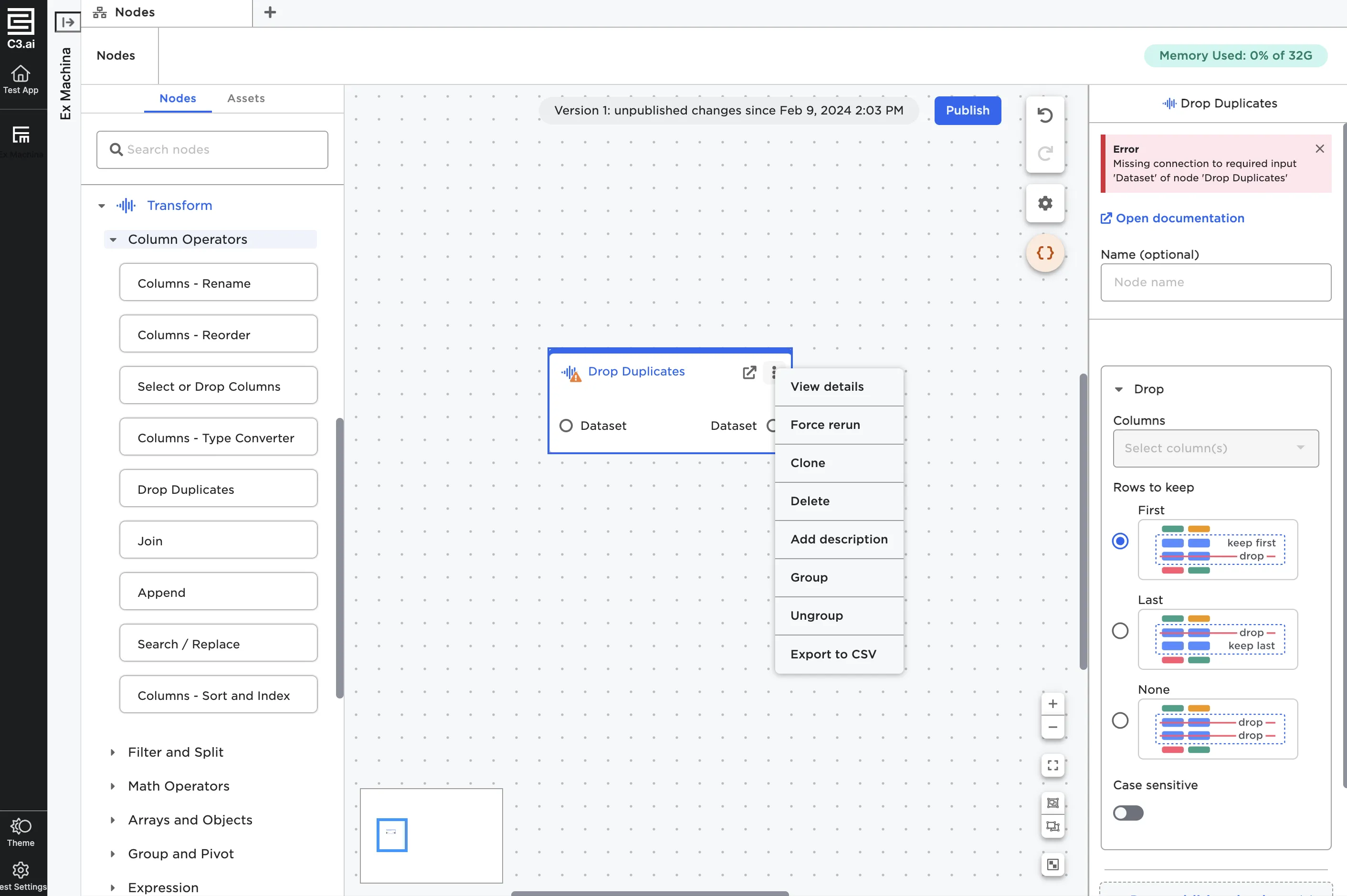
Figure 4: Additional node options
As you use nodes, you may notice that some have flags in the right corner that indicate their status or state. These are pictured and described below.
- Estimator flag: Indicates that this node is an estimator. For more information about estimators, see below.
- Beta flag: Indicates that the node is a new feature and may have limited functionality.
- Stories flag: Indicates that a visualization within the node is publishing to a collection and is used in an Visual Notebooks story.
- Parameter flag: Indicates that a parameter is being used within the node.
 Estimator flag
 Beta flag
 Stories flag
 Parameter flag
What is an estimator?
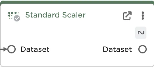
An estimator is any node that is "fit" on data—in other words, these nodes use the current values of the data to perform some action on that data. For example, consider the Standard Scaler node. The Standard Scaler node is frequently used before training a model. This node finds the standard deviation of the values in a column, then divides all values in that column by the standard deviation. In order for this node to work properly, it has to be able to "see" the values in the given column so it can calculate the standard deviation. If the values in that column change, the standard deviation the node uses would need to change as well. This node, as well as other estimators like it, relies on the actual content of your data at the time you run the node.
While Standard Scaler is a good example, it isn't the only estimator worth talking about. Nearly all machine learning nodes are estimators, because they learn and find patterns based on the values of the provided data. Most estimators in Visual Notebooks live in the Prepare and AutoML Train node categories.
Configuring nodes
You can configure nodes from the side panel in the canvas or in the full-screen view. Nodes have a mixture of required and optional fields. Every node has an identical Name field as the first option. If you chose to enter a name, that name will show up on the canvas within the node. Adding names for your nodes can help you remember what each node does in your workflow. Naming nodes is similar to commenting your code in a traditional data science workflow.
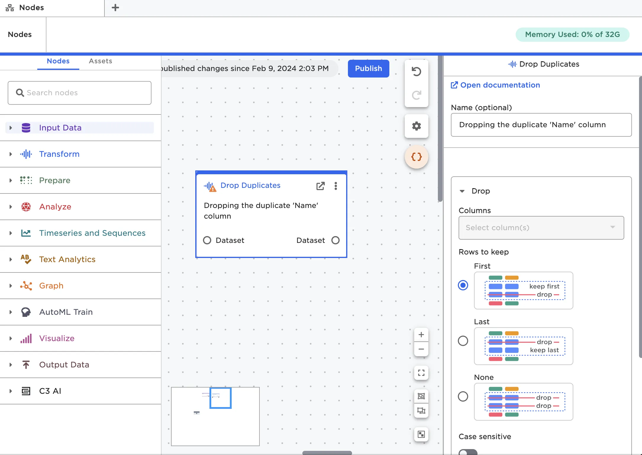
Figure 6: Add an optional name to your nodes
If you need help determining what each field does, see the documentation for that node. You can access the documentation by selecting the See documentation link that appears at the top of the configuration panel.
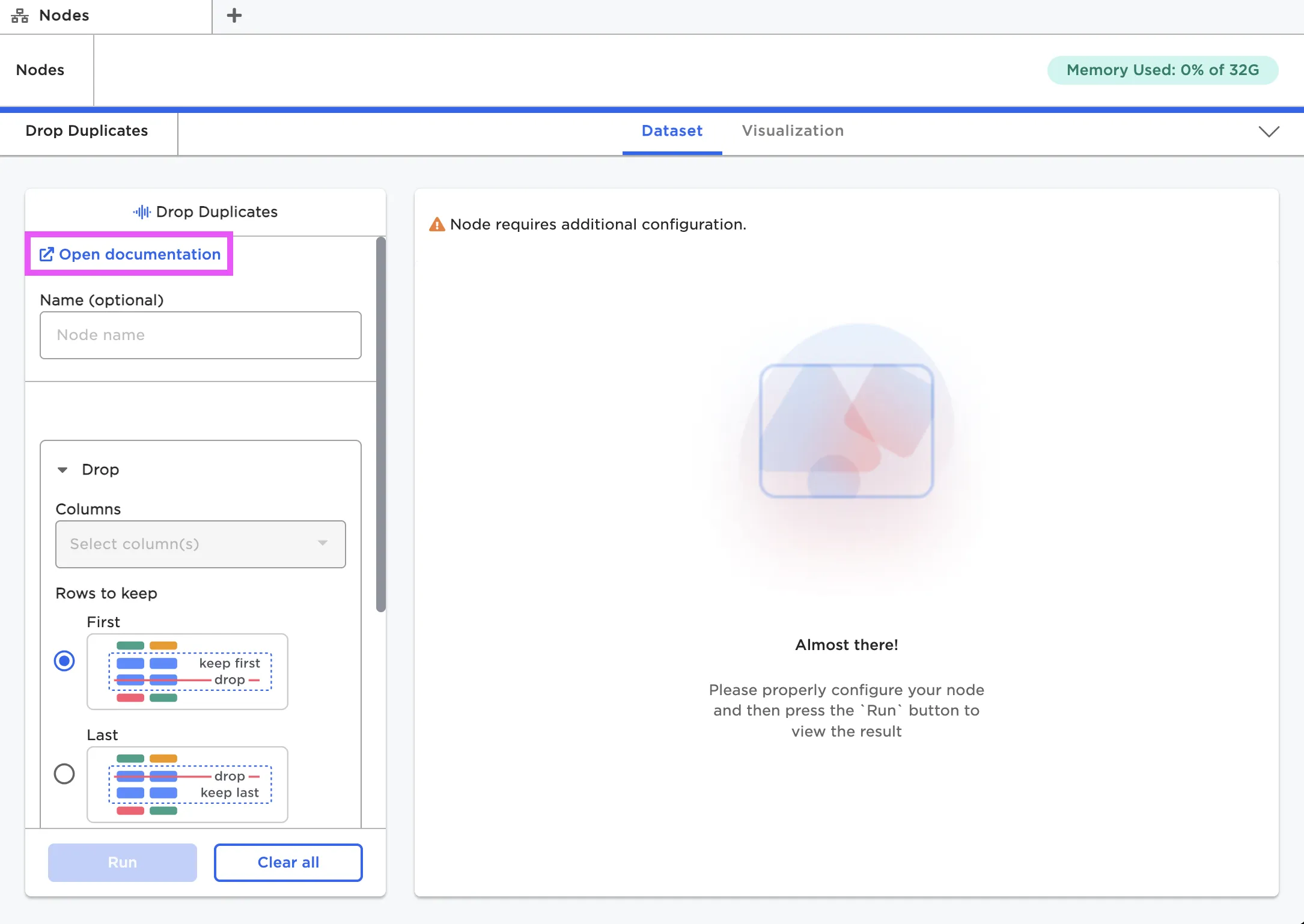
Figure 7: View documentation for a specific node
If a node is not configured correctly, Visual Notebooks shows an error message. These error messages are usually helpful to pinpoint what is wrong, but if you need extra help, check out the documentation for that node.
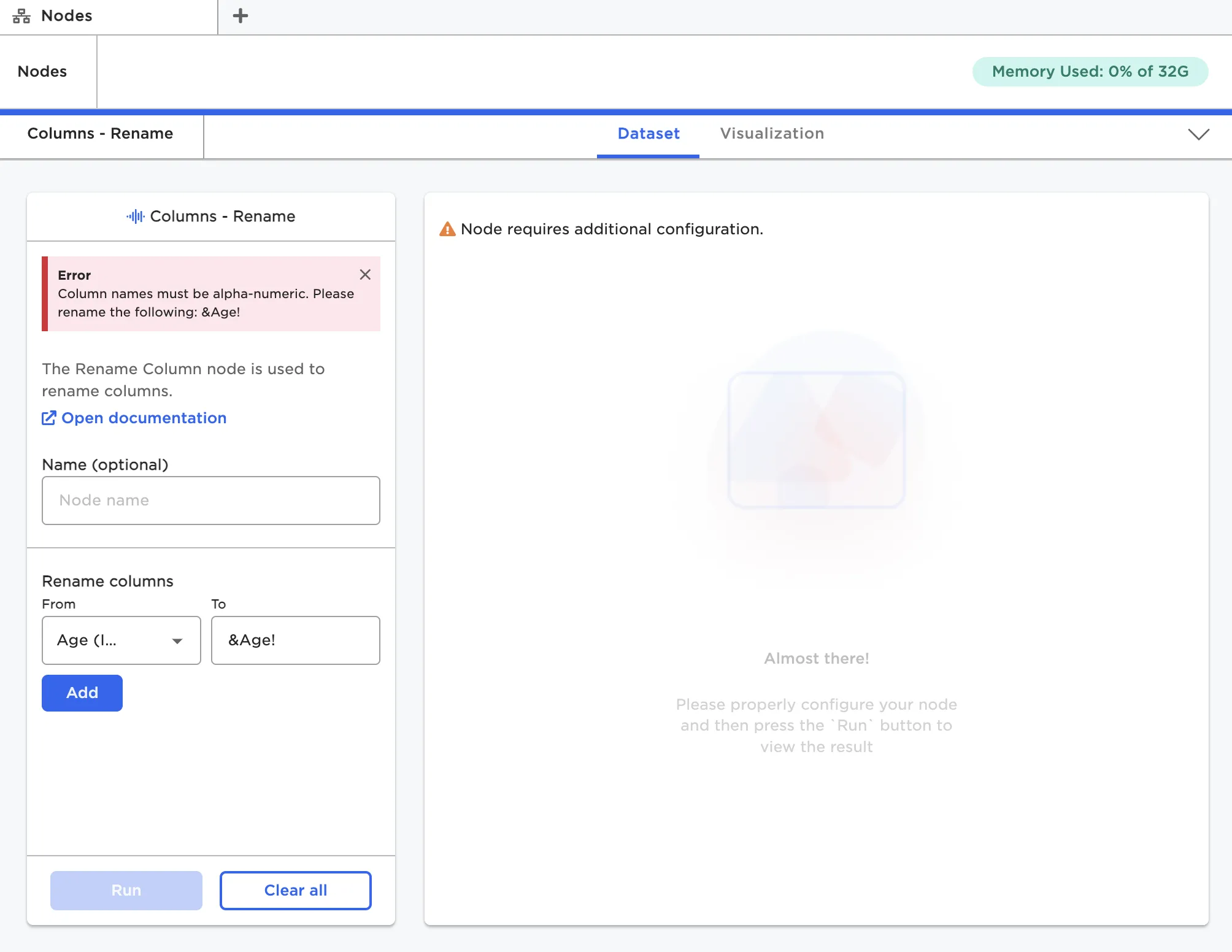
Figure 8: A node's error message
When viewing nodes on the canvas, the icon in the left corner indicates the node's state. Nodes have a yellow caution icon in the left corner until they are correctly configured. Once a node is configured, the icon changes to a gray check mark. When the node runs successfully, you see a green check mark. If a node encounters an error, the icon is a red exclamation mark.
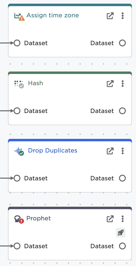
Figure 9: A node's status indicator
Dataframes
Visual Notebooks displays data in dataframes. A dataframe is a way of representing data using a table with columns and rows. As you work with data in Visual Notebooks, you can see and interact with your dataframe at every step in the process. To see the dataframe associated with a specific node, you must open the node in the full-screen view.
If the node is correctly configured, you should be able to select the blue Run button at the bottom of the configuration panel. After you select Run, the dataframe appears to the right.
Note: Running a particular node also runs any nodes earlier in the chain. So if you want to run a whole project you don't have to run each individual node, you can just run the last node in the chain.
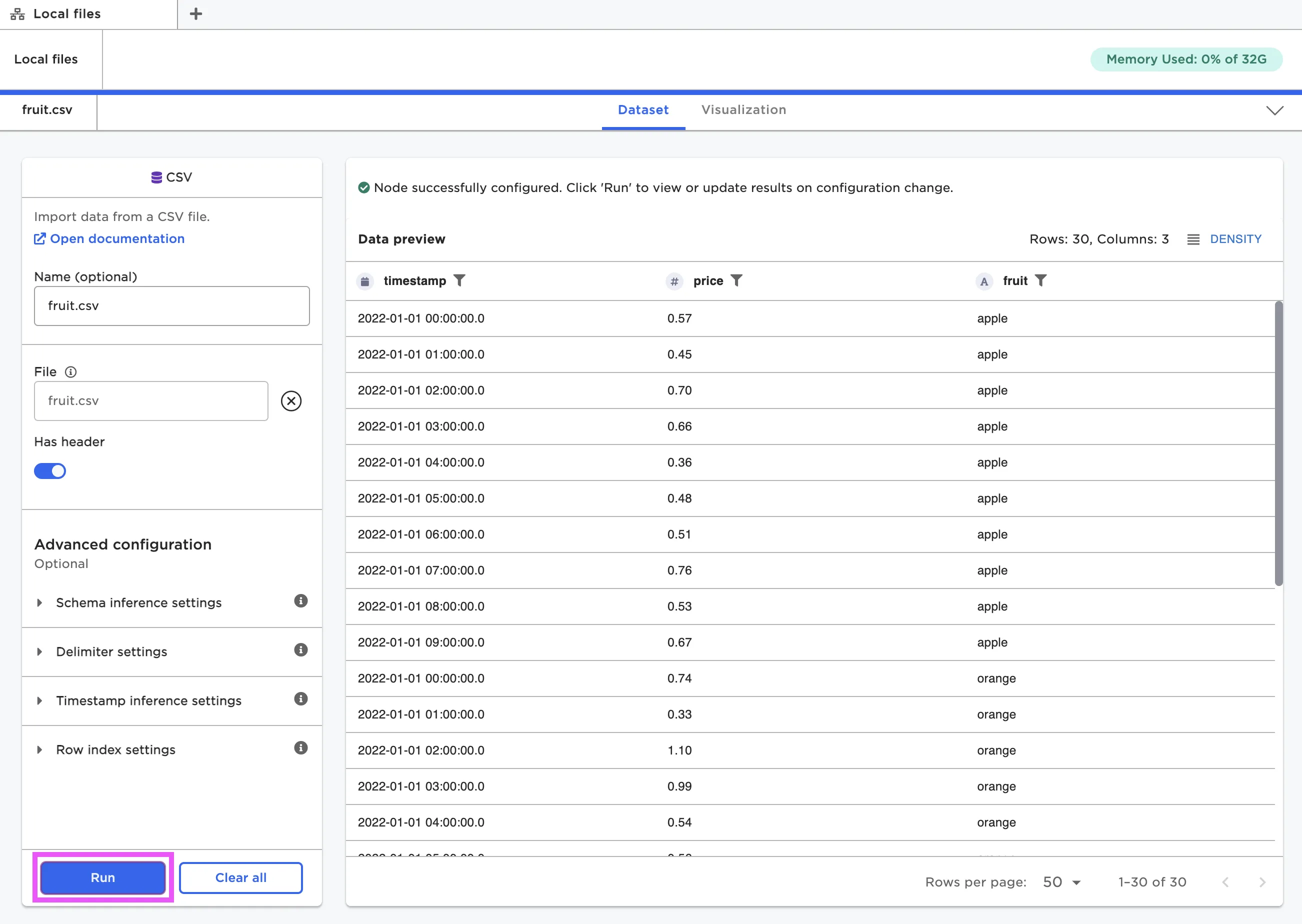
Figure 10: View the dataframe within a node
Visual Notebooks dataframes have interactive components. At the top of the dataframe is a row with column header names. Each column name has an icon beside it that indicates what data type the column is. You can select any of the column names to bring up an analysis panel with information about the data in that column. View data quality information, basic statistics, a histogram, and a list of most frequent values in that column.
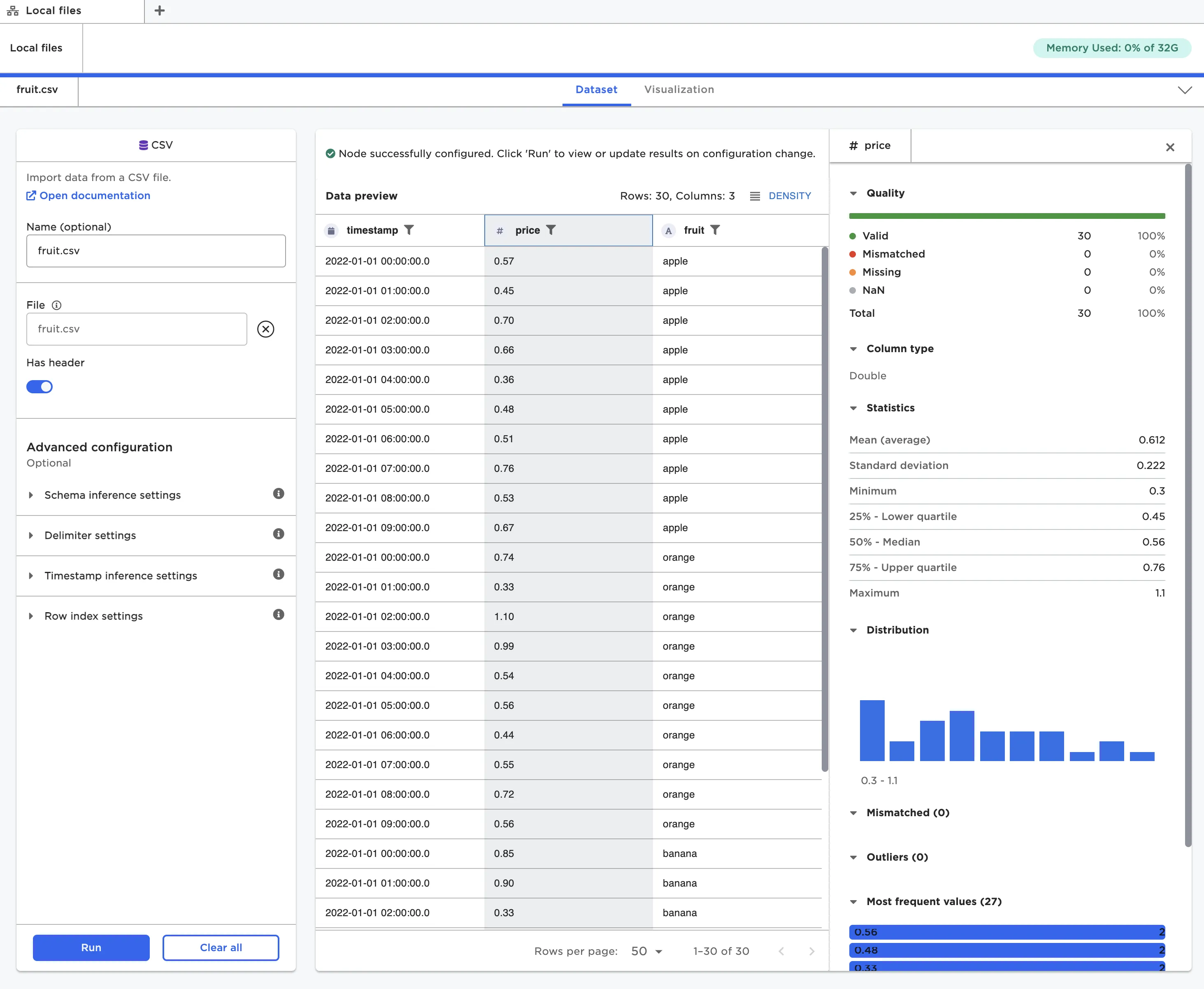
Figure 11: Analysis panel for the selected column
You can change the way the dataframe is displayed within a node. Use fields at the top and bottom of the window to adjust the row density and the number of rows displayed per page.
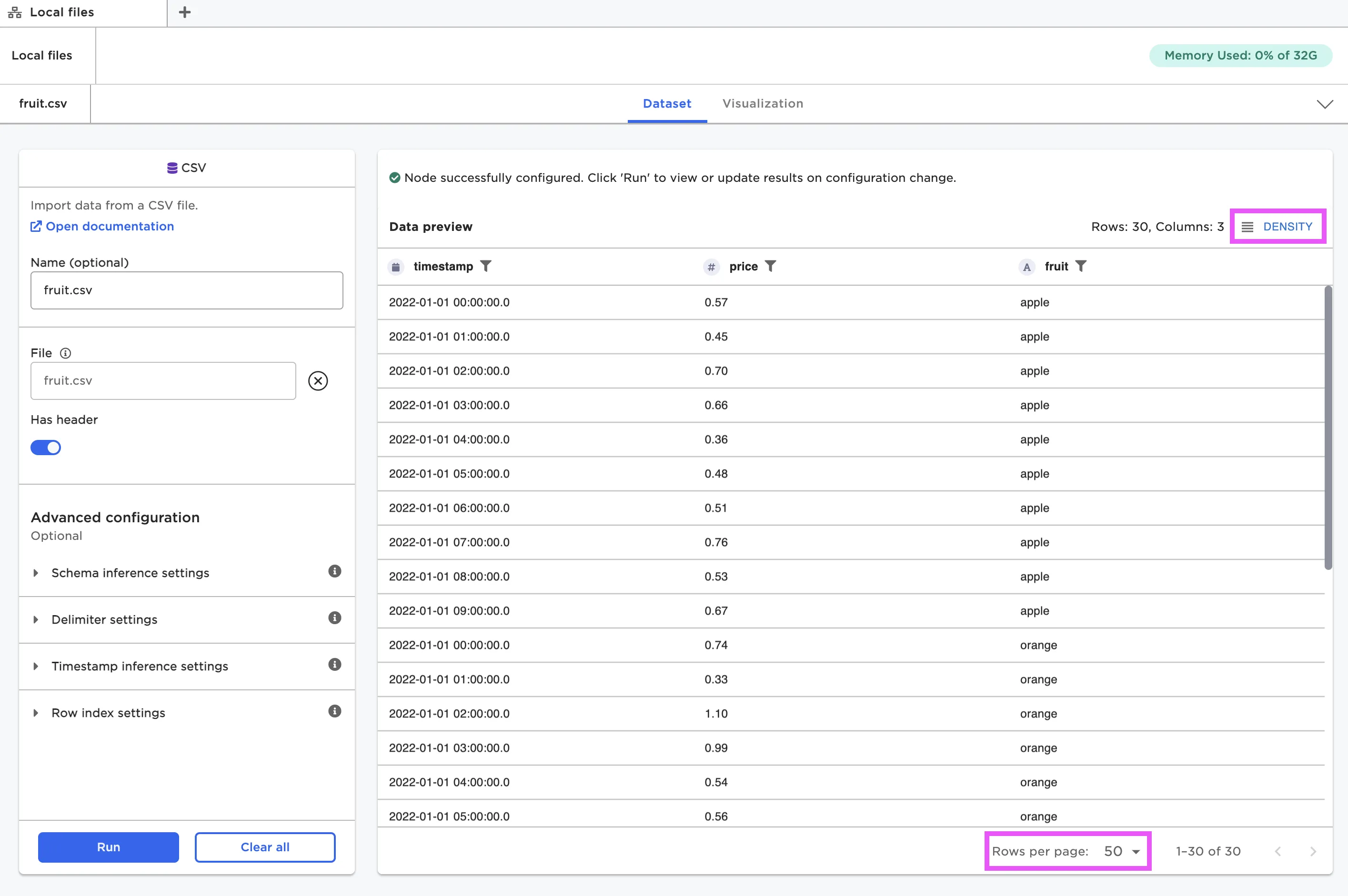
Figure 12: Change the way the dataframe is displayed
If you want to take a closer look at the data, you can select the funnel beside a column name to filter the data by a certain condition.
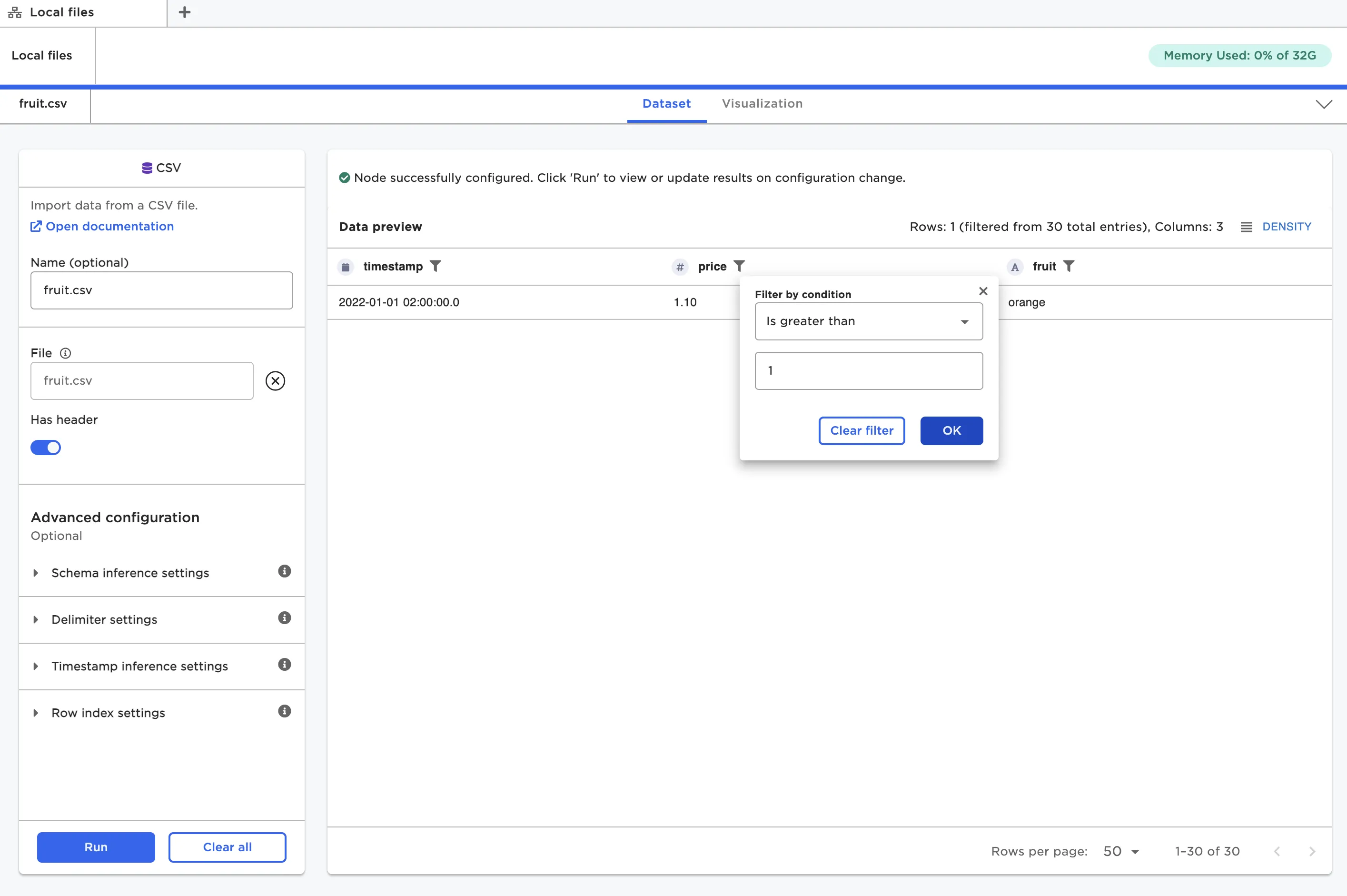
Figure 13: Filter the dataframe by a certain condition
When hovering over the column header name, both an arrow icon and three dot icon appear. Use the arrow icon to sort the column in ascending or descending order. Select the three dot icon to bring up identical sort options, as well as options to pin that particular column to the right or left. Pinned columns remain visible when scrolling horizontally across the dataframe.
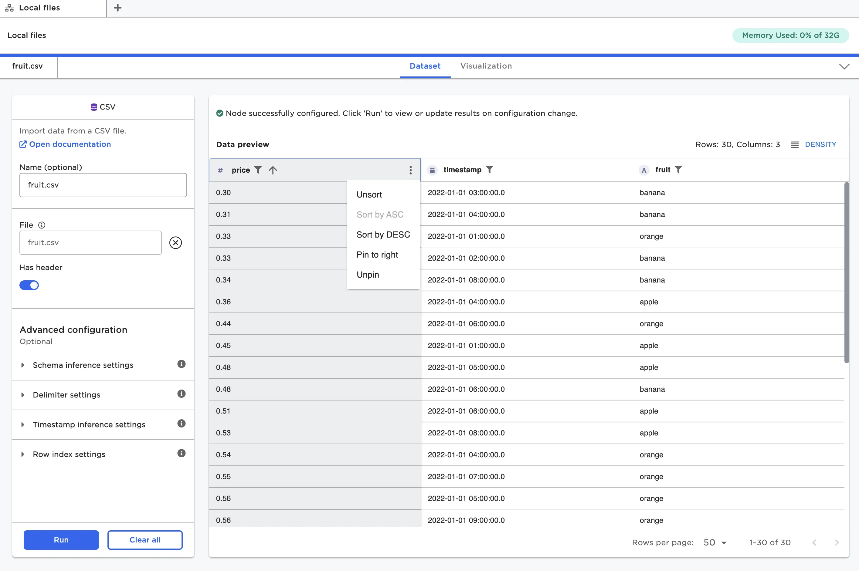
Figure 14: A dataframe with the "price" column sorted in ascending order and pinned to the left
Note: All filtering and sorting done within a node are not persisted in the dataframe. These options are meant for temporarily analyzing data within that specific node. If you want to definitively alter the dataframe with specific sort and filter conditions, use the Columns - Sort and Index, Filter by Value, or Filter by SQL nodes.
If you want to exit the full-screen dataframe view and return to the canvas, select the down carat in the top right corner of the screen.
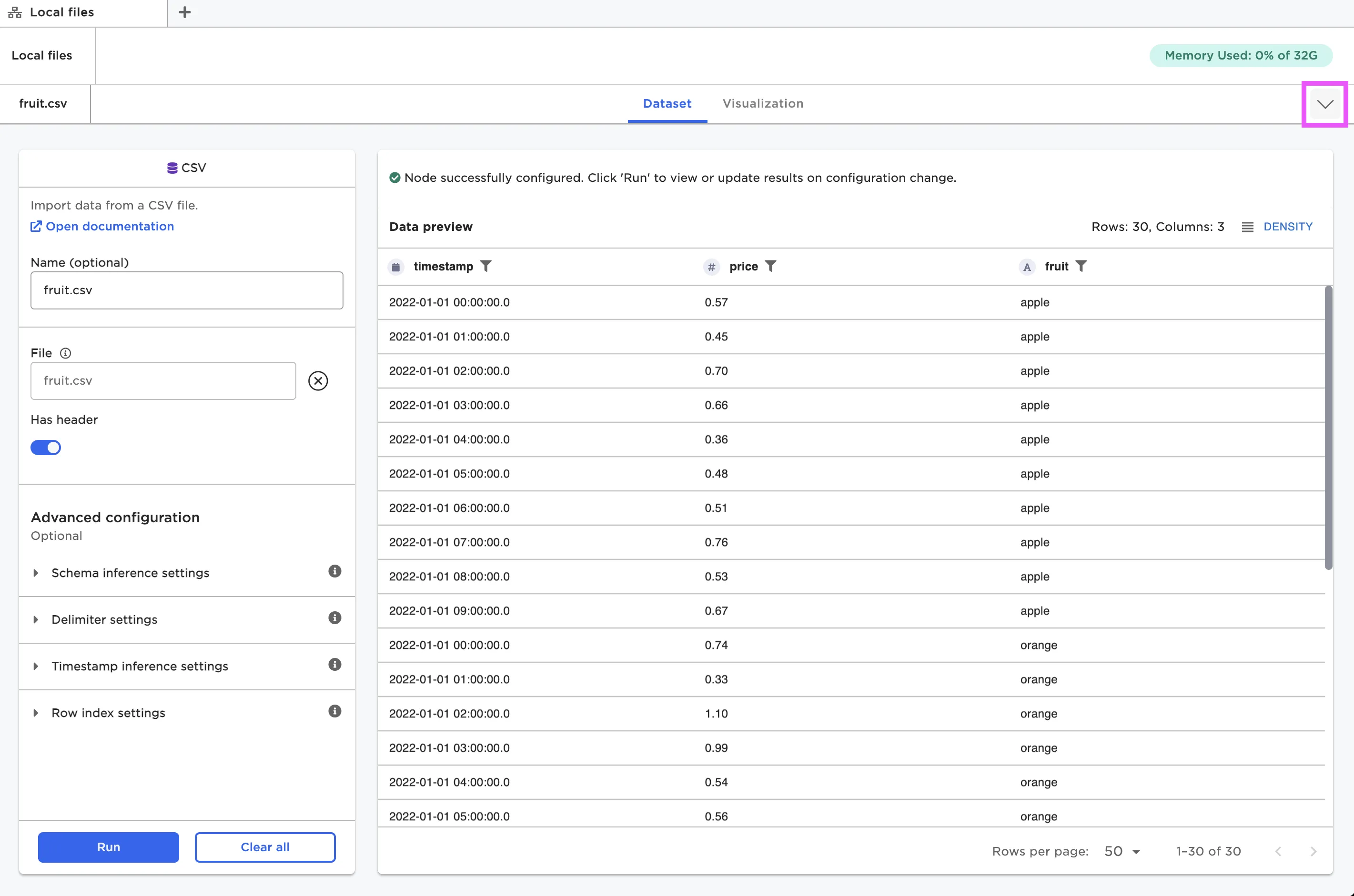
Figure 15: Exit the full-screen view and return to the canvas
Your dataframe is accessible from any node at any time.
Note that the dataframe is saved separately within each node. This means that even if you do something unintentional or you change your data in a way you dislike, you can simply delete that node and replace it with something else.
Visualizations
When viewing a node in the full-screen view, there are two tabs at the top of the screen: Dataset and Visualization. When you are viewing the dataframe, the Dataset tab is active. If you'd prefer to view your dataframe as a visualization, you can switch to the Visualization tab instead.
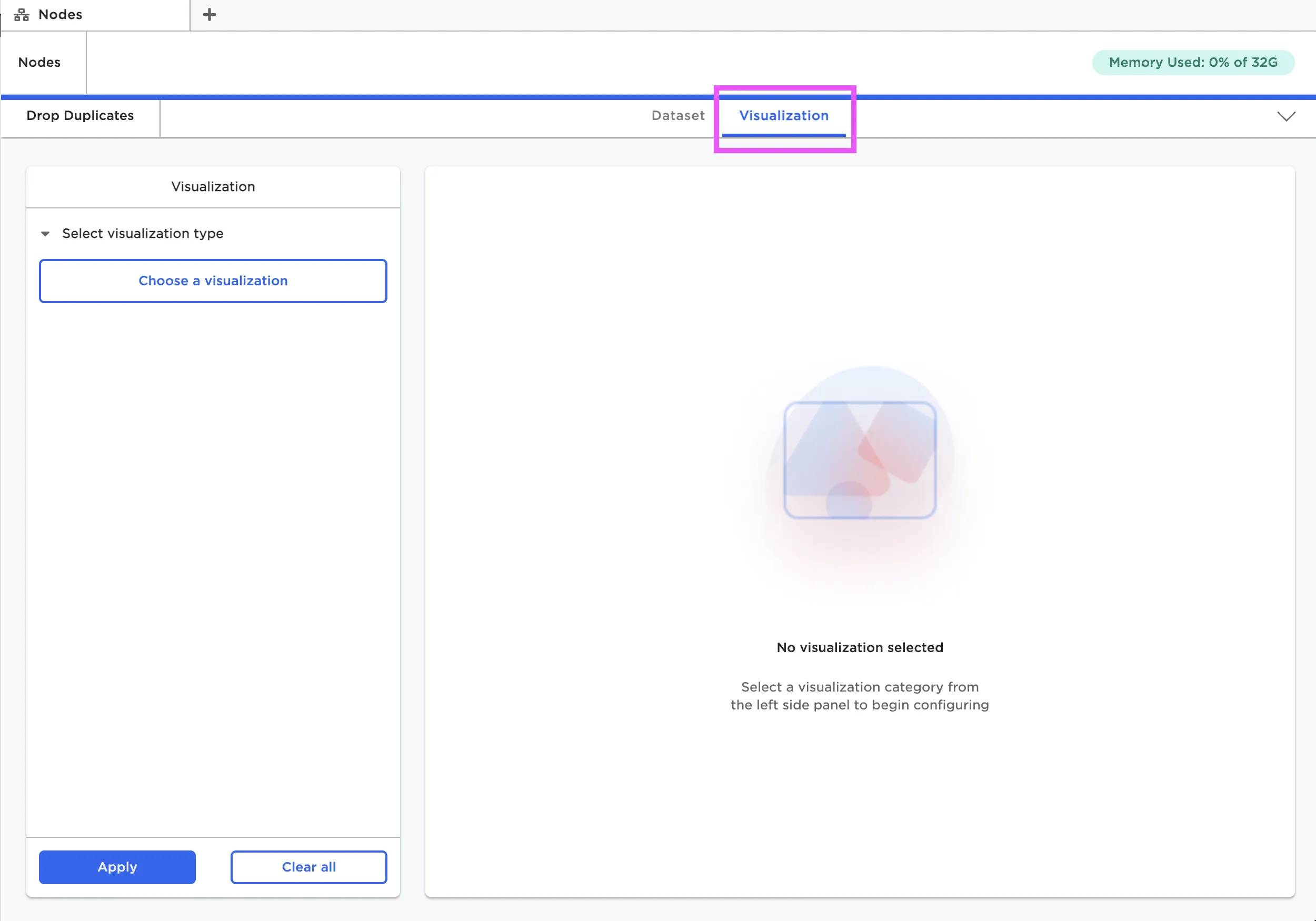
Figure 16: The Visualization tab within a node
Once in the Visualizations tab, select the button to Choose a visualization. The following visualizations are available:
- Calendar Heat Map
- Line Chart
- Pie/Donut Chart
- 3D Scatter Plot
- Autocorrelation Plot
- Correlation Matrix
- Pair Plot
- Scatter Plot
- Box Plot
- Histogram
- Normal and QQ Plots
- Bar Chart
- Sankey Diagram
- Geospatial Visualization
- Python Visualization
- Summary Table
Select a visualization type, then configure the visualization using the provided fields.
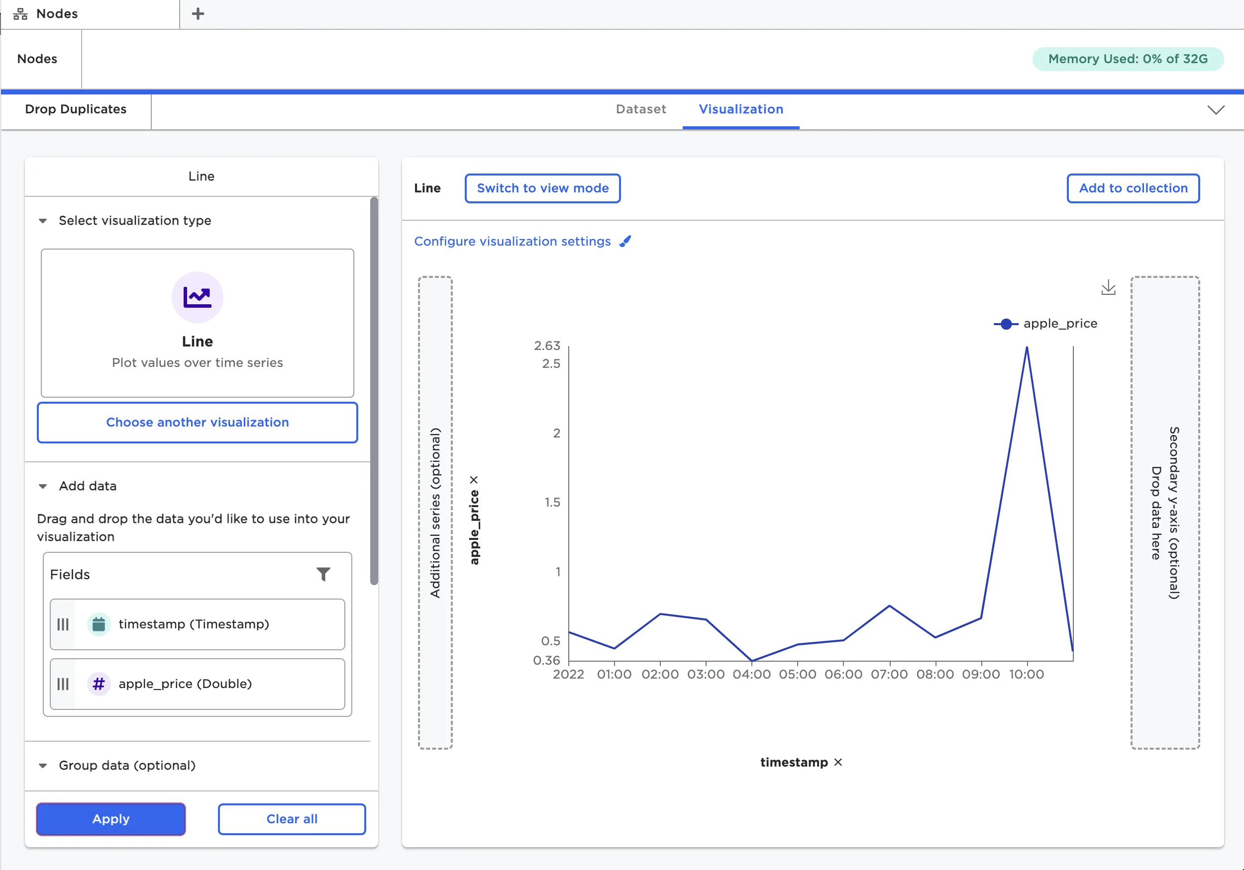
Figure 17: A visualization made within a node
Note that there are individual visualization nodes available. Visualizations made from the Visualizations tab have the same functionality as visualizations made from a specific visualization node. Some people prefer to use separate nodes for their visualizations, while other prefer to have visualizations tied to a specific dataframe.
Connecting nodes
On the canvas, you can connect nodes using the input and output ports to build a visual analytics workflow.
To connect nodes, drag a line between the output port of the previous node to the input port of the following node. Connecting nodes is directional; you must connect nodes in the direction the data flows. In other words, the connecting line must start from the node that has the existing data. You can only connect output ports to input ports; you cannot connect input ports to output ports.
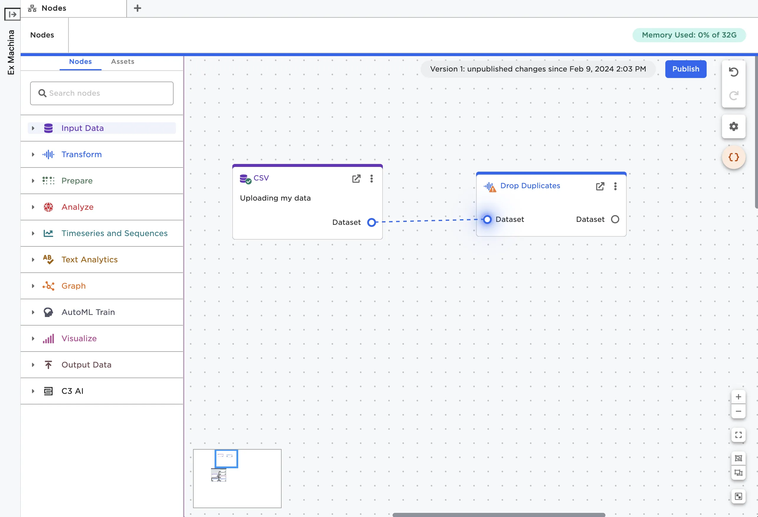
Figure 18: Connect nodes using ports
You can delete a connection by selecting the line between nodes and pressing delete or backspace on your keyboard.
Note that you can connect multiple nodes to the same output port to explore different ideas in parallel.
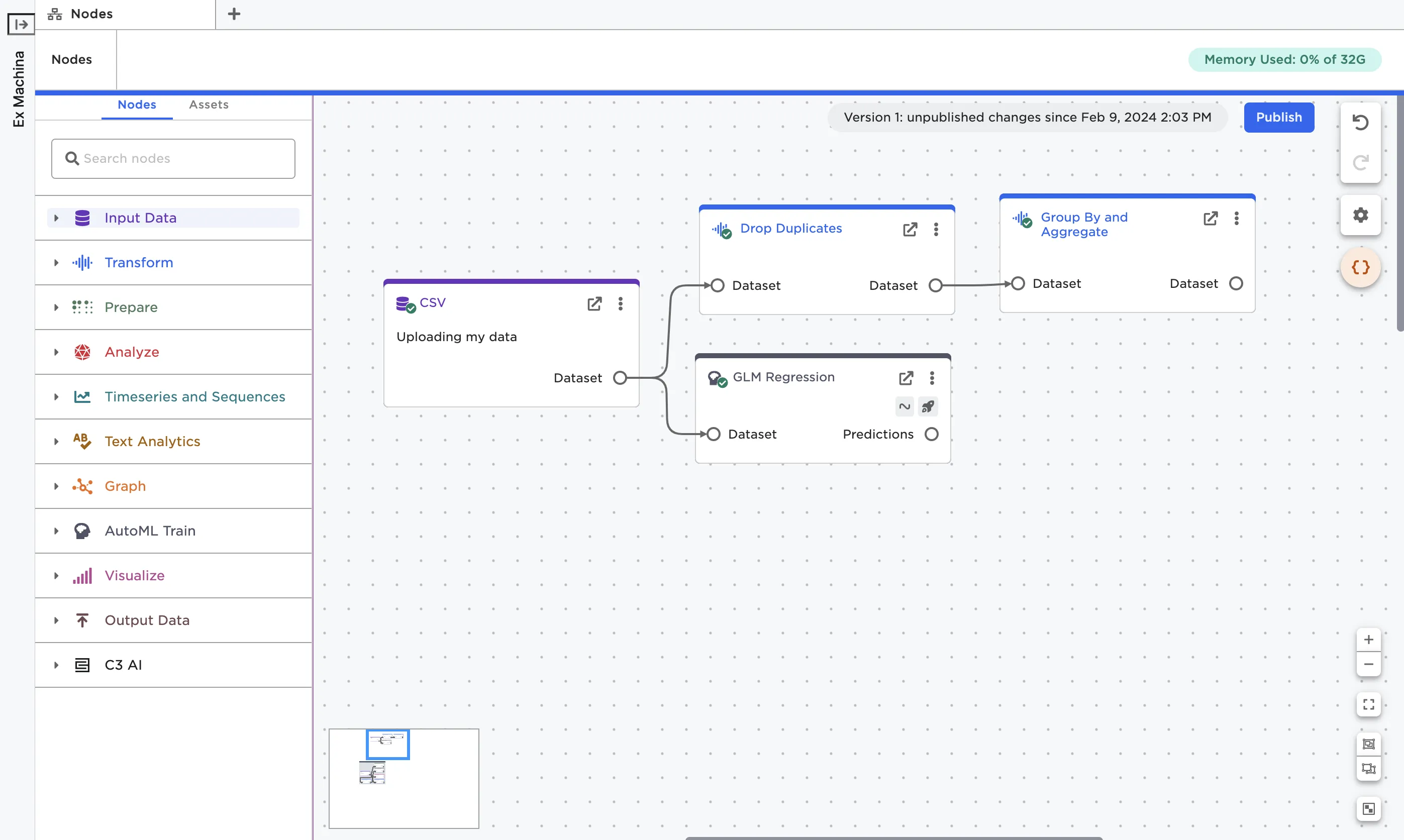
Figure 19: A node with multiple connections