Visualizations in Visual Notebooks
Visual Notebooks supports visualizations with flexible configuration options. Visualizations can be assembled into dashboards called Stories.
Visualization Selection
Visual Notebooks contains an informative visualization selection modal. There is a concise description and an example chart for each visualization type. Switching visualization types preserves the data configured for the initial visualization.
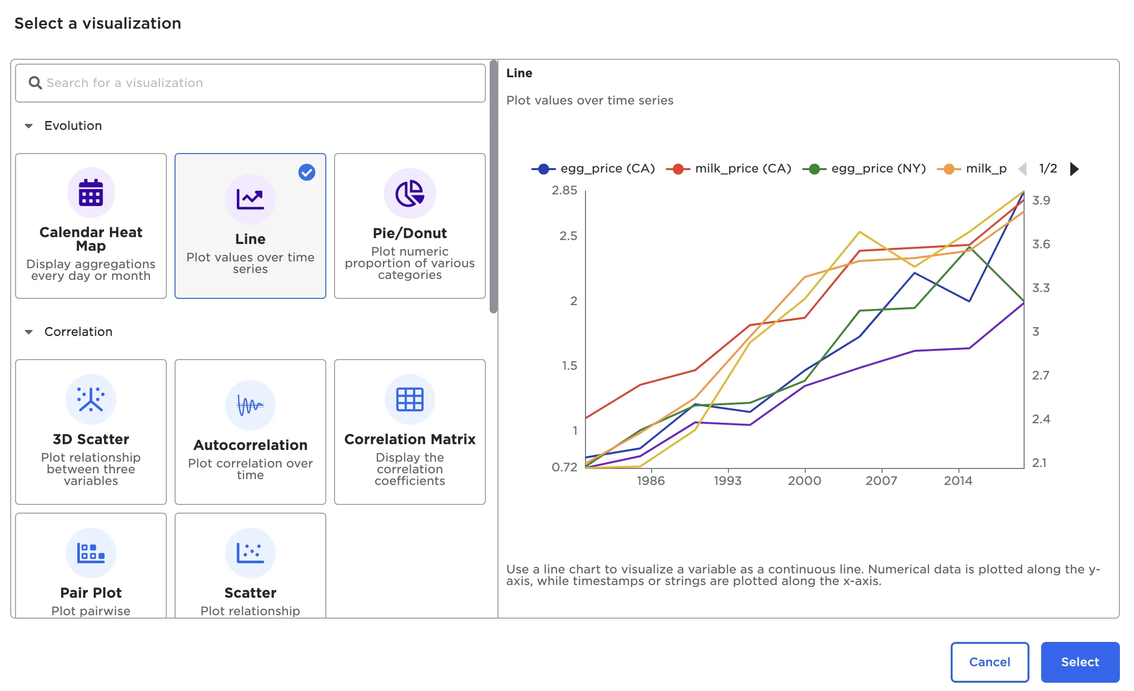
Figure 1: Visualization selection modal
Available Chart Types and Examples
Visual Notebooks offers the following visualizations. Select examples are depicted below:
- Autocorrelation Plot
- Correlation Matrix
- Pair Plot
- Scatter Plot
- 3D scatter
- Box Plot
- Histogram
- Normal and QQ Plots
- Line Chart
- Calendar Heat Map
- Pie/Donut Chart
- Bar Chart
- Sankey
- Geospatial
- Python Visualizer
- Graph
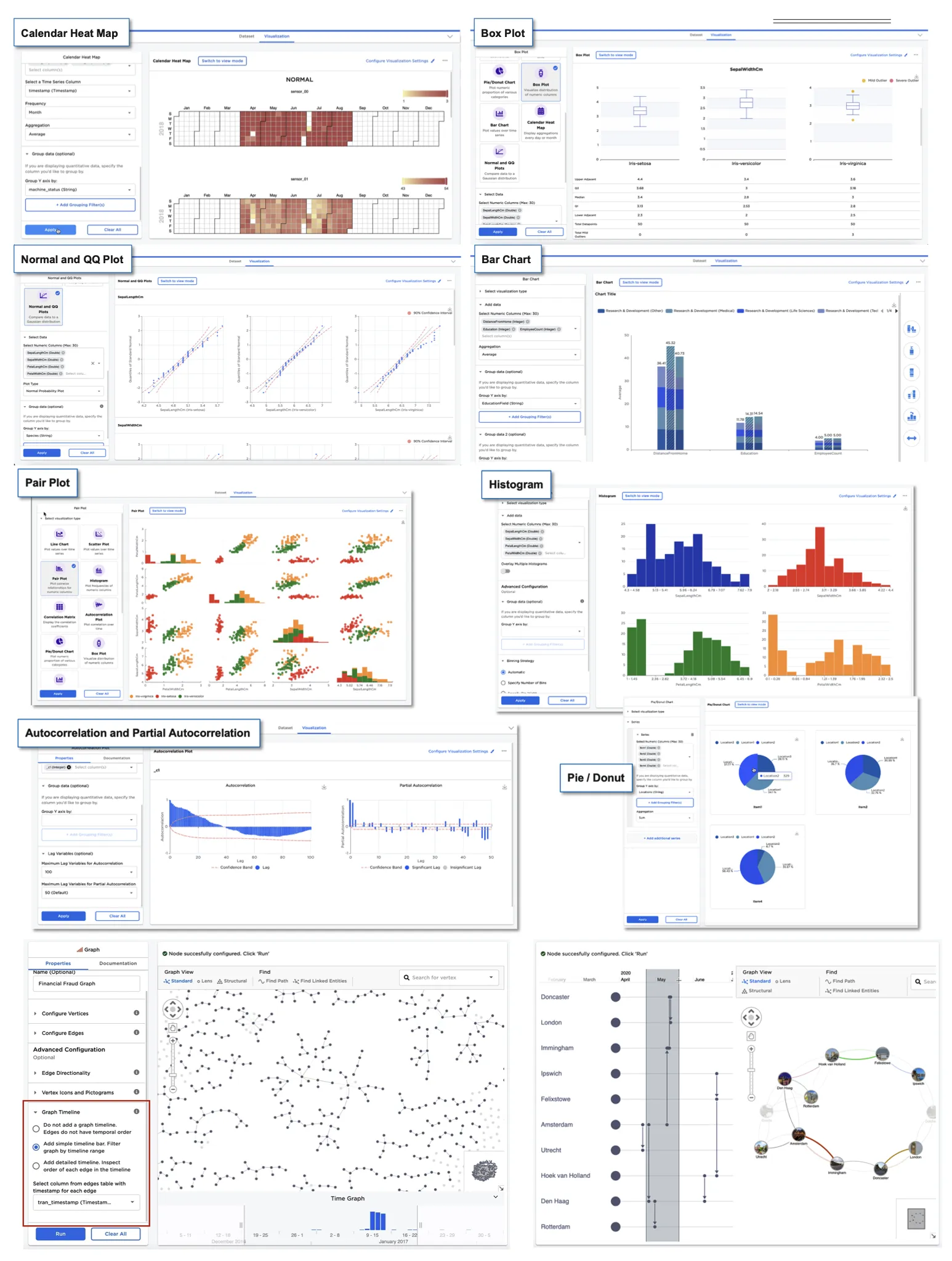
Figure 2: Example visualizations
Chart Configuration Options
Each visualization is highly customizable, with customizable legends, color schemes, axis labels and much more.
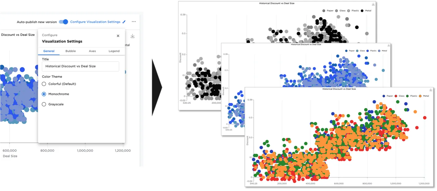
Figure 3: Example visualization color schemes
The Bar Chart node offers significant flexibility. Side menus let users arrange, order, label, and display bar chart data.
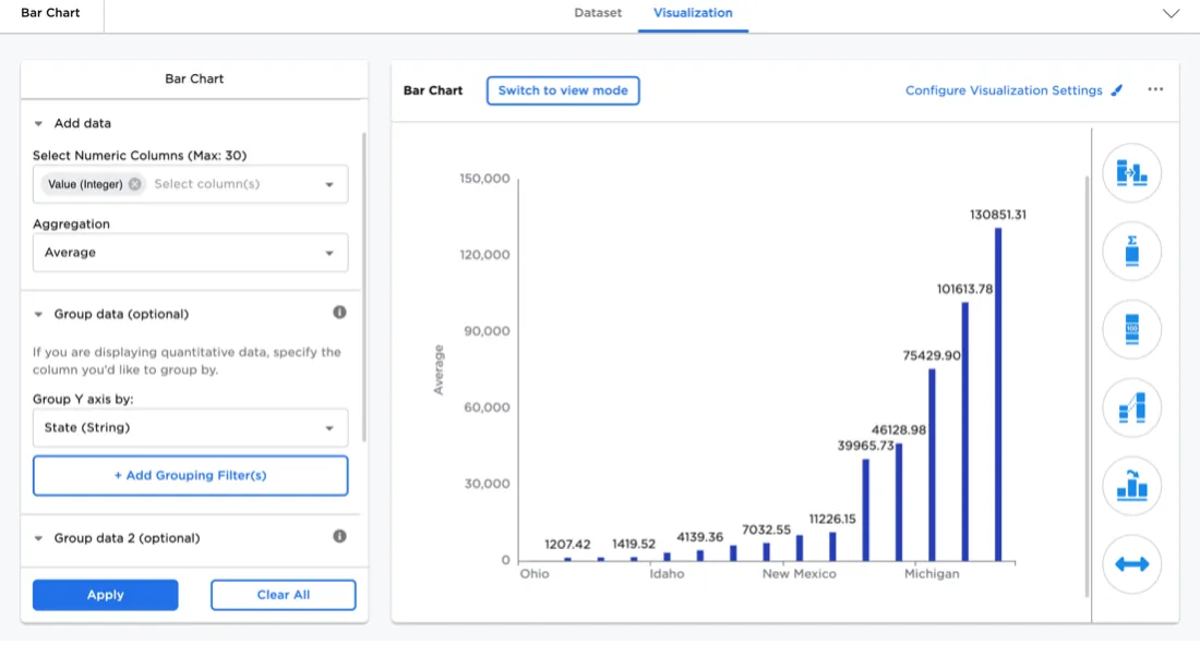
Figure 4: Bar Chart configuration side menus
The bar chart visualizer supports seven bar chart types. In addition to the simple bar shown above, users can select stacked bar, clustered bar, 100% stacked bar, stacked cluster bar, double stacked bar, or double cluster bar.
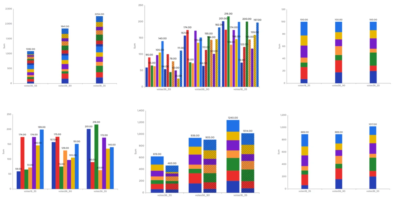
Figure 5: Supported bar chart types
Additionally, users can change the color scheme, add bar connectors, include custom bar labels, rotate the chart, reorder the bars, and hide certain data.
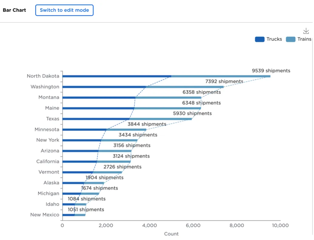
Figure 6: Customized bar chart
Custom Charts with Python
With the introduction of the Python visualizer node, users can now visualize a dataset using their favorite Python visualization library.
The Matplotlib, Seaborn, and statsmodel libraries are supported.
Of important note is that the Python Visualization node does not automatically down-sample on large datasets and thus should not be used with big data in excess of 1Gb.
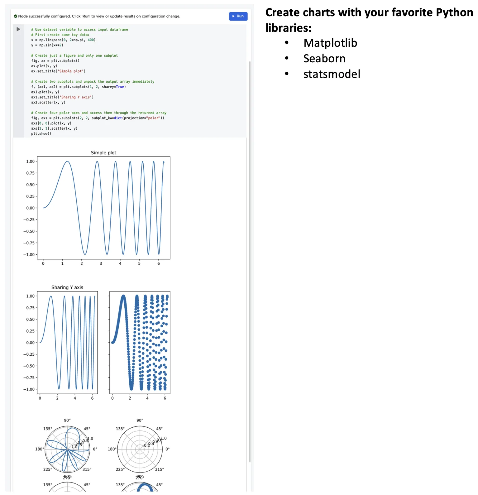
Figure 7: Example custom Python visualizations