Creating Visualizations in Visual Notebooks
You can create interactive visualizations at any point in your analytics workflow. Visual Notebooks supports the following visualization types:
- Autocorrelation
- Correlation Matrix
- Pair Plot
- Scatter
- 3D Scatter
- Box
- Histogram
- Normal and QQ
- Calendar Heat Map
- Line
- Pie/Donut
- Geospatial
- Bar
- Sankey
- Graph
- Python Visualization
- Summary Table
Note: The Python Visualization and Summary Table nodes offer unique capabilities. Use the Python Visualization node to build your own visualization using custom Python code. Use the Summary Table node to create a curated view of your dataframe that can be displayed in Visual Notebooks stories.
Select a node
You can create visualizations within visual notebooks and ML pipelines. There are two ways to make visualizations: you can use a dedicated visualization node, or you can use the Visualization tab within an existing node. Visualizations made from the Visualizations tab have the same functionality as visualizations made from a dedicated visualization node. Some people prefer to use separate nodes for their visualizations, while other prefer to have visualizations tied to a specific dataframe. This document explains how to create visualizations using the dedicated visualization nodes. For information about the Visualization tab, see Working with Nodes.
Dedicated visualization nodes are in the Visualization section, then grouped into one of the following subsections: Correlation, Distribution, Evolution, GeoMap, Ranking, Relationship, Python, or Summary.
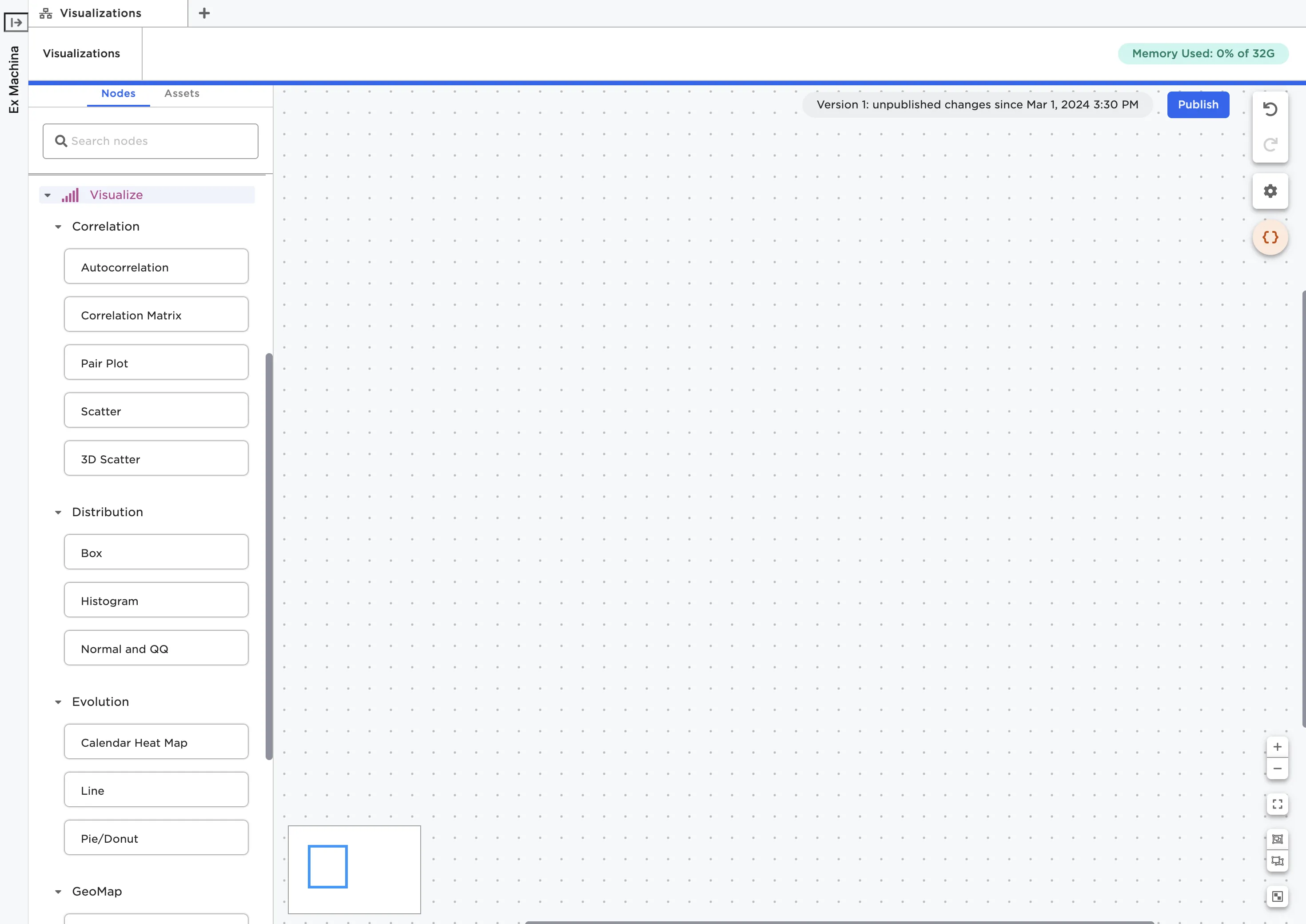
Figure 1: Dedicated visualization nodes
Once you've identified the node that corresponds to the visualization you'd like to create, drag the node onto the canvas. For example, if you want to create a line plot, drag a Line node onto the canvas. Connect the visualization node to an existing node that contains the dataframe you'd like to visualize.
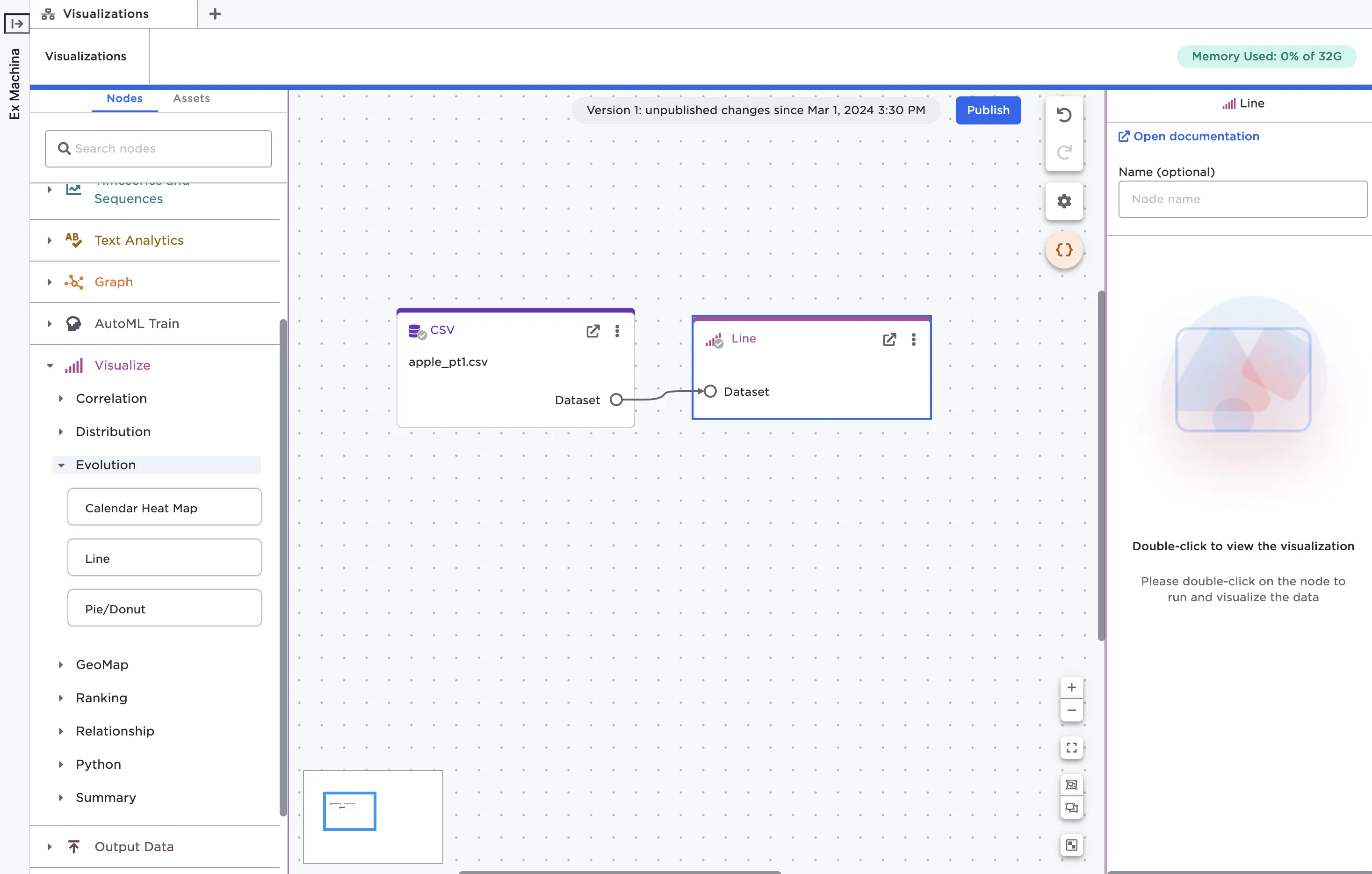
Figure 2: A Line node on the canvas
Configure the visualization
Double click on the node to open it in a full-screen view. Each visualization node requires a slightly different configuration. Some visualization nodes, like the Line node shown in Figure 3, have a drag-and-drop interface for configuring the visualization. For details about the fields required for the specific node you're using, see the documentation for that node.
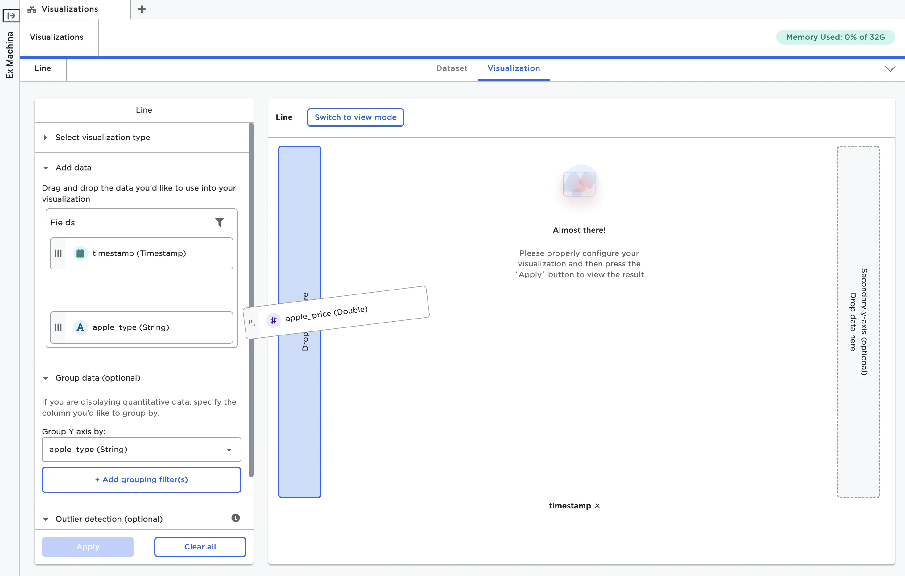
Figure 3: Using a drag-and-drop interface to configure the Line node
Once the visualization node is correctly configured, select Apply to view the visualization.
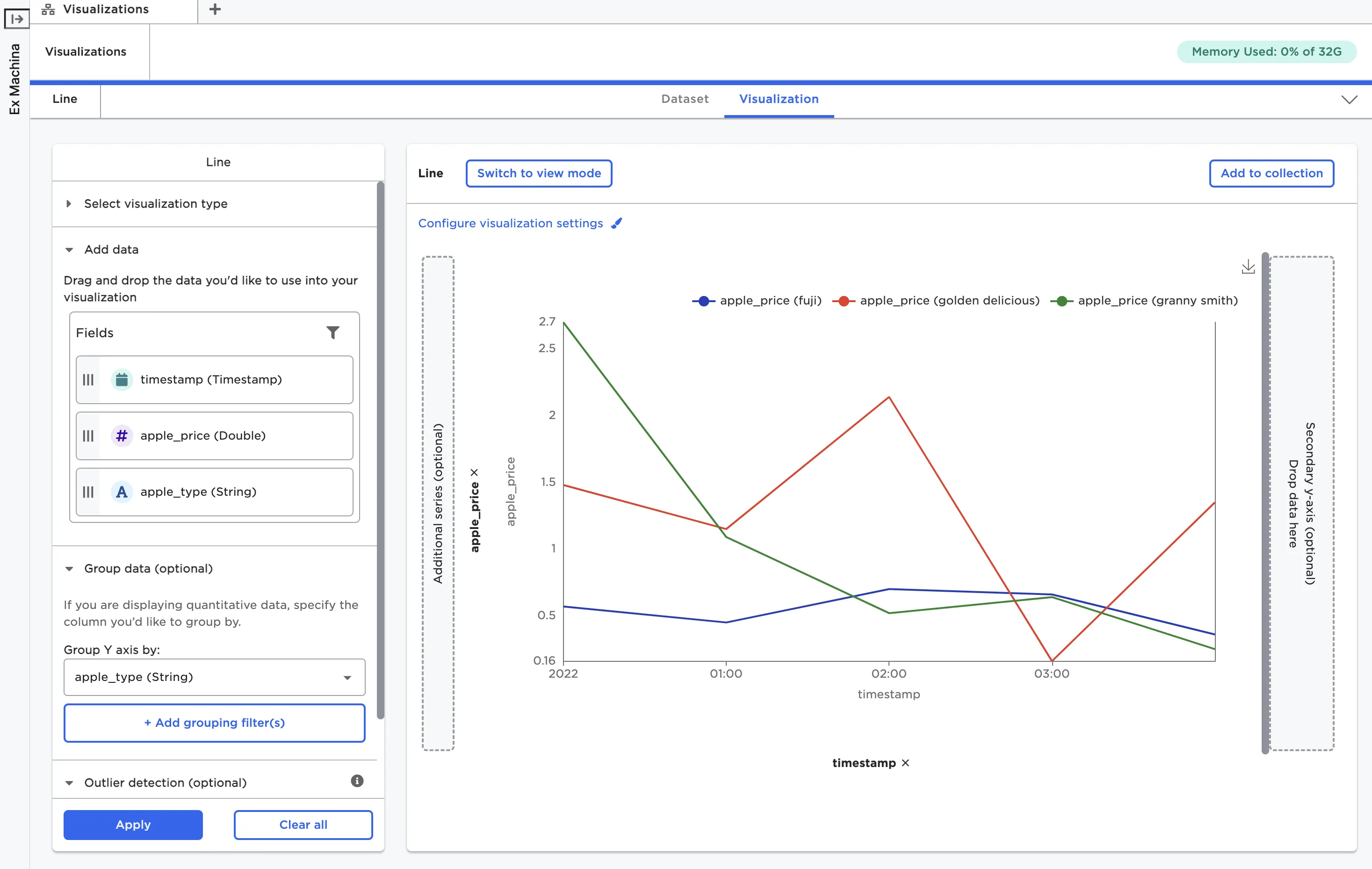
Figure 4: A line chart created with the Line node
Most visualization nodes have a button at the top left of the visualization to Configure visualization settings. This button opens a popup menu with options to adjust the color scheme, change the visualization display, create labels, and adjust the legend. Changing one of the visualization settings in this menu immediately changes the visualization to match your selection.
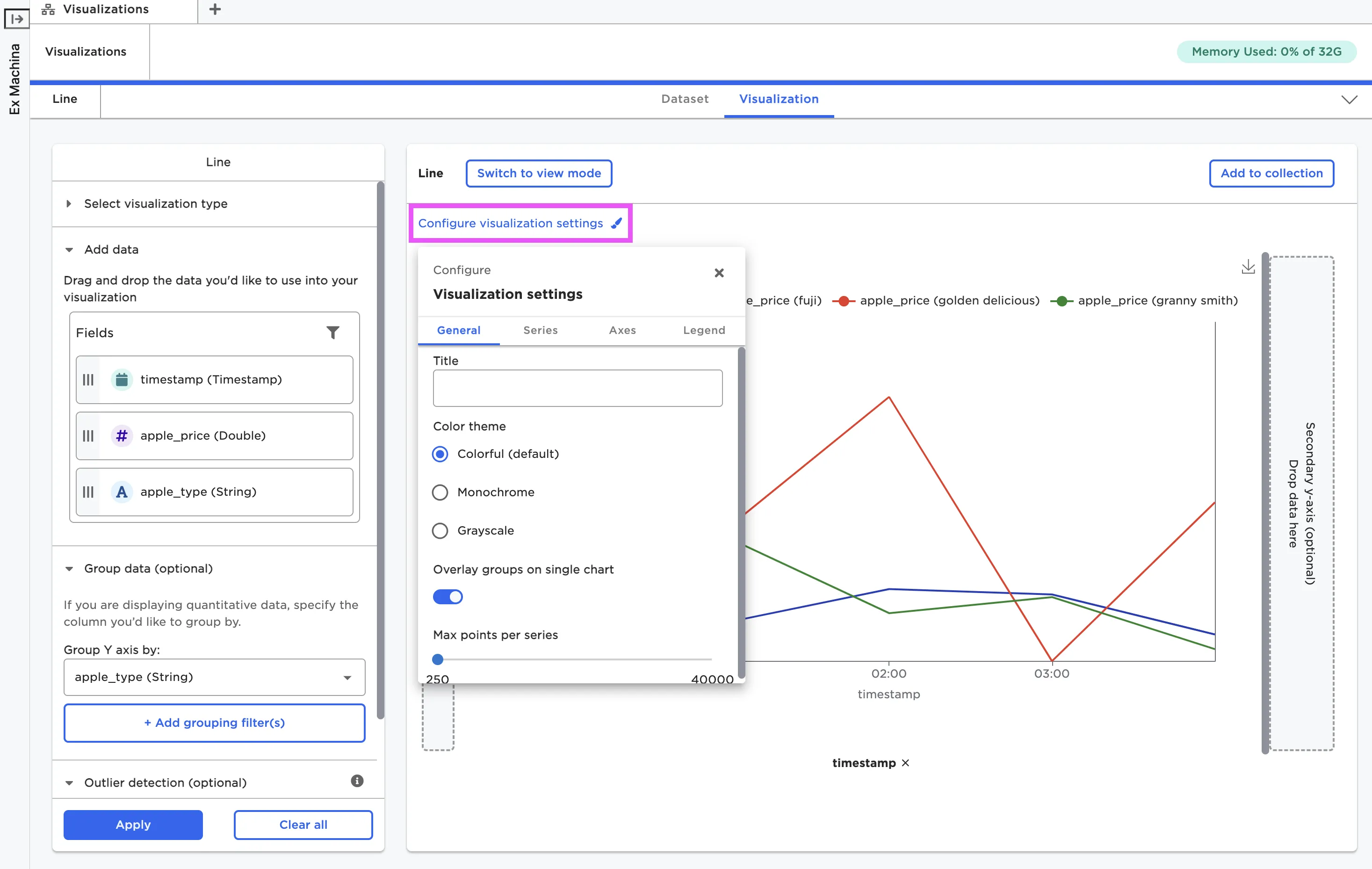
Figure 5: The popup menu used to adjust visualization settings
Interact with the visualization
With the exception of Python visualizations, Visual Notebooks visualizations are interactive. You can hover over different components, hide data within certain groups or ranges, zoom in and out, and more. For the Line node, you can select groups in the legend to hide them from the chart. Explore different visualization types to see what interactive capabilities are available.
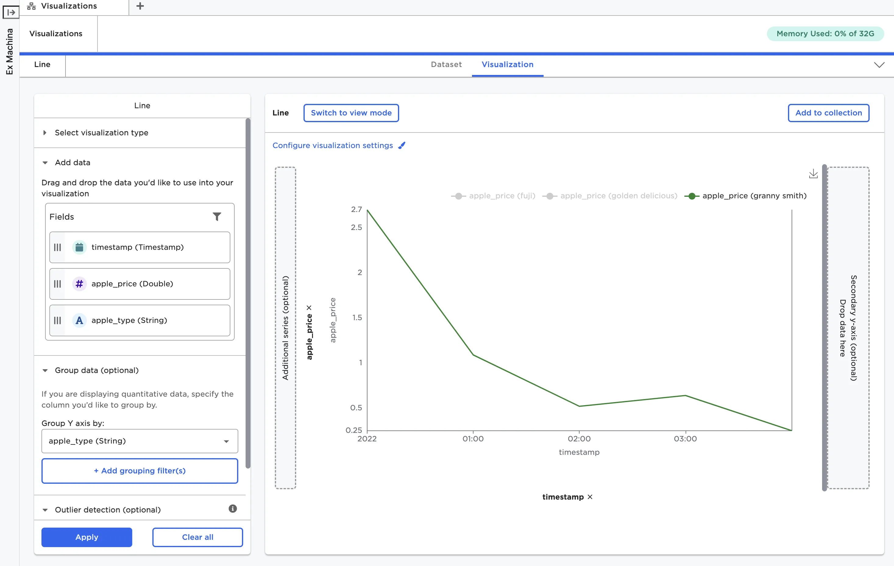
Figure 6: Hide groups using the legend
If you want to view the visualization without the configuration options cluttering the image, you can select Switch to view mode. Once in view mode, you can return to edit mode at any time by selecting the corresponding Switch to edit mode button.
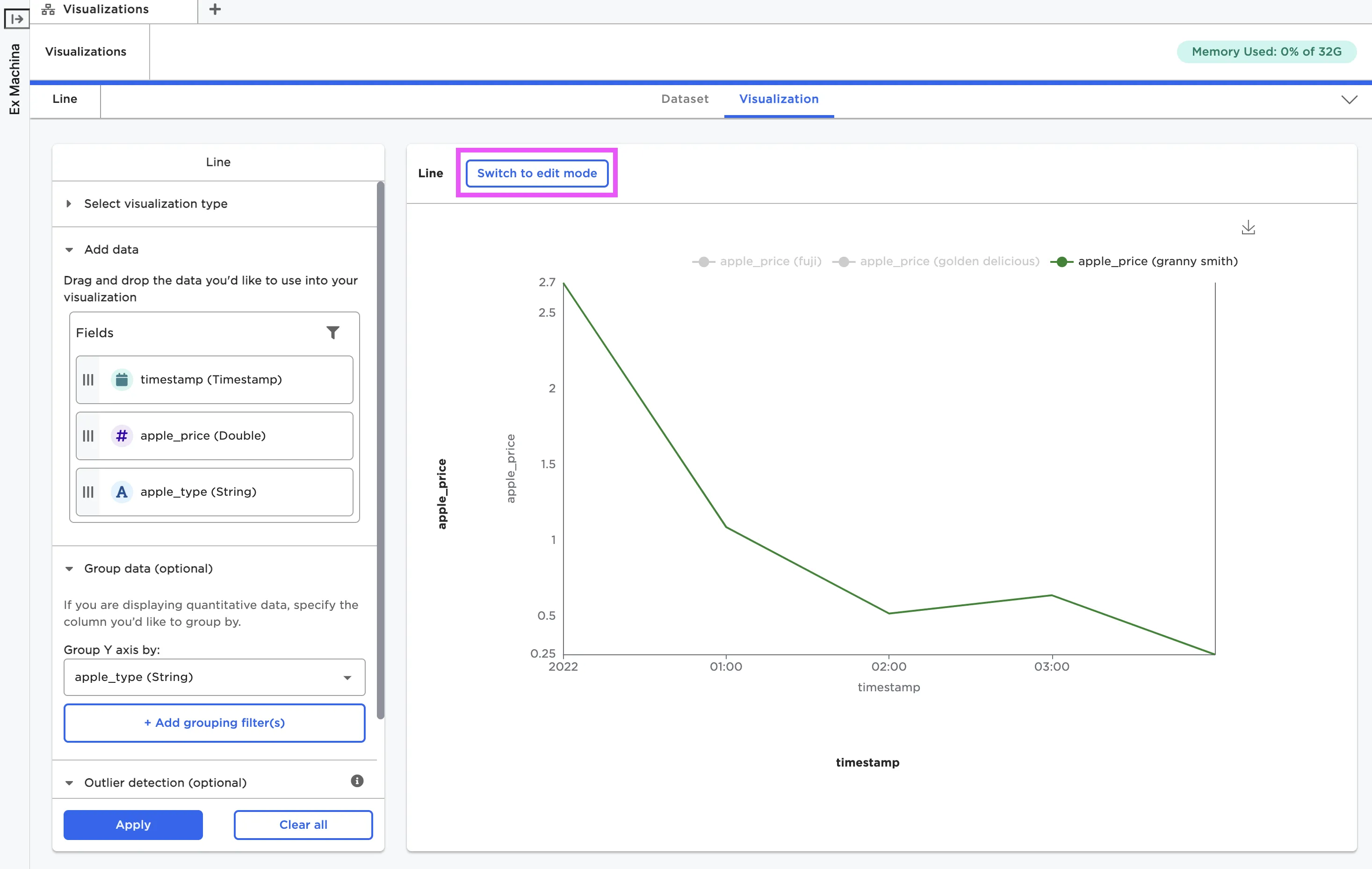
Figure 7: A line chart in view mode
Save the visualization
If you'd like to save your visualization as a static image, select the download icon to the right of the visualization. Images are saved as local PNG files.
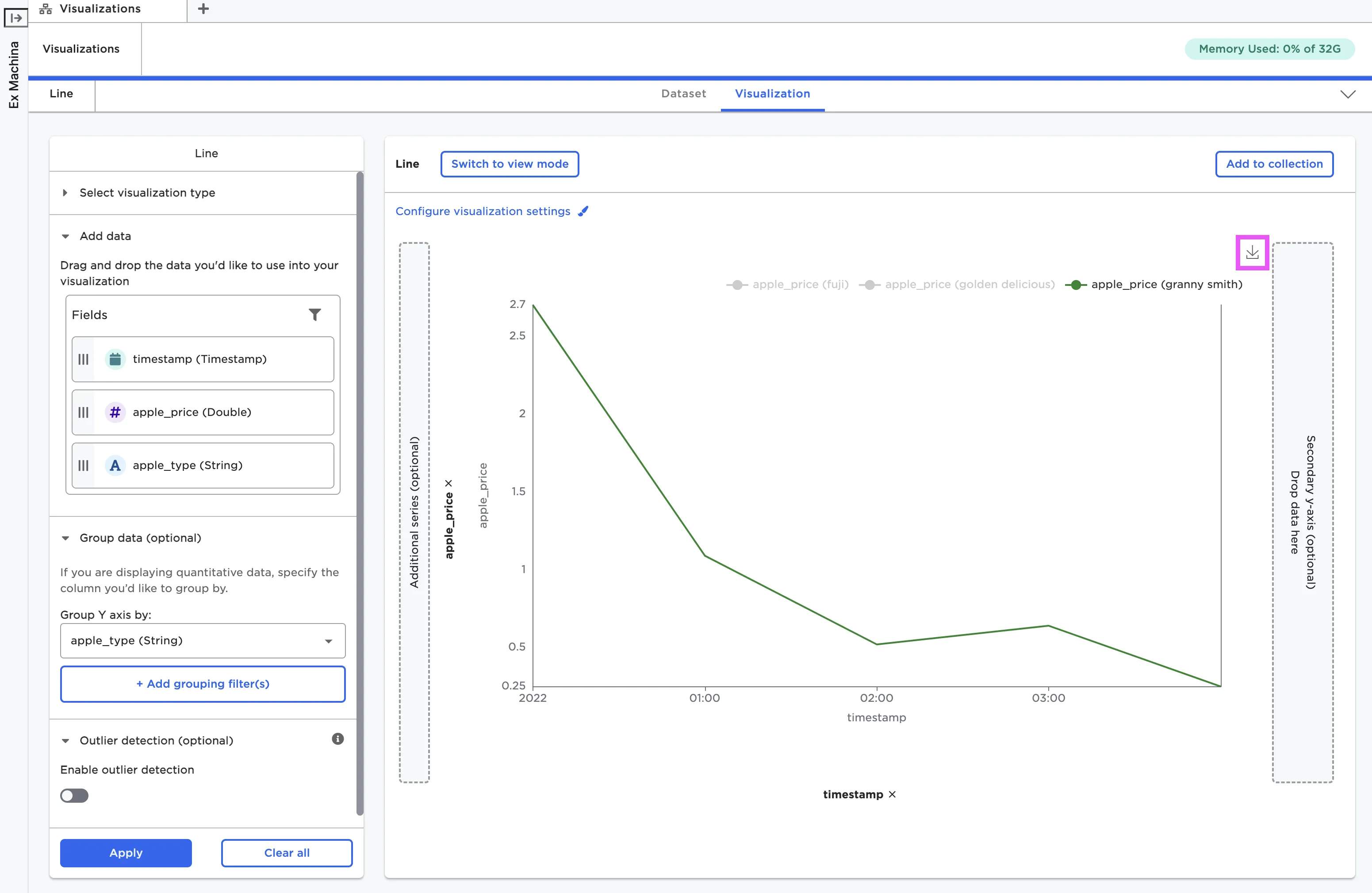
Figure 8: Download a local copy of a visualization
You can also save your visualizations so they can be used in Visual Notebooks stories. To use a visualization in a story, you must first add it to a collection. See the Stories section for more information about publishing visualizations to a collection.